
JS-110 · Lesson 10 of 12 · 30 min
Accessible interactive components
▶ Video coming soon A video version of this lesson is on the way.
Before the counter page goes any further, Sana Qureshi, Brightwater's designer, reviews Mira's draft the way she reviews everything: with the mouse unplugged and a screen reader running. Within ten minutes she has a list. The plus and minus buttons are read out as plus and minus with no dish name. The tip choices are four coloured boxes that cannot be reached with the Tab key. The confirmation that appears when an order is placed is never announced, so a blind trainee would not know it happened. And the Order summary panel slides open and shut, but nothing tells a screen reader whether it is open.
"None of this is unusual," Sana says. "Static pages are mostly accessible if the HTML is right. Interactive pages are where accessibility breaks, because scripts change things that assistive technology needs to be told about." The session planned for Thursday, February 11, 2027, works through her list. For the Food Hub this is also a legal duty: as an Ontario non-profit with more than 50 employees, it must keep its public website to WCAG 2.0 Level AA under the Accessibility for Ontarians with Disabilities Act, and Brightwater builds to WCAG 2.2 AA, which goes well beyond 2.0.
How assistive technology sees a page
Alongside the DOM, browsers build an accessibility tree: a simplified version of the page that they pass to the operating system's accessibility services, which screen readers, voice control software and switch devices use. Each object in it has a role, which says what kind of thing it is, such as button, link, checkbox or heading; an accessible name, which is what it is called, such as Add Lentil soup; and states and properties, such as whether it is checked, expanded, disabled or invalid.
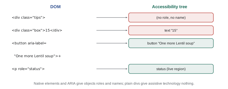
HTML elements come with these built in. A button element has the role button, takes its name from its text and is focusable and operable with Enter and Space without any script. An input with a label has the role textbox and takes its name from the label. A div has no role, no name and no keyboard behaviour at all. That is why the most important rule of accessible scripting is the simplest one: use the native HTML element that does what you need, and add script only for the behaviour HTML does not provide.
| Need | Use | Avoid |
|---|---|---|
| Something that does an action | <button type="button"> | A div or span with a click listener |
| Something that goes to another page | <a href="..."> | A button that changes location |
| A choice of one from a few | Radio buttons in a fieldset with a legend | Clickable coloured boxes |
| Show or hide a section | <details> and <summary>, or a button with aria-expanded | A heading with a click listener |
| A modal message | <dialog> opened with showModal() | A div positioned over the page |
| A number the user can change | <input type="number"> or labelled buttons | Text that changes when tapped |
ARIA: filling the gaps
ARIA, short for Accessible Rich Internet Applications, is a W3C standard set of attributes that change what the accessibility tree says about an element. role sets the role, aria-label and aria-labelledby set the accessible name, aria-describedby adds a description, and attributes such as aria-expanded, aria-pressed, aria-checked, aria-invalid and aria-current set states. ARIA changes only what assistive technology is told. It does not make anything focusable, clickable or keyboard-operable; the script must still do all of that.
The W3C's guidance on using ARIA opens with a rule often quoted as no ARIA is better than bad ARIA: if a native element or attribute gives the semantics and behaviour you need, use it instead. ARIA that contradicts what an element actually does, such as role="button" on a div with no keyboard support, is worse than none, because it promises a screen reader user something the page does not deliver.
Accessible names
Sana's first complaint was about names. The plus and minus buttons show a symbol, which a screen reader reads as plus and minus, and in a list of eight dishes nobody can tell which dish a button belongs to. Every interactive element needs a name that makes sense on its own. The browser works one out in a fixed order of preference: aria-labelledby first, then aria-label, then the element's own content or its label element, then the title attribute as a last resort.
// a simplified version of the browser's accessible name rules
function accessibleName(el, byId) {
  if (el.labelledby) return el.labelledby.split(' ').map((id) => byId[id]).join(' ');
  if (el.ariaLabel) return el.ariaLabel;
  if (el.labelText) return el.labelText;
  if (el.text && el.text.trim()) return el.text.trim();
  return el.title ?? '(no name)';
}

const byId = { 'name-soup': 'Lentil soup', 'qty-soup': '2' };
const buttons = [
  { what: 'plus, symbol only', text: '+' },
  { what: 'plus with aria-label', text: '+', ariaLabel: 'One more Lentil soup' },
  { what: 'icon button, no text', text: '' },
  { what: 'quantity output', labelledby: 'name-soup qty-soup' },
  { what: 'add button', text: ' Add ' , title: 'Add to order' },
];
for (const b of buttons) console.log(b.what.padEnd(22), '->', accessibleName(b, byId));plus, symbol only -> + plus with aria-label -> One more Lentil soup icon button, no text -> (no name) quantity output -> Lentil soup 2 add button -> Add
What this code does
The function checks the same sources in the same order as browsers do, in simplified form: references to other elements, then aria-label, then a label, then the visible text, then the title. A plus sign on its own gives a name of just a symbol, which is why the counter's buttons get an aria-label naming the dish. An icon with no text and no label has no name at all, which screen readers announce as an unlabelled button.
For the stepper buttons, Mira uses aria-label, because the visible text is a single symbol. For the quantity itself, she uses aria-labelledby pointing at the dish name and the number, so that it is read as Lentil soup 2. Visible text is always the best name when it is clear, because it is the same for everyone; aria-label is for cases where the visible text cannot say enough. WCAG's Label in Name criterion adds that when an element has visible text, its accessible name should contain that text, so that voice control users can say what they see.
Keyboard access and focus
Everything that can be done with a mouse must be possible with a keyboard alone. Keyboard users move between interactive elements with Tab and Shift+Tab, activate buttons with Enter or Space, and use arrow keys inside composite widgets such as radio groups and tab lists. The element that receives key presses is the one with focus, and WCAG requires that it is always visible, which is what the :focus-visible outline Mira fixed in Web Development I is for.
Native buttons, links and form controls are in the Tab order automatically. The tabindex attribute changes that for other elements: tabindex="0" puts an element into the Tab order in its normal position, and tabindex="-1" makes it focusable by script, with element.focus(), without putting it in the Tab order. Positive values such as tabindex="3" force a custom order that almost always ends up confusing, and should never be used.
| tabindex | In the Tab order | Focusable by script | Use for |
|---|---|---|---|
| (none, on a button, link or field) | Yes | Yes | Normal interactive elements |
| 0 | Yes, in document order | Yes | A custom widget that must be reachable |
| -1 | No | Yes | Headings, panels and messages that scripts move focus to |
| 1 or more | Yes, before everything else | Yes | Never |
Scripts must also manage focus when they change the page. When the order is placed and the menu is cleared, the button the trainee just pressed may disappear, and focus falls back to the top of the document, so a keyboard user has to tab all the way back. The rule is: when you remove or hide the focused element, move focus somewhere sensible, such as the confirmation message or the first item of the menu, with element.focus().
Disclosure: showing and hiding a section
The Order summary panel is a disclosure: a button that shows and hides a section. The pattern needs a real button, an aria-expanded attribute on the button that says whether the section is open, and, optionally, aria-controls naming the section's id. The script toggles the section's hidden attribute and keeps aria-expanded in step, so a screen reader says Order summary, button, collapsed or expanded.
<button type="button" id="summary-toggle" aria-expanded="false" aria-controls="summary">
  Order summary
</button>
<section id="summary" hidden>
  ... the order lines ...
</section>
What this code does
The button starts with aria-expanded set to false, matching the hidden section it controls. Because it is a real button, it is already in the Tab order and works with Enter and Space. The script only needs to flip the two values when it is clicked.
const toggle = document.querySelector('#summary-toggle');
const summary = document.querySelector('#summary');
toggle.addEventListener('click', () => {
  const open = toggle.getAttribute('aria-expanded') === 'true';
  toggle.setAttribute('aria-expanded', String(!open));
  summary.hidden = open;
});
What this code does
The listener reads the current state from aria-expanded, so the attribute is the single record of whether the panel is open. It then sets the opposite state on the button and shows or hides the section to match. aria-expanded holds the strings true and false, which is why the comparison and the String call are needed.
For simple cases, HTML has a disclosure that needs no script at all: the details element with a summary inside it. Lucy's Frequently asked questions on the Volunteer page use details, and they are fully accessible without a line of JavaScript. Mira uses a button for the order summary only because Sana's design needs the toggle and the panel in different parts of the layout.
Groups of choices and roving focus
The tip choices were Sana's second complaint. Four options of which exactly one is chosen is the definition of a radio group, and the fix is to use one: four radio inputs with the same name, in a fieldset with a legend reading Tip for the youth garden. The browser then provides everything: Tab moves into the group and out again, the arrow keys move between options and select them, and a screen reader announces Tip for the youth garden, radio group, 15 in 100, 3 of 4, selected. The coloured boxes can stay, as styles on the radio buttons' labels.
When a design needs a composite widget that HTML does not provide, such as a set of tabs, the standard keyboard technique is roving tabindex. Only one item in the group has tabindex="0" and so is in the Tab order; the others have tabindex="-1". The arrow keys move the 0 to the next item and focus it, wrapping at the ends, and Home and End jump to the first and last. Tab then leaves the group altogether, so a keyboard user does not have to tab through every item.
function nextIndex(current, key, count) {
  switch (key) {
    case 'ArrowRight': case 'ArrowDown': return (current + 1) % count;
    case 'ArrowLeft': case 'ArrowUp': return (current - 1 + count) % count;
    case 'Home': return 0;
    case 'End': return count - 1;
    default: return current;
  }
}

const tabs = ['Soups', 'Sandwiches', 'Drinks', 'Treats'];
let active = 0;
for (const key of ['ArrowRight', 'ArrowRight', 'ArrowLeft', 'End', 'ArrowRight', 'Home', 'ArrowUp', 'Tab']) {
  active = nextIndex(active, key, tabs.length);
  const tabindexes = tabs.map((_, i) => (i === active ? 0 : -1)).join(' ');
  console.log(key.padEnd(10), tabs[active].padEnd(11), 'tabindex:', tabindexes);
}ArrowRight Sandwiches tabindex: -1 0 -1 -1 ArrowRight Drinks tabindex: -1 -1 0 -1 ArrowLeft Sandwiches tabindex: -1 0 -1 -1 End Treats tabindex: -1 -1 -1 0 ArrowRight Soups tabindex: 0 -1 -1 -1 Home Soups tabindex: 0 -1 -1 -1 ArrowUp Treats tabindex: -1 -1 -1 0 Tab Treats tabindex: -1 -1 -1 0
What this code does
nextIndex works out which item should be active after a key press, using the remainder operator to wrap from the last item to the first and back. After each key, exactly one item has tabindex 0 and the rest have -1, which is the roving tabindex pattern. The Tab key is not handled, so the index stays the same and the browser moves focus out of the group as usual.
const list = document.querySelector('[role="tablist"]');
const tabs = [...list.querySelectorAll('[role="tab"]')];
list.addEventListener('keydown', (event) => {
  const current = tabs.indexOf(document.activeElement);
  const next = nextIndex(current, event.key, tabs.length);
  if (next === current) return;
  event.preventDefault();
  tabs.forEach((t, i) => {
    t.tabIndex = i === next ? 0 : -1;
    t.setAttribute('aria-selected', String(i === next));
  });
  tabs[next].focus();
  showPanel(tabs[next].getAttribute('aria-controls'));
});
What this code does
One delegated keydown listener on the tab list finds which tab has focus and asks nextIndex where to go. If the key means a move, it updates every tab's tabIndex and aria-selected, moves focus to the new tab and shows its panel. The roles tablist and tab, with aria-selected and aria-controls, tell assistive technology that this is a set of tabs.
The counter's menu uses tabs in Sana's design, Soups, Sandwiches, Drinks and Treats, to keep the screen uncluttered on the tablet. The W3C's ARIA Authoring Practices Guide gives the full expected keyboard behaviour and markup for tabs and for about thirty other patterns, and Brightwater's rule is to follow it exactly rather than invent a variation.
Announcing changes with live regions
Sana's third complaint, the unannounced confirmation, is about content that changes without focus moving. Sighted users see the toast or the new total; screen reader users hear nothing, because screen readers read what has focus and what the user navigates to. A live region fixes this. An element with role="status", or aria-live="polite", is watched by screen readers, and when its text changes they read the new text at the next pause, without moving focus. role="alert", or aria-live="assertive", interrupts at once and is kept for urgent problems.
Live regions work reliably only if the region element is already in the page when it loads, empty, and the script changes its text later. A region inserted together with its message is often not announced. Messages should be short and complete on their own, and the page should not flood the region: one message after each action is plenty.
const money = (c) => (c / 100).toFixed(2);

function announcement(action, line, order) {
  const count = order.reduce((n, l) => n + l.qty, 0);
  const total = order.reduce((s, l) => s + l.qty * l.priceCents, 0);
  const what = action === 'removed' ? `${line.name} removed` : `${line.qty} ${line.name} in order`;
  return `${what}. ${count} ${count === 1 ? 'item' : 'items'}, subtotal ${money(total)}.`;
}

let order = [{ name: 'Lentil soup', qty: 1, priceCents: 550 }];
console.log(announcement('added', order[0], order));
order[0].qty = 2;
order.push({ name: 'Tea', qty: 1, priceCents: 200 });
console.log(announcement('added', order[1], order));
const removed = order.shift();
console.log(announcement('removed', removed, order));1 Lentil soup in order. 1 item, subtotal 5.50. 1 Tea in order. 3 items, subtotal 13.00. Lentil soup removed. 1 item, subtotal 2.00.
What this code does
The function builds one short sentence describing what just changed and the state of the order afterwards, with the item word made singular or plural to match the count. The page puts this text into a role status element after every change, and screen readers read it out at the next pause. Building the text in a pure function means its wording can be checked in the runner and agreed with Sana and Rosa.
Dialogs
When a trainee presses Place order, Rosa wants a confirmation step: the order and total, with Confirm and Back buttons. That is a modal dialog, and HTML has an element for it. A dialog element opened with showModal() is placed above the page, makes everything else inert so that it cannot be clicked or focused, moves focus into the dialog, closes when Escape is pressed and, when closed, returns focus to the element that was focused before. Before the dialog element was supported everywhere, which happened in 2022, developers had to build each of those behaviours by hand.
<dialog id="confirm" aria-labelledby="confirm-title">
  <h2 id="confirm-title">Confirm order</h2>
  <p id="confirm-text"></p>
  <form method="dialog">
    <button value="back">Back</button>
    <button value="confirm" autofocus>Confirm</button>
  </form>
</dialog>
What this code does
The dialog takes its accessible name from its heading through aria-labelledby. A form with method dialog closes the dialog when either button is pressed and records the pressed button's value as the dialog's returnValue. The autofocus attribute puts focus on Confirm when the dialog opens.
const dialog = document.querySelector('#confirm');
function confirmOrder(summaryText) {
  dialog.querySelector('#confirm-text').textContent = summaryText;
  dialog.showModal();
}
dialog.addEventListener('close', () => {
  if (dialog.returnValue === 'confirm') placeOrder();
});
What this code does
confirmOrder puts the order summary into the dialog as text and opens it as a modal, which makes the rest of the page inert. The close event fires however the dialog is closed, by either button or by Escape. Only a returnValue of confirm places the order; Escape and Back leave it unchanged.
Two newer HTML features take this further. The popover attribute, supported in all major browsers since 2024, gives non-modal pop-ups such as menus and tooltips light dismissal and top-layer display without script. Invoker commands, a command and commandfor attribute pair on buttons, let a button open a dialog or popover with no JavaScript at all; they became available in all major browsers in December 2025, so Brightwater uses them on new pages while keeping a script fallback for older tablets.
Worked problem
Reviewing a component
Sana finds this markup for the tip choice: four div elements with click listeners, each showing a number, with the chosen one given the class chosen. List the problems and the fix.
Show solution
- Role: a div has no role, so a screen reader does not know these are choices. Radio buttons have the radio role and a group.
- Name: the divs show only a number, so they are read as 10, 15 and so on with no context. A fieldset with the legend Tip for the youth garden and labels such as 15 in 100 give a clear name.
- State: the chosen class is visible only through styling. Radio buttons report which option is selected.
- Keyboard: divs cannot be reached with Tab or operated with keys. A radio group is reachable with Tab and uses arrow keys, with no script.
- Fix: replace the divs with four radio inputs in a fieldset and style their labels to look like the boxes.
Answer: Four problems, role, name, state and keyboard, all solved by one native element. The script then reads the chosen value with FormData or from the checked radio.
Testing what you build
Sana's review method is one Mira can repeat for every component. Unplug the mouse and do the whole task with the keyboard, checking that focus is always visible and goes somewhere sensible. Turn on a screen reader, NVDA on Windows, VoiceOver on Apple devices or TalkBack on Android, and listen to what each control is called and what happens when it changes. Zoom the page to twice its normal size and check that nothing is cut off. Then run an automated checker, such as the accessibility panel in the browser's developer tools or the axe extension, which finds missing names and contrast problems quickly but can never confirm that a component actually makes sense to use.
Try it yourself
Roving index with wrapping
Write nextIndex(current, key, count) for a horizontal tab list. ArrowRight moves to the next item and wraps from the last to the first; ArrowLeft moves back and wraps from the first to the last; Home goes to 0; End goes to the last item; any other key leaves the index unchanged.
function nextIndex(current, key, count) {
  // return the new index
  return current;
}

let i = 0;
for (const key of ['ArrowLeft', 'ArrowLeft', 'ArrowRight', 'Home', 'End', 'ArrowRight', 'Enter']) {
  i = nextIndex(i, key, 4);
  console.log(key, i);
}
Try it yourself
A stepper's accessible names
Write stepperLabels(name, qty), which returns an object with the accessible names for a quantity stepper: less is One fewer NAME, more is One more NAME, and value is NAME, quantity QTY.
When qty is 0, less should instead be NAME, none in order, because the button is disabled then. When qty is 20, more should be NAME, maximum of 20.
function stepperLabels(name, qty) {
  // return { less, more, value }
  return {};
}

for (const q of [0, 2, 20]) console.log(JSON.stringify(stepperLabels('Lentil soup', q)));
Common mistakes
Mistakerole="button" makes a div work like a button.
InsteadARIA changes only what assistive technology is told. A div still needs tabindex, Enter and Space handling and more; use a button element.
MistakeA plus sign is a good enough name for a quantity button.
InsteadNames must make sense out of context. Name the dish, for example with aria-label.
Mistaketabindex="1" is a good way to make a control come first.
InsteadPositive tabindex values create confusing orders. Use document order, tabindex 0 or -1.
MistakeA live region can be added to the page at the moment a message needs announcing.
InsteadRegions must already be in the page, usually empty, before their text changes.
MistakeAutomated checkers prove a component is accessible.
InsteadThey find some problems quickly but cannot judge whether it is usable. Test with a keyboard and a screen reader.
Summary and key terms
- Browsers build an accessibility tree in which every object has a role, an accessible name and states.
- Native HTML elements provide these and keyboard behaviour for free, so the first rule is to use the native element.
- ARIA attributes change roles, names and states but add no behaviour, and bad ARIA is worse than none.
- Accessible names come from aria-labelledby, aria-label, labels, content and titles, in that order, and must make sense out of context.
- Everything must work from the keyboard with visible focus; tabindex 0 adds an element to the Tab order and -1 makes it focusable by script only.
- Scripts must move focus sensibly when they remove the focused element.
- A disclosure uses a button with aria-expanded; choices use radio groups; composite widgets such as tabs use roving tabindex.
- Live regions announce changes without moving focus.
- The dialog element with showModal gives a complete modal.
- Test with a keyboard, a screen reader, zoom and an automated checker.
- accessibility tree
- The browser's simplified model of a page, passed to assistive technology.
- assistive technology
- Software or hardware, such as screen readers and switch devices, that helps people use computers.
- role
- What kind of object an element is, such as button, link or checkbox.
- accessible name
- The name assistive technology uses for an element, such as Add Lentil soup.
- ARIA
- A standard set of attributes that change an element's role, name or states in the accessibility tree.
- focus
- The state of being the element that receives keyboard input.
- tabindex
- An attribute that controls whether an element can receive focus and whether it is in the Tab order.
- disclosure
- A button that shows and hides a section, with aria-expanded reporting its state.
- roving tabindex
- A technique in which only the active item of a group has tabindex 0 and arrow keys move it.
- live region
- An element whose changes screen readers announce without moving focus.
- modal dialog
- A dialog that makes the rest of the page inert until it is closed.
- inert
- Unable to be focused, clicked or reached by assistive technology.
Practice problems
Work each problem on paper first, then reveal the answer to check.
Why is a native button better than a div with role="button"?
Show answer
The button is focusable and works with Enter and Space automatically; the div needs all of that added by script.
What does aria-expanded tell a screen reader?
Show answer
Whether the section controlled by a disclosure button is currently open.
What is the difference between tabindex="0" and tabindex="-1"?
Show answer
0 puts an element in the Tab order; -1 makes it focusable only by script.
What must be true of a live region for its messages to be announced reliably?
Show answer
It must already be in the page before its text changes, and messages should be short.
What does showModal do that show does not?
Show answer
It makes the rest of the page inert, traps focus inside the dialog and lets Escape close it.
Lesson quiz · 5 questions
Score 60% or more to complete this lesson.
Create a free account to save your progress, take quizzes and earn a certificate.