
PHOT-211 · Lesson 4 of 12 · 25 min
Color in light: gels, theory and creative color
Studio Lighting I introduced correction gels and simple creative color. This lesson goes further, treating color as a full design element: how colored light mixes, how colored light interacts with colored surfaces, how gels affect exposure, how to build color harmonies with light, how RGB LED fixtures change the possibilities, and how to manage white balance and skin when much of the light is colored. Colored light is used in fashion, music, beauty, product and editorial photography to create energy, mood and brand identity, and in still life to separate objects and suggest time of day. Used well, it looks bold and intentional; used carelessly, it looks garish or muddy.
Additive color mixing
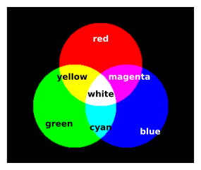
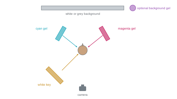
Light mixes additively. The primary colors of light are red, green and blue: red and green light combine to make yellow, green and blue make cyan, red and blue make magenta, and all three in balance make white. This is different from mixing paints or inks, which subtract wavelengths and mix toward black. In the studio, additive mixing means that where two colored lights overlap on a white surface, a third color appears, and where a gelled light falls on a shadow cast by another colored light, the shadow takes on the color of the light that is not blocked. Photographers use this to create colored shadows: three lights with red, green and blue gels aimed at a white background from slightly different positions produce a white background with colored shadows of each primary and its mixtures behind a subject.
Colored light on colored surfaces
A surface appears colored because it reflects some wavelengths and absorbs others. A red apple reflects mainly red light; under white light it looks red, under red light it looks bright red, but under pure blue light it looks almost black, because there is little red light to reflect. Colored gels therefore interact strongly with the colors of subjects, clothing and backgrounds. A blue gel on a white background produces blue; on a gray background, a darker blue; on a red background, a dull, dark purple-brown. To achieve saturated colored backgrounds, use white or light gray backgrounds and gel the lights, or use a background in the target color and light it with a similar gel for maximum intensity. On skin, strongly colored light changes skin tone dramatically, which is why many color setups light the face with white light and use colored gels only for rims, backgrounds and accents.
Gels and exposure
Gels absorb light, reducing the output of a light by an amount that depends on their color and density. Light correction gels such as quarter CTO lose about a quarter to a third of a stop; full CTO and CTB lose about two-thirds of a stop and one and a half stops respectively. Saturated creative gels lose much more: deep blue, green and purple gels may absorb two to three stops or more, while yellow and pale gels absorb little. Manufacturers publish transmission percentages and stop losses for each gel. Meter lights with their gels in place, or test and adjust by eye, because a gelled light often needs considerably more power. Flash meters may also read colored light differently from the camera, so test shots are the final check. Some colors, especially saturated blues and reds, can clip one color channel while appearing well exposed overall; check the RGB histogram.
| Gel | Typical transmission | Approximate light loss |
|---|---|---|
| Quarter CTO | About 80 % | About 1/3 stop |
| Full CTO | About 55–60 % | About 2/3 to 1 stop |
| Full CTB | About 35 % | About 1.5 stops |
| Pale yellow or amber | 70–90 % | 1/6 to 1/2 stop |
| Saturated red | 10–20 % | 2.5–3.5 stops |
| Deep blue | 3–10 % | 3.5–5 stops |
Worked problem
Compensating for a deep blue gel
A background light meters f/8 without a gel. The photographer adds a deep blue gel rated at about 6 % transmission and wants the background to record at the same brightness as before. How much more power is needed?
Show solution
- Light loss in stops: log₂(1 / 0.06) ≈ log₂(16.7) ≈ 4.1 stops.
- The light needs about 4 more stops of power, sixteen times the output.
- If the light is at 1/32 power, raise it to about 1/2 power; if already near full power, move it closer to the background (halving the distance gains 2 stops).
- Test-shoot and check the blue channel on the RGB histogram for clipping.
Answer: About 4 stops more light, achieved by raising power sixteenfold or combining more power with a closer position, then checked on the RGB histogram.
Color harmony with light
The color wheel principles used in design and painting apply to light. Complementary colors, opposite on the wheel, such as blue and orange, magenta and green, or cyan and red, create strong contrast and energy; the teal and orange pairing common in cinema places warm skin against cool surroundings. Analogous colors, neighbors on the wheel, such as magenta, purple and blue, create harmonious, moody atmospheres. Split complementary and triadic schemes offer variations. A practical approach is to choose one dominant color for the background or atmosphere, a contrasting accent for rims or highlights, and neutral or lightly warmed light for the face. Limiting the palette to two or three colors keeps the image cohesive. Consider brand colors in commercial work, and how colors will be read culturally: red can suggest passion, danger or celebration; blue can suggest calm, technology or melancholy.
RGB LED fixtures
Modern LED fixtures with red, green and blue emitters, often with additional white, amber or lime emitters, can produce almost any color, with adjustable hue, saturation and intensity, controlled from the fixture or an app. They replace stacks of gels with instant adjustment, allow color effects such as gradients and color-changing light during video, and make it possible to match brand colors by entering color values. Limitations include lower output than flash, especially in saturated colors; potential differences between the color seen by the eye and recorded by the camera; and variable color rendering quality in white modes. Many photographers combine flash for the key light on the subject, giving power and freezing motion, with RGB LEDs for colored backgrounds and accents, balancing the two with shutter speed and ISO (Lesson 5).
Colored gel portrait setups
Popular color setups include:
- Colored background with neutral key: a white or gray background lit with a gelled light, or a colored background lit to intensify it, behind a subject lit with white light. The simplest and most controllable way to add color.
- Dual-color rims: two gelled strip boxes or gridded reflectors behind the subject on either side, in contrasting colors such as cyan and magenta, with a white or lightly colored key in front.
- Split color: two colored lights from opposite sides of the face, each lighting half of it, often blue and red or orange and teal, creating a graphic, club or music-video look.
- Colored shadows: a white key light with a colored fill from a different direction, so that shadows take on the fill color.
- Full color wash: the whole scene in one strong color, with a contrasting accent, for highly stylized images.
In each case, decide where white light falls, especially on skin and eyes, and where color falls, and use grids and flags to keep the colors from mixing unintentionally.
White balance with colored light
When some lights are colored, white balance should usually be set for the light on the subject's face, typically the white key, using a gray card lit only by that light or a fixed kelvin value matching the flash, such as 5,500 K. Auto white balance will try to neutralize the colored light, reducing the effect, and may shift from frame to frame. Shooting raw allows white balance to be adjusted later, but setting a fixed value from the start keeps the preview and tethered images consistent. If the key light itself is colored for creative effect, set white balance to the flash's neutral color temperature so that the color is preserved as intended.
Color and skin
Skin under colored light can become unflattering or unrecognizable. Green light makes skin look sickly; strong magenta can make skin look blotchy; blue light on the face reads as cold or ghostly. Effective color work often keeps skin in neutral or slightly warm light, with color reserved for backgrounds, rims and surroundings, or uses colors deliberately for a stylized, theatrical result. Different skin tones respond differently: saturated colors can look vivid on darker skin, which often holds color well in highlights, but may wash out lighter skin. Test colors on the actual subject, and consider their makeup, wardrobe and the intended use of the images.
Practical color tips
Practical habits make color work smoother. Keep gels organized by color and type in a labeled swatch book or folder, and record the gel numbers used. Replace faded gels, which lose saturation with heat and use. Use gel holders or frames on reflectors and grids, and ensure gels are not touching hot modeling lamps, which can melt or burn them; LED modeling lamps reduce this risk. Use black surroundings for strongly saturated color work, since white walls bounce colored light everywhere and contaminate the scene. Start with one colored light and add others gradually, as with any multi-light setup.
Projected color and patterns
Colored light can also be shaped into patterns. Optical spot attachments and projection lights with gobos project sharp-edged shapes, such as circles, lines, windows or logos, in any color onto backgrounds and subjects. Colored gels on hard sources create crisp colored shadows; on soft sources, gentle washes. Prisms, crystals and textured glass held in front of the lens or a light create rainbow flares and refractions, a popular creative effect in portraiture. Projected patterns work best in a dark studio, where ambient light does not wash them out.
Color and exposure balance
When colored light falls on a background and white light on the subject, their relative exposure controls saturation. A gelled background exposed about a stop below the subject's key appears rich and saturated; exposed at the same level or brighter, it can become pale and washed out, or clip one channel and lose its hue. Similarly, a gelled rim light that is too bright turns white at its core. Underexposing colored light slightly relative to the white key is a common way to preserve saturation. Check colors on the RGB histogram and adjust power until channels sit below clipping.
Gels on location
Gels are equally useful outside the studio. On location, a CTO-gelled flash with white balance set to tungsten turns daylight skies blue while keeping skin natural, a technique used for dramatic dusk portraits. Green-correcting gels, minus green or plus green, balance flash with fluorescent or LED fixtures that have a green cast. Matching or deliberately contrasting gels with existing light lets studio-style color control extend into real environments.
Building a gel kit
A practical gel kit includes correction gels in quarter, half and full strengths of CTO and CTB; plus green and minus green; a range of saturated creative colors, such as deep blue, cyan, magenta, red, orange, yellow and green; and diffusion materials. Sample packs from gel manufacturers provide many colors in small sizes suitable for speedlights and small reflectors, while larger sheets cover softboxes and windows. Label each gel with its name and number for repeatability.
Common mistakes
MistakeGelling lights on colored backgrounds that absorb the gel color.
InsteadUse white or matching backgrounds for saturated color.
MistakeIgnoring the light loss of saturated gels.
InsteadMeter with gels in place and add power or move closer.
MistakeUsing auto white balance with colored lights.
InsteadSet white balance for the key light.
MistakeStrong colored light on skin without intent.
InsteadKeep skin in neutral light unless stylized.
MistakeToo many colors.
InsteadLimit the palette to two or three colors.
Summary and key terms
- Light mixes additively: red, green and blue combine to white.
- Surfaces reflect only colors present in the light; colored gels interact with subject colors.
- Gels reduce output, saturated gels by several stops.
- Color harmonies such as complementary and analogous guide palette choices.
- RGB LEDs offer instant color; flash plus LEDs combine power and flexibility.
- Common setups include colored backgrounds, dual rims, split color and colored shadows.
- Set white balance for the key and keep skin in flattering light.
- Additive mixing
- Combining colored light toward white.
- Primary colors of light
- Red, green and blue.
- Gel
- Colored filter placed over a light.
- Transmission
- Percentage of light passed by a gel.
- CTO
- Color temperature orange gel that warms light.
- CTB
- Color temperature blue gel that cools light.
- Complementary colors
- Colors opposite on the color wheel.
- Analogous colors
- Neighboring colors on the wheel.
- RGB LED
- Fixture mixing red, green and blue emitters.
- Colored shadow
- Shadow filled by a differently colored light.
Practice problems
Work each problem on paper first, then reveal the answer to check.
What do red and green light make?
Show answer
Yellow.
Why does a red apple look dark under blue light?
Show answer
There is little red light to reflect.
Light loss of a gel with 25 % transmission?
Show answer
2 stops.
Approximate loss of full CTB?
Show answer
About 1.5 stops.
Name a complementary pair.
Show answer
Blue and orange, magenta and green, cyan and red.
What is an advantage of RGB LEDs?
Show answer
Instant adjustable color without gels.
Describe a dual-color rim setup.
Show answer
Two gelled rims behind the subject with a white key.
How should white balance be set with colored accents?
Show answer
For the white key, for example 5,500 K.
Why avoid green light on skin?
Show answer
It looks sickly.
Why use black surroundings for color work?
Show answer
White walls bounce colored light everywhere.
Lesson quiz · 5 questions
Score 60% or more to complete this lesson.
Create a free account to save your progress, take quizzes and earn a certificate.