
CRE-210 · Lesson 7 of 12 · 25 min
On-screen text, captions and graphics
Text is part of the language of short-form video. Hook text tells viewers what a video is about before they hear a word; captions make speech accessible and followable without sound; labels guide viewers through steps; and graphics such as arrows, highlights, stickers and simple animations direct attention and add personality. Used well, text and graphics increase retention and accessibility; used badly, they clutter the frame, hide faces and slow comprehension. This lesson covers the roles of on-screen text, typography for small screens, burned-in and platform captions, caption styles, labels and progress markers, motion graphics and kinetic text, stickers and interactive elements, the written caption and cover, and accessibility.
The roles of on-screen text
On-screen text serves several distinct purposes, and knowing which purpose a piece of text serves helps decide its style and placement:
- Framing: the hook text and title that tell viewers what the video is and who it is for.
- Transcription: captions of what is said, for sound-off viewers and accessibility.
- Structure: step numbers, labels and progress markers that show where viewers are.
- Emphasis: highlighted key words, numbers or punchlines.
- Information: data, ingredients, product names, prices, sources and disclaimers that would be hard to say.
- Personality: comments, jokes and asides that add the creator's voice.
Too many kinds of text at once compete for attention. Prioritize: in any given moment, viewers should be able to read the most important text easily.
Typography for small screens
Text on a phone screen must be read quickly, often in a second or two, by viewers holding the phone at arm's length. Good practice includes:
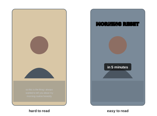
- Large type: hook text and titles typically occupy a significant part of the frame width; captions should be readable without squinting.
- Clear, bold, sans-serif fonts for most uses, with decorative fonts reserved for short, prominent words.
- High contrast: white or yellow text with a dark outline, shadow or background box, or dark text on a light box, so that text remains readable over changing footage.
- Short lines: one to five words per line for hooks and captions; break lines at natural phrase boundaries.
- Placement within the safe zone, away from platform buttons and captions (CRE-130 Lesson 3), and away from faces and key action.
- Consistent styles for each purpose: one style for hooks, one for captions, one for labels.
- Limited fonts and colors: two fonts and two or three colors are usually enough, aligned with brand identity (CRE-230).
Burned-in and platform captions
Captions can be added in two ways. Burned-in or open captions are rendered into the video in the editing app; they look the same everywhere, allow full control of style and timing, and travel with the video when it is reposted to other platforms. Platform captions, generated automatically by TikTok, Instagram, YouTube and others and editable by the creator, can be turned on or off by viewers, may be translated, and are read by screen readers and search systems. Many creators use burned-in captions for style and retention and also enable or upload platform captions for accessibility and search. Whichever method you use, check captions carefully: automatic transcription often mishears names, technical terms, accents and fast speech, and errors look careless and can change meaning.
Caption styles
Short-form captions have developed distinctive styles:
- Word-by-word or phrase-by-phrase captions that appear in sync with speech, often with the current word highlighted, which keep eyes on the screen and help comprehension.
- Captions with emphasized key words in a different color or size.
- Captions that move or bounce slightly with speech for energy.
- Clean, static two-line captions for calmer, educational or professional content.
Animated captions can increase engagement, but they can also distract and reduce readability if overdone, and very fast word-by-word captions are hard for some viewers to follow. Match caption style to content and audience, keep them in a consistent position, and avoid covering the creator's mouth, which many viewers, including people who lip-read, use to follow speech.
| Caption style | Strengths | Watch out for |
|---|---|---|
| Word-by-word highlight | High engagement, follows speech closely | Can feel frantic; hard for some to read |
| Phrase chunks | Readable, natural rhythm | Needs careful line breaks |
| Key-word emphasis | Draws attention to important words | Overuse dilutes emphasis |
| Static two-line | Calm, professional, accessible | Less dynamic |
Labels, steps and progress markers
Labels help viewers follow structure. In tutorials, numbered steps ("Step 2: fold the corners") let viewers track progress and find their place if they rewatch. In lists, item numbers ("3/5") signal how much remains, which can improve retention because viewers want to reach the end. Labels for ingredients, tools, products and settings provide information compactly. Progress bars or countdown timers can show remaining time, though some creators avoid them because they also tell viewers how long they must wait. Keep labels short and consistent in position and style, so that viewers learn where to look.
Motion graphics and kinetic text
Simple motion graphics add clarity and energy. Arrows and circles direct attention to details; highlights and underlines emphasize text; zooms and magnifiers show small details; split screens compare before and after; diagrams and simple charts explain processes and data; emojis and stickers add tone. Kinetic typography, text that moves, scales or appears in rhythm with speech or music, can make text-heavy videos dynamic, such as quote videos, explainers or lyric-style videos. Editing apps offer animation presets, keyframes for custom motion, and templates. As with editing generally, restraint matters: motion should guide attention, not compete for it.
Worked problem
Adding text to a tutorial short
A 40-second video shows how to change a bike tire in five steps, filmed overhead and side-on with the creator talking. Many viewers watch without sound. What text and graphics should be added?
Show solution
- Hook text in the first second: "Flat tire? Fix it in 5 steps", large, top third of the safe zone.
- Phrase-chunk captions of everything said, in a consistent lower-middle position, avoiding the hands.
- Step labels at the start of each step: "1/5 Remove the wheel", and so on, in a separate style.
- An arrow and circle highlighting the valve and tire lever at the key moments.
- Final text with the takeaway, "Carry two levers and a spare tube", and correct spelling checked throughout.
Answer: A clear hook, accurate phrase captions, numbered step labels, a few targeted arrows and a takeaway line, all in consistent styles and safe-zone positions.
Stickers and interactive elements
Platforms provide interactive elements such as polls, questions, quizzes, links, location tags, product tags and countdowns, mostly in stories but increasingly in short videos. These can increase engagement and gather audience input, which feeds future ideas (Lesson 2). Product tags and shopping links allow viewers to buy featured items directly, which requires accurate tagging and, for sponsored content, clear disclosure (Lesson 11). Some interactive features differ between platforms and change frequently, so check current options and use them when they serve the video and the audience.
The written caption and cover
The written caption that appears below or beside a short video is separate from on-screen text but works with it. It can add context, a question to prompt comments, relevant keywords for search (CRE-201 Lesson 8), credits for music or collaborators, sources for factual claims, and disclosures. The first line is most important, because longer captions are truncated. The cover image chosen for the video appears on the profile grid and in some search results; a clear cover with a short title, consistent with other covers in a series, helps viewers browsing your profile find and choose videos. CRE-120 covers caption writing in detail.
Accessibility
Accessible short-form content reaches more people and is good practice. Key points include accurate captions for all speech and important sounds; sufficient text size and contrast, following guidelines such as the Web Content Accessibility Guidelines (WCAG) contrast ratio of at least 4.5:1 for normal text; leaving text on screen long enough to read, a rule of thumb being at least one second for every three or four words plus time to notice it; avoiding rapidly flashing graphics and text; describing important visual information in speech or captions for viewers with low vision; and using alt text on platforms that support it. Accessibility improvements often benefit everyone: clear captions help non-native speakers and people in noisy places, and readable text helps all viewers.
Text-only and text-led videos
Some successful short videos rely mostly on text: a story told in on-screen text over a simple visual, a list of tips over B-roll, or a quote over atmospheric footage. Text-led videos suit creators who prefer not to speak on camera, topics where reading is faster than listening, and viewers who watch without sound. They need careful pacing so that each line stays on screen long enough to read, clear hierarchy so viewers know what to read first, and visuals that support rather than distract. Music and sound design carry mood. Because text-led videos are easy to make, the content and writing must be strong to stand out (CRE-120).
Translation and multilingual captions
Captions can widen an audience beyond one language. Some platforms automatically translate captions or offer translated audio, and creators can upload captions in several languages on platforms that support it. In Canada, creators may serve both English- and French-speaking audiences, and in the United States, Spanish is widely spoken; adding captions in a second language can reach large communities. Machine translation should be checked by a fluent speaker where possible, since errors can change meaning or sound unnatural. Burned-in captions in one language cannot be switched, so some creators publish separate versions for different language audiences.
Graphics for data and claims
When short videos present numbers, research findings or comparisons, simple graphics help viewers understand: a bar showing a percentage, two numbers side by side, a simple timeline or map. Keep graphics minimal, with large numbers and short labels, and on screen long enough to read. Accuracy is essential: round numbers sensibly, show units, avoid distorted scales, and cite sources in the caption or on screen. Misleading graphics, such as truncated axes that exaggerate differences, damage credibility and can spread misinformation.
Brand consistency in text
For creators building a brand, consistent text styles across all videos, using the same fonts, colors, caption style and placement, make content instantly recognizable and look professional. A simple brand kit with fonts, colors, logo usage, caption presets and examples helps keep consistency, especially when working with editors (CRE-230 covers graphic design for social media). Consistency does not mean every video must look identical; series can have their own variations within the overall style.
Text and safe zones on each platform
Interface elements differ between TikTok, Instagram Reels, YouTube Shorts and Facebook, and they change as apps are redesigned. Text placed perfectly for one platform may be covered on another. When cross-posting (Lesson 12), check each version in the platform's preview, or use safe-zone overlay templates updated for each platform, and move text if necessary. Keeping essential text toward the center of the frame, away from the bottom fifth and the right edge, works reasonably well across platforms.
Checking text on a phone
Always review text and captions on a phone at normal viewing distance, not only on a computer monitor. Text that looks large on a desktop editor can be too small on a phone, and colors that look strong on a calibrated screen may wash out outdoors. Adjust size, contrast and timing based on the phone review.
Common mistakes
MistakeSmall, thin text over busy footage.
InsteadUse large, bold, high-contrast text with outlines or boxes.
MistakeUnchecked automatic captions.
InsteadProofread and correct every caption.
MistakeText covering faces or platform buttons.
InsteadPlace text within the safe zone away from key action.
MistakeMany fonts, colors and animations at once.
InsteadUse consistent styles for each text role.
MistakeText that disappears before it can be read.
InsteadAllow enough reading time.
Summary and key terms
- On-screen text frames, transcribes, structures, emphasizes, informs and adds personality.
- Use large, bold, short, high-contrast text in the safe zone.
- Burned-in captions give style; platform captions add accessibility and search.
- Choose caption styles that suit the content without sacrificing readability.
- Labels and progress markers help viewers follow structure.
- Motion graphics and stickers should guide attention purposefully.
- Written captions, covers and accessibility complete the text layer.
- On-screen text
- Words displayed in the video frame.
- Burned-in captions
- Captions rendered permanently into the video.
- Platform captions
- Captions generated or uploaded on the platform.
- Kinetic typography
- Animated text that moves with speech or music.
- Safe zone
- Area not covered by platform interface elements.
- Progress marker
- Label showing position in a sequence.
- Sticker
- Interactive or decorative overlay on a video.
- Cover image
- Still frame representing a video on the profile.
- Contrast ratio
- Measure of difference between text and background brightness.
- Alt text
- Text description for screen readers.
Practice problems
Work each problem on paper first, then reveal the answer to check.
Name four roles of on-screen text.
Show answer
Framing, transcription, structure, emphasis, information, personality.
How many words per line for hooks?
Show answer
About one to five.
How do you keep text readable over changing footage?
Show answer
Outlines, shadows or background boxes.
Advantage of burned-in captions?
Show answer
Consistent style everywhere.
Advantage of platform captions?
Show answer
Accessibility, translation and search.
Why avoid covering the mouth with captions?
Show answer
Viewers, including lip-readers, use it to follow speech.
Why number list items on screen?
Show answer
Shows progress and encourages finishing.
What WCAG contrast ratio applies to normal text?
Show answer
At least 4.5:1.
Rule of thumb for reading time?
Show answer
About one second per three or four words.
What should the first line of a written caption do?
Show answer
Add key context or a question before truncation.
Lesson quiz · 5 questions
Score 60% or more to complete this lesson.
Create a free account to save your progress, take quizzes and earn a certificate.