
WEB-230 · Lesson 9 of 12 · 24 min
WCAG principles and accessible components
▶ Video coming soon A video version of this lesson is on the way.
On Tuesday, February 13, Sana takes over the review. She starts not with guidelines but with a recording. Lucy asked Beatrix Lund whether the studio could watch her use the portal, and Beatrix agreed to come into the office on Monday, January 29 with her laptop and screen reader. Sana plays the part of the recording where Beatrix reaches the hamper-drive plan, the page from JS-220 where a volunteer picks up to four packing shifts. The screen reader announces "clickable, clickable, clickable" for each shift tile, and nothing else. Beatrix can hear that there are tiles, but not which shift each one is, whether it is chosen, or how to choose it with the keyboard. After a few minutes she gives up, says "this is where I phoned Lucy", and laughs. Nobody in the room does.
The tiles were built from div elements with click handlers. They looked like buttons, and with a mouse they worked like buttons, but nothing told the browser that they were controls, so nothing told the screen reader either. It is the most common accessibility failure on the web, and it is entirely preventable. This lesson is about how to prevent it: the principles of the Web Content Accessibility Guidelines, the handful of rules that cover most real problems, and how to build the components the Food Hub needs so that they work for everyone.
Who accessibility is for
About one person in five in Canada and in the United States has a disability, and many more have a temporary or situational limitation: a broken wrist, a bright sunny screen, a noisy kitchen, an old phone. Beatrix uses a screen reader, which turns the page into speech or braille. Other volunteers use the keyboard alone because of a motor disability, zoom the screen to 300 or 400 in 100 because of low vision, use voice control, rely on captions, or need plain language and predictable layouts because of a cognitive disability or because English is their second language. Accessibility is the practice of making sure all of them can use the site, and it benefits everyone: captions help in noisy kitchens, clear labels help people in a hurry, and keyboard support helps power users.
WCAG and the law
The Web Content Accessibility Guidelines (WCAG), published by the World Wide Web Consortium, are the standard almost every law points to. The current version, WCAG 2.2, was published in October 2023 and approved as the international standard ISO/IEC 40500:2025 in October 2025. It contains testable success criteria at three levels: A (the minimum), AA (the usual target, required by most laws) and AAA (enhanced, not expected for whole sites). A page conforms at AA when it meets every A and AA criterion.
For the Food Hub in Ontario, the law is the Accessibility for Ontarians with Disabilities Act (AODA). Its Integrated Accessibility Standards, O. Reg. 191/11, require organizations with 50 or more employees to make their public websites and web content meet WCAG 2.0 Level AA, except for live captions and pre-recorded audio description, and the Food Hub, with 54 paid staff, has been covered since January 1, 2021. The regulation names WCAG 2.0, but WCAG 2.2 includes every 2.0 criterion except one that was removed as obsolete, so meeting 2.2 AA meets the law and covers newer needs too. The federal Accessible Canada Act applies to federally regulated organizations, not to the Food Hub.
The four principles
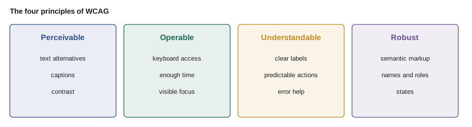
WCAG organizes its criteria under four principles, often remembered as POUR. Content must be perceivable: people must be able to take it in with the senses they use, so images need text alternatives, video needs captions and text needs enough contrast. It must be operable: every function must work with a keyboard, users need enough time, nothing should flash dangerously, and people must be able to find their way. It must be understandable: language is identified, behaviour is predictable and errors are explained. And it must be robust: built with standard markup that assistive technologies can interpret, now and in the future.
| Criterion (level) | What it asks | Food Hub example |
|---|---|---|
| 1.1.1 Non-text content (A) | Images have text alternatives; decorative ones are hidden | Program photos have alt text; the leaf ornament has alt="" |
| 1.3.1 Info and relationships (A) | Structure shown visually is in the markup: headings, lists, labels, table headers | Form fields have real label elements |
| 1.4.3 Contrast (minimum) (AA) | Text contrast at least 4.5:1, or 3:1 for large text | Grey footer text checked |
| 1.4.10 Reflow (AA) | Content works at 320 CSS pixels wide without horizontal scrolling | The order list at 400 in 100 zoom |
| 1.4.11 Non-text contrast (AA) | Controls and focus indicators at least 3:1 | WEB-101's focus outline fix |
| 2.1.1 Keyboard (A) | Everything works with a keyboard | The shift tiles |
| 2.4.7 Focus visible (AA) | The keyboard focus can be seen | No outline: none without a replacement |
| 2.5.8 Target size (minimum) (AA) | Targets at least 24 by 24 CSS pixels, or enough space around them | The small × on order rows |
| 3.3.1 Error identification (A) | Errors are described in text | Sign-up form messages |
| 3.3.8 Accessible authentication (minimum) (AA) | Sign-in does not depend on a memory or puzzle test; paste and password managers allowed | No paste blocking (lesson 6) |
| 4.1.2 Name, role, value (A) | Every control exposes its name, role and state | The shift tiles again |
WCAG 2.2 added nine criteria to 2.1, six of them at A or AA. Three matter particularly for the Food Hub: Focus Not Obscured (2.4.11), so a sticky header or cookie banner never hides the focused element; Dragging Movements (2.5.7), so the portal's drag-to-reorder list also has buttons; and Accessible Authentication (3.3.8), which lines up exactly with lesson 6's advice to allow password managers and paste. The other new A and AA criteria are Target Size (Minimum), Consistent Help and Redundant Entry.
Contrast
Contrast is the most frequently failed criterion on the web, and unlike many criteria it can be calculated exactly. WCAG defines the contrast ratio of two colours from their relative luminance, a measure of perceived brightness. Each colour channel is converted from its sRGB value to linear light, the three channels are weighted by how sensitive eyes are to red, green and blue, and the ratio is the lighter luminance plus 0.05 divided by the darker plus 0.05. Ratios run from 1:1, identical colours, to 21:1, black on white.
// WCAG contrast ratio from two hex colors.
function luminance(hex) {
  const [r, g, b] = [1, 3, 5].map((i) => parseInt(hex.slice(i, i + 2), 16) / 255)
    .map((v) => (v <= 0.04045 ? v / 12.92 : ((v + 0.055) / 1.055) ** 2.4));
  return 0.2126 * r + 0.7152 * g + 0.0722 * b;
}
function ratio(a, b) {
  const [hi, lo] = [luminance(a), luminance(b)].sort((x, y) => y - x);
  return (hi + 0.05) / (lo + 0.05);
}

const pairs = [
  ['#8a5a00', '#ffffff', 'focus outline (WEB-101 fix)', 3],
  ['#c58b1b', '#ffffff', 'focus outline (before the fix)', 3],
  ['#767676', '#ffffff', 'footer text', 4.5],
  ['#949494', '#ffffff', 'placeholder text', 4.5],
  ['#ffffff', '#2b6cb0', 'button label', 4.5],
];
for (const [fg, bg, what, need] of pairs) {
  const r = ratio(fg, bg);
  console.log(`${r.toFixed(2)}:1`.padEnd(8), r >= need ? 'pass' : 'FAIL', `${what} (needs ${need}:1)`);
}5.93:1 pass focus outline (WEB-101 fix) (needs 3:1) 2.96:1 FAIL focus outline (before the fix) (needs 3:1) 4.54:1 pass footer text (needs 4.5:1) 3.03:1 FAIL placeholder text (needs 4.5:1) 5.42:1 pass button label (needs 4.5:1)
What this code does
The luminance function converts each channel to linear light with the formula WCAG specifies and weights the channels, and the ratio divides the lighter value by the darker one after adding 0.05 to each. The results reproduce WEB-101's numbers, 5.93:1 after the focus outline fix and 2.96:1 before it. The placeholder text fails, which matters because volunteers often mistake faint placeholders for filled-in fields.
Contrast is not only for text. Criterion 1.4.11 asks for 3:1 for the parts of controls needed to identify them, such as a text field's border or a checkbox's outline, and for focus indicators. And colour must never be the only way information is shown: the order board marks late orders in red, but it also prints the word late, so Rosa's colour-blind kitchen assistant can read it.
Semantic HTML first
Sana's first rule is the one that would have prevented Beatrix's problem: use the native HTML element for the job. A button element is focusable, is announced as a button, works with Enter and Space, and can be disabled, all without a line of script. A div with a click handler has none of that, and adding it back by hand takes a role, a tabindex, two key handlers and state attributes, and is easy to get subtly wrong. The same goes for links, checkboxes, radio buttons, select menus, details and summary for disclosure, and the dialog element for modals.
<!-- Before: looks like a control, but assistive technology sees only text in a box -->
<div class="tile" onclick="toggle(17)">Sat Dec 16, 9:00–12:00 · Packing</div>

<!-- After: a real checkbox in a label, so name, role, state and keyboard all come for free -->
<label class="tile">
  <input type="checkbox" name="shifts" value="17">
  <span>Sat Dec 16, 9:00–12:00 · Packing</span>
</label>
What this code does
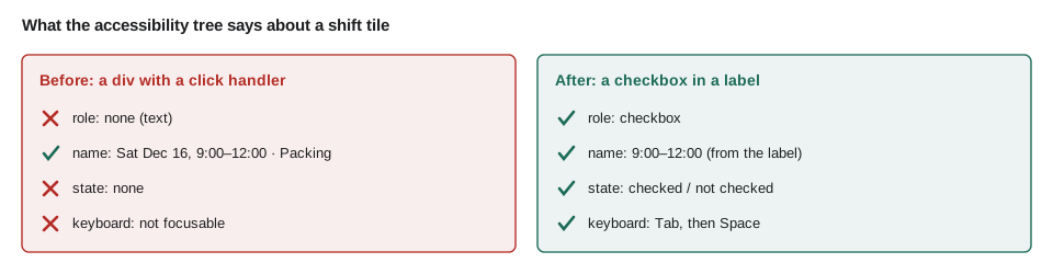
The first version is a div, so a screen reader announces only that it is clickable and a keyboard cannot reach it. The second uses a real checkbox inside a label, so the shift's text becomes the checkbox's name, its checked state is announced, and Space toggles it. CSS can make the label look exactly like the old tile.
This is also where accessibility and security meet the same habit. A real form element sends real form data, so the server's validation from lesson 3 sees exactly what the user chose. Custom widgets that build hidden values in script are harder to validate and easier to break.
Names, roles, states and ARIA
Assistive technologies read the page through the accessibility tree, which the browser builds alongside the visible page. Each element in it has a role (button, checkbox, heading, link), an accessible name (the text announced for it), and states and properties (checked, expanded, disabled, required). Criterion 4.1.2 asks that every control has all three. Native elements provide them automatically, with the name coming from the label, the element's text, or alt text for images.
ARIA, Accessible Rich Internet Applications, is a set of attributes that change what the accessibility tree says: role="dialog", aria-expanded="true", aria-label="Close". It is powerful and easily misused. Its first rule, written by its own authors, is not to use it when a native element will do. ARIA changes only what is announced, not behaviour: role="button" does not make a div focusable or respond to Enter. A widely quoted survey of a million home pages each year by WebAIM finds that pages using ARIA have more detected errors on average than pages without, usually because ARIA was used to patch a non-semantic element instead of replacing it.
// A simplified accessible-name calculation for a few common cases.
function accessibleName(el, labels = {}) {
  if (el.attrs['aria-labelledby']) return el.attrs['aria-labelledby'].split(' ').map((id) => labels[id] ?? '').join(' ').trim();
  if (el.attrs['aria-label']) return el.attrs['aria-label'].trim();
  if (el.tag === 'img') return (el.attrs.alt ?? '').trim();
  if (el.tag === 'input' && el.labelText) return el.labelText.trim();
  return (el.text ?? '').trim();
}

const labels = { 'h-plan': 'Your hamper drive plan' };
const controls = [
  { tag: 'button', attrs: {}, text: 'Save plan' },
  { tag: 'button', attrs: { 'aria-label': 'Remove shift 17' }, text: '×' },
  { tag: 'input', attrs: { type: 'checkbox' }, labelText: 'Sat Dec 16, 9:00–12:00 · Packing' },
  { tag: 'img', attrs: { src: 'logo.svg' } },
  { tag: 'section', attrs: { 'aria-labelledby': 'h-plan' } },
  { tag: 'div', attrs: { onclick: 'toggle(17)' }, text: '' },
];
for (const c of controls) {
  const name = accessibleName(c, labels);
  console.log(c.tag.padEnd(8), name ? JSON.stringify(name) : 'NO NAME');
}button "Save plan" button "Remove shift 17" input "Sat Dec 16, 9:00–12:00 · Packing" img NO NAME section "Your hamper drive plan" div NO NAME
What this code does
The function follows the order browsers use for these cases: aria-labelledby first, then aria-label, then alt text for images, the label for inputs, and finally the element's own text. The remove button is named by its aria-label because its visible text is only a symbol. The logo with no alt attribute and the empty div both end up with no name, which is exactly what a screen reader user would hear.
Building the components the Food Hub needs
Most of the portal's components are native elements with styling. A few need more: a disclosure that shows and hides the details of a shift, a dialog to confirm a plan, and live messages, such as "Plan saved", that a screen reader should announce without moving focus. For each, the ARIA Authoring Practices Guide from the W3C describes the expected roles, states and keyboard behaviour. Sana keeps a shared component library so these are built once, correctly.
<!-- Disclosure: a real button that reports its state -->
<button type="button" aria-expanded="false" aria-controls="shift-17-details">Details</button>
<div id="shift-17-details" hidden>Bring closed-toe shoes. Parking behind the church hall.</div>

<!-- Confirmation dialog: the native element provides focus trapping and Escape -->
<dialog id="confirm-plan" aria-labelledby="confirm-title">
  <h2 id="confirm-title">Confirm your plan</h2>
  <p>You have chosen 3 shifts.</p>
  <button type="button" value="cancel">Back</button>
  <button type="submit" value="ok">Confirm</button>
</dialog>

<!-- Status messages announced without moving focus -->
<p role="status" id="plan-status"></p>
What this code does
The disclosure is a button whose aria-expanded value the script switches between true and false as it shows and hides the details. The dialog element, opened with showModal, keeps focus inside it and closes with Escape, and aria-labelledby gives it a name from its heading. Text placed in the status paragraph is read out politely by screen readers when it changes.
// The disclosure's behavior, modeled without a DOM: state and announcement stay in step.
function makeDisclosure(label) {
  const state = { expanded: false, hidden: true };
  return {
    toggle() { state.expanded = !state.expanded; state.hidden = !state.expanded; },
    announce() { return `${label}, button, ${state.expanded ? 'expanded' : 'collapsed'}`; },
    get panelHidden() { return state.hidden; },
  };
}

const d = makeDisclosure('Details');
console.log(d.announce(), '| panel hidden:', d.panelHidden);
d.toggle();
console.log(d.announce(), '| panel hidden:', d.panelHidden);
d.toggle();
console.log(d.announce(), '| panel hidden:', d.panelHidden);Details, button, collapsed | panel hidden: true Details, button, expanded | panel hidden: false Details, button, collapsed | panel hidden: true
What this code does
The model keeps one source of truth, expanded, and derives the panel's hidden state from it, so the two can never disagree. The announce function produces roughly what a screen reader says for a button with aria-expanded: its name, role and state. Bugs where the visible panel and the announced state drift apart are common when the two are tracked separately.
Keyboard behaviour needs the same care as names. Every control must be reachable with Tab in a sensible order, which usually means following the visual order and never using positive tabindex values. Focus must always be visible, and when a dialog closes, focus must return to the button that opened it. When content changes, such as a filtered shift list, focus should stay where the user is, and a status message should say what changed.
Worked problem
Is the tile big enough?
The order rows on the partner page have a remove control drawn as a 16 by 16 CSS pixel ×, and the next control is 10 pixels away. Under criterion 2.5.8, a target smaller than 24 by 24 passes only if a 24 pixel circle centred on it does not overlap another target or its circle. Does it pass, and what is the smallest change that would make it pass on size alone?
Show solution
- The target is 16 × 16, smaller than 24 × 24, so the spacing exception must be checked.
- A 24 pixel circle centred on the × reaches 12 pixels from its centre; the × is 8 pixels from centre to edge, so the circle extends 12 − 8 = 4 pixels beyond its edge.
- The next control's circle extends the same 4 pixels toward it, so the two circles need 4 + 4 = 8 pixels between the controls; they have 10, so they do not overlap.
- Making the target itself 24 × 24 would pass on size alone, without relying on spacing.
Answer: It passes through the spacing exception, with 2 pixels to spare. Sana still recommends enlarging the clickable area to 24 by 24, because spacing is easily lost when the layout changes.
Common mistakes
MistakeBuilding controls from div or span elements with click handlers.
InsteadUse the native element: button, a, input, select, details, dialog.
MistakeAdding role="button" and assuming the job is done.
InsteadARIA only changes what is announced; native elements also give focus and keyboard behaviour.
MistakeRemoving focus outlines for looks.
InsteadKeep a visible focus indicator with at least 3:1 contrast, styled to fit the design.
MistakeShowing state with colour alone.
InsteadPair colour with text, an icon with a name, or a pattern.
MistakeLeaving icon-only buttons and decorative images undecided.
InsteadGive icon buttons an accessible name, informative images alt text, and decorative images alt="".
Summary and key terms
- Accessibility makes a site usable by people who use screen readers, keyboards, zoom, voice control or captions, and it benefits everyone.
- WCAG 2.2, also ISO/IEC 40500:2025, sets success criteria at levels A, AA and AAA; AA is the usual legal target. In Ontario, AODA requires WCAG 2.0 AA of organizations with 50 or more employees, and meeting WCAG 2.2 AA satisfies it. The criteria fall under four principles: perceivable, operable, understandable and robust.
- Contrast ratios are calculated from relative luminance and must reach 4.5:1 for normal text and 3:1 for large text, controls and focus indicators.
- The most important habit is to use native HTML elements, which give every control a name, role, state and keyboard behaviour; ARIA should fill gaps, not replace them.
- WCAG
- The Web Content Accessibility Guidelines, the W3C standard for accessible web content, currently version 2.2.
- Success criterion
- A single testable requirement in WCAG, at level A, AA or AAA.
- POUR
- WCAG's four principles: perceivable, operable, understandable and robust.
- Contrast ratio
- The ratio of the relative luminance of two colours plus 0.05 each, from 1:1 to 21:1.
- Accessibility tree
- The structure the browser gives assistive technology, with each element's role, name and state.
- Accessible name
- The text that assistive technology announces for an element.
- ARIA
- Accessible Rich Internet Applications, attributes that change how elements are described in the accessibility tree.
- Screen reader
- Software that presents the page as speech or braille and lets users navigate it by keyboard or gestures.
Practice problems
Work each problem on paper first, then reveal the answer to check.
Why did the shift tiles fail Beatrix?
Show answer
They were div elements with click handlers, so they had no role, name, state or keyboard support.
What contrast ratio does normal text need at level AA?
Show answer
At least 4.5:1.
What is the first rule of ARIA?
Show answer
Do not use ARIA if a native HTML element or attribute will do the job.
Which three WCAG 2.2 additions matter most for the Food Hub?
Show answer
Focus Not Obscured, Dragging Movements and Accessible Authentication.
Try it yourself
Contrast ratio
Complete contrast(fg, bg) so that it returns the WCAG contrast ratio of two #rrggbb colours, rounded to two decimal places, as a string such as 4.54:1.
A luminance function is provided.
function luminance(hex) {
  const [r, g, b] = [1, 3, 5].map((i) => parseInt(hex.slice(i, i + 2), 16) / 255)
    .map((v) => (v <= 0.04045 ? v / 12.92 : ((v + 0.055) / 1.055) ** 2.4));
  return 0.2126 * r + 0.7152 * g + 0.0722 * b;
}

function contrast(fg, bg) {
  return (luminance(fg) / luminance(bg)).toFixed(2) + ':1';
}

console.log(contrast('#767676', '#ffffff'));
console.log(contrast('#ffffff', '#767676'));
console.log(contrast('#000000', '#ffffff'));
Try it yourself
Target size check
Complete targetOk(width, height, gap). A target passes criterion 2.5.8 if it is at least 24 by 24 CSS pixels. A smaller target passes if gap, the distance to the nearest other target, is at least 24 - min(width, height) (a simplified form of the spacing exception, for two equal targets side by side).
Return pass or fail.
function targetOk(width, height, gap) {
  return width >= 24 ? 'pass' : 'fail';
}

console.log(targetOk(24, 24, 0), targetOk(16, 16, 10), targetOk(16, 16, 4), targetOk(30, 20, 3), targetOk(30, 20, 4));
Lesson quiz · 5 questions
Score 60% or more to complete this lesson.
Create a free account to save your progress, take quizzes and earn a certificate.