
WEB-101 · Lesson 8 of 12 · 18 min
Layout with Flexbox
▶ Video coming soon A video version of this lesson is on the way.
The header on the old Food Hub site had been laid out with a table: the logo in one cell, the menu in another, and a "Donate" button in a third, with spacer images to push them apart. On a phone it shrank to an unreadable strip. On Monday, October 26, Gareth asked Mira to rebuild the header, the menu and the row of program cards with Flexbox. "Flexbox is for lining things up in one direction," he said, "a row or a column. Next week, Grid does two directions at once."
This lesson explains the Flexible Box Layout, defined in the W3C's CSS Flexible Box Layout Module and supported by every current browser. It covers the flex container and its items, the main and cross axes, alignment, wrapping and gaps, how items grow and shrink, and the patterns used on almost every website. It also covers one accessibility rule that layout tools make easy to break: the visual order must match the order in the HTML.
Containers and items
Flexbox starts with one declaration. Setting display: flex on an element makes it a flex container, and its direct children become flex items. Only the children are affected; grandchildren lay out normally unless their own parent is also made a flex container.
<header class="site-header">
  <a class="logo" href="/"><img src="images/logo.svg" alt="Riverside Community Food Hub home" width="180" height="48"></a>
  <nav aria-label="Main">
    <ul class="menu">
      <li><a href="/programs">Programs</a></li>
      <li><a href="/volunteer">Volunteer</a></li>
      <li><a href="/contact">Contact</a></li>
    </ul>
  </nav>
  <a class="button" href="/donate">Donate</a>
</header>.site-header {
display: flex;
align-items: center;
gap: 1.5rem;
padding: 1rem 1.5rem;
}
.menu {
display: flex;
gap: 1rem;
list-style: none;
margin: 0;
padding: 0;
}
.site-header .button {
margin-left: auto;
}Two flex containers are at work. The header lines up its three children, the logo, the nav and the button, in a row. The menu list lines up its list items in a row too, and list-style: none removes the bullets. The list is still a list in the HTML, so a screen reader still announces "list, 3 items": CSS changes how it looks, not what it is.
The two axes
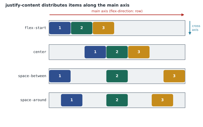
Every flex container has a main axis, the direction items are placed in, and a cross axis at right angles to it. flex-direction sets the main axis: row (the default, left to right in English), row-reverse, column (top to bottom) or column-reverse. Almost every alignment property is named for one of the axes, so knowing which is which is the key to Flexbox.
| Property (on the container) | Axis | Common values |
|---|---|---|
| flex-direction | Sets the main axis | row, column |
| justify-content | Main axis | flex-start, center, flex-end, space-between, space-around, space-evenly |
| align-items | Cross axis, for each line | stretch (default), flex-start, center, flex-end, baseline |
| flex-wrap | Whether items may wrap onto new lines | nowrap (default), wrap |
| align-content | Cross axis, spacing between wrapped lines | flex-start, center, space-between, stretch |
| gap | Space between items, on both axes | A length such as 1rem |
In a row, justify-content works horizontally and align-items vertically; in a column, they swap. That is why the classic problem of centring something both ways takes only three declarations in Flexbox: display: flex, justify-content: center and align-items: center.
The default align-items value, stretch, makes every item as tall as the tallest in its line. That is often exactly what a design wants: four program cards in a row come out the same height even when one has a longer paragraph. In the header it would make the logo stretch, so the header uses align-items: center instead.
gap sets the space between items without adding space at the outer edges. Before gap was supported in Flexbox, developers used margins on each item and then cancelled the extra margin on the first or last, which was fiddly and easy to get wrong.
Growing, shrinking and the flex shorthand
Three properties on each item decide how big it is along the main axis.
- flex-basis is the item's starting size before free space is shared out, such as 15rem; auto uses the item's width or its content's size.
- flex-grow is a number that says how much of any positive free space the item takes. Items with flex-grow: 1 share it equally; an item with 2 gets twice as much as one with 1. The default is 0: do not grow.
- flex-shrink says how much the item gives up when there is not enough room. The default is 1, so items shrink to fit; 0 prevents shrinking.
The flex shorthand sets all three. flex: 1 means grow 1, shrink 1, basis 0, so items share the whole row equally whatever their content. flex: 1 1 15rem means start at 15rem and then grow or shrink. flex: none means a fixed size.
function shareSpace(container, items) {
  const used = items.reduce((total, item) => total + item.basis, 0);
  const free = container - used;
  const totalGrow = items.reduce((total, item) => total + item.grow, 0);
  console.log('Free space: ' + free + 'px shared by ' + totalGrow + ' grow unit(s)');
  for (const item of items) {
    const extra = totalGrow === 0 ? 0 : free * item.grow / totalGrow;
    console.log(item.name + ': ' + item.basis + ' + ' + extra + ' = ' + (item.basis + extra) + 'px');
  }
}

shareSpace(1000, [
  { name: 'Logo', basis: 180, grow: 0 },
  { name: 'Search', basis: 220, grow: 2 },
  { name: 'Menu', basis: 300, grow: 1 }
]);Free space: 300px shared by 3 grow unit(s) Logo: 180 + 0 = 180px Search: 220 + 200 = 420px Menu: 300 + 100 = 400px
What this code does
The function adds up the items' starting sizes (their flex-basis values) and subtracts them from the container width to find the free space: 1,000 minus 700 is 300 pixels. It then gives each item a share of the free space in proportion to its flex-grow number. The logo has 0 and stays at 180; the search box has 2 of the 3 grow units and gets 200 more; the menu has 1 and gets 100 more. reduce runs through the list keeping a running total. This is the core of what the browser does, leaving out gaps, minimum sizes and shrinking.
Worked problem
Sizing the program cards
The Programs page container is 1,104 pixels wide inside its padding. Mira gives each of the four cards flex: 1 1 240px and the container gap: 24px, with flex-wrap: wrap. How wide is each card? On a tablet, the container is 720 pixels wide; how many cards fit on the first line and how wide are they?
Show solution
- On the wide screen, the gaps between four cards take three gaps.
- \[4 \times 240 + 3 \times 24 = 1{,}032 \text{ px} \le 1{,}104\]
- All four fit, and the free space is shared equally because every card has flex-grow 1.
- \[(1{,}104 - 1{,}032) \div 4 = 18, \quad 240 + 18 = 258 \text{ px}\]
- On the tablet, test three cards on one line.
- \[3 \times 240 + 2 \times 24 = 768 > 720\]
- Three do not fit, so the line holds two, and they share its free space.
- \[2 \times 240 + 24 = 504, \quad (720 - 504) \div 2 = 108, \quad 240 + 108 = 348 \text{ px}\]
Answer: On the wide screen each card is 258 pixels wide. On the tablet two cards fit per line, each 348 pixels wide, and the other two wrap to a second line of the same layout. No media query is needed: flex-basis sets a minimum comfortable width, flex-wrap allows wrapping, and flex-grow fills each line.
.cards {
  display: flex;
  flex-wrap: wrap;
  gap: 1.5rem;
}

.card {
  flex: 1 1 15rem;
  display: flex;
  flex-direction: column;
}

.card .button {
  margin-top: auto;
}
Each card is itself a column flex container. Because the cards in a line stretch to the same height, the paragraphs end at different points; margin-top: auto on the button absorbs the spare space above it, so all four buttons line up along the bottom. An auto margin in a flex container takes up all the free space on that side, which is the same trick that pushed the Donate button to the right of the header.
Common patterns
- Navigation bar: a row with the logo first, the menu after it, and margin-left: auto on the last item to push it right.
- Centring: justify-content: center and align-items: center on the container.
- Wrapping cards: flex-wrap: wrap with a flex-basis that sets the narrowest comfortable card.
- Media object: an image with flex: none beside a text block with flex: 1, used for the volunteer testimonials.
- Sticky footer: the body as a column flex container with min-height: 100vh and main given flex: 1, so the footer sits at the bottom even on a short page.
When items refuse to shrink
One Flexbox behaviour confuses almost everyone once. A flex item will not, by default, shrink below the width of its longest unbreakable content, because its minimum width is auto rather than zero. On a phone, a card containing a long web address, such as a link to a provincial or state program page, can stay wider than the screen and push the whole layout sideways, even with flex-shrink set. The fix is min-width: 0 on the item, so it is allowed to shrink, together with overflow-wrap: anywhere on the text, so the long address can break onto several lines. Mira met this on the Contact page, where the Food Hub's long email address for donations held its card open.
Browser developer tools help here too. Selecting a flex container shows a Flexbox overlay with the free space, gaps and each item's size, and the Layout panel lists every flex container on the page. When an item is the wrong size, the inspector shows its flex-basis, how much it grew or shrank, and why, which is usually faster than guessing.
Order and accessibility
Flexbox can display items in an order different from the HTML. flex-direction: row-reverse or column-reverse reverses them, and the order property moves single items: an item with order: -1 comes before items with the default 0. It is tempting to use this to rearrange a layout, but screen readers read in the HTML order, and the Tab key moves through links and buttons in the HTML order too. If the visual order differs, a keyboard user sees focus jump around the screen unpredictably.
Two WCAG criteria apply. 1.3.2 Meaningful Sequence asks that when the order affects meaning, a correct reading order can be determined from the code. 2.4.3 Focus Order asks that keyboard focus moves in an order that preserves meaning and operability. The safe rule is to get the order right in the HTML and use CSS ordering only for changes that do not affect meaning, if at all.
Mira's first version of the mobile header used order to put the Donate button before the menu on small screens. Gareth pressed Tab through it and watched the focus ring leap from the logo to the far right and then back to the menu. They moved the button in the HTML instead.
Common mistakes
MistakeApplying Flexbox properties to the grandchildren of the container.
InsteadOnly direct children are flex items; make an inner element a flex container if its children need it too.
MistakeMixing up justify-content and align-items.
Insteadjustify-content works on the main axis and align-items on the cross axis; check flex-direction first.
MistakeSpacing items with margins and then removing the extra on the last item.
InsteadUse gap on the container.
MistakeUsing order or row-reverse to fix the reading order.
InsteadFix the order in the HTML; screen readers and keyboard focus follow the source.
MistakeExpecting flex: 1 to keep items at their content width.
Insteadflex: 1 sets a basis of 0, so items share the space equally; use flex: auto or a basis to respect content size.
MistakeForgetting flex-wrap, so items squeeze onto one line.
InsteadAdd flex-wrap: wrap and a sensible flex-basis for rows of cards.
Practice problems
Work each problem on paper first, then reveal the answer to check.
A container has flex-direction: column. Which property centres its items horizontally?
Show answer
align-items: center, because in a column the cross axis is horizontal.
Three items have flex-grow 1, 1 and 2 and there are 200 pixels of free space. How much does each gain?
Show answer
50, 50 and 100 pixels: 4 grow units in total, so each unit is worth 50 pixels.
Build this: style the footer so its three columns (an address block, a list of links and a social links list) sit in a row with 2rem between them and wrap on narrow screens, each at least 12rem wide.
Show answer
See the model answer below. Each column gets a basis of 12rem and grows to fill the line.
.site-footer {
  display: flex;
  flex-wrap: wrap;
  gap: 2rem;
}

.site-footer > * {
  flex: 1 1 12rem;
}
Try it yourself
Share the free space
A 900-pixel container holds three items with flex-basis 200, 200 and 100 and flex-grow 1, 0 and 3.
Print the final width of each item, one per line, ignoring gaps.
const container = 900;
const items = [
  { basis: 200, grow: 1 },
  { basis: 200, grow: 0 },
  { basis: 100, grow: 3 }
];
// your code here
Summary and key terms
- display: flex makes an element a flex container and its direct children flex items.
- flex-direction sets the main axis; the cross axis is at right angles to it.
- justify-content distributes items on the main axis, align-items positions them on the cross axis, and gap spaces them.
- flex-basis sets a starting size, flex-grow shares free space and flex-shrink gives space back; the flex shorthand sets all three.
- flex-wrap: wrap with a flex-basis builds rows of cards that adapt to any width without media queries.
- Auto margins in a flex container absorb free space, pushing items apart.
- Keep the HTML order meaningful; order and reverse directions change only the visual order, not reading or focus order.
- Flexbox
- The CSS Flexible Box Layout, which lines items up along one axis.
- Flex container
- An element with display: flex.
- Flex item
- A direct child of a flex container.
- Main axis
- The direction in which flex items are placed, set by flex-direction.
- Cross axis
- The axis at right angles to the main axis.
- justify-content
- The property that distributes items along the main axis.
- align-items
- The property that positions items on the cross axis.
- flex-grow
- How much of the positive free space an item takes, relative to its siblings.
- flex-basis
- The starting size of a flex item before free space is shared.
- gap
- The space between items in a flex or grid container.
Lesson quiz · 5 questions
Score 60% or more to complete this lesson.
Create a free account to save your progress, take quizzes and earn a certificate.