
WEB-101 · Lesson 10 of 12 · 18 min
Responsive design and media queries
▶ Video coming soon A video version of this lesson is on the way.
Dev Bhatt had been looking at the Food Hub's visitor statistics. Over the past year, 71 visits in every 100 came from phones, 6 from tablets and 23 from desktop and laptop computers. Visits from phones peaked on Tuesday and Saturday mornings, just before the grocery program opened, when people checked the hours on the bus. The old site, built for a 1,024-pixel desktop screen, showed those visitors a tiny version of the whole page that they had to pinch and zoom. "If it only works on one size of screen," Dev said at the Tuesday, November 3 meeting, "make it the phone."
Responsive design means building one site that adapts to any screen, from a small phone to a wide monitor, rather than separate sites for each. The term was coined by Ethan Marcotte in 2010, and it rests on three ideas: fluid layouts, flexible images and media queries. Lessons 7 to 9 already covered most of the fluid parts. This lesson adds the viewport, media queries, the mobile-first approach, other media features such as reduced motion and dark mode, container queries, and the accessibility criteria that responsive design must meet.
The viewport
The viewport is the area of the browser window where the page is drawn. When phones first arrived, almost every site was designed for desktops, so mobile browsers pretended to have a viewport about 980 pixels wide and shrank the result to fit the screen. That is still what happens without the viewport meta element from Lesson 3. With it, the browser uses the device's real width in CSS pixels, typically 360 to 430 on a phone, and the layout can respond.
<meta name="viewport" content="width=device-width, initial-scale=1">A CSS pixel is not a hardware pixel. A phone with a screen 1,080 hardware pixels wide and a device pixel ratio of 3 reports a viewport 360 CSS pixels wide; each CSS pixel is drawn with a 3 by 3 block of hardware pixels, which is why text looks sharp. Layout always works in CSS pixels.
Media queries
A media query applies CSS only when a condition about the device or viewport is true. The most common condition is the viewport width.
/* Base styles: phones and anything narrow */
.page {
  display: grid;
  grid-template-columns: 1fr;
  grid-template-areas:
    "header"
    "main"
    "aside"
    "footer";
  gap: 1rem;
}

/* From 48em (768px at the default font size) */
@media (min-width: 48em) {
  .page {
    grid-template-columns: 2fr 1fr;
    grid-template-areas:
      "header header"
      "main   aside"
      "footer footer";
    gap: 1.5rem;
  }
}
The rule inside the @media block applies only while the condition holds. Because it comes later in the stylesheet and has the same specificity, it overrides the base rule from Lesson 6's cascade. Newer browsers also accept range syntax, @media (width >= 48em), which reads more naturally and means the same thing; all current major browsers support it.
Brightwater writes media queries in em rather than px. In a media query, 1em is the browser's default font size, usually 16 pixels. If a reader enlarges the default font size, em-based breakpoints move with it, so a reader with 32-pixel text gets the one-column layout sooner, which is what their larger text needs.
Mobile first
Mobile-first CSS writes the base styles for the narrowest screens and then adds min-width media queries to adjust the layout as space grows. The opposite, desktop first with max-width queries, tends to produce stylesheets that set a complicated layout and then undo it piece by piece for phones. Mobile-first has three advantages: the simplest layout is the default, so it works even in browsers that ignore the queries; phones, the most common visitors, process the fewest overrides; and it forces the team to decide what matters most on a small screen.
Choosing breakpoints
A breakpoint is a width at which the layout changes. It is tempting to pick breakpoints from popular devices, but devices change every year. A better rule is to let the content decide: widen the browser slowly from 320 pixels and add a breakpoint where the layout starts to look wrong, such as lines becoming too long or a row of cards leaving too much empty space. The Food Hub site needed only two.
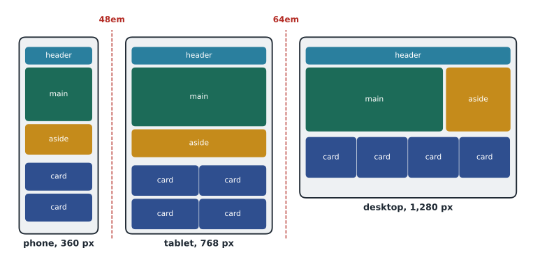
| Range | Layout of the home page | What changes |
|---|---|---|
| Below 48em | One column | The base styles: menu as a stacked list, cards one per row (or two if they fit) |
| 48em to 64em | Main content and aside side by side | Header becomes a single row; cards two or three per row |
| 64em and wider | Content limited to 72rem and centred | Four cards per row; larger hero heading |
const breakpoints = [
  { name: 'wide', minEm: 64 },
  { name: 'medium', minEm: 48 },
  { name: 'base', minEm: 0 }
];

function layoutFor(widthPx, fontPx) {
  const widthEm = widthPx / fontPx;
  for (const bp of breakpoints) {
    if (widthEm >= bp.minEm) return bp.name + ' (' + widthEm.toFixed(1) + 'em)';
  }
}

console.log('360px phone, 16px text:   ' + layoutFor(360, 16));
console.log('820px tablet, 16px text:  ' + layoutFor(820, 16));
console.log('1280px laptop, 16px text: ' + layoutFor(1280, 16));
console.log('1280px laptop, 24px text: ' + layoutFor(1280, 24));360px phone, 16px text: base (22.5em) 820px tablet, 16px text: medium (51.3em) 1280px laptop, 16px text: wide (80.0em) 1280px laptop, 24px text: medium (53.3em)
What this code does
The function converts a viewport width in pixels to em by dividing by the reader's default font size, then checks the breakpoints from widest to narrowest and returns the first one that matches. A 1,280-pixel laptop is 80em wide at the normal 16-pixel default, so it gets the wide layout; with a 24-pixel default it is only about 53em, so it gets the medium layout and larger text has room. toFixed(1) rounds to one decimal place for display.
Other media features
Width is not the only thing a media query can test. Several user preference features let a site respect choices people have made in their operating system.
- prefers-reduced-motion: reduce is set by people who find animation distracting or who get dizzy or nauseous from motion, a real problem for people with vestibular disorders. The site should turn off or tone down animation and smooth scrolling.
- prefers-color-scheme: dark is set by people who use a dark theme. A site may offer dark colours, but each colour pair must still have enough contrast.
- prefers-contrast: more asks for stronger contrast.
- hover and pointer describe the input device: (hover: hover) means the main pointer can hover, so hover-only effects make sense; (pointer: coarse) means a finger, so targets should be larger.
- print styles apply when a page is printed: the Food Hub volunteer orientation page hides the menu and prints the web addresses of links.
@media (prefers-reduced-motion: reduce) {
  *,
  *::before,
  *::after {
    animation-duration: 0.01ms !important;
    transition-duration: 0.01ms !important;
    scroll-behavior: auto !important;
  }
}

@media print {
  nav,
  .site-header .button {
    display: none;
  }
}
Container queries
A media query asks about the viewport, but a component often cares about the space it has been given. A program card might sit in a wide main column on one page and a narrow sidebar on another. Container queries, supported by all major browsers since 2023, let a component respond to the size of its container instead. The container is declared with container-type: inline-size, and @container rules then test its width.
.card-holder {
  container-type: inline-size;
}

@container (min-width: 30rem) {
  .card {
    display: grid;
    grid-template-columns: 10rem 1fr;
    gap: 1rem;
  }
}
Images and the picture element
Lesson 4's srcset and sizes attributes let the browser choose a file of the right size. When a phone should show a differently cropped image, such as a tight crop of the kitchen counter instead of the whole room, the picture element offers alternative sources with media conditions, and the browser uses the first that matches. It can also offer newer formats such as AVIF with a JPEG fallback. One more rule belongs in every stylesheet: setting max-width on images to the full width of their container, with height left automatic, stops any image from ever being wider than its container while keeping its proportions.
img {
  max-width: 100%;
  height: auto;
}<picture>
<source media="(min-width: 48em)" srcset="images/kitchen-wide.avif" type="image/avif">
<source media="(min-width: 48em)" srcset="images/kitchen-wide.jpg">
<img src="images/kitchen-tight.jpg" width="600" height="600"
alt="Two volunteers ladling soup into bowls at the kitchen counter">
</picture>Responsive design and accessibility
Several WCAG criteria are, in effect, responsive design requirements.
- 1.4.10 Reflow (Level AA): content must work at a width of 320 CSS pixels without scrolling in two directions, except for things that need two dimensions, such as maps and data tables. A desktop browser zoomed to 400 per cent on a 1,280-pixel screen gives exactly that width, so this criterion protects people who zoom.
- 1.4.4 Resize Text (Level AA): text can be resized to 200 per cent.
- 1.3.4 Orientation (Level AA): the site must not lock itself to portrait or landscape, because some people have their devices mounted in one position.
- 2.5.8 Target Size (Minimum) (Level AA, new in WCAG 2.2): pointer targets must be at least 24 by 24 CSS pixels, or be spaced so that a 24-pixel circle centred on each does not overlap another target, with some exceptions such as links in a sentence. Brightwater goes further on touch screens and makes buttons and menu links at least 44 pixels tall.
Worked problem
Checking reflow at 400 per cent zoom
A tester uses a laptop with a viewport 1,366 CSS pixels wide and zooms to 400 per cent. What viewport width does the page see? Which Food Hub layout applies, given breakpoints at 48em and 64em and a 16-pixel default font size?
Show solution
- Zooming divides the available CSS pixels by the zoom factor.
- \[1{,}366 \div 4 = 341.5 \text{ CSS px}\]
- Convert to em to compare with the breakpoints.
- \[341.5 \div 16 \approx 21.3 \text{ em} < 48 \text{ em}\]
Answer: The page sees a viewport about 341 pixels wide, so it uses the one-column base layout, the same one a phone gets. Because the mobile layout already works at 320 pixels, the zoomed page reflows without sideways scrolling, which is what 1.4.10 asks.
Testing
Browser developer tools include a device mode that resizes the viewport and imitates touch, which is quick for checking layouts. It does not reproduce real phones' performance, fonts or keyboard behaviour, so Brightwater also tests on a few real devices: an older Android phone, a current iPhone and a tablet. Mira added a fourth check: she zoomed a desktop browser to 400 per cent and worked through every page with the keyboard. She found one problem, a wide table of cooking class dates that pushed the whole page sideways, and fixed it by wrapping the table in a container with overflow-x: auto, so the table scrolls on its own, which 1.4.10 allows for data tables.
Common mistakes
MistakeLeaving out the viewport meta element.
InsteadInclude it on every page, or phones will lay the page out at about 980 pixels and shrink it.
MistakeDisabling zoom with user-scalable=no or maximum-scale=1.
InsteadNever stop people zooming; it fails WCAG 1.4.4.
MistakeChoosing breakpoints from popular devices.
InsteadLet the content decide where the layout needs to change.
MistakeWriting desktop styles first and undoing them for phones.
InsteadWrite mobile-first base styles and add min-width queries.
MistakeUsing px in media queries.
InsteadUse em so breakpoints follow the reader's font size.
MistakeIgnoring reduced-motion and other preferences.
InsteadRespect prefers-reduced-motion and test dark and high-contrast settings.
MistakeMaking tap targets tiny on phones.
InsteadMeet WCAG 2.5.8's 24-pixel minimum and aim for about 44 pixels for main controls.
Practice problems
Work each problem on paper first, then reveal the answer to check.
A rule sits inside @media (min-width: 40em). At a 16-pixel default font size, from what viewport width does it apply?
Show answer
From 640 CSS pixels (40 × 16).
Why is mobile-first CSS more robust in an old browser that does not understand media queries?
Show answer
The base styles, which come first and are outside any query, already give a working single-column layout.
Build this: a media query that turns the menu list into a row with 1rem gaps from 48em upwards.
Show answer
See the model answer below.
@media (min-width: 48em) {
  .menu {
    display: flex;
    gap: 1rem;
  }
}
Try it yourself
Choose the layout
Write a function layout(widthPx) that returns wide from 1,024 pixels, medium from 768 pixels and base below that.
Print the layout for 375, 768, 1,000 and 1,440 pixels, one per line.
function layout(widthPx) {
  // your code here
}

for (const w of [375, 768, 1000, 1440]) console.log(layout(w));
Summary and key terms
- Responsive design builds one site that adapts to every screen using fluid layouts, flexible images and media queries.
- The viewport meta element makes phones use their real width; never disable zoom.
- Media queries apply CSS when a condition is true; write them mobile-first with min-width and in em.
- Let the content choose the breakpoints; fluid Flexbox and Grid layouts reduce how many are needed.
- Respect user preferences such as prefers-reduced-motion and prefers-color-scheme.
- Container queries let a component respond to the space it is given; picture offers different crops and formats.
- WCAG 1.4.10 Reflow, 1.4.4 Resize Text, 1.3.4 Orientation and 2.5.8 Target Size are responsive design requirements.
- Responsive design
- Building one site that adapts its layout to any screen size.
- Viewport
- The area of the browser window in which the page is drawn.
- CSS pixel
- The unit of layout in CSS; it may be drawn with several hardware pixels.
- Media query
- A condition, such as a minimum width, that controls whether a block of CSS applies.
- Breakpoint
- A width at which the layout changes.
- Mobile-first
- Writing base styles for small screens and adding rules for larger ones.
- Container query
- A condition on the size of a component's container rather than the viewport.
- Reflow
- Content adapting to a narrow width without scrolling in two directions.
- Target size
- The area of a control that responds to a tap or click.
Lesson quiz · 5 questions
Score 60% or more to complete this lesson.
Create a free account to save your progress, take quizzes and earn a certificate.