
WEB-101 · Lesson 7 of 12 · 19 min
The box model and typography
▶ Video coming soon A video version of this lesson is on the way.
Sana's design for the Programs page showed four cards, one for each program, each with a photo, a heading, a short paragraph and a button. When Mira first styled them, the cards came out a little too wide, and the fourth one dropped onto a new line by itself. She had set each card to a width of 25 per cent of the row and added padding and a border, and the total no longer fit. "Welcome to the box model," said Gareth. "Every web developer has made exactly that mistake. Once."
This lesson explains how the browser sizes every element as a rectangular box, how to control that sizing, which units to use, and how to set text so that it is comfortable to read and meets the accessibility rules about resizing and spacing. Good typography is most of good web design: the Food Hub site is mainly text, and most of its visitors read it on a phone.
Every element is a box
The browser lays out every element as a rectangle made of four layers, from the inside out.
- Content: the text, image or child elements, with a width and height.
- Padding: space between the content and the border, filled with the element's background.
- Border: a line around the padding, with a width, a style such as solid or dashed, and a colour.
- Margin: space outside the border that pushes other boxes away. It is always transparent.
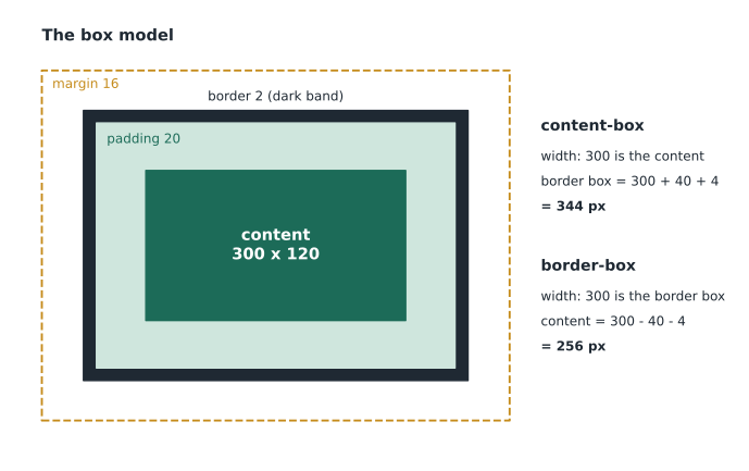
.card {
  width: 300px;
  padding: 20px;
  border: 2px solid #c9d2da;
  margin: 16px;
}
Padding, border and margin can be set for all four sides at once, as here, or side by side with properties such as padding-top and margin-left. The shorthand takes up to four values in clockwise order from the top: margin: 0 16px 24px 16px sets top, right, bottom and left. Two values mean top and bottom, then left and right.
box-sizing: why the card was too wide
By default, CSS uses content-box sizing: the width property sets only the content's width, and padding and border are added on top. The card above is therefore 300 + 2 × 20 + 2 × 2 = 344 pixels wide from border to border, not 300. With border-box sizing, the width property sets the width of the border box, and the browser shrinks the content to make room for the padding and border. Almost every modern stylesheet switches to border-box at the start, because it makes widths mean what designers expect.
*,
*::before,
*::after {
  box-sizing: border-box;
}function borderBoxWidth(width, padding, border, sizing) {
if (sizing === 'content-box') return width + 2 * padding + 2 * border;
return width;
}
function contentWidth(width, padding, border, sizing) {
if (sizing === 'border-box') return width - 2 * padding - 2 * border;
return width;
}
for (const sizing of ['content-box', 'border-box']) {
console.log(sizing + ': card is ' + borderBoxWidth(300, 20, 2, sizing) +
'px wide, content is ' + contentWidth(300, 20, 2, sizing) + 'px');
}content-box: card is 344px wide, content is 300px border-box: card is 300px wide, content is 256px
What this code does
The two functions apply the two sizing rules to the card's numbers: a width of 300, padding of 20 on each side and a border of 2 on each side. With content-box, the width is the content, so the border box adds twice the padding and twice the border. With border-box, the width is the border box, so the content is what is left after subtracting them. Margins are outside both and are never included.
Worked problem
Why the fourth card wrapped
The row of cards is 1,200 pixels wide. Mira set each card to width: 25 per cent (300 pixels), with 20 pixels of padding and a 2-pixel border on each side, and left box-sizing at its default. How wide are four cards together? How wide is each card's content area after she switches to border-box?
Show solution
- With content-box, padding and border are added to the 300-pixel width.
- \[300 + 2(20) + 2(2) = 344 \text{ px per card}\]
- \[4 \times 344 = 1{,}376 \text{ px} > 1{,}200 \text{ px}\]
- With border-box, each card is exactly 300 pixels, and the content shrinks.
- \[300 - 2(20) - 2(2) = 256 \text{ px of content}\]
- \[4 \times 300 = 1{,}200 \text{ px}\]
Answer: Four content-box cards need 1,376 pixels, 176 more than the row has, so the fourth wraps. With border-box the four cards fill the 1,200-pixel row exactly, each with 256 pixels for its content. Adding gaps between cards would need a layout tool, which Lesson 8 provides.
Margins, display and overflow
Vertical margins between block elements collapse: when a paragraph with a bottom margin of 24 pixels sits above one with a top margin of 16 pixels, the space between them is 24 pixels, the larger of the two, not 40. Collapsing keeps text evenly spaced, but it surprises people. It does not happen to padding, to horizontal margins, or inside the Flexbox and Grid layouts of Lessons 8 and 9.
The display property says how a box takes part in layout. Block boxes, such as p, h1, section and div, start on a new line and stretch to fill the width available. Inline boxes, such as a, strong and span, sit within a line of text; their width and height cannot be set and vertical padding does not push other lines away. inline-block sits in a line like text but accepts width, height and padding, which suits small buttons. display: none removes the element from the page entirely, including for screen readers. Lessons 8 and 9 add the values flex and grid.
Content that is too big for its box overflows. The overflow property chooses whether it shows anyway (visible, the default), is clipped (hidden or clip), or gets a scroll bar (auto). A long, unbroken string such as a web address can push a phone layout sideways; overflow-wrap: anywhere lets the browser break it.
Backgrounds, borders and shadows
Several properties decorate a box without changing its size. background-color fills the content and padding; background-image places an image or a gradient there, such as linear-gradient(#eef1f3, #ffffff) for a soft fade. border-radius rounds the corners: Sana's cards use 0.5rem, and a value of 50 per cent of the width turns a square photo into a circle. box-shadow draws a shadow outside the border box, which can lift a card off the page, but it takes up no space, so it never affects layout. The outline property, used for focus indicators, is also drawn outside the border and takes no space, so adding an outline on focus never makes the page jump.
.card {
  background-color: #ffffff;
  border: 1px solid #c9d2da;
  border-radius: 0.5rem;
  box-shadow: 0 1px 3px rgb(31 41 51 / 0.15);
}
Decoration should never carry meaning on its own. A card that is "selected" only because its shadow is darker gives no information to someone who cannot see the difference; the selected state also needs text or a clearly visible border, as Lesson 11 explains.
Units
| Unit | Relative to | Good for |
|---|---|---|
| px | A reference pixel (about 1/96 of an inch at arm's length) | Borders, fine details |
| rem | The font size of the root html element (16px by default) | Font sizes, spacing |
| em | The font size of the current element | Padding that should grow with the element's text |
| Percentages | The containing block, for widths | Fluid widths |
| vw and vh | 1/100 of the viewport width or height | Full-screen sections, fluid type |
| ch | The width of the 0 character in the current font | Line length limits |
The most important choice is to size text in rem rather than px. A visitor who has set a larger default font size in the browser, as many older readers and people with low vision do, then gets larger text everywhere, because everything is measured from their setting. Font sizes fixed in px ignore that setting in most browsers.
Typography
font-family takes a list of fonts, called a font stack, ending with a generic family such as sans-serif or serif. The browser uses the first one it has. Sana chose Atkinson Hyperlegible, a free typeface designed by the Braille Institute for readers with low vision, with clear differences between similar letters such as I, l and 1. It loads as a web font with an @font-face rule; font-display: swap shows the text at once in a fallback font and swaps the web font in when it arrives, rather than leaving the text invisible.
@font-face {
  font-family: "Atkinson Hyperlegible";
  src: url("../fonts/atkinson-hyperlegible-regular.woff2") format("woff2");
  font-weight: 400;
  font-display: swap;
}

html {
  font-size: 100%;
}

body {
  font-family: "Atkinson Hyperlegible", Arial, sans-serif;
  font-size: 1.125rem;
  line-height: 1.6;
}

h1 {
  font-size: clamp(2rem, 1.5rem + 2vw, 3rem);
  line-height: 1.2;
}

main p,
main li {
  max-width: 66ch;
}- font-size on body is 1.125rem, 18 pixels at the default setting, a common size for body text on content sites.
- line-height is written without a unit, 1.6, so it scales with each element's font size. Headings need tighter leading, here 1.2.
- clamp(min, preferred, max) lets the heading grow smoothly with the screen width, but never below 2rem or above 3rem.
- max-width: 66ch limits paragraphs to about 66 characters per line. Lines of roughly 45 to 75 characters are easiest to read; longer lines make the eye lose its place when it returns to the left edge.
- font-weight takes numbers from 100 to 900, where 400 is normal and 700 is bold. Each weight of a web font is a separate download, so the Food Hub site uses only two.
- text-align sets alignment. Left-aligned text with a ragged right edge is easiest to read; fully justified text creates uneven gaps between words, which some readers with dyslexia find hard.
Typography and accessibility
Two WCAG success criteria apply directly to text. 1.4.4 Resize Text asks that text can be enlarged to 200 per cent without loss of content or function, which rem units, flexible boxes and the absence of fixed heights make easy. 1.4.12 Text Spacing asks that nothing breaks when a reader overrides the spacing with their own stylesheet: line height of 1.5 times the font size, spacing after paragraphs of 2 times, letter spacing of 0.12 times and word spacing of 0.16 times. Text inside a box with a fixed height and overflow: hidden fails this test, because enlarged text is cut off. 1.4.10 Reflow, which Lesson 10 covers, asks that the page work at a width of 320 CSS pixels without scrolling sideways.
Mira tested the Programs page by setting her browser's default font size to 32 pixels, twice the normal size. On the old site, the menu had overlapped the logo and the opening hours had disappeared behind a photo. On the new one, everything grew and moved down the page, and nothing was lost.
Common mistakes
MistakeAdding padding to a box with a percentage width and expecting it to stay the same size.
InsteadSet box-sizing: border-box on every element at the start of the stylesheet.
MistakeSetting font sizes in px.
InsteadUse rem so text respects the reader's chosen default size.
MistakeGiving text containers fixed heights.
InsteadLet boxes grow with their content; use min-height if a minimum is needed.
MistakeLetting paragraphs run the full width of a wide screen.
InsteadLimit line length to roughly 45 to 75 characters, for example with max-width in ch.
MistakeUsing line-height with a unit such as 24px.
InsteadUse a unitless value such as 1.6 so it scales with the font size.
MistakeHiding content with display: none when it should be read by screen readers.
Insteaddisplay: none hides from everyone; Lesson 11 shows how to hide something only visually.
Practice problems
Work each problem on paper first, then reveal the answer to check.
A box has width: 20rem, padding: 1rem and a 0.125rem border, with border-box sizing, at the default root size of 16 pixels. How wide is it on screen, in pixels?
Show answer
Exactly 20rem, which is 20 × 16 = 320 pixels; with border-box, padding and border are inside that width.
Two paragraphs are stacked. The first has margin-bottom: 32px and the second margin-top: 20px. How much space is between them?
Show answer
32 pixels, because vertical margins between block elements collapse to the larger of the two.
Build this: a rule for the class .button that makes an inline-block button with 0.75rem of padding top and bottom and 1.5rem left and right, a 2px solid border in the brand green, and text that is 1rem and bold.
Show answer
See the model answer below. The two-value padding shorthand sets top and bottom first, then left and right.
.button {
  display: inline-block;
  padding: 0.75rem 1.5rem;
  border: 2px solid var(--brand-green);
  font-size: 1rem;
  font-weight: 700;
}
Try it yourself
Content width under border-box
Write a function content(width, padding, border) that returns the content width of a border-box element with the same padding and border on each side.
Print the content width of a 300-pixel card with 24 pixels of padding and a 1-pixel border, and of a 360-pixel card with 16 pixels of padding and a 2-pixel border.
function content(width, padding, border) {
  // your code here
}

console.log(content(300, 24, 1));
console.log(content(360, 16, 2));
Summary and key terms
- Every element is a box of content, padding, border and margin.
- content-box sizing adds padding and border to the width; border-box includes them. Most stylesheets set border-box on every element.
- Vertical margins between blocks collapse to the larger value.
- display sets how a box joins the layout: block, inline, inline-block, none, and later flex and grid.
- Size text in rem so it respects the reader's settings; use unitless line-height.
- Use readable font stacks, font-display: swap for web fonts, and lines of about 45 to 75 characters.
- WCAG 1.4.4 and 1.4.12 require text that can be enlarged to 200 per cent and respaced without anything being lost.
- Box model
- The description of every element as content surrounded by padding, border and margin.
- Padding
- Space inside the border, between it and the content.
- Margin
- Transparent space outside the border that separates boxes.
- box-sizing
- The property choosing whether width includes padding and border (border-box) or not (content-box).
- Margin collapsing
- Adjacent vertical margins between blocks combining into the larger one.
- rem
- A unit equal to the font size of the root element.
- Font stack
- A list of fonts in font-family, ending in a generic family.
- Web font
- A font file downloaded by the page and declared with @font-face.
- Line length
- The number of characters on one line of text; about 45 to 75 is comfortable.
Lesson quiz · 5 questions
Score 60% or more to complete this lesson.
Create a free account to save your progress, take quizzes and earn a certificate.