
WEB-101 · Lesson 11 of 12 · 21 min
Accessibility basics and validation
▶ Video coming soon A video version of this lesson is on the way.
On Monday, November 9, Sana ran Brightwater's accessibility review of the new Food Hub site, as she does for every project before launch. Mira had been building accessibility in from the first lesson: semantic landmarks, real headings, alt text, labelled form fields, rem-based text, reflow at 320 pixels. Even so, Sana's review found nine problems. The worst was one that Mira had written herself in Lesson 6: the orange focus outline. Against the white page it had a contrast ratio of 2.96 to 1, so the focus indicator was too faint for many people to see. "Nobody gets everything right on the first pass," Sana said. "That's why we test."
Web accessibility means that people with disabilities can perceive, understand, navigate and interact with a website. It covers people who are blind or have low vision, who are deaf or hard of hearing, who have motor disabilities and use a keyboard, switch or voice control instead of a mouse, and who have cognitive, learning or neurological disabilities. In the Canadian Survey on Disability 2022, about 27 in every 100 Canadians aged 15 and over reported a disability. Accessible design also helps everyone else: captions help people in noisy places, good contrast helps people outdoors on phones, and clear forms help people in a hurry.
This lesson brings together the accessibility points from earlier lessons, adds colour contrast, keyboard access and ARIA, sets out what the law requires on each side of the border, and explains how to test a site with validators, automated checkers and people.
WCAG: the standard
The Web Content Accessibility Guidelines (WCAG), published by the W3C's Web Accessibility Initiative, are the standard that laws and contracts around the world refer to. The current version, WCAG 2.2, was published on October 5, 2023. It kept every criterion of WCAG 2.1 except one, 4.1.1 Parsing, which was removed because modern browsers handle markup errors consistently, and added nine new criteria, including 2.4.11 Focus Not Obscured (Minimum), 2.5.7 Dragging Movements, 2.5.8 Target Size (Minimum), 3.2.6 Consistent Help, 3.3.7 Redundant Entry and 3.3.8 Accessible Authentication (Minimum). Because each version builds on the last, a site that meets WCAG 2.2 Level AA also meets 2.1 AA and 2.0 AA.
WCAG is organized under four principles, often remembered as POUR.
| Principle | Meaning | Examples from the Food Hub site |
|---|---|---|
| Perceivable | Information can be perceived by at least one of the senses a person uses | Alt text, captions on the garden video, sufficient contrast |
| Operable | Every function can be operated, including by keyboard | Skip link, visible focus, no keyboard traps, large targets |
| Understandable | Content and controls are clear and predictable | Page language set, labelled fields, clear error messages, consistent menu |
| Robust | Content works with current and future browsers and assistive technology | Valid HTML, semantic elements, correct names and roles for controls |
Under the principles sit success criteria, each with a number, a name and a level. Level A is the minimum, Level AA is the level required by most laws and policies, and Level AAA is the highest, too strict to require for whole sites but useful for particular content. A site "meets WCAG 2.2 AA" when every page meets every A and AA criterion.
Colour and contrast
Text must stand out from its background. Success criterion 1.4.3 Contrast (Minimum), Level AA, requires a contrast ratio of at least 4.5 to 1 for normal text and 3 to 1 for large text, which WCAG defines as at least 18 points (about 24 CSS pixels) or 14 points bold (about 18.7 CSS pixels). 1.4.11 Non-text Contrast requires 3 to 1 for the parts of controls needed to identify them, such as input borders and focus indicators, and for meaningful parts of graphics. 1.4.1 Use of Colour requires that colour is not the only way information is shown: a required field needs the word "required", not just a red label, and links in body text keep their underline.
The contrast ratio compares the relative luminance of the two colours: how bright each looks, on a scale from 0 for black to 1 for white. Luminance weights green most and blue least, because the eye is most sensitive to green. The ratio runs from 1 to 1 (no contrast) to 21 to 1 (black on white).
Worked problem
Contrast of the old grey text
The old site printed body text in light grey, #9aa5b1, on white. The relative luminance of that grey is about 0.3695 and of white is 1. What is the contrast ratio, and does it pass for normal text? What about the new body text, #1f2933, with a luminance of about 0.0212?
Show solution
- The ratio is the lighter luminance plus 0.05, divided by the darker luminance plus 0.05.
- \[\text{ratio} = \frac{L_1 + 0.05}{L_2 + 0.05}\]
- For the old grey on white:
- \[\frac{1 + 0.05}{0.3695 + 0.05} = \frac{1.05}{0.4195} \approx 2.50\]
- For the new text colour on white:
- \[\frac{1.05}{0.0212 + 0.05} = \frac{1.05}{0.0712} \approx 14.76\]
Answer: The old grey text had a ratio of about 2.5 to 1, far below the 4.5 to 1 needed; many visitors, especially older ones and anyone reading outdoors, would have struggled. The new text colour gives about 14.8 to 1.
function luminance(hex) {
  const channels = [1, 3, 5].map(i => parseInt(hex.slice(i, i + 2), 16) / 255);
  const linear = channels.map(c => c <= 0.04045 ? c / 12.92 : Math.pow((c + 0.055) / 1.055, 2.4));
  return 0.2126 * linear[0] + 0.7152 * linear[1] + 0.0722 * linear[2];
}

function contrast(a, b) {
  const la = luminance(a);
  const lb = luminance(b);
  return (Math.max(la, lb) + 0.05) / (Math.min(la, lb) + 0.05);
}

const pairs = [
  ['#1f2933', '#ffffff', 'body text'],
  ['#ffffff', '#1c6b58', 'button text'],
  ['#c58b1b', '#ffffff', 'old focus outline'],
  ['#8a5a00', '#ffffff', 'new focus outline']
];
for (const [fg, bg, use] of pairs) {
  const ratio = contrast(fg, bg);
  const verdict = ratio >= 4.5 ? 'passes for text' : ratio >= 3 ? 'passes for large text and non-text only' : 'fails';
  console.log(use + ': ' + ratio.toFixed(2) + ' to 1, ' + verdict);
}body text: 14.76 to 1, passes for text button text: 6.38 to 1, passes for text old focus outline: 2.96 to 1, fails new focus outline: 5.93 to 1, passes for text
What this code does
luminance reads the red, green and blue pairs of hexadecimal digits from a colour such as #1c6b58 and scales each to between 0 and 1. It then converts each channel from the way screens store brightness to actual light (the formula with 12.92 and 2.4 comes from the sRGB colour standard) and combines them with weights that favour green. contrast puts the lighter luminance on top, adds 0.05 to each, and divides. The loop checks four pairs against WCAG's thresholds: 4.5 for text, 3 for large text and parts of controls. The orange focus outline fails even the lower 3 to 1 threshold, which is what Sana's review found.
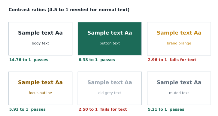
Mira changed the focus outline to the darker #8a5a00, which reaches 5.9 to 1, and kept the brand orange for large decorative shapes where contrast rules do not apply.
Keyboard access and focus
Many people never use a mouse. Some use only a keyboard; others use switches, voice control or screen readers, which all rely on the same keyboard interface. 2.1.1 Keyboard requires that every function works from the keyboard, and 2.1.2 No Keyboard Trap that focus can always move away from any element. 2.4.7 Focus Visible requires a visible focus indicator, and WCAG 2.2's 2.4.11 Focus Not Obscured (Minimum) requires that the focused element is not entirely hidden behind something such as a sticky header or a cookie banner.
Native HTML controls, such as links, buttons and form fields, are keyboard accessible for free. A div made clickable with a script is not, which is one of the strongest reasons to use the right element. The skip link from Lesson 4 lets keyboard users jump past the menu; the CSS below hides it until it receives focus.
.skip-link {
  position: absolute;
  left: 1rem;
  top: -10rem;
  padding: 0.75rem 1rem;
  background: #ffffff;
  color: #1f2933;
}

.skip-link:focus {
  top: 1rem;
}

.visually-hidden {
  position: absolute;
  width: 1px;
  height: 1px;
  margin: -1px;
  padding: 0;
  overflow: hidden;
  clip: rect(0 0 0 0);
  white-space: nowrap;
  border: 0;
}

:focus-visible {
  outline: 3px solid #8a5a00;
  outline-offset: 2px;
}
The visually-hidden class is used for text that screen reader users need but sighted users do not, such as "(opens in a new tab)" after an icon, or a heading for a section whose purpose is obvious visually. It is different from display: none, which hides from everyone.
ARIA: use with care
WAI-ARIA, Accessible Rich Internet Applications, is a set of attributes that add or change the name, role and state that assistive technology reports for an element. aria-label gives a name, as the nav elements on the Food Hub site do with aria-label="Main"; aria-describedby links descriptions, as the form errors in Lesson 5 do; aria-expanded tells a screen reader whether a menu button's menu is open; aria-current="page" marks the menu link for the current page.
The first rule of ARIA, in the W3C's own guidance, is not to use it when a native HTML element already does the job. ARIA changes only what is announced; it adds no behaviour. A div with role="button" is announced as a button but still cannot be focused or pressed with Enter or Space unless a script adds all of that. WebAIM's annual survey of the home pages of the top million websites has found, year after year, that pages using ARIA have more detected accessibility errors on average than pages without it, largely because it is so often misused.
The law in practice
The Food Hub is an Ontario non-profit with 54 employees, so it is covered by the Accessibility for Ontarians with Disabilities Act, 2005 (AODA) and its Integrated Accessibility Standards Regulation, O. Reg. 191/11. Section 14 requires designated public sector organizations and businesses and non-profits with 50 or more employees in Ontario to make their public websites, and web content published after January 1, 2012, conform to WCAG 2.0 Level AA, with two exceptions: live captions (1.2.4) and pre-recorded audio description (1.2.5). That requirement has applied since January 1, 2021. The regulation also requires accessible ways to give feedback and accessible formats on request, and organizations with 20 or more employees file an accessibility compliance report every three years. The Ontario Human Rights Code applies alongside the AODA. Brightwater builds to WCAG 2.2 AA, which more than meets the 2.0 AA requirement.
At the federal level, the Accessible Canada Act covers the federal public sector and federally regulated industries such as banking, telecommunications and air travel. Its Digital Technologies Accessibility Regulations, registered on December 5, 2025, adopt the standard CAN/ASC-EN 301 549, which incorporates WCAG, with compliance due on December 5, 2027 for the federal public sector and December 5, 2028 for federally regulated private organizations with 100 or more employees. The Food Hub is not federally regulated, so these do not apply to it, but Brightwater's bank and telecommunications clients will need them.
Validation and testing
Accessible pages start with valid HTML: elements properly nested and closed, attributes spelled correctly, ids unique. Validity is no longer a WCAG criterion, since 4.1.1 was removed, but broken markup often breaks names and roles, which 4.1.2 Name, Role, Value still requires. The W3C Markup Validation Service (the Nu HTML Checker at validator.w3.org/nu) checks HTML against the Living Standard, and the W3C CSS Validation Service checks stylesheets. Mira ran every page through both; the checker found two duplicate ids on the Contact page and a stray end tag on Programs.
Automated accessibility checkers, such as axe DevTools, WAVE from WebAIM and the accessibility audit in Chrome's Lighthouse, find problems that can be detected by rule: missing alt attributes, missing labels, low contrast, empty links, skipped headings. They are fast and catch many common errors, but no tool can judge whether alt text is accurate, whether the heading outline makes sense, or whether a form can be completed. People must test the rest.
- Keyboard test: unplug the mouse and use Tab, Shift+Tab, Enter, Space and the arrow keys to do everything on each page. Is focus always visible? Is the order logical? Is anything unreachable or a trap?
- Screen reader test: NVDA on Windows is free, and VoiceOver is built into Apple devices. List the headings, landmarks and links, fill in the form, and listen to the alt text.
- Zoom and reflow test: zoom to 200 and 400 per cent and set a large default font size.
- Contrast check: test every text colour and control border with a contrast checker.
- Real users: whenever possible, test with people who use assistive technology every day. The Food Hub recruited two volunteers, one who uses a screen reader and one who uses voice control, who each spent an hour with the site.
| Problem found | Criterion | Fix |
|---|---|---|
| Orange focus outline too faint | 1.4.11 Non-text Contrast | Darker outline colour, 5.9 to 1 |
| Sticky header hid focused links when tabbing up the page | 2.4.11 Focus Not Obscured (Minimum) | scroll-padding-top equal to the header height |
| Two photos with alt text that was just the file name | 1.1.1 Non-text Content | Rewrote the alt text with Lucy |
| Donate amount buttons only 20 pixels tall on phones | 2.5.8 Target Size (Minimum) | Raised to 44 pixels with padding |
| Required fields shown only by a red asterisk | 1.4.1 Use of Colour and 3.3.2 Labels or Instructions | Added the word required to each label |
| Duplicate ids on the Contact page | 4.1.2 Name, Role, Value (labels pointed at the wrong field) | Made every id unique |
Sana also asked the Food Hub to publish an accessibility statement page saying which standard the site aims for, any known limitations, and how to report a problem or ask for information in another format, with a phone number as well as an email address. Paul Desrosiers, the executive director, approved it on Thursday, November 12.
Common mistakes
MistakeChecking accessibility only at the end of a project.
InsteadBuild it in from the first page and test throughout; fixing late is slow and expensive.
MistakeRelying on an automated checker alone.
InsteadUse automated tools, then test with the keyboard, a screen reader, zoom and real users.
MistakeAdding ARIA roles to divs instead of using native elements.
InsteadUse button, a, input and other native elements; reach for ARIA only when HTML has nothing suitable.
MistakeRemoving focus outlines or making them faint.
InsteadKeep a focus indicator with at least 3 to 1 contrast and make sure nothing covers it.
MistakeShowing information by colour alone.
InsteadAdd text, icons or patterns as well as colour.
MistakeAssuming WCAG 2.0 or 2.1 is enough because that is what the law names.
InsteadBuild to WCAG 2.2 AA, which meets every earlier version at the same level.
Practice problems
Work each problem on paper first, then reveal the answer to check.
A button has white text on #c58b1b orange, with a luminance of about 0.3041. What is the contrast ratio, and does 18-pixel bold text pass?
Show answer
(1 + 0.05) ÷ (0.3041 + 0.05) ≈ 2.97 to 1 (2.96 with unrounded luminance). It fails even the 3 to 1 large-text threshold, and 18-pixel bold is just under the 18.7-pixel large-text size anyway.
Why does a clickable div fail the keyboard criterion even with role="button"?
Show answer
ARIA changes only what is announced. The div still cannot receive focus or respond to Enter and Space without extra script; a button element does all of that natively.
Build this: a link that opens the annual report PDF in a new tab, where the visible text is "Annual report 2025" and screen reader users also hear that it is a PDF opening in a new tab.
Show answer
See the model answer below. The extra words are in a visually-hidden span.
<a href="reports/annual-report-2025.pdf" target="_blank" rel="noopener">
  Annual report 2025<span class="visually-hidden"> (PDF, opens in a new tab)</span>
</a>
Try it yourself
Check a colour pair
Given the two luminance values in the starter, compute the contrast ratio with (lighter + 0.05) / (darker + 0.05).
Print the ratio rounded to two decimal places, then print pass if it is at least 4.5 and fail otherwise.
const text = 0.1147;
const background = 1;
// your code here
Summary and key terms
- Accessibility lets people with disabilities perceive, understand, navigate and interact with a site, and helps everyone else too.
- WCAG 2.2 (October 5, 2023) is the current standard; Level AA is the usual target, and meeting 2.2 AA meets 2.1 AA and 2.0 AA.
- POUR: perceivable, operable, understandable, robust.
- Text needs a contrast ratio of 4.5 to 1 (3 to 1 for large text); control borders and focus indicators need 3 to 1; colour must not be the only cue.
- Every function must work from the keyboard, with a visible focus indicator that nothing hides.
- Use native HTML first; ARIA changes what is announced but adds no behaviour.
- In Ontario, the AODA requires WCAG 2.0 AA (with two exceptions) for public websites of non-profits and businesses with 50 or more employees, such as the Food Hub; the Accessible Canada Act's new regulations cover federally regulated organizations.
- Test with validators, automated checkers, the keyboard, a screen reader, zoom and real users.
- Web accessibility
- Designing sites so people with disabilities can use them fully.
- WCAG
- Web Content Accessibility Guidelines, the international standard for web accessibility.
- Success criterion
- A testable WCAG requirement with a number, name and level.
- Level AA
- The WCAG conformance level required by most laws and policies.
- Contrast ratio
- A measure from 1 to 21 of how much two colours differ in relative luminance.
- Relative luminance
- The brightness of a colour on a scale from 0 (black) to 1 (white).
- Focus indicator
- The visible outline or other mark showing which element has keyboard focus.
- ARIA
- Attributes that change the name, role or state reported to assistive technology.
- Screen reader
- Software that reads the page aloud or in braille and lets users navigate it by keyboard or gesture.
- Validator
- A tool that checks HTML or CSS against its specification.
Lesson quiz · 5 questions
Score 60% or more to complete this lesson.
Create a free account to save your progress, take quizzes and earn a certificate.