
CINE-310 · Lesson 8 of 12 · 27 min
Building a look: palettes, film emulation and texture
Once shots are balanced and matched, the colourist and cinematographer shape the look: the characteristic palette, contrast, texture and mood that make a production feel like itself. A look may be developed in pre-production as a show LUT, refined during the shoot through dailies, and finalized in the grade; or it may be built almost entirely in the suite. Either way, a good look supports the story, works across every scene and lighting condition in the film, and survives delivery to many displays. This lesson covers how looks are designed and built, the main components of a look, film emulation, texture such as grain and halation, and how to keep a look consistent and flexible. Technical LUT formats and the CDL as an interchange format were covered in CINE-202 Lesson 8; here the focus is the craft of the look itself.
Starting from references
Looks begin with conversations and references: stills from films, paintings, photographs, location scouts and camera tests. A director might say they want the film to feel "like a faded photograph from the 1970s", or "cold and clinical until the last act". The cinematographer translates this into lighting, lenses, filtration and exposure, and the colourist into the grade. Camera tests graded early, with skin, costumes and key locations, let the team see how the look behaves on real material. A look book collects reference frames and test grades so that everyone, from the production designer to the VFX supervisor, shares the same picture.
Components of a look
Most looks can be described by a handful of components. Thinking in components helps the colourist build looks deliberately rather than by trial and error, and helps the team discuss changes.
| Component | Questions | Typical tools |
|---|---|---|
| Tonal curve | Contrast, black density, highlight roll-off | Contrast and pivot, curves, soft clip |
| Black and white colour | Neutral, warm, cool or tinted blacks and highlights | Lift and gain balance, log wheels |
| Palette and hue | Which hues are emphasized or suppressed | Hue curves, colour warper, secondaries |
| Saturation | Overall and by tone or hue | Saturation, colour boost, sat vs lum curves |
| Split toning | Different colour in shadows and highlights | Shadow and highlight balance |
| Texture | Grain, sharpness, halation, bloom, softness | Film grain, blur, glow and halation tools |
| Framing effects | Vignettes, frame-edge darkening | Inverted windows |
Tonal curve and black and white points
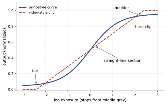
The tonal curve sets much of a look's emotional character. A soft, low-contrast curve with lifted blacks feels gentle, faded or dreamy; a steep curve with dense blacks feels dramatic and graphic. Highlight roll-off, the way bright areas approach white, distinguishes filmic from video-like images: a gentle roll-off, like a print stock's shoulder, keeps highlights smooth and detailed, while a hard clip looks harsh. Lifted blacks are fashionable but should be used with care; raising black too far makes images look washed out on bright displays and can reveal noise. Many colourists set a deliberate black point, slightly above true black, so the image never looks crushed, and a highlight shoulder that keeps skies and windows soft.
Palette
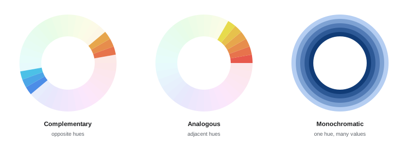
A palette defines which colours a film emphasizes and how they relate. Complementary palettes, such as orange skin against teal backgrounds, create separation and energy; analogous palettes, using neighbouring hues such as yellows, oranges and browns, feel harmonious and warm; monochromatic palettes, built around one hue with variations in brightness and saturation, feel controlled and stylized. A palette is shaped mainly by production design, costumes and lighting, but the grade reinforces it by pulling stray hues toward the palette, desaturating colours that do not belong, and enhancing those that do. Hue-versus-hue curves and colour warpers, which move regions of the colour space like a mesh, are the main tools. Excessive palette pushing, such as turning every background teal, can look formulaic; restraint and story-specific choices age better.
Split toning
Split toning gives shadows and highlights different colours. A classic example is warm highlights with cool shadows, which mimics the natural contrast of sunlight and skylight; the reverse, cool highlights and warm shadows, can feel unsettling or vintage. Split toning is applied with lift and gain balance, or log shadow and highlight wheels, and should usually be subtle in the midtones so that skin is not affected. When split toning interacts with a palette, such as a teal shadow tone in an orange–teal look, the colourist must check that skin in shadow does not turn grey or green.
Worked problem
Split toning with lift and gain
Using the simplified model out = gain × (in + lift × (1 − in)), a colourist adds blue to the shadows by setting blue lift to +0.04, and warms the highlights by setting red gain to 1.05, with everything else neutral. What happens to a neutral black at 0.05, a midtone at 0.45 and a highlight at 0.85?
Show solution
- Black: red 1.05 × 0.05 = 0.0525; green 0.05; blue 0.05 + 0.04 × 0.95 = 0.088. The black turns noticeably blue.
- Midtone: red 1.05 × 0.45 = 0.4725; green 0.45; blue 0.45 + 0.04 × 0.55 = 0.472. Red and blue rise by similar amounts, so the midtone shifts slightly magenta.
- Highlight: red 1.05 × 0.85 = 0.8925; green 0.85; blue 0.85 + 0.04 × 0.15 = 0.856. The highlight turns warm.
Answer: Blacks become cool (blue about 0.09), highlights warm (red about 0.89), and the midtone gains a slight magenta tint from both, which may need a touch of green in gamma to neutralize.
Film emulation
Many digital productions emulate the look of photochemical film. Film's characteristic look comes from several properties: a negative stock with a long, gentle toe and shoulder; a print stock with high contrast and a distinctive colour response; the interaction between the two, in which saturated colours shift in hue and density; the reduction of saturation in highlights and deep shadows; grain structure that varies with exposure; and optical effects such as halation, a reddish glow around bright highlights caused by light scattering in the film base. Film emulation in grading ranges from simple LUTs that mimic a print stock, to tools such as Resolve's Film Look Creator, Baselight's film grade and Truelight colour spaces, and third-party plug-ins such as Dehancer and FilmConvert, that model negative and print separately with grain and halation. Emulation LUTs are usually designed for a specific input space, often Cineon log, so the image must be converted correctly before the LUT, and they often expect exposure to be set with printer-point offsets before the LUT, as at a lab.
Halation, bloom and grain
Texture effects are subtle but powerful. Halation adds a soft red-orange fringe around bright highlights, such as practical lamps and specular reflections, reminiscent of film. Bloom or glow adds a soft spread of light around highlights, suggesting diffusion filters or atmosphere. Grain adds a random texture that varies with brightness and can make digital images feel more organic, mask banding and compression artefacts, and unify footage from different sources. Grain should be applied at the end of the grade, after scaling if possible, and judged at the delivery resolution and viewing distance. Too much grain or halation looks like an effect; too little may be invisible after streaming compression. Streaming services may also strip grain during encoding, so some productions choose a slightly stronger grain or accept that it will soften on delivery.
| Effect | What it mimics | Caution |
|---|---|---|
| Halation | Light scattering in film base | Keep to bright highlights; avoid red outlines on all edges |
| Bloom / glow | Diffusion, atmosphere | Can lower contrast and look dreamy everywhere |
| Grain | Film silver or dye clouds | Judge at delivery resolution; codecs may remove it |
| Softening | Vintage lenses, diffusion filters | Do not soften focus-critical detail |
| Gate weave, dust | Projection artefacts | Easily becomes a gimmick |
Building a look in the structure
Where the look sits in the grade structure matters. A show look, applied at the timeline level after shot balancing, ensures consistency; scene looks in groups adjust the show look for locations or story moments. The look should be built on balanced, representative shots of different types, such as day and night, interior and exterior, light and dark skin, and saturated costumes, so that it works everywhere. A look built on one beautiful shot often breaks on others: crushing a night scene, turning a daylit face orange or clipping a saturated red dress. Colourists often build looks with a mix control or a key output gain so the strength can be reduced on difficult shots without rebuilding the look.
Worked problem
Reducing look strength
A look node shifts a neutral grey at 0.45 to R 0.49, G 0.45, B 0.40. On a night interior the look is too warm, and the colourist sets the node's key output (mix) to 60 %. What are the new RGB values for that grey?
Show solution
- Mixed value = original + 0.60 × (graded − original).
- Red: 0.45 + 0.60 × 0.04 = 0.474.
- Green: 0.45 + 0.60 × 0 = 0.450.
- Blue: 0.45 + 0.60 × (−0.05) = 0.420.
Answer: R 0.474, G 0.450, B 0.420: the same direction of warmth at 60 % of the strength.
Look development in pre-production
Increasingly, looks are designed before the shoot. The colourist builds a show LUT from camera tests, which the DIT and dailies colourist apply on set and in editorial so that the director and editor see the intended look throughout post. This creates consistency, but also a risk: by the time the final grade begins, everyone is used to the dailies look, including its compromises. Colourists therefore often rebuild the look properly in the final grade, matching the show LUT where it works and improving it where it does not. Keeping the show LUT simple, without heavy secondaries or texture, makes it more robust on set and easier to reproduce later.
Consistency and flexibility
A look needs to be consistent enough that the film feels unified, and flexible enough to handle every scene. Good practice includes building looks from a few well-understood operations, rather than many stacked LUTs; separating the look from shot balancing; testing on a wide range of shots, complexions and colours; keeping a reference still of the approved look for each scene; and reviewing the whole film in sequence to check that the look evolves as the story intends. Looks that depend on extreme saturation or contrast are hard to maintain across HDR and SDR versions (Lesson 9) and may break during streaming compression.
Looks for television series
Series present a particular challenge: a look must work across many episodes, often graded by different colourists or at different facilities, and sometimes across several seasons. Series looks are therefore usually defined in a show LUT or a well-documented timeline grade, with reference stills of key locations and characters in neutral and stylized versions, and written notes on contrast, palette and skin. New colourists joining the show begin from this package rather than reinventing the look, and the supervising colourist or cinematographer reviews early episodes for consistency. Strong but simple looks travel better between colourists than complex ones built from many interacting secondaries.
When the look evolves
Some films deliberately change their look as the story develops: a palette that drains of colour as a character loses hope, or a cold world that warms as relationships form. Building such an arc requires planning across the whole film rather than scene by scene. Colourists often build a base look and then a small number of scene looks or adjustments that move it in steps, reviewing the transitions between acts in sequence. Changes that are too gradual may go unnoticed; changes that are too abrupt may feel like errors. A colour script, a strip of key frames from every scene, helps the team see the arc at a glance.
Testing a look
Before a look is approved, colourists test it systematically. A test reel might include a daylight exterior, a tungsten interior, a night scene, close-ups of every main character, a saturated costume or prop, a bright window, and a VFX shot. The look is applied to each, and the team checks that skin remains healthy, that saturated colours do not clip or shift unpleasantly, that shadows keep detail, and that highlights roll off smoothly. Problems found at this stage are far cheaper to fix than problems discovered halfway through the grade, when hundreds of shots already depend on the look.
Common mistakes
MistakeBuilding the look on one beautiful shot.
InsteadTest on day, night, skin and saturated colour.
MistakeFeeding an emulation LUT the wrong input space.
InsteadConvert to the LUT's expected log encoding first.
MistakeStacking many LUTs to create a look.
InsteadBuild from a few understood operations.
MistakeHeavy halation and grain everywhere.
InsteadKeep texture subtle and judge at delivery resolution.
MistakeBaking the look into shot balancing.
InsteadKeep the look in a separate group or timeline level.
Summary and key terms
- Looks begin with references, tests and a shared look book.
- Components include curve, black and white colour, palette, saturation, split toning and texture.
- Palettes can be complementary, analogous or monochromatic.
- Split toning gives shadows and highlights different colours.
- Film emulation models negative, print, saturation roll-off, grain and halation.
- Show and scene looks sit at timeline and group levels with adjustable strength.
- Looks must be tested widely and kept simple enough to survive delivery.
- Look
- Characteristic palette, contrast and texture of a production.
- Look book
- Collection of reference frames and test grades.
- Highlight roll-off
- How bright tones approach white.
- Palette
- Set of emphasized colours and their relationships.
- Colour warper
- Tool moving regions of colour space like a mesh.
- Split toning
- Different colours in shadows and highlights.
- Print stock emulation
- Mimicking the response of film print stock.
- Halation
- Red-orange glow around bright highlights.
- Grain
- Random texture mimicking film.
- Show LUT
- LUT carrying the look through production and dailies.
Practice problems
Work each problem on paper first, then reveal the answer to check.
Name four components of a look.
Show answer
Curve, palette, saturation, texture.
What does a soft highlight shoulder suggest?
Show answer
A filmic, smooth roll-off.
What is an analogous palette?
Show answer
Neighbouring hues.
How is split toning applied?
Show answer
Shadow and highlight balance (lift/gain or log wheels).
What causes halation in film?
Show answer
Light scattering in the film base.
What input do many emulation LUTs expect?
Show answer
Cineon log.
When should grain be applied?
Show answer
At the end, judged at delivery resolution.
A 50 % mix on a +0.06 shift gives?
Show answer
+0.03.
Why rebuild a show LUT look in the final grade?
Show answer
To fix compromises and use full tools.
Why test a look on several complexions?
Show answer
Looks can break skin on some faces.
Lesson quiz · 5 questions
Score 60% or more to complete this lesson.
Create a free account to save your progress, take quizzes and earn a certificate.