
CINE-310 · Lesson 10 of 12 · 27 min
Calibrated monitoring, projection and the grading suite
Every grading decision is made by looking at a display, so the display and the room around it are the colourist's most important instruments. If the reference monitor is too bright, the colourist will grade too dark; if it is slightly green, every shot will be pushed slightly magenta; if the walls are coloured or the room is lit by a window, judgement drifts with the weather. PHOT-301 covered monitor profiling for still photographers and CINE-202 covered scopes for exposure. This lesson concerns the motion-picture finishing environment: reference displays and their standards, calibration with probes and LUTs, theatrical projection, the design of grading suites and review rooms, and how colourists use scopes alongside the picture to keep grades honest.
Reference displays
A reference or grade-one display is designed to reproduce a standard exactly rather than to look impressive. Key requirements include accurate primaries for the target gamut, such as Rec.709 or P3; a precise transfer function, such as BT.1886 gamma 2.4 for SDR or PQ for HDR; a stable white point at D65 for video and HDR, or the DCI white for theatrical work; uniformity across the screen; deep, stable blacks; consistent off-axis viewing; and no automatic picture processing, such as dynamic contrast or motion smoothing. Professional grading displays include OLED and dual-layer LCD monitors from manufacturers such as Sony, Flanders Scientific and Canon, often with built-in calibration and the ability to load 3D calibration LUTs. Consumer televisions can be useful client or check monitors when calibrated, but they tone-map HDR and process images in ways that make them unsuitable as the main reference.
| Target | Primaries | White | Transfer | Peak luminance |
|---|---|---|---|---|
| SDR video | Rec.709 | D65 | BT.1886 (gamma 2.4) | 100 nits |
| HDR video | P3 within Rec.2020 | D65 | PQ (ST 2084) | 1,000 nits typical master |
| HLG broadcast | Rec.2020 | D65 | HLG | Up to 1,000 nits reference |
| Digital cinema | P3 | DCI white (about 6,300 K) | Gamma 2.6 | 48 nits (14 fL) |
| Web and graphics review | sRGB / Rec.709 | D65 | sRGB or 2.2 | 80–120 nits |
Calibration
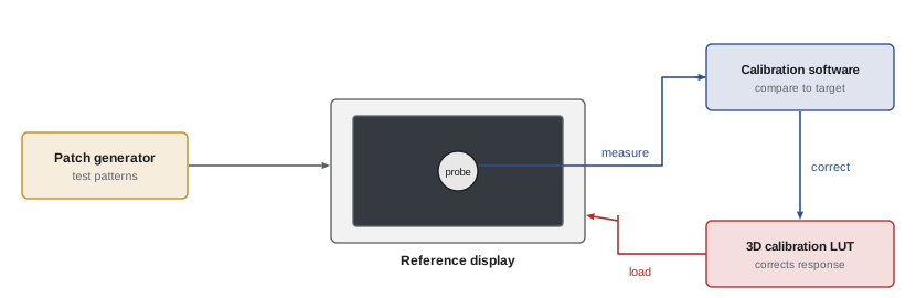
Calibration measures a display and corrects it so that it matches the target. A colorimeter or spectroradiometer is placed on the screen, and calibration software, such as Portrait Displays CalMAN, LightSpace or ColourSpace, sends a series of test patches through the display chain. Simple calibrations adjust white point and gamma using the display's controls; full calibrations measure hundreds or thousands of colour patches and generate a 3D LUT that corrects the display's response across the whole gamut. The LUT is loaded into the display, a LUT box or the grading system's output. Spectroradiometers are more accurate than colorimeters, especially on displays with narrow-band primaries such as OLED and laser projectors, so facilities often use a spectroradiometer to create a correction profile for a faster colorimeter.
Measuring accuracy: delta E
Calibration reports express errors as delta E, a measure of perceived colour difference. The modern formula, ΔE2000, is complex, but its interpretation is simple: below about 1 the difference is generally invisible; 1 to 2 is visible only to trained observers in side-by-side comparison; above 3 it is often noticeable. The older ΔE76 is a plain distance in CIELAB:
Reference displays are usually expected to calibrate to an average ΔE2000 well below 1 and a maximum below about 2 across a test set, with greyscale tracking especially tight because neutral errors are the most visible.
Worked problem
Checking a grey patch
A 50 % grey patch should measure L* 53.4, a* 0, b* 0. The probe reads L* 53.9, a* 0.6, b* −1.2. What is ΔE76, and is the error likely to matter?
Show solution
- ΔL = 0.5, Δa = 0.6, Δb = −1.2.
- ΔE76 = √(0.25 + 0.36 + 1.44) = √2.05 ≈ 1.43.
- The b* error of −1.2 means the grey is slightly blue, which is the largest contributor.
Answer: About 1.4 ΔE76, a slight blue tint that a trained colourist could notice on neutrals; recalibration is worthwhile for a reference display.
Display drift and checks
Displays drift with age, temperature and hours of use; OLED panels can change in brightness and colour over their life, and projector lamps or lasers dim. Facilities recalibrate on a schedule, often monthly or before a major project, and perform quick checks more often: measuring white and a few greys at the start of a session, comparing displays side by side with test patterns, and warming displays up for 30 minutes or more before critical work. When several suites work on the same production, matching all their displays to one another is as important as matching each to the standard, so that a shot graded in one room looks the same in another.
Theatrical projection
Features intended for cinemas are graded, or at least reviewed, on a calibrated digital cinema projector in a screening-style room. The DCI specification sets peak white at 48 nits, or 14 foot-lamberts, in P3 with the DCI white point and gamma 2.6, viewed in a dark room. Projection differs from a monitor in ways that affect grading: the image is large, so the viewer's eye moves around it more; the room is dark, so the image appears lower in contrast (a surround effect, Lesson 2); blacks depend on the projector and room reflections; and the screen's brightness may vary slightly from centre to edge. HDR cinema formats, such as Dolby Cinema and others using laser projection or LED screens, have higher peak brightness and much deeper blacks, and require their own masters and trims.
Worked problem
Foot-lamberts and nits
One foot-lambert equals about 3.426 nits. A projector measures 13.2 fL at the centre of the screen. What is this in nits, and how far is it from the 48-nit target in stops?
Show solution
- 13.2 × 3.426 ≈ 45.2 nits.
- Ratio: 45.2 ÷ 48 ≈ 0.942.
- Stops: log2(0.942) ≈ −0.09 stop.
Answer: About 45 nits, roughly a tenth of a stop below the 48-nit target, within normal tolerance but worth noting at calibration.
Designing the grading suite
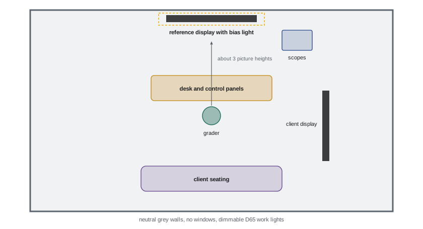
A grading suite is built to keep the colourist's perception stable. Typical guidelines, drawn from SMPTE and ITU recommendations and facility practice, include: neutral grey walls and furniture, with no saturated colours in the field of view; a bias light behind or around the display at D65, at about 10 % of display white for SDR (around 10 nits) and lower for HDR (about 5 nits), to reduce eye strain and stabilize adaptation; no daylight and no uncontrolled light sources; dimmable, D65-matched work lights that do not fall on the screen; a viewing distance of about three picture heights for HD and somewhat closer for UHD; and the colourist's eye level centred on the display, with the reference display directly ahead. Clients sit behind the colourist, often with a larger client monitor or projector, which must be calibrated to match the reference.
Control surfaces and ergonomics
Colourists work with control panels that provide trackballs for lift, gamma, gain and offset, rings for levels, and many knobs and buttons for other tools. Panels such as the DaVinci Resolve Advanced Panel, the FilmLight Blackboard and Slate, and Tangent panels allow both hands to work simultaneously and make adjustments fluid and repeatable. Long sessions require attention to ergonomics: adjustable chairs, wrists supported at panel height, the display at a comfortable angle, and regular breaks to rest eyes and reset adaptation. Many colourists take a short break every hour and look at a neutral reference before continuing.
Scopes in the suite
In the suite, scopes are not only exposure tools but guardians of objectivity. Colourists keep them visible at all times, typically waveform or parade, vectorscope and sometimes a CIE chromaticity plot or gamut monitor. Scopes catch problems the eye adapts to: a gradual drift toward green across a session; blacks that have crept above or below the intended level; highlights exceeding the delivery peak; colours outside the delivery gamut; and illegal levels for broadcast. HDR scopes display luminance in nits on a PQ scale and can show false-colour overlays of brightness ranges, helping colourists ensure highlights sit where intended. Hardware scopes, such as those from Tektronix or Leader, and software scopes built into grading systems or provided by tools like Scopebox and Omniscope, are both used.
Review rooms and remote review
Directors, producers and studios review grades in screening rooms, client monitors at the facility, or, increasingly, remotely. Remote review uses calibrated displays at the client's location and streaming systems that send a high-quality, low-latency feed from the suite; tools such as Streambox and ClearView Flex are widely used. For remote review to be meaningful, the client's display must be calibrated to the same standard and viewed in a suitable environment. Some facilities send calibrated monitors to directors' homes for this purpose. Notes from review are compared with the reference display, not the client's screen, if they differ.
Matching client and reference displays
Clients sitting behind the colourist usually watch a larger display or a projector, which must match the reference display closely enough that both see the same grade. Perfect matching between different display technologies is difficult, because OLED, LCD and projection differ in contrast, black level, viewing angle and spectral characteristics. Facilities calibrate both to the same target with the same probe and correction profile, check them side by side with skin and neutral test images, and tell clients that the reference display is the authority if they differ. Some facilities avoid large client displays altogether for critical sessions and invite the director to sit beside the colourist instead.
Metamerism between displays
Two displays can measure identically with a colorimeter and still look slightly different to a viewer, because their spectral outputs differ and individual observers' eyes respond differently to narrow-band light. This observer metamerism is most noticeable between OLED, laser and LCD displays with very different primaries. Facilities address it by using spectroradiometers and, where appropriate, white point offsets agreed among colourists to match perceived white between technologies. The issue is a reminder that calibration is a measurement of agreement with a standard, not a guarantee that every eye sees every display the same way.
Calibration schedule
| Interval | Task |
|---|---|
| Every session | Warm up displays; visual check of white and greys |
| Weekly | Quick probe check of white point and luminance |
| Monthly or per project | Full calibration and 3D LUT verification |
| After moves or repairs | Full recalibration |
| Across suites | Side-by-side matching of all project displays |
Looking after the colourist
The colourist's visual system is part of the calibrated chain. Long sessions in dim rooms, bright HDR highlights and constant critical viewing are tiring. Good facilities schedule breaks, provide daylight and outdoor space between sessions, and avoid booking supervised sessions late into the night when judgement is weakest. Colourists should know their own colour vision; many take a colour vision test, such as the Farnsworth-Munsell 100 Hue test, early in their careers and periodically afterwards. Age also matters: the lens of the eye yellows over the years, slightly changing perception of blues, which is another reason to trust scopes and calibrated references alongside the eye.
Scopes and the picture together
The best colourists move constantly between the picture and the scopes. The picture tells them whether a grade feels right; the scopes tell them whether it is technically correct and consistent. A shot that looks good but reads oddly on the scopes deserves a second look, perhaps because of adaptation; a shot that reads perfectly but looks wrong usually has a creative problem that numbers cannot solve. Neither replaces the other, and over time colourists learn to predict what the scopes will show before they look, which is a sign that their perception and measurement have become calibrated together.
Field and on-set monitoring
Calibration matters beyond the grading suite. The DIT's on-set monitor, the dailies colourist's display and the editor's viewing monitor all influence decisions long before the final grade. When these displays are uncalibrated, the director may fall in love with a look that exists only on one screen, or reject footage that was correctly exposed. Many productions therefore calibrate on-set and editorial monitors to the same standard as the suite, using the same show LUT, so that the look the team sees throughout production is a reliable preview of the final grade.
Common mistakes
MistakeGrading on an uncalibrated or consumer display.
InsteadUse a calibrated reference display.
MistakeDaylight or coloured walls in the suite.
InsteadNeutral grey surfaces and controlled D65 lighting.
MistakeGrading before the display has warmed up.
InsteadWarm up and check white before critical work.
MistakeMatching only to the standard, not between suites.
InsteadMatch displays across all rooms on the project.
MistakeHiding scopes during creative work.
InsteadKeep scopes visible to catch drift.
Summary and key terms
- Reference displays reproduce standards exactly, without processing.
- Calibration measures patches and corrects with a 3D LUT.
- Delta E expresses colour errors; below about 1 is invisible.
- Displays drift and need regular checks and matching between rooms.
- Digital cinema targets 48 nits, P3, DCI white and gamma 2.6.
- Suites have neutral surfaces, D65 bias lighting and no daylight.
- Scopes guard objectivity; remote review needs calibrated client displays.
- Reference display
- Display that reproduces a standard accurately.
- Colorimeter
- Probe measuring colour with filters.
- Spectroradiometer
- Probe measuring the full spectrum.
- Calibration LUT
- 3D LUT correcting a display's response.
- Delta E
- Measure of perceived colour difference.
- BT.1886
- SDR reference display transfer function.
- Foot-lambert
- Luminance unit, about 3.426 nits.
- Bias light
- Neutral light behind a display.
- Control surface
- Hardware panel for grading.
- Remote review
- Client viewing of the grade at another location.
Practice problems
Work each problem on paper first, then reveal the answer to check.
What white point is used for SDR and HDR video?
Show answer
D65.
What gamma does BT.1886 approximate?
Show answer
2.4.
What is the DCI peak white?
Show answer
48 nits (14 fL).
Why use a spectroradiometer?
Show answer
Accuracy on narrow-band displays.
What ΔE is generally invisible?
Show answer
Below about 1.
ΔE76 for differences 1, 0, 0?
Show answer
1.0.
Convert 14 fL to nits.
Show answer
About 48 nits.
Typical SDR bias light level?
Show answer
About 10 % of display white.
Why keep scopes visible?
Show answer
To catch drift the eye adapts to.
What must remote review clients have?
Show answer
A calibrated display in a suitable environment.
Lesson quiz · 5 questions
Score 60% or more to complete this lesson.
Create a free account to save your progress, take quizzes and earn a certificate.