
CINE-310 · Lesson 7 of 12 · 27 min
Grading skin tones
Faces are what audiences watch, and skin is the colour they judge most critically. A grade can push a landscape to strange extremes and still feel right, but skin that looks ill, sunburned, waxy or plastic breaks the illusion immediately. Skin also varies enormously, from very light to very dark complexions, with undertones that can be pink, olive, golden or red-brown, and with variation within a single face. Grading skin well means respecting that diversity, understanding where skin sits on the scopes, protecting it during stylized grades, and refining it with care. This lesson covers the physics and appearance of skin, the skin tone line on the vectorscope, exposure and contrast for different complexions, isolating and refining skin, common problems, and the ethics of representing people fairly.
What makes skin look like skin
The colour of skin comes mainly from two pigments, melanin (brown-black) and haemoglobin in blood (red), together with carotenoids (yellow) and the scattering of light within the skin. Because light penetrates and scatters below the surface, skin has a characteristic soft, luminous quality, called subsurface scattering, that distinguishes it from paint or plastic. Skin also has local variation: cheeks and nose are redder because of blood flow, the forehead and areas under the eyes can be more yellow or blue, and there are highlights where light reflects from oil on the surface. A natural skin grade preserves this variation. A grade that flattens skin into a single hue, through heavy qualifier corrections or narrow hue-versus-hue curves, makes faces look like masks.
The skin tone line
On a vectorscope, skin of all complexions falls close to a single hue direction, roughly between the red and yellow targets, often marked by a skin tone line or "I-line" at about 123° in the conventional vectorscope orientation. The line exists because the hue of skin is set mainly by blood and melanin in similar proportions across people: darker complexions have more melanin, which makes skin darker and somewhat more saturated, but the hue angle changes only slightly. Lighter complexions sit closer to the centre in saturation and higher on the waveform; darker complexions sit lower on the waveform. Skin that falls clearly to the green or yellow side of the line looks jaundiced or sallow; skin to the magenta side looks flushed or sunburned.
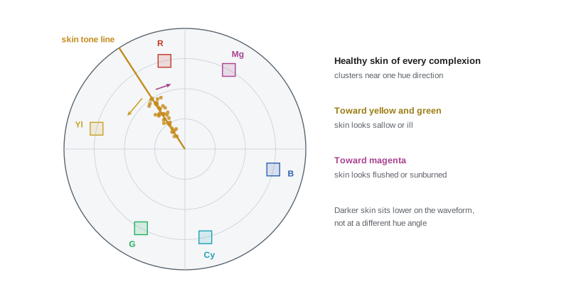
The skin line is a guide, not a rule. Under strongly coloured light, such as sodium street lamps, neon or a sunset, skin should take on the colour of the light; forcing it onto the line would look unnatural. And within any face, points will scatter around the line. The colourist uses the line to judge whether skin looks healthy under the intended light, and to compare skin between shots and characters.
Measuring skin hue
The hue angle of a colour on the vectorscope is calculated from its colour difference components. In Rec.709 video, the blue and red difference signals are:
The hue angle is then the angle of the point \((C_B, C_R)\) on the vectorscope, and saturation is its distance from the centre.
Worked problem
Is this skin on the line?
A probe on an actor's cheek reads R' = 0.70, G' = 0.52, B' = 0.42 in Rec.709. Calculate Y', CB and CR, and the hue angle measured from the +CB axis. Is the skin close to the conventional skin line at about 123°?
Show solution
- Y' = 0.2126 × 0.70 + 0.7152 × 0.52 + 0.0722 × 0.42 = 0.1488 + 0.3719 + 0.0303 ≈ 0.551.
- CB = (0.42 − 0.551) ÷ 1.8556 ≈ −0.0706.
- CR = (0.70 − 0.551) ÷ 1.5748 ≈ 0.0946.
- Angle = atan2(0.0946, −0.0706) ≈ 180° − 53.3° ≈ 126.7°.
Answer: About 127°, within a few degrees of the skin tone line, so the skin hue is healthy; only a small shift toward yellow would place it exactly on the line.
Exposure and contrast for every complexion
Skin exposure is a creative choice, but some patterns are common. On a Rec.709 waveform, very light skin often sits around 70 to 80 %, typical medium complexions around 50 to 65 %, and dark complexions around 30 to 45 %, depending on the lighting and intent. The goal is not to push every face to the same level, which would erase real differences, but to make sure each face has detail, shape and texture. Darker skin often has more specular reflection and richer variation in hue, including red, gold and blue undertones; flat lighting or a heavy contrast curve can crush that variation into a featureless dark shape. Colourists grading dark complexions often lift midtone detail within the face with a soft window, protect against crushed shadows, preserve speculars without clipping them, and avoid desaturating skin, which makes dark skin look grey or ashy. Light skin can easily clip or look pasty in high-key grades and benefits from preserving gentle colour variation.
| Complexion | Typical Rec.709 level | Common risk | Approach |
|---|---|---|---|
| Very light | 70–80 % | Clipping, pasty or pink | Roll off highlights, keep variation |
| Medium | 50–65 % | Sallow or orange under mixed light | Check the skin line, balance mixed sources |
| Dark | 30–45 % | Crushed detail, ashy desaturation | Lift midtone detail, keep saturation and speculars |
| All | Varies with intent | Mismatch between characters | Grade each face to look its best in the same light |
Scenes with several complexions
When characters with different complexions share a frame, a single global exposure may suit one face and not another. This is a lighting problem first, and good cinematographers light each face appropriately, but the grade can help. A soft window or skin qualifier on one face can lift or lower it by a fraction of a stop, so that both read well, without making the difference look artificial. The aim is that each person looks like themselves in the same light. Colourists should never "average" faces toward a single tone or lighten darker skin to make it closer to lighter skin; that misrepresents people and has a long, harmful history in film and photography.
A history of bias
Colour film and video were for decades calibrated with reference images of light-skinned models, most famously the "Shirley cards" used by photo labs to set printer balance. Film stocks and processes were optimized for light skin, which often left darker skin underexposed, muddy or lacking detail. Change came slowly, partly driven by furniture and chocolate advertisers who needed better rendering of browns, and by cinematographers and colourists who developed lighting and grading techniques for darker skin. Recent productions such as Moonlight (2016) and Insecure (2016–2021) have been widely discussed for their rich, deliberate rendering of dark skin. Modern sensors and wide-gamut pipelines can render every complexion beautifully, but defaults, presets and even AI tools may still carry bias, so colourists must look critically at every face.
Isolating and refining skin
Skin is often refined with a qualifier, but heavy-handed skin keys create problems. Good practice includes:
- Qualify by hue and saturation with soft ranges, and intersect with a window around the face so that the key does not catch walls, wood or clothing of similar colour.
- Use small corrections: a few degrees of hue, a little saturation, a fraction of a stop of exposure.
- Use hue-versus-hue and hue-versus-saturation curves gently to pull stray skin hues toward the line, without collapsing variation.
- Avoid using a skin qualifier as the main tool for a cast that affects the whole frame; fix the cast with primaries first.
- Check lips, eyes and teeth, which can shift unattractively when skin is corrected.
Common skin problems
Many skin problems arrive from set: mixed lighting that puts green fluorescent light on one side of a face and warm tungsten on the other; bounce from coloured walls or foliage; makeup that reads differently on camera; and sunburn or flushing from heat. Others arise from the grade: an orange–teal look that pushes skin too orange; heavy contrast that makes skin blotchy; and saturation boosts that make blemishes and redness more visible. The table below lists typical fixes.
| Problem | Likely cause | Fix |
|---|---|---|
| Green or yellow cast on skin | Fluorescent or foliage bounce | Primary balance, then hue curve toward the line |
| Red, blotchy skin | Heat, makeup, saturation boost | Reduce red saturation in skin, soften local contrast |
| Orange, artificial skin | Heavy warm look | Pull skin hue toward the line within the look |
| Grey, ashy dark skin | Desaturation, low exposure | Restore saturation, lift midtones in face |
| Waxy, plastic skin | Overuse of beauty or softening | Reduce softening, keep texture |
Beauty work
Commercials, music videos and many dramas use beauty work: subtle softening of skin texture, reduction of blemishes and redness, and gentle lifting of faces. Grading systems offer skin-smoothing and face-refinement tools that blur fine detail within a skin key while preserving edges. These tools should be used with restraint; heavy smoothing produces the waxy look audiences recognize as artificial, and it can raise ethical questions when it changes how people look. Productions often have agreements with talent about retouching, and colourists should follow the director's and producer's instructions rather than making cosmetic changes unasked.
Worked problem
Reducing redness in a cheek
A hue-versus-saturation curve shows skin redness at a hue near 105° with saturation 20 % higher than the surrounding skin. The colourist wants to reduce the difference by half. What saturation factor should be applied to that hue range, and why not remove the difference entirely?
Show solution
- Relative saturation of the red area: 1.20.
- Halving the difference gives a target of 1.10, so the factor is 1.10 ÷ 1.20 ≈ 0.92.
- A factor of about 0.92 (8 % reduction) on the narrow hue range brings the redness halfway toward the surrounding skin.
Answer: About 0.92 on that hue range. Removing the difference entirely would flatten natural variation and make the face look mask-like.
Skin under coloured and mixed light
Many scenes place skin under strongly coloured light on purpose: a club lit with magenta and blue LEDs, a campfire, a sodium-lit street, a police light flashing red and blue. In these scenes the goal is not to neutralize skin but to make it read as skin within the light. Colourists keep enough variation and texture for the face to look real, avoid pushing skin into hues that read as illness (such as deep green), and often allow a little of the natural skin hue to show in the highlights or in the fill side of the face. Mixed light, such as daylight from a window on one side and tungsten on the other, is common on location; the colourist may correct the overall balance toward one source and leave the other as natural colour contrast, or use a soft window to bring an unflattering source closer to the scene palette.
Skin and the look
Stylized looks are where skin is most at risk. A teal look applied globally pulls skin toward grey or green; a heavy warm look turns faces orange; a bleach-bypass look desaturates skin until it looks ill. Colourists protect skin within looks in several ways: building the look with hue-specific curves that leave the skin hue range largely untouched; using a skin key in parallel with the look node to hold back part of the change on faces; or reducing the strength of the look on close-ups. The goal is that the look and the faces feel like one world, rather than faces pasted onto a coloured background.
Matching skin across a film
Characters must look like the same people throughout the film, even when scenes were shot months apart under different light, with different makeup, or after an actor has gained a suntan. Colourists keep reference stills of each main character in neutral light and compare faces across scenes, using the vectorscope angle and waveform level as well as the eye. Where story requires change, such as illness, exhaustion or a sunburn, the change should be deliberate and progressive, discussed with the director and makeup department, rather than an accident of the grade.
| Situation | Approach |
|---|---|
| Neon or LED-coloured light | Keep skin readable within the light; avoid ill-looking hues |
| Mixed daylight and tungsten | Balance to one source, soften the other with a window |
| Stylized teal or warm look | Protect the skin hue range with curves or a parallel key |
| Character across many scenes | Compare with reference stills and scope values |
| Story-driven change in appearance | Plan with director and makeup, grade progressively |
Common mistakes
MistakeForcing every face onto the skin line under coloured light.
InsteadLet skin take the colour of the scene light.
MistakePushing all faces to the same level.
InsteadGrade each face to look its best in the same light.
MistakeDesaturating dark skin.
InsteadPreserve saturation, undertones and speculars.
MistakeFixing a whole-frame cast with a skin key.
InsteadFix the cast with primaries first.
MistakeHeavy skin smoothing.
InsteadKeep texture; follow agreed beauty notes only.
Summary and key terms
- Skin colour comes from melanin, blood and scattering, with natural variation.
- Skin of all complexions falls near one hue line on the vectorscope.
- Hue angle can be calculated from CB and CR.
- Each complexion has typical levels and risks; none should be averaged away.
- Film and video have a history of bias toward light skin.
- Skin keys should be soft, limited by windows and used gently.
- Beauty work should be restrained and agreed.
- Skin tone line
- Vectorscope line where healthy skin hue falls.
- Subsurface scattering
- Light scattering inside skin, giving it a soft glow.
- Melanin
- Brown-black pigment in skin.
- Undertone
- Underlying hue tendency of a complexion.
- Colour difference signals
- CB and CR, blue and red minus luma.
- Hue angle
- Direction of a colour on the vectorscope.
- Shirley card
- Historical lab reference image of a light-skinned model.
- Sallow
- Yellow-green, unhealthy-looking skin.
- Beauty work
- Subtle cosmetic refinement of skin.
- Ashy
- Grey, desaturated look on dark skin.
Practice problems
Work each problem on paper first, then reveal the answer to check.
Why does skin look different from paint?
Show answer
Subsurface scattering.
Where does the skin tone line sit?
Show answer
Between red and yellow, about 123°.
What does skin toward yellow-green look like?
Show answer
Sallow or jaundiced.
Write CR for Rec.709.
Show answer
(R' − Y') ÷ 1.5748.
Typical level for dark complexions?
Show answer
About 30–45 % on a Rec.709 waveform.
What risk does desaturation pose for dark skin?
Show answer
An ashy, grey look.
What were Shirley cards?
Show answer
Lab reference images of light-skinned models.
How should a skin key be limited?
Show answer
Intersect with a face window.
Saturation factor to cut a 1.30 area to 1.15?
Show answer
About 0.88.
Should skin always sit on the line?
Show answer
No, not under coloured light.
Lesson quiz · 5 questions
Score 60% or more to complete this lesson.
Create a free account to save your progress, take quizzes and earn a certificate.