
ARCH-110 · Lesson 9 of 12 · 20 min
Rendering light and material
Ingrid's two-point perspective of the boathouse is perfectly constructed, and it looks like a wire frame. Every surface is the same white as the paper. Professor Visser asks her to stand at the window and describe what she sees on the building across the street. 'The wall facing us is bright,' Ingrid says. 'The side wall is darker. There is a black slot under the roof edge. The window glass is dark, but with a bright reflection at the top.' Visser nods. 'You just rendered it. Now put those words on the paper.' By the end of the afternoon, with a soft pencil and a grey marker, the boathouse has weight, depth and a sense of the time of day.
Value: the foundation of rendering
Rendering means adding tone, texture and sometimes colour to a drawing so that it shows light, form and material. The foundation of all rendering is value: how light or dark a tone is, from the white of the paper to the darkest black. A drawing with a full range of values, from pure white highlights through several greys to deep darks, reads as solid and lit. A drawing with only middle greys looks flat and muddy, however carefully it is made.
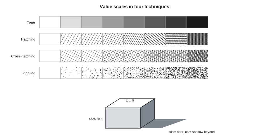
Learn to see and draw a value scale. Make a strip of ten boxes and fill them from white to black in even steps, with whatever medium you are using: pencil pressure, hatching density, marker layers or watercolour washes. Then use only three to five of those values in a drawing: the white of the paper for lit surfaces facing the light, a light value for surfaces turned slightly away, a middle value for shaded faces, and a dark value for shadows and openings. A few clear, separate values read better than many subtle ones.
Shade and shadow
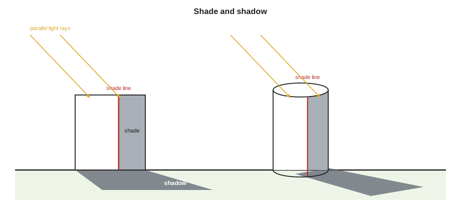
As you saw in elevation, light produces two kinds of darkness. Shade is the side of an object turned away from the light. A box lit from the upper left has a lit top, a lit left face and a shaded right face. Shadow is the dark shape that an object casts onto another surface where it blocks the light: the box casts a shadow onto the ground. The line between the lit and shaded sides of an object is called the shade line; the shadow is the projection of the shade line onto the receiving surface, along the light rays.
In architectural rendering, shadows are usually drawn as the darkest values, with sharp edges, because they make the clearest statement about depth. Shade is a little lighter, and its tone may vary as reflected light from the ground or nearby surfaces bounces into it. A thin band of reflected light along the bottom edge of a shaded face, or the inside of a shadow, adds subtlety and makes the form rounder.
Constructing shadows
Shadows can be constructed geometrically. In plan and elevation with the conventional 45-degree sun, each shadow is as deep as the projection that casts it, as you saw in lesson 4. In axonometric and perspective, cast shadows are found by drawing light rays through the top points of an object and finding where they meet the ground or another surface. For sunlight, the rays are parallel; in an axonometric they stay parallel on the page, while in a perspective they converge to a vanishing point for the sun, above the horizon if the sun is in front of the viewer, below it if the sun is behind.
For a real site and time, the sun's altitude and azimuth determine the shadows. You calculated these in ARCH-100. The length of a shadow on level ground is the height of the object divided by the tangent of the sun's altitude. At the latitude of Winnipeg, about 49.9 degrees north, the sun at noon on the winter solstice is only about 16.6 degrees above the horizon, and a 3 m (10 ft) wall casts a shadow about 10 m long; at the summer solstice it is about 63.5 degrees, and the same wall casts a shadow of about 1.5 m. Real shadows like these, drawn in plan, are some of the most important design drawings for a site.
# Shadow lengths on level ground for a real latitude
import math
lat = 49.9                                       # degrees north
height = 3.0                                      # object height
for name, decl in [("winter solstice", -23.44), ("equinox", 0.0), ("summer solstice", 23.44)]:
    alt = 90 - lat + decl                         # noon sun altitude
    shadow = height / math.tan(math.radians(alt))
    print(f"{name:16s} noon altitude {alt:5.1f} deg, shadow {shadow:6.2f} m")
# shadows at 45 degrees are as long as the object is tall: the drawing convention
print(f"45-degree convention: {height / math.tan(math.radians(45)):.2f} m")winter solstice noon altitude 16.7 deg, shadow 10.02 m equinox noon altitude 40.1 deg, shadow 3.56 m summer solstice noon altitude 63.5 deg, shadow 1.49 m 45-degree convention: 3.00 m
The script computes the noon altitude from the latitude and the sun's declination, then the shadow length. Compare the real winter and summer shadows with the conventional 45-degree shadow at the end: the convention is a reasonable compromise for presentation drawings, but a site plan that shows the true winter shadow tells you where snow will linger and where a terrace will never see the sun in December.
Techniques for tone
Hatching builds tone from parallel lines. Closer lines and thicker lines give darker tone. Cross-hatching adds a second set of lines at an angle to the first, and a third and fourth for the darkest values. Keep each set of hatching straight, even and in one direction; on architectural surfaces, hatch parallel to an edge of the surface or at a consistent diagonal across the whole drawing. Avoid scribbling, which looks nervous and uneven.
Stippling builds tone from dots. It is slow but gives a soft, even tone that works well for ground surfaces, concrete and shadows in ink drawings. Use a fine pen, hold it upright and make true dots, not dashes; more dots closer together give a darker tone.
Washes build tone from diluted ink or watercolour applied with a brush. Mix a pool of tone first, then lay it in one quick, even pass from top to bottom, keeping a wet edge, on paper that will not buckle. Build darker values by laying further washes over dry earlier ones. A graded wash, darker at the top and fading to the horizon, is the classic way to render a sky. The Beaux-Arts schools taught elaborate ink washes for presentation drawings, and the technique still gives a luminous quality that is hard to match.
Markers and digital tools follow the same principles: a few clear values applied consistently. In digital work, place tone on separate layers so you can adjust each value across the whole drawing at once.
Rendering materials
Materials are rendered by their texture, their value and their reflectivity. Wood: parallel grain lines, with the end grain shown where it is cut. Brick and block: coursing lines, drawn lightly and faded across the surface, with a few individual units picked out. Concrete: a light stipple, a few small marks for aggregate, and tie holes in a grid for board-formed or panel-formed concrete. Stone: irregular joints and a little texture inside each stone. Metal: crisp, even tone with sharp highlights. Grass and ground: short vertical strokes or stipple, darker under objects.
Glass is the hardest material to render because it can look dark, transparent or reflective depending on the light and the view. In daylight from outside, glass usually looks dark, often darker than the walls around it, with streaks of reflected sky. Draw it dark with a few diagonal light streaks, or show what is behind it if the view into the room matters. At night, lit glass glows and the walls are dark, a reversal often used for dramatic presentation drawings.
Do not render every material over every surface. Texture near edges and in shadow, fading out in the light, suggests the whole surface. Let the white of the paper do as much work as the ink.
Worked problem
Real versus conventional shadows
Wren is drawing a site plan of Kestrel Point with the boathouse's shadow at noon on the winter solstice. The boathouse is 4.2 m (14 ft) tall at the ridge. At Winnipeg's latitude, the noon sun on the winter solstice is about 16.6 degrees high. How long is the shadow, and how does it compare with the 45-degree convention?
Show solution
- Shadow length = height ÷ tan(altitude).
- tan(16.6°) ≈ 0.298, so 4.2 ÷ 0.298 ≈ 14.1 m.
- With the 45-degree convention, the shadow would be 4.2 m (14 ft).
- The real winter shadow is more than three times as long, stretching well beyond the building toward the north.
Answer: The winter noon shadow is about 14 m long, which tells Wren that the ground north of the boathouse will stay in shadow and hold snow all winter.
Exercise 9: rendering studies
This exercise takes about six hours.
- Make value scales of ten steps in four techniques: pencil tone, hatching, cross-hatching and stippling, plus one in marker or wash.
- Render a box and a cylinder with lit, shaded and shadow values, with the shade line and the cast shadow constructed.
- Render your two-point perspective of the boathouse from lesson 6 in three or four values with constructed shadows, and with materials suggested on each surface.
- Draw a site plan with real shadows at noon on the winter solstice, equinox and summer solstice, computed with the script.
- Deliverable: one sheet of value studies, the rendered perspective and the shadow site plan.
Self-critique checklist
- Is there a full range of value from white paper to deep dark?
- Are shade and shadow distinct, with crisp shadow edges?
- Are all shadows cast in the same direction from the same light?
- Is texture concentrated near edges and in shadow, fading in the light?
- Does the glass read as glass?
Colour and atmosphere
Colour is powerful but optional. Many of the finest architectural drawings are in black, white and grey, and you should be able to render convincingly in value alone before you add colour. When you do use colour, start from value: a colour rendering whose values are wrong will look wrong however attractive the hues. A useful test is to photograph the drawing and convert it to black and white on your phone; if the lit, shaded and shadowed surfaces still separate clearly, the colour is working.
Use a restrained palette, often one or two accent colours over a base of greys or muted earth tones. Warm colours, such as yellows, oranges and reds, seem to advance and suggest sunlight; cool colours, such as blues and blue-greys, seem to recede and suggest shade and distance. Painters call the effect of distance atmospheric or aerial perspective: far objects become lighter, bluer and lower in contrast. Adding it to the background of a perspective, with the far bank of the river paler and cooler than the boathouse, gives depth without a single extra line.
Time of day changes everything. Morning and evening light are low, warm and long-shadowed; midday light is high, white and short-shadowed; overcast light is soft, with almost no cast shadows. Decide the time and season of every rendering before you start, and keep the light consistent across the set. Callum renders the boathouse at a summer sunrise, with warm light raking across the water and long cool shadows behind the building, and the drawing immediately says what the place is for.
Whatever the medium, test the rendering from a distance. Pin it on the wall, step back three or four paces and squint. The building should separate clearly from the sky and the ground, its lit and shaded faces should read at once and the darkest darks should be where you want the eye to go first. If the drawing goes grey and flat from across the room, strengthen the darks and clean out the lights before adding any more detail.
Common mistakes
MistakeRendering in only middle greys.
InsteadUse the white of the paper and a true dark, with a few clear values between.
MistakeScribbled, uneven hatching.
InsteadHatch in straight, even, parallel lines, building darker values with more layers.
MistakeShadows falling in different directions.
InsteadChoose one light source and construct every shadow from it.
MistakeTexture over every surface.
InsteadSuggest texture near edges and in shade, and let it fade.
Summary and key terms
- Value, from white to black, is the foundation of rendering; use a few clear values.
- Shade is the side of an object away from the light; shadow is cast onto another surface by the shade line.
- Shadows can be constructed with the 45-degree convention or computed for a real sun from latitude and season.
- Hatching, cross-hatching, stippling, washes and markers each build tone; keep each technique even and consistent.
- Materials are rendered through texture, value and reflectivity, suggested near edges and fading in the light.
- Value
- The lightness or darkness of a tone.
- Shade line
- The line between the lit and shaded sides of an object.
- Hatching
- Building tone with parallel lines.
- Stippling
- Building tone with dots.
- Wash
- Tone applied with diluted ink or watercolour and a brush.
Practice problems
Work each problem on paper first, then reveal the answer to check.
What is the difference between shade and shadow?
Show answer
Shade is on the object away from the light; shadow is cast on another surface.
How do you make hatching darker?
Show answer
Lines closer together, thicker lines, or further sets of lines at another angle.
How long is the shadow of a 3 m (10 ft) object when the sun is 45 degrees high?
Show answer
3 m (10 ft), the same as the height.
Why does glass often look dark in daylight from outside?
Show answer
The room behind is darker than outside, and only reflected sky appears as streaks.
What is a graded wash used for?
Show answer
Classically to render a sky, darker at the top and fading toward the horizon.
Lesson quiz · 5 questions
Score 60% or more to complete this lesson.
Create a free account to save your progress, take quizzes and earn a certificate.