
ARCH-110 · Lesson 1 of 12 · 23 min
Line weight and drafting conventions
On the first morning of the drawing course at the Elmhurst School of Architecture in Winnipeg, Professor Anneke Visser pins two drawings of the same little boathouse to the wall. Both show exactly the same walls, doors and windows. The first was drawn with a single fine pen, every line the same. The second was drawn with five different line weights, a few hatched areas and a tidy title block. 'Which one can you read?' she asks. Wren points at the second without hesitation, and then admits she cannot say why. Callum guesses that it looks more professional. Ingrid notices that in the second one the walls seem to jump forward while the furniture sits quietly behind them. 'That is the whole course in one sentence,' says Visser. 'A drawing is not a picture of a building. It is a set of instructions for the eye. Line weight, symbols and conventions are the grammar of those instructions.' This lesson sets out that grammar, which you will use in every drawing for the rest of your career.
Why architecture has drawing conventions
An architectural drawing has to be read by many people who were not in the room when it was made: other designers, clients, engineers, the building authority, contractors and trades on site. A carpenter reading a floor plan in the rain needs to know at a glance which lines are walls, which are windows and which are cabinets above the counter. Conventions make that possible. They are agreed ways of showing things, so that a dashed line means the same in a Toronto office as in a Minneapolis one, and a circle with a number and a sheet reference always points to a detail somewhere else in the set.
Conventions also save time. Instead of explaining every door in words, you draw its swing as a quarter circle and everyone understands. Instead of writing 'this is the cut through a concrete wall', you fill the wall with a solid tone. The rules are not arbitrary; most of them grew out of what could be drawn quickly and read reliably with pen and ink, long before computers. Learning them is a little like learning the grammar of a language: at first it feels restrictive, then it becomes invisible, and finally it lets you say things clearly that you could not say at all before.
The conventions in this course follow international and North American practice. In Canada, building drawings follow the metric system and the long-standing CSA building drawing standard (CAN3-B78.3), along with ISO standards for lines and scales and the conventions set by clients and offices. Every office then adds its own house style. What matters most is consistency within one set of drawings.
Line types: what each kind of line means
Before thinking about thickness, learn the line types. Each has a meaning.
- Continuous line: a visible edge, such as the face of a wall, the edge of a counter or the outline of a building.
- Dashed line (short dashes): something hidden or out of the cut, such as a beam above the plane of a plan, a cabinet above a counter, or an edge behind another object.
- Long dash and short dash (centre line): an axis of symmetry, the centre of a column or a structural grid line. Grid lines are usually labelled with letters one way and numbers the other.
- Long dash and two short dashes (phantom line): something that moves or will exist later, such as an alternative position of a sliding panel or a future addition.
- Dotted line: often used for things overhead, such as a skylight, a roof edge seen from below, or an area to be demolished in a renovation drawing.
- Break line (a line with a zigzag): shows that a drawing has been cut short because it continues beyond the paper or because nothing changes along its length.
You will see small differences between offices, especially in what dashed and dotted lines mean, so every set of drawings has a legend or a general notes sheet that explains them. Check it before you interpret a drawing you did not make yourself.
Line weight: building a hierarchy
Line weight means the thickness and darkness of a line. Weight is how a drawing tells the eye what matters. In a plan or section the rule is simple: what is cut is heaviest, what is seen beyond is lighter, and what is texture or far away is lightest. Think of it as three or four levels.
- Profile or cut line: the heaviest, used for walls, floors and the ground where the drawing plane slices through them. In hand drawing, about a 0.7-mm or 0.5-mm technical pen.
- Object line: medium, for edges seen beyond the cut, such as window sills, steps, counters and furniture.
- Light line: fine, for textures, hatching, paving joints, dimension lines and things in the far distance.
- Construction line: the very lightest, drawn faintly to set out the drawing and usually left in a hand drawing as a ghost, or deleted in a digital one.
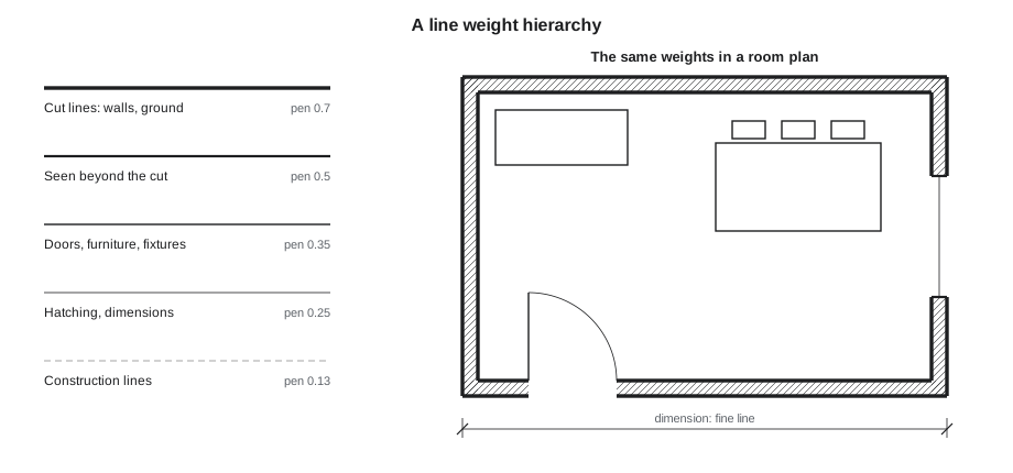
Technical pen sizes follow the ISO line-width series, in which each pen is about 1.4 times the width of the one before it (the square root of two): 0.13, 0.18, 0.25, 0.35, 0.5, 0.7 and 1.0 millimetres. This ratio was chosen so that a drawing reduced from one ISO paper size to the next smaller one keeps the same relationship between its lines. Even if you never touch a technical pen, the same series appears as lineweight settings in drafting software.
Line weight also changes with scale. A wall drawn at a large scale, where it is 20 or 30 millimetres thick on paper, can carry a heavy outline and a fill. At a small scale, where it is a fraction of a millimetre, the wall becomes a single heavy line. The general rule: the smaller the scale, the fewer weights you need and the more you simplify.
# Pick pen widths for a drawing from the ISO series (each about 1.41x the last).
series = [0.13, 0.18, 0.25, 0.35, 0.5, 0.7, 1.0, 1.4]
roles = ["construction", "hatch and dimension", "light (doors, furniture)", "object (seen beyond)", "cut (walls, ground)"]

def weights(scale_denominator):
    # At larger scales (smaller denominator) the whole set moves up one or two steps.
    if scale_denominator <= 20:
        start = 2
    elif scale_denominator <= 50:
        start = 1
    else:
        start = 0
    return {role: series[start + i] for i, role in enumerate(roles)}

for label, d in [('1:20', 20), ('1:50', 50), ('1:100', 100), ('1:200', 200)]:
    w = weights(d)
    print(f"{label:>5}: " + ", ".join(f"{r.split(' ')[0]} {v}" for r, v in w.items()))
print("Ratios between neighbours:", [round(b / a, 2) for a, b in zip(series, series[1:])])1:20: construction 0.25, hatch 0.35, light 0.5, object 0.7, cut 1.0 1:50: construction 0.18, hatch 0.25, light 0.35, object 0.5, cut 0.7 1:100: construction 0.13, hatch 0.18, light 0.25, object 0.35, cut 0.5 1:200: construction 0.13, hatch 0.18, light 0.25, object 0.35, cut 0.5 Ratios between neighbours: [1.38, 1.39, 1.4, 1.43, 1.4, 1.43, 1.4]
The script shows the idea rather than a rule you must obey: as the drawing gets bigger on the page, every line weight moves up a step, so that the cut walls on a 1:20 (1/2 in = 1 ft) drawing are noticeably heavier than on a 1:100 (1/8 in = 1 ft) one. The ratios printed at the end confirm that each pen is about 1.4 times the one before it.
Scale
Buildings are too big to draw full size, so architects draw them at scale: a fixed ratio between the size on paper and the size in reality. In metric practice the scale is written as a ratio, such as 1:100, which means 1 millimetre on paper stands for 100 millimetres in the building, so 1 centimetre on paper is 1 metre. The preferred metric scales come from the ISO series: 1:1, 1:2, 1:5, 1:10, 1:20, 1:50, 1:100, 1:200, 1:500 and 1:1000.
| Drawing | Typical scale | What it shows |
|---|---|---|
| Site plan | 1:500 or 1:200 (1 in = 40 ft or 1 in = 20 ft) | Building footprint, property lines, landscape, access |
| Floor plans | 1:100 or 1:50 (1/8 in or 1/4 in = 1 ft) | Rooms, walls, doors, windows, stairs, main dimensions |
| Building sections and elevations | 1:100 or 1:50 (1/8 in or 1/4 in = 1 ft) | Heights, floor levels, roof, openings |
| Wall sections | 1:20 (3/4 in or 1 in = 1 ft) | Layers of the wall, floor and roof |
| Details | 1:10 or 1:5 (1-1/2 in or 3 in = 1 ft) | How materials meet: a window head, a stair nosing |
Every drawing carries its scale, and because drawings are often printed at a different size from the one they were drawn for, it should also carry a graphic scale bar. A scale bar stays correct when the sheet is reduced; a written scale does not. A drawing marked 1:100 (1/8 in = 1 ft) but printed at half size is now really 1:200 (1/16 in = 1 ft), and anyone measuring it with a scale rule will get every dimension wrong unless the bar is there to warn them.
Symbols and annotation
Drawings use a small set of standard symbols so that they can refer to each other.
- North arrow: on every plan, usually pointing up or close to it. True north and project north (a rotated north used to keep the building square on the sheet) are sometimes both shown.
- Section marker: a line across a plan with arrows or flags at its ends, showing where a section is cut and which way you look. A bubble at the end gives the section's number and the sheet where it is drawn, such as 2 over A-301.
- Elevation marker: a circle or triangle pointing at a wall, with a number and sheet reference, showing where an elevation is drawn.
- Detail callout: a circle or cloud around an area, with a bubble linking it to an enlarged detail.
- Grid lines: structural column lines with lettered and numbered bubbles at the ends.
- Level marker: a symbol on sections and elevations giving the height of a floor, ceiling or roof, such as 100.000 or +3.000.
- Door and window tags: small symbols with numbers that key each door or window to a schedule.
Lettering should be plain and uniform. Hand lettering in architecture is traditionally all capitals, with guide lines drawn faintly so that letters stay the same height, about 3 millimetres (1/8 inch) for notes and larger for titles. Digital lettering uses a simple sans-serif typeface. Notes should be short, consistent and placed so that the leader line (the line from the note to the thing it describes) is short and does not cross other lines.
Dimensions
Dimensions tell the builder exact sizes. A dimension has four parts: extension lines that come out from the object (with a small gap so they do not touch it), a dimension line between them, terminators at the ends (architects use short slashes or dots rather than the arrowheads engineers use), and the dimension text. In Canada dimensions on building drawings are given in millimetres without the unit, such as 3600, and levels in metres, such as 100.450.
Good practice: dimension in strings, from overall dimensions outside the building to smaller ones closer in; dimension to the structure or to the face of framing, as the office standard says; never make the builder add or subtract to find a dimension they need; and make sure the strings add up. A dimension string that does not add up is a classic error that causes real problems on site.
# Check that a dimension string adds up to its overall dimension.
overall = 9600
string = [450, 2400, 900, 1800, 900, 2700, 450]
total = sum(string)
print("Pieces:", " + ".join(str(x) for x in string), "=", total, "mm")
if abs(total - overall) < 1:
    print("OK: the string matches the overall dimension of", overall, "mm.")
else:
print("ERROR: the string is off by", round(total - overall, 3), "mm. Fix it before issuing the drawing.")Pieces: 450 + 2400 + 900 + 1800 + 900 + 2700 + 450 = 9600 mm OK: the string matches the overall dimension of 9600 mm.
The sheet and the title block
Architectural drawings are issued as sheets of standard sizes. Canadian practice uses the ISO A series (A0 is 841 by 1189 millimetres, A1 is 594 by 841, A3 is 297 by 420), and many offices also use ANSI or ARCH sizes for clients who ask for them. Each sheet has a border and a title block, usually along the right side or bottom.
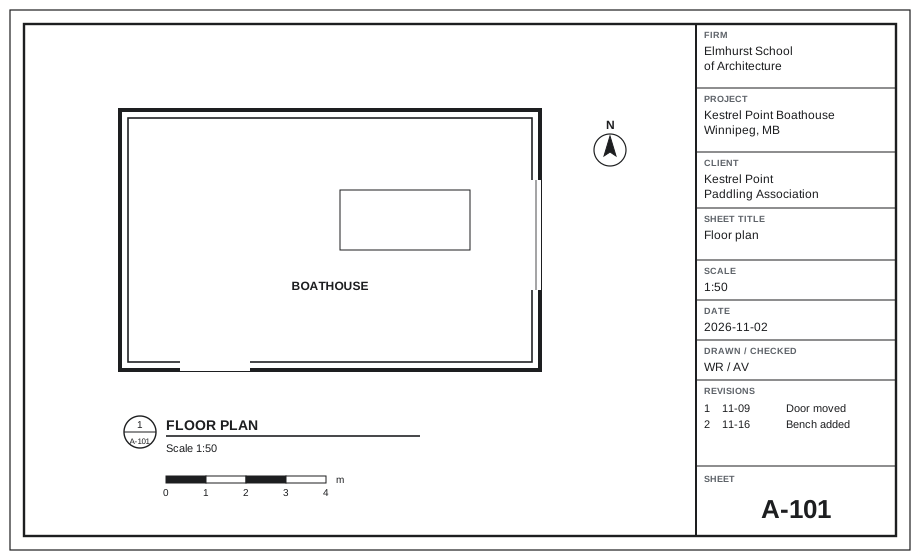
The title block identifies the firm and the project, gives the sheet title and number, lists who drew and checked it, and records revisions with dates. Sheet numbers follow a pattern by discipline, so that A means architectural, S structural, M mechanical, E electrical and so on, followed by a number grouping the sheet's content: for example 100s for plans, 200s for elevations, 300s for sections and 500s for details. You will meet a fuller treatment of sets of drawings in the course on construction documents; for now, put a simple title block on every drawing you hand in, with your name, the project, the drawing title, the scale, a north arrow where relevant and the date.
Worked problem
Laying out a title block for studio
Callum is preparing his first studio sheet: a plan and two sections of the boathouse at Kestrel Point on a 594 by 841 mm (A1) sheet, landscape. He wants a title block 60 mm wide on the right and a 15 mm border. How much width is left for drawings, and will the 9.6 m long plan fit at 1:50 (1/4 in = 1 ft)?
Show solution
- Sheet width 841 mm. Subtract two borders (30 mm) and the title block (60 mm): 751 mm left.
- The plan at 1:50 is 9600 ÷ 50 = 192 mm long.
- Two sections side by side add similar widths, so the three drawings need about 3 × 192 = 576 mm plus gaps.
- That fits with room for titles and notes.
Answer: The plan fits comfortably. Always do this arithmetic before you start drawing; redrawing because a plan runs off the sheet is a painful way to learn it.
Exercise 1: one plan, three ways
This exercise takes about four hours.
- Trace or draw the plan of a small room you know well (your bedroom, a studio corner, a café) at 1:50 (1/4 in = 1 ft).
- Draw it three times on one sheet: first with a single fine line throughout; then with two weights (walls heavy, everything else light); then with four weights and a solid fill in the cut walls.
- Add a north arrow, a graphic scale bar, one dimension string that adds up, and a simple title block.
- Deliverable: the sheet, plus three sentences describing what changed in the way the drawing reads.
Self-critique checklist
- Can someone else tell at once which lines are cut and which are seen beyond?
- Are dashed lines used only for things that are hidden, above or beyond?
- Does every drawing have a title, a scale and a scale bar?
- Do my dimension strings add up to the overall dimension?
- Is my lettering even in height and easy to read?
Common mistakes
MistakeDrawing every line with the same pen or the same lineweight setting.
InsteadUse at least three weights: cut, seen beyond and texture.
MistakeWriting only a scale such as 1:100 (1/8 in = 1 ft) on a drawing that may be printed at another size.
InsteadAdd a graphic scale bar, which stays correct when the drawing is reduced.
MistakeDimension strings that do not add up, or leave the builder to calculate a dimension.
InsteadCheck every string and give the dimensions the builder actually needs.
MistakeLong leader lines crossing the drawing.
InsteadPlace notes close to what they describe and keep leaders short and clear.
Summary and key terms
- Drawing conventions let many people read drawings reliably; consistency within a set matters most.
- Line types carry meaning: continuous for visible edges, dashed for hidden or above, centre lines for axes and grids.
- Line weight builds a hierarchy: cut lines heaviest, objects seen beyond medium, texture and dimensions lightest.
- Every drawing needs a title, a scale and a graphic scale bar; plans need a north arrow.
- Dimension strings must add up, and sheets carry a title block identifying the project, sheet and revisions.
- Line weight
- The thickness and darkness of a line, used to show importance and depth.
- Cut line
- The heaviest line in a plan or section, drawn where the cutting plane slices through material.
- Scale
- The fixed ratio between the size of something on a drawing and its real size.
- Graphic scale bar
- A drawn bar showing lengths at the drawing scale, which stays correct when the drawing is resized.
- Title block
- The area of a sheet that identifies the firm, project, sheet title and number, scale and revisions.
- Section marker
- A symbol on a plan showing where a section is cut and where it is drawn.
Practice problems
Work each problem on paper first, then reveal the answer to check.
What does a dashed line usually mean on a floor plan?
Show answer
Something hidden or above the cutting plane, such as a beam, a cabinet above or a roof edge overhead.
Which lines in a section are drawn heaviest?
Show answer
The lines where the cutting plane passes through material: walls, floors, roof and ground.
A drawing at 1:100 (1/8 in = 1 ft) is printed at half size. What is its scale now?
Show answer
1:200 (1/16 in = 1 ft). A graphic scale bar shows this automatically.
By about what factor does each pen width in the ISO series increase?
Show answer
About 1.41, the square root of two.
What does a sheet number such as A-301 usually tell you?
Show answer
That it is an architectural sheet in the 300s, which usually holds sections.
Lesson quiz · 5 questions
Score 60% or more to complete this lesson.
Create a free account to save your progress, take quizzes and earn a certificate.