
ARCH-300 · Lesson 8 of 12 · 22 min
Facade design
By week eight, every student has a massing, a ground floor and a typical residential plan, and every one of them has drawn the avenue facade the same way: a grid of identical windows marching 130 ft from the Harland Building to the corner. Adeyemi pins the four elevations next to a photograph of the warehouse block across the avenue, and next to that a photograph of a recent condominium on the edge of downtown, all glass and spandrel panels. 'The block across the street is four buildings by four architects over thirty years, and it looks like a family,' she says. 'The condominium is one building by one architect, and it looks like a spreadsheet. You have one building. Make it look like it belongs to the family, without pretending to be a hundred years old.' This lesson is about facade design for an urban building.
What a facade does
A facade is the building's face to the city, but it is also a working wall. It must keep out rain, wind and snow, insulate against the cold and the heat, let in daylight and views without overheating or losing too much heat, control noise from the street, resist fire spread between floors and to neighbors, and last for decades with modest maintenance. ARCH-130 introduced the layers of the building envelope; the envelope course next term will go deeper. This lesson concentrates on the facade's design: its composition, rhythm, proportions, depth and materials, and how these relate to the street and the context.
A facade also expresses what is inside. In the studio building, the ground floor holds shops, the second floor holds the Foundry Collective's workshops and the upper floors hold homes. A facade that treats every floor the same hides those differences; one that shows them makes the building legible, so that passersby understand where the public and private parts are.
Base, middle and top
Historic urban buildings, including the warehouses of the district, were usually composed in three parts, an idea inherited from the classical column with its base, shaft and capital. The base, the ground floor and sometimes the second, was tall, heavily built and open with shopfronts or large openings. The middle, the repeated upper floors, had regular windows in a wall of brick or stone. The top had a cornice, a band of smaller windows, a parapet or a change of material that finished the building against the sky. The tripartite facade is not a rule, but it solves real problems: it relates the building to the pedestrian at the base, to the street as a whole in the middle, and to the skyline at the top.
The studio building's section already suggests three parts: a two-story base of the ground floor and the workshop floor, at about the height of the Coach House; a middle of residential floors rising to about the Harland Building's cornice line at 80 ft; and a stepped-back top. Exactly how many floors belong in the middle and how many in the top is a question the heritage lesson will settle. The facade design can make these parts legible with changes of material, window proportion, depth and detail.
Rhythm and bays
Rhythm is the pattern of repetition along a facade: the spacing of columns, windows, bays and entrances. The warehouses across the avenue have a strong vertical rhythm of bays, each 13 to 20 ft wide, defined by brick piers that run from the base to the cornice, with windows set between them. That rhythm gives the street its scale and makes even large buildings comprehensible. A facade with no rhythm, or with a rhythm unrelated to the structure or the neighbors, can feel arbitrary.
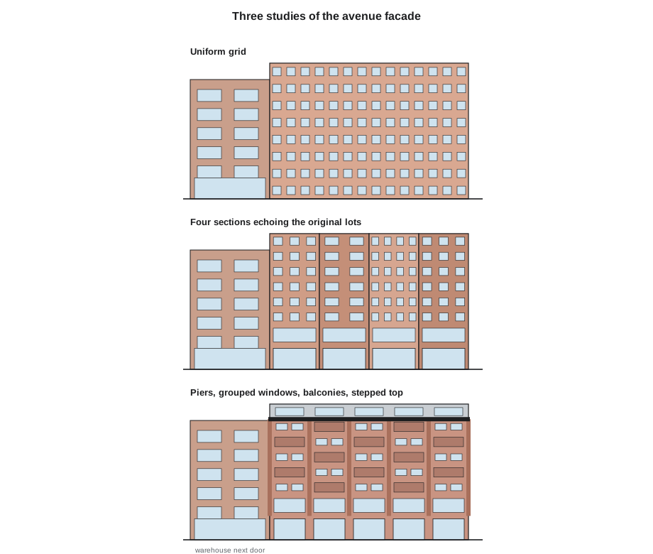
The structural grid of the studio building, at 25 ft, gives a natural primary rhythm. Within each structural bay, the windows of the homes can be grouped in pairs or threes, creating a secondary rhythm. Callum tests three variations: a uniform grid of identical windows; a pattern of bays matching the four original lots of 33 ft, each with a slightly different window arrangement; and a vertical rhythm of piers at the structural grid, with windows grouped between them and recessed balconies in alternating bays.
Proportion and openings
The proportions of windows and of the wall between them strongly affect a facade's character. Historic masonry buildings have vertical windows, taller than wide, set in a wall that is clearly solid; the wall carries the eye. Modern frame buildings can have windows of any shape, and floor-to-ceiling glazing is now common. But a facade that is mostly glass has drawbacks in a northern city: it loses much more heat than an insulated wall, overheats in summer, offers residents little privacy and makes furniture placement hard. Energy codes limit the share of glazing in a wall for these reasons.
# Window-to-wall ratio and heat loss of one structural bay of the residential facade
bay_w, floor_h = 25, 10.5          # width of the bay and floor-to-floor height (ft)
wall = bay_w * floor_h
schemes = {
    # name: list of windows (width, height) in one bay
    "floor-to-ceiling glass": [(23.0, 9.0)],
    "two tall windows": [(5.0, 7.3), (5.0, 7.3)],
    "one window and a balcony door": [(6.5, 5.25), (3.25, 7.5)],
}
u_wall, u_win = 0.037, 0.25          # thermal transmittance of wall and window (Btu/h ft2 F)
dt = 100                            # indoor minus outdoor design temperature difference
for name, wins in schemes.items():
    glass = sum(w * h for w, h in wins)
    wwr = glass / wall
    loss = (u_win * glass + u_wall * (wall - glass)) * dt
    print(f"{name:30s} window-to-wall ratio {wwr:.2f}, design heat loss of the bay {loss:6.0f} Btu/h")
print("studio target: ratio at or below 0.40 for the residential floors")floor-to-ceiling glass window-to-wall ratio 0.79, design heat loss of the bay 5380 Btu/h two tall windows window-to-wall ratio 0.28, design heat loss of the bay 2526 Btu/h one window and a balcony door window-to-wall ratio 0.22, design heat loss of the bay 2217 Btu/h studio target: ratio at or below 0.40 for the residential floors
The floor-to-ceiling scheme has a window-to-wall ratio near 0.8 and loses about twice as much heat as the scheme with two tall windows, which has a ratio of about 0.28. The commercial energy code adopted in Minnesota in 2024, based on ASHRAE 90.1-2019, limits vertical glazing in its prescriptive path to 40 of every 100 units of wall area unless the designer shows compliance another way. Beyond energy, the two-window scheme gives each room a well-proportioned window that frames a view, leaves wall for furniture, and reads from the street as a pattern of openings in a solid wall, like the warehouses next door.
Depth and shadow
Historic facades have depth. Windows are set back in thick masonry walls, piers project from the wall plane, and cornices, sills and lintels cast shadows that change through the day. Many modern facades are flat, with windows flush with thin cladding, and look papery in comparison. Depth can be created with recessed windows, projecting frames or fins, recessed or projecting balconies, changes of plane between bays and articulated cornices. Depth also has performance benefits: recessed windows and projecting frames shade south-facing glass in summer, and balconies shelter the windows below.
On the avenue, which faces south, Wren proposes recessing every window 8 in behind the face of the brick and giving the homes recessed balconies in alternating bays. The recesses read as deep shadows from the street, echo the warehouses and shade the glass. On the courtyard side, which faces north, depth matters less for shading and the windows can be larger to capture daylight.
Materials
Material choice is where a new building most directly joins or departs from its context. The district's palette is red and buff brick, limestone and sandstone trim, painted steel and wood windows, and pressed metal cornices. The students consider how the studio building can belong without copying. Options include brick of a similar shade laid in a contemporary bond, terracotta or fiber cement panels in a related tone, metal cladding with a warm finish, or precast concrete with a texture that recalls stone. Each has implications for cost, weight, carbon, durability and the building envelope.
Brick remains a strong choice in a warehouse district: it ages well, is durable in freeze-thaw climates when properly detailed, is easy to repair, and relates directly to the neighbors. On a timber-framed building, brick is usually a veneer, a single layer of brick tied to the structure with an air space behind it, as ARCH-130 showed, and it is supported at each floor or every few floors on steel angles. Those supports can be expressed as horizontal lines on the facade, giving each floor or group of floors a visible base.
Ingrid suggests a different idea for the upper stepped-back floors: a lighter, metal-clad top that reads as a separate element, set behind the brick of the middle, like a contemporary penthouse sitting behind an old cornice. That gives the building a clear top, reduces the weight carried by the facade and lets the two floors have larger windows toward the views.
The base
The base is where the facade meets people. On the studio building, the base is two floors tall: the shopfronts at the ground floor and the Foundry Collective's workshops above. The students design it as a strong frame of brick or precast piers with large openings: clear shopfront glass at the ground floor and large industrial windows on the second, recalling the warehouse loading floors and showing the workshop's activity to the street. A continuous canopy or a sign band marks the top of the ground floor. The base's height, about 30 ft, matches the second-floor sill line of the Harland Building, linking the two.
The corner and the top
The corner, chamfered at the ground floor, needs a response above. The students test continuing the chamfer up the full height, holding a sharp corner above a chamfered base, and placing corner balconies or a vertical bay window that marks the corner from down the avenue. Callum's version holds the corner with brick piers and puts the largest windows of the building, the living rooms of the corner homes, in the chamfered face, so that the corner glows at night.
The top finishes the building. With the upper floors stepped back, the cornice line of the middle, at the height of the Harland Building's cornice, is the building's strongest horizontal line, and the students give it a projecting band or a change in brick coursing. The metal-clad top floors set behind it and the rooftop mechanical equipment, screened and set back further, complete the silhouette.
Facade and the building envelope
Every facade decision has consequences for the wall behind it. Recessed windows need careful detailing so that water drains away and the insulation and air barrier are continuous around the opening. Balconies that pass through the insulation create thermal bridges that lose heat and can cause condensation; modern detailing uses thermally broken connections or self-supported balconies. Brick veneer needs relieving angles, ties and movement joints. Fire codes may limit combustible cladding and require fire stops at each floor. The students must show a wall section through each facade type by the end of the term.
Worked problem
Composing the avenue facade
Joon-ho's facade has the correct window-to-wall ratio and good materials, but at the midterm review it looks monotonous. How can he compose it so that the long facade relates to the street?
Show solution
- Divide the facade into vertical sections that echo the four original lots, using the structural grid: two bays of 25 ft and a narrower corner bay, for example.
- Vary the window grouping within each section while keeping a common vocabulary of brick, window proportions and sill heights.
- Mark the transition from base to middle with a band at the top of the second floor, aligned with the Harland Building's second-floor sill line.
- Recess the windows and add balconies in alternating bays to create depth and shadow.
- Finish the middle with a cornice band at the Harland Building's cornice height, and set the lighter top floors behind it.
- Test the result in perspective from the sidewalk across the street, where people will actually see it, not only in elevation.
Answer: The facade becomes a family of related parts: one building, but with the rhythm, scale and depth of the street.
Exercise 8: facades
This exercise takes one and a half weeks.
- Draw the avenue and Tessier Street elevations at 1/8 in = 1 ft with the neighboring buildings.
- Calculate the window-to-wall ratio of each facade and of a typical bay.
- Draw a facade bay at 1 in = 2 ft in elevation, section and plan, showing the window recess, balcony and materials.
- Make a physical facade model of one bay at 1 in = 2 ft to study depth and shadow.
- Render the avenue facade in perspective from the far sidewalk, in daylight and at night.
Self-critique checklist
- Does the facade show the base, middle and top, and the uses inside?
- Does its rhythm relate to the structure and to the neighbors?
- Is the window-to-wall ratio reasonable for the climate?
- Does the facade have depth?
Common mistakes
MistakeDrawing a uniform grid of identical windows on a long facade.
InsteadCompose the facade in sections and bays related to the structure and the street.
MistakeUsing floor-to-ceiling glass on every floor in a cold climate.
InsteadKeep the window-to-wall ratio moderate and give rooms well-proportioned windows.
MistakeDesigning a flat facade with no shadow.
InsteadRecess windows and use piers, balconies and bands to create depth.
MistakeCopying the historic buildings' details.
InsteadLearn their proportions, rhythm and materials, then interpret them in a contemporary way.
MistakeStudying the facade only in elevation.
InsteadTest it in perspective from the sidewalk, where people see it.
Summary and key terms
- A facade is the building's face to the city and a working wall that controls weather, energy, light, noise and fire.
- Base, middle and top relate a building to the pedestrian, the street and the skyline.
- Rhythm, proportion and depth give a facade scale and character; they should relate to the structure and the context.
- Energy codes and comfort favor moderate window-to-wall ratios in cold climates.
- Materials link a new building to its context; every facade decision has consequences for the envelope.
- Facade
- The exterior face of a building, especially the face toward a street.
- Tripartite facade
- A facade composed of a base, a middle and a top.
- Rhythm
- The pattern of repetition of elements along a facade.
- Window-to-wall ratio
- The area of windows divided by the gross area of the wall.
- Brick veneer
- A single layer of brick cladding tied to a structural backup wall with an air space between.
- Thermal bridge
- A part of the envelope where heat bypasses the insulation, such as a balcony slab passing through the wall.
Practice problems
Work each problem on paper first, then reveal the answer to check.
A bay 25 ft wide and 10.5 ft tall has two windows of 5 × 7.3 ft. What is its window-to-wall ratio?
Show answer
73 ÷ 262.5 = 0.28.
Why do energy codes limit the window-to-wall ratio?
Show answer
Windows lose much more heat than insulated walls and can overheat buildings in summer.
Name two ways to give a facade depth.
Show answer
Any two of recessed windows, projecting piers or frames, balconies, changes of plane, articulated cornices.
Why might the top floors be clad in a lighter material?
Show answer
To give the building a clear top that reads as separate from the middle, reduce weight and allow larger windows.
Why must balconies be detailed carefully in the envelope?
Show answer
Balcony slabs passing through the insulation create thermal bridges that lose heat and can cause condensation.
Lesson quiz · 5 questions
Score 60% or more to complete this lesson.
Create a free account to save your progress, take quizzes and earn a certificate.