
SLS-254 · Lesson 3 of 12 · 24 min
Product pages that sell
▶ Video coming soon A video version of this lesson is on the way.
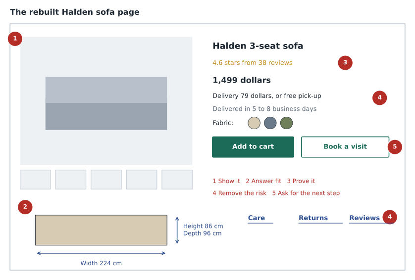
On Wednesday, October 14, 2026, Tessa printed two versions of the same product page and laid them side by side on the desk. Both were for the Halden sofa, a three-seat sofa in performance fabric that Juniper & Pine had carried since spring. The first was the page as it had looked in August: one photo on a white background, a two-line description, the price and an "add to cart" button. The second was the page Tessa had rebuilt in September with Noura Saleh's help: seven photos, including one in a styled living room and one showing the fabric up close, full dimensions with a simple drawing, a fabric care section, delivery costs and dates, the return policy, reviews and a button to book a time to sit on it in the store. "Which one would you buy from?" she asked. Aiden pointed at the second one. "So would almost everyone," Tessa said. "The question is how much better it is, and which parts are doing the work."
A product page is the online equivalent of the conversation an associate has with a shopper at a product. It has to attract attention, answer questions, build trust, handle objections and ask for the next step, all without knowing who is reading. This lesson covers what a good product page contains, how to write and photograph for it, how to make it work for every shopper, and how to test whether a change actually helps.
The jobs of a product page
In SLS-250, Aiden learned to move a floor conversation from greeting to discovery, presentation, objections and close. A product page follows a similar sequence, except that the shopper controls the order. Some scroll straight to the reviews; others look only at the price and the photos. A good page therefore puts the most important information near the top and makes everything else easy to find. Tessa uses a checklist of five jobs.
| Job | What the page needs | The in-store equivalent |
|---|---|---|
| Show the product | Clear photos from several angles, scale, close-ups, video if useful | Letting the shopper see and touch it |
| Answer the fit question | Dimensions, materials, weight, a fit or measuring guide | Asking about the room and the doorway |
| Prove it is good | Reviews, ratings, customer photos, warranty | Telling stories of other customers |
| Remove the risk | Total price, delivery dates and costs, returns, help options | Explaining policies at the counter |
| Ask for the next step | Add to cart, book a visit, order a swatch, chat | Closing or arranging a follow-up |
Photos and video
Photos are usually the first thing shoppers look at and the main thing they remember. For furniture, the minimum set is a clean photo on a plain background, a styled photo in a room, close-ups of the fabric or finish, the legs and any mechanism, a photo with a person or familiar object for scale, and photos of every available colour. A short video of the recliner moving, the sofa bed opening or the dishwasher racks sliding answers questions that photos cannot.
Photos must show the product honestly. A styled room shot lit with warm studio light may make a grey fabric look beige, and a wide-angle lens can make a small sofa look large. If the photo misleads, customers return the product and leave angry reviews, and in both countries a misleading picture can be a misleading representation in law, just like misleading words. Juniper & Pine's rule is that at least one photo for every colour is taken in daylight without colour editing beyond basic correction, and that photos of a product with optional extras, such as a chaise or ottoman, say so clearly.
Writing descriptions that answer questions
Most product descriptions in furniture stores are copied from the supplier's catalogue and full of words like "elegant", "luxurious" and "timeless". Those words fill space without answering a single question. Tessa's rule for writing descriptions is the same as Bev's rule for the floor: turn features into benefits for a specific person, and give facts a shopper can check. "Performance fabric" is a feature. "Spills bead up so you can blot them before they soak in, and the cushion covers can be spot cleaned with mild soap and water" is a benefit backed by a checkable claim.
Good descriptions start with who the product is for and the one or two reasons to choose it, then give the facts in a scannable list. They use the words customers use; Tessa checks what people type into the site search and what they ask in chat. They are honest about limits: a sofa with a 46 cm deep seat is comfortable for most people but too deep for some shorter people, and saying so prevents returns. And they avoid claims the store cannot support. "The most comfortable sofa in Regina" is unprovable; "rated 4.6 out of 5 by 38 verified buyers" is checkable.
Any claim on a product page is advertising. Under the Competition Act, a representation to the public that is false or misleading in a material respect is prohibited, and performance claims, such as "stain-proof" or "lasts 20 years", must be based on an adequate and proper test done before the claim is made. Environmental claims about products must be backed by internationally recognized methods since the 2024 amendments.
Answering the fit question
The most common reason furniture comes back is that it does not fit: the room, the doorway, the stairs or the life of the customer. SLS-250 showed Aiden measuring a doorway on the floor. On a product page the same job is done with dimensions and a measuring guide. Juniper & Pine's rebuilt pages show overall width, depth and height, seat height and depth, the diagonal depth that matters for doorways, the packaged size and the weight, along with a short guide to measuring doorways, hallways and stairs.
Worked problem
Will it fit through the doorway?
A customer emails about the Halden sofa, which is 224 cm wide, 96 cm deep and 86 cm high, with a diagonal depth of 84 cm. Her apartment door opening is 80 cm wide and 203 cm high, and the hallway beyond is straight. Can the sofa go through the door?
Show solution
- A sofa can usually be turned on its back or side and carried through with the depth or height across the opening. Compare the smallest dimension with the door width:
- \[\text{height } 86 \text{ cm} > 80 \text{ cm}, \quad \text{depth } 96 \text{ cm} > 80 \text{ cm}\]
- Neither fits flat, so check the diagonal depth, the measurement that matters when the sofa is tilted through on its back:
- \[\text{diagonal } 84 \text{ cm} > 80 \text{ cm}\]
- The legs unscrew, which takes 10 cm off the height, but the diagonal still does not clear the opening without removing the door.
Answer: Not as built. Removing the door from its hinges usually adds about 4 to 5 cm, which might just be enough, but the safer answer is the Halden with the bolt-on arms, which reduces the carrying size, or the apartment-size version. Saying this before the sale saves a failed delivery.
Price, delivery and returns on the page
Lesson 2 showed that surprise costs are the biggest reason for abandoned checkouts. The product page is where to prevent them. The rebuilt Halden page shows the price, the delivery charge in a separate line, the free pick-up option and an estimated delivery date based on the shopper's postal code. It links the 30-day return policy and explains the store's protection plan in two sentences. Financing appears as an option with the total cost of credit, not just a small monthly payment.
Mandatory fees must be in the price shown, but optional delivery can appear as a separate line as long as it is clear before the customer pays. Under The Consumer Protection and Business Practices Act, Saskatchewan internet sellers must also disclose, before the contract is made, details such as the total price, delivery arrangements, and cancellation, return and refund policies, and give the customer a chance to accept or decline. Lesson 6 covers what happens after the order.
Making the page work for everyone
About one adult in four in Canada and the United States reports a disability. Some shoppers use screen readers that read the page aloud, some cannot use a mouse, some enlarge text or need strong colour contrast, and some find long, complex pages hard to follow. A page that excludes them loses customers and, in some cases, breaks the law.
The usual standard for accessible websites is the Web Content Accessibility Guidelines (WCAG) published by the World Wide Web Consortium. Level AA of version 2.1 or 2.2 is the level most laws, policies and settlements refer to. In practice, for a product page, it means every product photo has alt text that describes it, text has enough contrast with its background, every button can be reached and used with a keyboard, form fields have labels, error messages say what went wrong, colour is never the only way information is shown, and videos have captions.
In Canada, the Accessible Canada Act and its digital technology standard apply to the federal government and federally regulated businesses such as banks and airlines, not to a Saskatchewan furniture store. The Accessible Saskatchewan Act's regulations apply so far to listed public bodies. The Saskatchewan Human Rights Code still prohibits discrimination in providing services because of disability, including online, so a store that refuses reasonable help to a shopper who cannot use its website takes a legal risk. Following WCAG 2.1 AA is the practical way to stay clear of that risk.
Worked problem
Checking photo alt text
Tessa audits 120 product pages. She finds that 312 of the 744 product photos have no alt text and another 96 have alt text that just repeats the file name, such as "IMG_4471". What share of photos need new alt text?
Show solution
- Photos needing work:
- \[312 + 96 = 408\]
- Share of all photos:
- \[408 \div 744 \approx 0.548\]
Answer: About 55 in 100 photos need new alt text. At about 2 minutes each, that is roughly 14 hours of work, which Tessa schedules in batches by department, starting with the best-selling pages.
Testing changes with A/B tests
Tessa's question at the start of the session was how much better the rebuilt page was. The way to find out is an A/B test, sometimes called a split test. The website shows the old version (A) to half of the visitors and the new version (B) to the other half, chosen at random, for the same period, and compares results. Because the two groups are random and see the pages at the same time, differences in weather, promotions or season affect both equally. This is the online version of the control groups used for display tests in SLS-251.
Worked problem
Did the new Halden page work?
From September 16 to October 13, the Halden page was split. Version A, the old page, had 4,600 product views and 23 orders. Version B, the new page, had 4,580 views and 32 orders. B also produced 41 "book a visit" requests, against 12 for A. Compare the conversion rates and the lift.
Show solution
- Version A conversion:
- \[23 \div 4{,}600 = 0.005\]
- Version B conversion:
- \[32 \div 4{,}580 \approx 0.00699\]
- Relative lift:
- \[0.00699 \div 0.005 \approx 1.40\]
Answer: Version B converted at about 0.70 in 100 against 0.50 in 100, a lift of about 40 in 100, and it produced more than three times as many store-visit bookings. With only 55 orders in total, the order result could still partly be chance, so Tessa kept the test running for another month before rolling the design out to every sofa page; the visit bookings were already a strong signal.
Small tests have small samples, and small samples can mislead. A rule of thumb is to decide in advance how long the test will run and what result would count as a win, not to stop it the moment one version pulls ahead. Testing one change at a time, or a clearly defined package of changes, makes it possible to know what made the difference.
Common mistakes
MistakeCopy the supplier's description; it is accurate.
InsteadSupplier copy rarely answers shoppers' questions. Rewrite it around benefits, facts and the words customers use.
MistakeStyled photos are enough.
InsteadShoppers also need plain, honest photos of every colour, close-ups and something for scale.
MistakeDimensions are only for designers.
InsteadFit is the most common reason furniture comes back; show full dimensions, including the diagonal, and a measuring guide.
MistakeAccessibility is only for government websites.
InsteadIt affects a large share of customers and creates legal risk for stores in both countries.
MistakeStop an A/B test as soon as the new version is ahead.
InsteadDecide the length and the success measure in advance; early leads are often chance.
Summary and key terms
- A product page has five jobs: show the product, answer the fit question, prove it is good, remove the risk and ask for the next step.
- Photos must be honest as well as attractive, and claims on the page are advertising subject to the law.
- Good descriptions turn features into checkable benefits and use the words customers use.
- Total price, delivery dates and the return policy belong on the product page, not just at checkout.
- Accessible pages, built to WCAG 2.1 AA, serve more customers and reduce legal risk.
- A/B tests compare versions with random visitors at the same time; decide the length and success measure in advance.
- Product page
- The web page that presents one product and invites the shopper to buy it or take a next step.
- Alt text
- A short description of an image that screen readers read aloud.
- WCAG
- The Web Content Accessibility Guidelines, the usual standard for accessible websites.
- Diagonal depth
- The measurement of a sofa from the back top to the front of the seat, used to check doorways.
- A/B test
- A test that shows two versions of a page to randomly split visitors at the same time.
- Lift
- How much better one version performs than another, as a ratio or a share.
Practice problems
Work each problem on paper first, then reveal the answer to check.
Version A of a page has 3,000 views and 15 orders; version B has 3,000 views and 21 orders. What is B's lift?
Show answer
A converts at 0.5 in 100 and B at 0.7 in 100; 0.7 divided by 0.5 is 1.4, a lift of 40 in 100.
Why should at least one photo of each colour be taken without heavy editing?
Show answer
So the colour shown is accurate; misleading photos cause returns and can be misleading advertising.
Rewrite "luxurious performance fabric" as a benefit.
Show answer
For example: "Spills bead up so you can blot them before they soak in."
Name three WCAG checks for a product page.
Show answer
Alt text on photos, enough colour contrast, and buttons that work with a keyboard; captions on videos is another.
Lesson quiz · 5 questions
Score 60% or more to complete this lesson.
Create a free account to save your progress, take quizzes and earn a certificate.