
CMPUT-421 · Lesson 8 of 12 · 33 min
Usability evaluation without users: heuristics and walkthroughs
Evaluation is the third part of the human-centred design cycle, and it comes in two broad kinds: empirical methods, which observe real users (lesson 9), and inspection methods, in which evaluators examine an interface and judge it against principles or a model of how users will think. Inspection methods are cheaper and faster, need no recruitment, and can be used on sketches and specifications as well as running systems. They also miss problems that only real users reveal and report some problems that real users never have. This lesson covers the two most widely used inspection methods, heuristic evaluation and the cognitive walkthrough, along with how to rate and aggregate their findings, how many evaluators to use, and what automated checks can and cannot contribute.
Heuristic evaluation
Heuristic evaluation, introduced by Jakob Nielsen and Rolf Molich in 1990, has a small number of evaluators examine an interface independently and judge its compliance with a set of usability principles, the heuristics. Nielsen's ten heuristics from lesson 4 are the usual set, but domain-specific sets exist for games, medical devices, mobile apps, voice interfaces and accessibility. The method was deliberately designed to be 'discount usability': cheap, quick and learnable enough to be used in real projects.
A typical heuristic evaluation proceeds in stages. In a briefing, the evaluators learn the domain, the intended users and the tasks, and receive the list of heuristics. Each evaluator then inspects the interface alone, usually in two passes: a first to get a feel for the flow and scope, and a second to examine each element and step in detail. For each problem, the evaluator records a description, the heuristic or heuristics violated, where it occurs and why it is a problem. Independence matters: evaluators who work together converge on the same problems and find fewer overall. After the individual sessions, the findings are merged into a single list with duplicates combined, each evaluator rates the severity of every problem on the merged list, and the team discusses fixes in a debriefing.
Nielsen's severity scale has five points: 0, not a usability problem; 1, cosmetic only, fix if time allows; 2, minor, low priority; 3, major, important to fix; 4, usability catastrophe, imperative to fix before release. Severity combines three factors: frequency (how many users will encounter it), impact (how hard it is to overcome) and persistence (whether users can learn to work around it or will be bothered repeatedly). Individual severity ratings are unreliable, so averaging ratings from several evaluators is recommended; three to five evaluators give reasonably stable means.
How many evaluators?
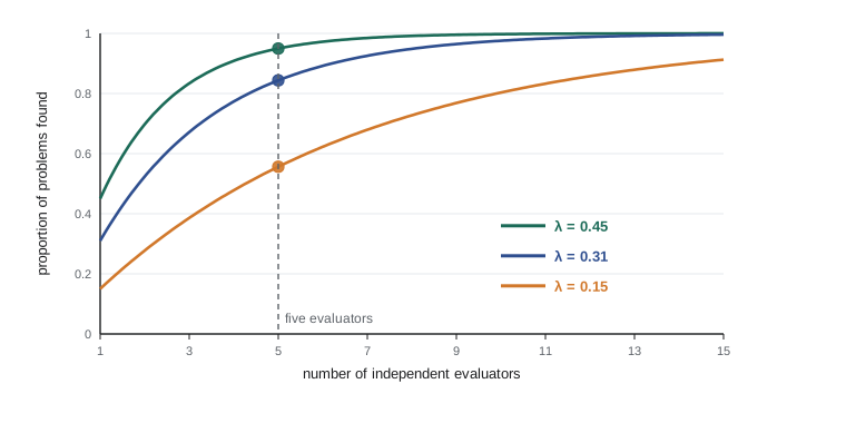
Single evaluators find only a minority of the problems in an interface; in Nielsen's studies, individual evaluators found on average about a third of the known problems, with usability specialists doing better than novices and 'double experts', who know both usability and the domain, doing best. Different evaluators find different problems, so aggregating several evaluators raises coverage quickly. Nielsen and Thomas Landauer (1993) modelled the number of problems found by i independent evaluators as
where N is the total number of problems and \(\lambda\) the proportion found by a single evaluator. With \(\lambda = 0.31\), five evaluators find about 84 per cent of the problems, and the curve flattens beyond that. Nielsen therefore recommended three to five evaluators as a cost-effective compromise. The same model, applied to users in a usability test, underlies the famous 'five users' claim discussed in lesson 9, and the same caveats apply: \(\lambda\) varies enormously between interfaces, evaluators and problems, and rare problems are found far less often than the average suggests.
The program below aggregates an invented heuristic evaluation of RideLine's old fare flow by five evaluators. It shows each evaluator's coverage, the average coverage of every combination of k evaluators, and the problems ranked by mean severity.
# Aggregating a heuristic evaluation of the RideLine fare flow: 5 evaluators, 12 problems.
# Each evaluator found some problems and rated severity (0 = not a problem ... 4 = catastrophe)
# after the merged list was circulated. Invented data.
import itertools, statistics as st
found = {   # evaluator -> problems found independently
    "E1": {1, 2, 4, 7, 9},       "E2": {1, 3, 4, 8},          "E3": {2, 4, 5, 10, 11},
    "E4": {1, 4, 6, 9, 12},      "E5": {3, 4, 7, 11},
}
severity = {  # problem -> ratings from all five evaluators on the merged list
    1: [4, 3, 4, 4, 3], 2: [2, 2, 3, 2, 2], 3: [3, 3, 2, 3, 4], 4: [4, 4, 4, 3, 4],
    5: [1, 1, 2, 1, 1], 6: [2, 3, 2, 2, 3], 7: [3, 2, 3, 3, 3], 8: [1, 0, 1, 1, 2],
    9: [3, 3, 4, 3, 3], 10: [2, 1, 2, 2, 1], 11: [2, 2, 2, 3, 2], 12: [3, 4, 3, 3, 4],
}
heur = {1: "H3 control", 2: "H2 match", 3: "H9 errors", 4: "H5 prevention", 5: "H8 minimalist", 6: "H6 recognition",
        7: "H1 status", 8: "H4 consistency", 9: "H5 prevention", 10: "H8 minimalist", 11: "H4 consistency", 12: "H3 control"}
N = len(severity)
print("share of the 12 problems found by each evaluator:",
      ", ".join(f"{e} {len(s) / N:.0%}" for e, s in found.items()))
for k in range(1, 6):   # average coverage over all combinations of k evaluators
    cov = st.mean(len(set().union(*c)) / N for c in itertools.combinations(found.values(), k))
    print(f"  {k} evaluator(s): mean share found {cov:.0%}")
ranked = sorted(severity, key=lambda p: -st.mean(severity[p]))
print("highest-severity problems (mean rating, heuristic):")
for p in ranked[:5]:
print(f" problem {p:2}: {st.mean(severity[p]):.1f} {heur[p]} found by {sum(p in s for s in found.values())} evaluator(s)")share of the 12 problems found by each evaluator: E1 42%, E2 33%, E3 42%, E4 42%, E5 33% 1 evaluator(s): mean share found 38% 2 evaluator(s): mean share found 62% 3 evaluator(s): mean share found 79% 4 evaluator(s): mean share found 92% 5 evaluator(s): mean share found 100% highest-severity problems (mean rating, heuristic): problem 4: 3.8 H5 prevention found by 5 evaluator(s) problem 1: 3.6 H3 control found by 3 evaluator(s) problem 12: 3.4 H3 control found by 1 evaluator(s) problem 9: 3.2 H5 prevention found by 2 evaluator(s) problem 3: 3.0 H9 errors found by 2 evaluator(s)
Each evaluator found between a third and just over two fifths of the twelve problems, consistent with Nielsen's figures, and the union of all five found all twelve by construction. Coverage rises steeply from one to three evaluators and then more slowly. The severity ranking puts the missing cancel action on the payment screen (user control and freedom) and the absence of a warning when a fare does not cover the planned trip (error prevention) at the top. Note that problem 4, found by every evaluator, is also rated most severe, while problem 12, rated third most severe once everyone saw it on the merged list, was found by only one evaluator: an inability to undo adding a pass to the phone wallet that only the evaluator who tried that path noticed. Evident problems tend to be found by everyone; serious but less visible ones may be found by one person and are easy to lose, which is why independent inspection, aggregation and rating of the merged list all matter.
Writing up findings
A useful heuristic evaluation report is short and actionable. For each problem it gives a concise title, a description with a screenshot or location, the heuristics violated, the mean severity, and a recommendation. It groups or ranks problems so that the team fixes the most severe first, and it notes positive findings, which protects good design from being changed carelessly. Language matters: 'The payment screen has no cancel action, so riders who change their mind must pay or close the app (H3 user control and freedom, severity 3.6). Add a cancel action that returns to the fare list without losing the selection' is far more useful than 'Payment flow is confusing'.
The cognitive walkthrough
The cognitive walkthrough, developed by Peter Polson, Clayton Lewis, John Rieman and Cathleen Wharton in the early 1990s, evaluates how easily new or occasional users can learn to use an interface by exploration. It is grounded in a theory of exploratory learning: users approach a task with a goal and try actions that seem to make progress toward it. Evaluators, often the designers themselves, step through a specific task one action at a time and, for each step of the correct action sequence, answer four questions from the user's point of view. Will the user try to achieve the right effect? (Do they know this step is needed?) Will the user notice that the correct action is available? Will the user associate the correct action with the effect they are trying to achieve? If the correct action is performed, will the user see that progress is being made toward the goal?
For each 'no', the evaluators write a failure story explaining why a user would get stuck, which becomes a problem report. Rick Spencer's streamlined cognitive walkthrough (2000), developed at Microsoft to fit busy teams, reduces the questions to two: will the user know what to do at this step, and if the user does the right thing, will they know they did the right thing and are making progress? It also sets ground rules that keep sessions from turning into design debates.
Consider Daniel, the visitor persona, buying a fare in the old RideLine app. Step 1, tap 'Fares' in the menu: will he try to achieve the right effect? Yes, he wants a ticket. Will he notice the action? Perhaps not, because 'Fares' is hidden in a menu behind an icon with no label. Step 3, select zone: will he try to achieve the right effect? No: he does not know that a zone choice is required or what it means, and nothing tells him which zone his destination is in. That failure story, written before any user test, predicted the abandonment that analytics later showed. The walkthrough's strength is this focus on learnability for a specific user and task; its weakness is narrowness, since it examines only the tasks and paths chosen and says little about efficiency for experts or consistency across the product.
| Aspect | Heuristic evaluation | Cognitive walkthrough |
|---|---|---|
| Focus | Broad compliance with principles | Learnability of specific tasks by exploration |
| Evaluators | 3–5, ideally usability specialists, working independently | Designers or a small group, working together |
| Input | An interface (or prototype) and a heuristic list | An interface, a user description and correct action sequences for chosen tasks |
| Output | List of problems with heuristics and severity ratings | Failure stories for steps where users would get stuck |
| Strengths | Cheap, fast, broad coverage | Grounded in a model of learning; good for walk-up-and-use systems |
| Weaknesses | Misses context-dependent problems; reports some false alarms | Narrow; time-consuming for long tasks; ignores expert efficiency |
Other inspection methods
Several other inspection methods are in use. Pluralistic walkthroughs bring users, developers and usability specialists together to step through a scenario, each writing down their actions before discussion. Consistency inspections compare an interface against a design system or across products. Standards inspections check compliance with guidelines such as platform rules or WCAG. Expert reviews are less structured inspections by experienced practitioners, often combining heuristics with domain knowledge. GOMS and KLM analyses (lesson 3) are inspection methods for efficiency. Accessibility expert reviews, checking an interface with a screen reader, keyboard only and zoom, are essential and are described in lesson 10.
Automated evaluation
Some checks can be automated. Accessibility checkers such as axe-core, WAVE, Lighthouse and the browser developer tools test machine-checkable WCAG criteria: missing alternative text, insufficient contrast, missing form labels, invalid ARIA, missing document language. Linters can enforce design-system usage. Crawlers can build navigation graphs and find dead ends, as the state-machine example in lesson 4 did by hand. Telemetry can flag rage clicks (rapid repeated clicks on an unresponsive element) and dead clicks. Automated tools are fast and repeatable and belong in continuous integration pipelines, but they find only a fraction of problems: Deque, the company behind axe, reported in 2021 that automated tests caught about 57 per cent of the issues, by volume, in its large set of audits, but many WCAG success criteria require human judgement (is this alternative text meaningful? is the focus order logical?), and no tool can tell whether users understand the fare system.
Inspection versus testing
Inspection and user testing find overlapping but different problems. Comparative studies in the 1990s, including Robin Jeffries and colleagues (1991), found that heuristic evaluation by specialists found many problems cheaply, including serious ones, while user testing found fewer problems at higher cost but the problems it found were real by definition. Inspections also produce false alarms: problems that evaluators predict but users never encounter. Rolf Molich's comparative usability evaluation studies, in which many professional teams evaluated the same website, found strikingly little overlap among the problems different teams reported, a reminder that every method samples problems and none finds them all. The practical conclusion is to use inspections early and often, especially before user tests so that the tests are not wasted on obvious problems, and to confirm important findings with users.
Worked examples
Worked problem
Nielsen–Landauer prediction
If each evaluator finds 25 per cent of problems on average, how many evaluators are needed to find at least 75 per cent?
Show solution
- Require \(1 - 0.75^i \ge 0.75\), so \(0.75^i \le 0.25\).
- \(i \ge \ln 0.25 / \ln 0.75 \approx 4.82\).
- So 5 evaluators (\(1 - 0.75^5 \approx 0.76\)).
Answer: Five evaluators, under the model's assumption that all problems are equally likely to be found.
Worked problem
Rating severity
A problem: the "Buy" button on the fare screen is below the fold on small phones, and 40 per cent of riders in analytics never scroll. Once found, riders remember where it is. Rate frequency, impact and persistence, and suggest a severity.
Show solution
- Frequency: high, since many riders use small phones and do not scroll.
- Impact: high for those riders, who cannot complete the purchase without discovering the button.
- Persistence: low, because once found it is remembered.
- Overall a major problem: severity 3, with a fix of keeping the primary action visible (a sticky bottom button).
Answer: Severity about 3 (major): frequent and blocking at first, though not persistent.
Worked problem
A walkthrough step
Apply Spencer's two questions to the step "tap the wallet icon to show your pass to the driver" for Gerald, a screen reader user.
Show solution
- Will Gerald know what to do? Only if the icon has an accessible name such as "Wallet, 1 active pass"; an unlabelled icon is announced as "button" and gives no clue.
- If he taps it, will he know he did the right thing? Only if the pass screen announces its title and validity, for example "Day pass, valid until 23:59".
- Failure story: with the current unlabelled icon and no announcement, Gerald cannot find or confirm his pass.
Answer: The step fails both questions for a screen reader user unless the icon is labelled and the result announced.
Common mistakes
MistakeHave the evaluators inspect together to save time.
InsteadIndependent evaluation finds more distinct problems; merge findings afterwards.
MistakeOne expert reviewer is enough.
InsteadSingle evaluators find roughly a third of problems; use three to five.
MistakeTreat every predicted problem as real.
InsteadInspections produce false alarms; prioritize by severity and confirm important findings with users.
MistakeA clean report from an automated accessibility checker means the site is accessible.
InsteadMany WCAG criteria need human judgement and testing with assistive technologies.
MistakeUse a cognitive walkthrough to judge expert efficiency.
InsteadIt targets learnability by exploration; use KLM or testing with experienced users for efficiency.
Summary and key terms
- Inspection methods evaluate interfaces without users; they are cheap and early but produce false alarms and miss some problems.
- Heuristic evaluation uses 3–5 independent evaluators who judge an interface against heuristics, then merge findings and rate severity on a 0–4 scale.
- Severity combines frequency, impact and persistence; average ratings from several evaluators.
- The Nielsen–Landauer model Found(i) = N(1 − (1 − λ)^i) explains diminishing returns from adding evaluators.
- The cognitive walkthrough steps through specific tasks asking whether a new user would know what to do and see progress.
- Automated tools catch machine-checkable issues and belong in continuous integration, but cannot judge meaning or understanding.
- Inspection and user testing find different problems; use inspections early and confirm key findings with users.
- Inspection method
- An evaluation in which evaluators examine an interface without observing users.
- Heuristic evaluation
- An inspection in which evaluators judge an interface against a list of usability principles.
- Severity rating
- A judgement of a problem's importance, combining frequency, impact and persistence.
- Double expert
- An evaluator with expertise in both usability and the application domain.
- Cognitive walkthrough
- An inspection that steps through tasks asking whether a new user would choose the correct actions and recognize progress.
- Failure story
- In a walkthrough, an explanation of why a user would fail at a step.
- False alarm
- A predicted usability problem that real users do not experience.
- Pluralistic walkthrough
- A walkthrough in which users, developers and usability specialists step through a scenario together.
- Discount usability
- Nielsen's term for cheap, fast usability methods suited to real projects.
- Rage click
- Rapid repeated clicks on an element, often signalling that it does not respond as expected.
Practice problems
Work each problem on paper first, then reveal the answer to check.
Why should heuristic evaluators work independently?
Show answer
Independent evaluators find different problems; working together makes them converge on the same ones.
Give Nielsen's severity scale.
Show answer
0 not a problem, 1 cosmetic, 2 minor, 3 major, 4 catastrophe.
What three factors make up severity?
Show answer
Frequency, impact and persistence.
With λ = 0.31, what share do three evaluators find?
Show answer
1 − 0.69³ ≈ 0.67, about two thirds.
Who are double experts and why are they valuable?
Show answer
Evaluators who know both usability and the domain; they find the most problems.
List the four questions of the cognitive walkthrough.
Show answer
Will the user try to achieve the right effect, notice the action, associate it with the effect, and see progress?
What are Spencer's two streamlined questions?
Show answer
Will the user know what to do, and will they know they did the right thing?
Name two things automated accessibility checkers cannot judge.
Show answer
Whether alternative text is meaningful and whether focus order is logical (also whether content is understandable).
What did Molich's comparative evaluations show?
Show answer
Different professional teams reported strikingly different sets of problems for the same site.
Why run an inspection before a user test?
Show answer
To fix obvious problems cheaply so the test reveals deeper issues.
Lesson quiz · 5 questions
Score 60% or more to complete this lesson.
Create a free account to save your progress, take quizzes and earn a certificate.