
CMPUT-421 · Lesson 7 of 12 · 32 min
Prototyping and iterative design
A prototype is any representation of a design that lets people experience, explore or evaluate it before the real thing is built. Prototyping is the engine of human-centred design: it turns ideas into something concrete enough to test, and it makes iteration cheap enough to do many times. This lesson covers the purposes and fidelities of prototypes, paper and digital prototyping, Wizard of Oz techniques for systems that are hard to build, design systems, the evidence for iterative design, and the visual design and form design knowledge needed to make prototypes, and the products that follow them, clear and usable.
What prototypes are for
Prototypes answer questions, and the question determines the prototype. Stephanie Houde and Charles Hill's classic paper 'What do prototypes prototype?' (1997) distinguishes three kinds of question: role (what the artefact does in a person's life), look and feel (what it is like to see, hear and touch) and implementation (whether it can be built and how it will perform). A paper sketch can explore role; a polished clickable mockup explores look and feel; a technical spike explores implementation. Bill Buxton, in Sketching User Experiences (2007), drew a further distinction between sketches, which are quick, cheap, plentiful and ambiguous, meant to explore and suggest, and prototypes, which are more refined and meant to test and refine a chosen direction. Early in a project the team should sketch many alternatives; it is a common mistake to commit to a single idea and polish it.
Prototypes also vary in breadth and depth. A horizontal prototype shows the breadth of features with little functionality behind them, which is good for testing navigation and information architecture. A vertical prototype implements one feature in depth, which is good for testing a complex interaction such as fare calculation. A T-shaped prototype combines a broad, shallow surface with one deep path. Choosing scope deliberately keeps prototyping cheap.
Fidelity
Fidelity describes how closely a prototype resembles the final product, and it has several dimensions: visual refinement, breadth of features, depth of functionality, richness of interactivity and realism of data. Low-fidelity prototypes, such as paper sketches, sticky notes and simple wireframes, are fast to make, easy to change and invite criticism, because people do not hesitate to suggest changes to something that obviously took ten minutes. High-fidelity prototypes, built in tools such as Figma, Sketch, Adobe XD or directly in code, look and behave like the real product and are needed to evaluate visual design, timing, animation and realistic content, but they take longer, and their polish can discourage fundamental criticism and lead reviewers to comment on colours rather than concepts.
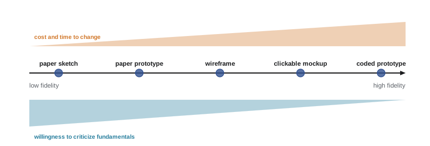
Research comparing low- and high-fidelity prototypes in usability testing, such as studies by Miriam Walker, Leila Takayama and James Landay (2002), found that both uncovered similar numbers and kinds of usability problems for many tasks. The practical rule is to use the lowest fidelity that answers the current question, increasing fidelity as the design converges. A mixed-fidelity prototype can combine a hand-drawn layout with real data, or a realistic screen with placeholder text, depending on what matters.
Paper prototyping
Paper prototyping, described in detail by Carolyn Snyder (2003), uses hand-drawn screens, cut-out widgets and sticky notes that a team member, playing the computer, swaps in response to a participant's actions. A facilitator gives tasks and asks the participant to think aloud, and an observer takes notes. The computer must not explain or help; when the participant taps 'Buy fare', the computer silently places the next screen. Paper prototypes can be changed between sessions, or even during one, which makes iteration extraordinarily fast. Their limits are real: timing, scrolling, gestures, animation and dynamic content are hard to simulate, and they do not work for screen reader users, which is one reason RideLine's team moved to coded prototypes early for accessibility testing.
Digital prototypes and design systems
Digital prototyping tools let designers lay out screens, link them with hotspots, add transitions and share them for remote testing. Components (reusable buttons, cards, list items) with variants and states keep prototypes consistent. Prototyping in code, with HTML and CSS or a front-end framework (CMPUT-404), produces prototypes that work with real data, real devices and assistive technologies, at the price of more effort. Many teams prototype the critical interactions in code and the rest in a design tool.
A design system is a collection of reusable components, patterns, guidelines and design tokens (named values for colours, type sizes, spacing and so on) that a product team shares, often with matching code libraries. Well-known public examples include Google's Material Design, Apple's Human Interface Guidelines, IBM's Carbon, Shopify's Polaris, the United States Web Design System for federal websites and the Government of Canada's Canada.ca design system. Design systems speed up design and development, improve consistency (Nielsen's heuristic 4) and can bake in accessibility, since a well-built button component is accessible everywhere it is used. They can also ossify a product's look and push teams toward existing patterns when a new problem needs a new solution.
Wizard of Oz
Some systems are too costly or uncertain to build just to test whether the idea works: speech interfaces, intelligent assistants, recommender systems, gesture recognition. In a Wizard of Oz study, a hidden human operator, the wizard, simulates the system's intelligence while the participant believes, or at least behaves as if, they are using a working system. John Kelley used the technique in the early 1980s for natural language interfaces, and it was used in a well-known 1984 IBM study of a 'listening typewriter' by John Gould, John Conti and Todd Hovanyecz to learn how people would dictate letters before speech recognition could handle it. For RideLine, a wizard study tested a conversational trip planner: a team member in another room read the participant's typed questions and replied using the real trip planner, revealing what riders asked ('Which bus is least crowded?', 'Will I make my connection if the train is late?') before any language model was integrated. Wizard of Oz studies raise ethical questions about deception, which should be justified and followed by debriefing (lesson 5).
Iterative design
Iterative design means repeating the cycle of design, prototype and evaluate, using what each round reveals to improve the next. Its value is supported by both experience and data. John Gould and Clayton Lewis's 1985 paper 'Designing for usability: key principles and what designers think' set out three principles: early focus on users and tasks, empirical measurement, and iterative design. Jakob Nielsen's 1993 analysis of redesign case studies reported a median improvement in measured usability of about 38 per cent per iteration, with diminishing but continuing gains over several iterations; such figures depend heavily on how bad the starting design was and how improvement is measured, but the direction is consistent. Iteration also allows teams to fix the new problems that fixes introduce, which are common.
Iteration is not aimless trial and error. Each round should have explicit questions, a clear record of design decisions and their rationale, and criteria for when the design is good enough, ideally the measurable user requirements from lesson 6. Design rationale methods, such as Allan MacLean's QOC (questions, options and criteria), record why a design is the way it is, which helps later teams avoid reintroducing problems that were already solved.
Visual design for interfaces
Visual design is not decoration; it organizes information, signals what is interactive and directs attention. A few principles carry most of the weight. Visual hierarchy uses size, weight, contrast, position and space to show what matters most: the next departure time on RideLine's arrivals screen should be the most prominent element. Alignment to a grid creates order and makes grouping (Gestalt proximity and common region) legible. White space separates groups and reduces clutter; it is not wasted space. Contrast between text and background must be sufficient for legibility (WCAG thresholds in lesson 10). Consistency of type, spacing and component styles lets users learn the visual language once.
Typography deserves special attention because interfaces are mostly text. Choose a legible typeface with distinct letterforms (a capital I, lowercase l and digit 1 that differ), generous x-height and good rendering on screens; system fonts such as San Francisco, Roboto and Segoe UI are designed for this. Use a limited type scale, often built from a ratio such as 1.25, so that sizes are distinct and harmonious. Keep body text at least 16 CSS pixels on the web and support users' own text-size settings (Dynamic Type on iOS, font scale on Android); WCAG 1.4.4 requires that text can be resized to 200 per cent without loss of content or function. Keep line length comfortable, roughly 45 to 75 characters, and line height around 1.4 to 1.6 times the font size for body text. Avoid long passages in all capitals, italics and light weights at small sizes.
# Visual design arithmetic for the RideLine redesign: a modular type scale, line length
# checks, and a 4-column mobile grid on an 8-pixel spacing system.
base, ratio = 16, 1.25                         # 16 px body text, "major third" scale
names = ["caption", "body", "subtitle", "title", "headline", "display"]
sizes = {n: round(base * ratio ** (i - 1)) for i, n in enumerate(names)}
print("type scale (px):", sizes)
# average character width for a typical sans-serif is roughly 0.5 em (an approximation)
def chars_per_line(width_px, font_px, avg_em=0.5):
    return int(width_px / (font_px * avg_em))
for label, width in (("phone 360 px, 16 px margins", 360 - 32), ("tablet column 600 px", 600), ("desktop full width 1200 px", 1200)):
    cpl = chars_per_line(width, sizes["body"])
    flag = "ok" if 45 <= cpl <= 75 else ("short" if cpl < 45 else "too long: constrain the column")
    print(f"{label:28} ~{cpl:3} characters per line -> {flag}")
# 4-column grid with 16 px margins and 16 px gutters on a 360 px screen
screen, margin, gutter, cols = 360, 16, 16, 4
col = (screen - 2 * margin - (cols - 1) * gutter) / cols
print(f"column width {col:.0f} px; a 2-column card spans {2 * col + gutter:.0f} px")
spacing = [8 * k for k in (1, 2, 3, 4, 6, 8)]
print("spacing tokens (px):", spacing)type scale (px): {'caption': 13, 'body': 16, 'subtitle': 20, 'title': 25, 'headline': 31, 'display': 39}
phone 360 px, 16 px margins ~ 41 characters per line -> short
tablet column 600 px ~ 75 characters per line -> ok
desktop full width 1200 px ~150 characters per line -> too long: constrain the column
column width 70 px; a 2-column card spans 156 px
spacing tokens (px): [8, 16, 24, 32, 48, 64]The calculations show that 16-pixel body text on a phone gives about 40 characters per line, a little below the usual range; that is normal on narrow screens, and shrinking the text to lengthen lines would be the wrong trade. A 600-pixel column sits at the top of the range, and a full-width desktop layout would produce lines of about 150 characters, far too long to read comfortably, so the text column needs a maximum width. A spacing system based on multiples of 8 pixels, common in design systems, keeps rhythm consistent. These are design tokens in miniature: named, reusable values that keep a prototype and the final product consistent.
Designing forms
Forms are where users give information to systems, and they are a frequent source of errors and abandonment. Research and practice, summarized by Luke Wroblewski in Web Form Design (2008) and by the Baymard Institute's extensive checkout studies, support a set of guidelines. Ask only for what is necessary; every field costs effort and some abandonment. Use a single column in a logical order. Place labels above fields, which supports fast scanning and works on narrow screens, and never use placeholder text as the only label, since it disappears on typing and often has poor contrast. Use the appropriate input type so phones show the right keyboard (numeric for a card number, email for an email address). Mark required or optional fields clearly. Accept input in flexible formats (spaces in a card number, upper or lower case in a postal code) and normalize it rather than rejecting it. Validate inline after the user leaves a field, not on every keystroke, and place error messages next to the field in plain language with a fix. Support autofill and password managers.
Postal codes are a good test of a team's care: Canadian postal codes follow the pattern letter-digit-letter digit-letter-digit, such as K1A 0B1, while US ZIP Codes are five digits, optionally followed by a hyphen and four more; an app used in both countries must accept both and should not demand a 'state' from a Canadian user or a 'province' from an American one. RideLine's account form originally rejected postal codes typed in lowercase or without the space, a small rule that generated a steady stream of support calls.
Worked examples
Worked problem
Choosing fidelity
The RideLine team wants to answer three questions: (a) do riders understand a wallet metaphor for passes? (b) does a new fare-calculation animation feel too slow? (c) can a screen reader user complete the purchase flow? What fidelity suits each?
Show solution
- (a) A conceptual question about role: paper sketches or low-fidelity wireframes with a few riders.
- (b) A look-and-feel question about timing: a high-fidelity prototype with real motion, in a design tool or code.
- (c) An accessibility question: a coded prototype with real semantics, since paper and most design-tool prototypes do not work with screen readers.
Answer: Low fidelity for concepts, high fidelity for timing and visual detail, and coded prototypes for assistive technology.
Worked problem
Type scale
With a base of 16 px and a ratio of 1.25, what are the next three sizes up?
Show solution
- \(16 \times 1.25 = 20\) px.
- \(20 \times 1.25 = 25\) px.
- \(25 \times 1.25 = 31.25 \approx 31\) px.
Answer: 20, 25 and 31 px.
Worked problem
Fixing a form field
A field labelled only by placeholder text "MM/YY" rejects "3/27" and shows the error "Invalid input" at the top of the page. List improvements.
Show solution
- Add a persistent visible label, "Card expiry date (MM/YY)".
- Accept flexible formats such as 3/27, 03/27 and 0327 and normalize them.
- Show the error next to the field in plain language: "Enter the expiry date as month and year, for example 03/27".
- Use a numeric keyboard and support autofill.
Answer: A persistent label, flexible parsing, specific inline errors and appropriate input types.
Common mistakes
MistakePolish one design to high fidelity before testing.
InsteadSketch several alternatives and test low-fidelity versions first; polish discourages fundamental criticism and is costly to change.
MistakePaper prototypes are enough to test accessibility.
InsteadAssistive technologies need real semantics; use coded prototypes for screen reader and keyboard testing.
MistakeUse placeholder text as the field label to save space.
InsteadPlaceholders vanish when typing begins and often have poor contrast; use persistent visible labels.
MistakeWhite space is wasted space on a small screen.
InsteadWhite space groups content and reduces clutter; removing it makes interfaces harder to scan.
MistakeIterate by changing whatever reviewers dislike most.
InsteadEach iteration should address explicit questions with evidence and record the rationale for decisions.
Summary and key terms
- Prototypes answer questions about role, look and feel, or implementation; sketches explore many ideas, prototypes refine chosen ones.
- Fidelity has several dimensions; use the lowest fidelity that answers the current question.
- Paper prototyping is fast and invites criticism but cannot test timing, gestures or assistive technology.
- Design systems provide reusable components and tokens that improve consistency and can build in accessibility.
- Wizard of Oz studies simulate intelligent behaviour with a hidden human to test ideas before building them.
- Iterative design is supported by evidence of substantial usability gains per iteration and should be driven by explicit questions.
- Visual hierarchy, alignment, white space, contrast and a consistent type scale make interfaces legible; forms should ask little, label clearly and validate kindly.
- Prototype
- A representation of a design that lets people experience or evaluate it before it is built.
- Fidelity
- How closely a prototype resembles the final product in appearance, breadth, depth, interactivity and data.
- Horizontal prototype
- A prototype showing many features with little functionality behind them.
- Vertical prototype
- A prototype implementing one feature in depth.
- Paper prototype
- A hand-drawn prototype operated by a person playing the computer.
- Wizard of Oz
- A technique in which a hidden human simulates a system's intelligent behaviour.
- Design system
- A shared collection of components, patterns, guidelines and design tokens.
- Design token
- A named value, such as a type size or spacing unit, used consistently across designs and code.
- Visual hierarchy
- The ordering of elements by visual prominence to show their importance.
- Design rationale
- A record of the questions, options and criteria behind design decisions.
Practice problems
Work each problem on paper first, then reveal the answer to check.
Name Houde and Hill's three prototype questions.
Show answer
Role, look and feel, and implementation.
How does Buxton distinguish sketches from prototypes?
Show answer
Sketches are quick, cheap, plentiful and exploratory; prototypes are refined and used to test a chosen direction.
Why do low-fidelity prototypes invite more fundamental criticism?
Show answer
They look unfinished, so people feel free to question concepts rather than details.
What does the "computer" do in a paper prototype session?
Show answer
Silently swaps screens and widgets in response to the participant's actions without explaining.
Give an example of a question best answered with a Wizard of Oz study.
Show answer
What riders would ask a conversational trip planner before building one.
What median improvement per iteration did Nielsen report?
Show answer
About 38 per cent in measured usability, with diminishing returns.
What line length is commonly recommended for body text?
Show answer
About 45 to 75 characters.
What does WCAG 1.4.4 require?
Show answer
Text can be resized up to 200 per cent without loss of content or functionality.
Why are labels above fields often recommended?
Show answer
They are fast to scan and work on narrow screens.
Give two benefits and one risk of a design system.
Show answer
Consistency and built-in accessibility (and speed); risk of forcing new problems into old patterns.
Lesson quiz · 5 questions
Score 60% or more to complete this lesson.
Create a free account to save your progress, take quizzes and earn a certificate.