
CMPUT-421 · Lesson 10 of 12 · 35 min
Accessibility and inclusive design
Accessibility means that people with disabilities can perceive, understand, navigate and interact with a product, and contribute to it, as effectively as anyone else. It is a legal requirement in many settings, an ethical obligation, and a matter of reaching customers: in the 2022 Canadian Survey on Disability, Statistics Canada reported that 27 per cent of Canadians aged 15 and over, about 8 million people, had one or more disabilities, and the US Centers for Disease Control and Prevention estimates that more than one in four American adults has some type of disability. The World Health Organization estimated in 2023 that about 1.3 billion people, roughly one in six worldwide, experience significant disability. Populations are ageing, and age brings declining vision, hearing, dexterity and memory. Accessibility is not a niche.
CMPUT-404 covered semantic HTML, landmarks, form labels and the basics of WCAG for web developers; ROB-430 applied inclusive design to robots. This lesson takes the HCI view: models of disability, the range of assistive technologies, WCAG 2.2 and its principles in more depth, including the criteria added in 2.2, ARIA and its pitfalls, an accessible design and evaluation process, inclusive design beyond compliance, and the legal frameworks in Canada and the United States.
Models of disability
How a team thinks about disability shapes what it builds. The medical model locates disability in the individual's body or mind, as an impairment to be diagnosed and treated. The social model, developed by disabled activists in the United Kingdom in the 1970s and articulated by Mike Oliver, distinguishes impairment (a characteristic of a person) from disability (the exclusion created by an environment designed without that person in mind): a wheelchair user is disabled by stairs, not by the wheelchair. In the social model, inaccessible software is a barrier the designer created. The World Health Organization's International Classification of Functioning, Disability and Health (2001) combines the two, treating disability as an interaction between health conditions and contextual factors. Disability is also diverse and often invisible: chronic pain, fatigue, mental health conditions, learning disabilities and many sensory and cognitive differences are not apparent to an observer. The disability rights movement's slogan 'Nothing about us without us' is a direct call for participatory design.
Assistive technologies
People with disabilities use a wide range of assistive technologies, and an interface must work with them. Screen readers, such as JAWS and NVDA on Windows, VoiceOver on Apple platforms, TalkBack on Android and Narrator, convert the interface into speech or refreshable braille; their users navigate by headings, landmarks, links, form controls and swipe gestures, relying on the accessibility tree that the platform builds from the interface's semantics. Screen magnifiers and zoom enlarge content, so layouts must reflow without horizontal scrolling (WCAG 1.4.10). Switch access lets people with severe motor impairments operate a device with one or two switches by scanning through options. Voice control, such as Voice Control on iOS and macOS or Voice Access on Android and Windows, lets users speak the visible names of controls, which works only if the accessible name matches the visible label (WCAG 2.5.3). Keyboard-only users, including many with motor impairments and many screen reader users on desktops, need every function to be operable from the keyboard with a visible focus indicator. Captions and transcripts serve deaf and hard-of-hearing users, and sign language interpretation serves Deaf users whose first language is a signed language such as American Sign Language (ASL) or Langue des signes québécoise (LSQ). Cognitive accessibility supports include plain language, consistent layouts, reminders and the absence of time pressure.
WCAG 2.2
The Web Content Accessibility Guidelines, published by the World Wide Web Consortium's Web Accessibility Initiative (W3C WAI), are the global reference standard for digital accessibility. WCAG 2.0 appeared in 2008, 2.1 in 2018 and 2.2 in October 2023. Although written for web content, WCAG is applied to mobile apps, documents and software through guidance such as W3C's WCAG2ICT and standards such as the European EN 301 549, which Canada has adopted as CAN/ASC-EN 301 549:2024.
WCAG is organized around four principles, summarized as POUR. Perceivable: information and interface components must be presentable in ways users can perceive (text alternatives for images, captions for video, sufficient contrast, content that can be presented in different ways without losing meaning). Operable: interface components and navigation must be operable (keyboard access, enough time, no content that causes seizures, navigable structure, input modalities beyond the keyboard). Understandable: information and operation must be understandable (readable text, predictable behaviour, input assistance and error prevention). Robust: content must be robust enough to be interpreted reliably by a wide variety of user agents, including assistive technologies, which mostly means valid, semantic markup with correct names, roles and values. Under the principles are 13 guidelines and, in 2.2, 86 testable success criteria at three conformance levels: A (minimum), AA (the level required by most laws and policies) and AAA (enhanced, not generally required for entire sites).
WCAG 2.2 added nine success criteria, focused on users with cognitive and learning disabilities, low vision and motor impairments, and removed one obsolete criterion (4.1.1 parsing). Among the new ones at levels A and AA: 2.4.11 focus not obscured (the focused element is not entirely hidden by sticky headers or banners); 2.5.7 dragging movements (any drag action has a single-pointer alternative, such as tapping arrows instead of dragging a map); 2.5.8 target size minimum (24 by 24 CSS pixels, lesson 3); 3.2.6 consistent help (help mechanisms appear in the same relative place across pages); 3.3.7 redundant entry (do not make users re-enter information already provided in the same process); and 3.3.8 accessible authentication (minimum) (no cognitive function test, such as remembering a password or solving a puzzle, without an alternative such as a password manager, copy and paste or a passkey).
WCAG 3, a major redesign with a new structure, scoring model and broader scope, remains a Working Draft; the W3C published an updated draft for review in March 2026 and does not expect it to replace WCAG 2 for some years. Laws and procurement standards in force as of October 2026 reference WCAG 2.0, 2.1 or 2.2, so teams should target WCAG 2.2 level AA now.
Contrast
Text must contrast sufficiently with its background. WCAG defines a contrast ratio from the relative luminance L of the lighter and darker colours, \((L_1 + 0.05)/(L_2 + 0.05)\), which ranges from 1:1 (no contrast) to 21:1 (black on white). Success criterion 1.4.3 (level AA) requires at least 4.5:1 for normal text and 3:1 for large text (at least 18 points, or 14 points bold, roughly 24 and 18.7 CSS pixels). Criterion 1.4.11 requires 3:1 for the visual boundaries of interface components, such as input borders and focus indicators, and for meaningful graphics. Relative luminance weights the linearized red, green and blue channels by 0.2126, 0.7152 and 0.0722, reflecting the eye's greater sensitivity to green. The program below checks RideLine's palette.
# WCAG contrast ratio: (L1 + 0.05) / (L2 + 0.05) using relative luminance of sRGB values.
# Check RideLine's palette against AA (4.5:1 normal text, 3:1 large text and UI parts)
# and find the darkest-needed adjustment for a failing brand shade.
def lum(hexcode):
    def ch(c):
        c = int(c, 16) / 255
        return c / 12.92 if c <= 0.04045 else ((c + 0.055) / 1.055) ** 2.4
    r, g, b = (ch(hexcode[i:i + 2]) for i in (1, 3, 5))
    return 0.2126 * r + 0.7152 * g + 0.0722 * b
def ratio(fg, bg):
    a, b = sorted((lum(fg), lum(bg)), reverse=True)
    return (a + 0.05) / (b + 0.05)
pairs = [("body text on white", "#333333", "#ffffff"), ("brand teal link on white", "#2aa198", "#ffffff"),
         ("white on brand teal button", "#ffffff", "#2aa198"), ("light placeholder on white", "#a0a0a0", "#ffffff"),
         ("alert text on pale yellow", "#7a5a00", "#fff4cc"), ("focus ring vs white", "#1a5fb4", "#ffffff")]
for name, fg, bg in pairs:
    r = ratio(fg, bg)
    verdict = "AA text" if r >= 4.5 else ("AA large text / UI only" if r >= 3 else "fails")
    print(f"{name:28} {fg} on {bg}: {r:5.2f}:1  {verdict}")
def darken(hexcode, f):
    return "#" + "".join(f"{int(int(hexcode[i:i + 2], 16) * f):02x}" for i in (1, 3, 5))
f = 1.0
while ratio(darken("#2aa198", f), "#ffffff") < 4.5:
    f -= 0.01
print(f"darken brand teal to {darken('#2aa198', f)} ({ratio(darken('#2aa198', f), '#ffffff'):.2f}:1) for link text")body text on white #333333 on #ffffff: 12.63:1 AA text brand teal link on white #2aa198 on #ffffff: 3.16:1 AA large text / UI only white on brand teal button #ffffff on #2aa198: 3.16:1 AA large text / UI only light placeholder on white #a0a0a0 on #ffffff: 2.61:1 fails alert text on pale yellow #7a5a00 on #fff4cc: 5.79:1 AA text focus ring vs white #1a5fb4 on #ffffff: 6.29:1 AA text darken brand teal to #22847c (4.51:1) for link text
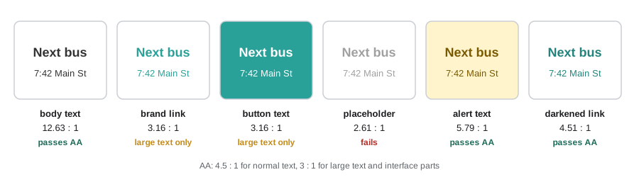
The brand teal passes only for large text and interface components, so links in body text need the darker shade the program finds; the grey placeholder fails outright, another reason not to use placeholders as labels (lesson 7). Contrast is necessary but not sufficient: thin, small type can be hard to read even at 4.5:1, and some users need higher contrast or dark mode, which operating system settings, and CSS media features that report a user's contrast and light or dark preferences, let interfaces respect. A newer contrast method, APCA, which models perceived lightness contrast more accurately and accounts for font size and weight, was explored for WCAG 3 but is not part of WCAG 2.
Semantics and ARIA
Assistive technologies rely on each element's name (what it is called), role (what it is, such as button, link, checkbox or heading), state (checked, expanded, disabled) and value. Native HTML elements and platform controls provide these automatically: a button element is announced as a button, can receive keyboard focus and responds to Enter and Space. Custom controls built from generic elements, such as a div styled to look like a button, provide none of this unless the developer adds it. WAI-ARIA (Accessible Rich Internet Applications) is a set of attributes that supply roles, states and properties for custom widgets and dynamic content, such as role='tab', aria-expanded='true' and aria-live regions for announcements.
The first rule of ARIA, in the W3C's guidance on using ARIA, is not to use ARIA if a native element with the required semantics and behaviour exists. ARIA changes only what is announced, not how the element behaves: adding role='button' to a div does not make it focusable or keyboard operable. WebAIM's annual survey of the home pages of the top one million websites has repeatedly found that pages using ARIA have more detectable accessibility errors on average than pages without it, which reflects misuse rather than ARIA itself. On mobile platforms, the equivalents are the accessibility properties of UIKit and SwiftUI (accessibilityLabel, accessibilityTraits) and of Android views and Jetpack Compose (contentDescription, semantics).
An accessible design and evaluation process
Accessibility is cheapest when designed in from the start and most expensive when retrofitted after an audit or complaint. In design, teams specify heading structure, reading and focus order, accessible names for icons, alternative text for meaningful images, error messages and their association with fields, contrast and target sizes, and behaviour at 200 per cent text size and 400 per cent zoom. Design systems with accessible components (lesson 7) multiply the benefit. In development, semantic markup and native controls do most of the work; automated checks in continuous integration catch regressions (lesson 8).
Evaluation combines automated tools, expert review and testing with disabled users. An expert review covers keyboard-only navigation (can every function be reached and operated, is focus visible and in a logical order, are there keyboard traps?), a screen reader pass on desktop and mobile, zoom and reflow, contrast, captions and media alternatives, forms and error handling, and the new WCAG 2.2 criteria. Testing with disabled participants finds problems that conformance checking misses, such as a technically conformant but bewildering screen reader experience. Recruiting disabled participants takes more time and should be paid fairly; remote testing lets participants use their own configured devices, which is usually essential, since assistive technology users customize settings heavily. Organizations document conformance in an accessibility conformance report, commonly based on the Voluntary Product Accessibility Template (VPAT).
RideLine's accessibility complaint came from Gerald, the screen reader user persona's real counterpart: the old app's arrivals were available only by exploring a map whose pins had no accessible names. The redesign added a list view as the default (which also proved faster for sighted users in the experiment in lesson 9), labelled every control, announced arrival updates in a polite live region no more than once a minute, and provided a step-free route option.
Inclusive design
Inclusive design goes beyond compliance by designing with, and for, the full range of human diversity. Microsoft's Inclusive Design toolkit (2016) puts it in three principles: recognize exclusion, learn from diversity, and solve for one, extend to many. Its persona spectrum (lesson 6) shows that designing for a permanent disability often helps people with temporary and situational limitations: captions, designed for deaf viewers, help people in noisy bus shelters and quiet libraries; one-handed operation helps an amputee, a person with a broken wrist and a parent holding a child. This is sometimes called the curb-cut effect, after the sloped kerb cuts that disability activists won in the 1970s, which now serve people with strollers, luggage and bicycles. Universal design, a term coined by the architect Ronald Mace, sets out seven principles, including equitable use, flexibility, simple and intuitive use, perceptible information and tolerance for error.
Inclusive design also extends to other dimensions of diversity: language and literacy (plain language, translation, support for right-to-left scripts), age, culture, socioeconomic status (older devices, limited data plans, shared phones), gender identity (forms that do not force binary choices) and neurodiversity. The Inclusive Design Research Centre at OCAD University in Toronto, founded by Jutta Treviranus, has been influential in arguing that designing for the edges of the distribution, rather than the average, produces better designs for everyone.
Accessibility law
In Canada, the Accessible Canada Act (2019) applies to federally regulated sectors, including banking, telecommunications, broadcasting, interprovincial transportation and the federal government, with the goal of a barrier-free Canada by 2040. Its regulations require federally regulated organizations to publish accessibility plans, feedback processes and progress reports. Accessibility Standards Canada develops standards, and the federal government has adopted CAN/ASC-EN 301 549:2024 for information and communication technology, which incorporates WCAG. Provinces have their own laws: Ontario's Accessibility for Ontarians with Disabilities Act (2005) requires many organizations' websites to meet WCAG 2.0 level AA; Manitoba, Nova Scotia, British Columbia, Newfoundland and Labrador, Saskatchewan and New Brunswick have accessibility acts at various stages; and Quebec applies its own standards for government websites. Human rights codes in every province and territory and the Canadian Human Rights Act prohibit discrimination on the basis of disability and impose a duty to accommodate to the point of undue hardship. For an app like RideLine, provincial transit and human rights obligations apply, and an interprovincial carrier would also fall under the Accessible Canada Act and Canadian Transportation Agency regulations.
| Topic | Canada | United States |
|---|---|---|
| Main federal law | Accessible Canada Act (2019) | Americans with Disabilities Act (1990) |
| Public bodies' digital content | Federal: CAN/ASC-EN 301 549:2024 (WCAG); provinces vary, e.g. AODA (WCAG 2.0 AA) | Title II rule (2024): WCAG 2.1 AA, deadlines extended to 2027 and 2028 in April 2026 |
| Federal government ICT | CAN/ASC-EN 301 549:2024 | Section 508 (WCAG 2.0 AA) |
| Private businesses | Federally regulated sectors under the ACA; provincial laws; human rights codes | Title III case law; no technical rule |
| Enforcement | Accessibility Commissioner, provincial bodies, human rights tribunals | Department of Justice, private lawsuits |
Outside North America, the European Accessibility Act, which applies from 28 June 2025, requires many consumer products and services sold in the European Union, including e-commerce, banking, e-books and passenger transport services, to meet accessibility requirements, using EN 301 549 for digital ones. Products sold internationally increasingly meet WCAG 2.2 AA as a common baseline.
Worked examples
Worked problem
Contrast ratio by hand
Text has relative luminance 0.10 and the background 0.90. Does it meet WCAG AA for normal text?
Show solution
- Ratio \(= (0.90 + 0.05)/(0.10 + 0.05) = 0.95/0.15 \approx 6.3\).
- AA for normal text needs 4.5:1, so it passes.
Answer: About 6.3:1, which passes AA for normal text (but not AAA, which needs 7:1).
Worked problem
A keyboard and screen reader check
RideLine's "Favourite stop" control is a star icon built from a generic element with a click handler. List the accessibility problems and fixes.
Show solution
- It is not focusable or operable from the keyboard (2.1.1 keyboard).
- It has no accessible name or role, so a screen reader announces nothing useful (4.1.2 name, role, value).
- Its state (whether the stop is saved as a favourite) is conveyed only visually.
- Fix: use a native button with the accessible name "Save stop as favourite" and aria-pressed reflecting the state, a visible focus indicator and a target of at least 24 by 24 CSS pixels.
Answer: Use a native button with a name, state and focus indicator; ARIA alone on a generic element would not add keyboard behaviour.
Worked problem
Applying the persona spectrum
Give a permanent, temporary and situational example for "can use only one hand" in the RideLine context, and one design change that helps all three.
Show solution
- Permanent: a rider with one arm. Temporary: a rider with a wrist in a cast. Situational: a rider holding a coffee or a child's hand at the stop.
- Design change: place primary actions within thumb reach at the bottom of the screen and avoid gestures that need two hands, such as pinch-only zoom without buttons.
Answer: Bottom-anchored primary actions and single-pointer alternatives to multi-finger gestures help all three groups.
Common mistakes
MistakeAccessibility is a feature for a small minority.
InsteadAbout a quarter of adults in Canada and the United States report a disability, and inclusive designs help many more people in temporary and situational limitations.
MistakeAdd role="button" to make a div accessible.
InsteadARIA changes semantics only; use a native button, which provides focus and keyboard behaviour.
MistakeAn automated checker with zero errors means WCAG conformance.
InsteadMany criteria need human judgement and testing with assistive technologies and disabled users.
MistakeAccessibility can be added after launch.
InsteadRetrofitting is far costlier; design semantics, focus order, names and contrast from the start.
MistakeDesign for WCAG 3 now because it replaces WCAG 2.
InsteadWCAG 3 is a working draft; laws reference WCAG 2.x, so target WCAG 2.2 AA.
Summary and key terms
- About a quarter of adults in Canada and the United States report a disability; accessibility is a legal, ethical and practical requirement.
- The social model locates disability in barriers created by design, not only in individuals.
- Assistive technologies include screen readers, magnifiers, switch access, voice control and keyboard-only use; interfaces must expose correct semantics to them.
- WCAG 2.2 has four POUR principles and 86 success criteria at levels A, AA and AAA; AA is the usual legal target, and new 2.2 criteria cover focus, dragging, target size, help, redundant entry and authentication.
- WCAG contrast ratios require 4.5:1 for normal text and 3:1 for large text and interface components.
- Use native controls first; ARIA supplies semantics but not behaviour.
- Inclusive design solves for one and extends to many; law includes the Accessible Canada Act and provincial acts in Canada and the ADA and Section 508 in the United States.
- Accessibility
- The degree to which people with disabilities can use a product as effectively as others.
- Social model of disability
- The view that disability arises from barriers in the environment rather than from impairments alone.
- Screen reader
- Software that conveys an interface through speech or braille.
- WCAG
- The Web Content Accessibility Guidelines published by the W3C.
- POUR
- The four WCAG principles: perceivable, operable, understandable and robust.
- Conformance level
- One of WCAG's levels A, AA and AAA.
- Contrast ratio
- The ratio (L1 + 0.05)/(L2 + 0.05) of the relative luminances of two colours.
- WAI-ARIA
- Attributes that add roles, states and properties to web content for assistive technologies.
- Accessibility tree
- The structure of names, roles, states and values that platforms expose to assistive technologies.
- Curb-cut effect
- The way features designed for disabled people benefit many others.
Practice problems
Work each problem on paper first, then reveal the answer to check.
What does the social model of disability say?
Show answer
Disability is created by barriers in the environment, not only by a person's impairment.
Name four kinds of assistive technology.
Show answer
Screen readers, magnifiers, switch access and voice control (also braille displays, captions).
What do the letters POUR stand for?
Show answer
Perceivable, operable, understandable, robust.
Which WCAG level do most laws require?
Show answer
Level AA.
Name three success criteria added in WCAG 2.2.
Show answer
Focus not obscured, dragging movements, target size minimum (also consistent help, redundant entry, accessible authentication).
What contrast ratio does AA require for normal text?
Show answer
4.5:1.
State the first rule of ARIA.
Show answer
Do not use ARIA if a native element with the required semantics and behaviour exists.
What does WCAG 2.5.3 (label in name) protect?
Show answer
Voice control users, who speak the visible label to activate a control.
What is the curb-cut effect?
Show answer
Accessibility features designed for disabled people benefit many others, such as captions in noisy places.
Why is remote testing often preferred with assistive technology users?
Show answer
They can use their own devices and customized settings.
Lesson quiz · 5 questions
Score 60% or more to complete this lesson.
Create a free account to save your progress, take quizzes and earn a certificate.