
ARCH-101 · Lesson 2 of 12 · 24 min
Human dimensions and ergonomics
Visser borrows a manual wheelchair from the school's facilities office and parks it in the middle of the studio. 'Each of you will spend two hours in this chair,' she says. 'Go to the café, use the washroom on the third floor, make a cup of tea in the studio kitchen and try to open the door to the model shop with your hands full.' Callum goes first. He is back in twenty minutes, red in the face. The café counter was too high to see over, the third-floor washroom door was so heavy and close to the corner that he could not reach the handle and pull at the same time, and the kettle sat at the back of a counter with cabinets underneath, so he could not get his knees under it. 'I measured everything,' he says, holding up a notebook. 'Most of it was only off by a few centimetres.' Visser nods. 'That is the point. Ergonomics lives in the last few centimetres.'
Why the body is the measure
Buildings are made for bodies. The height of a step, the width of a door, the depth of a seat and the height of a counter all come from the dimensions and movements of the people who will use them. The study of human body measurements is called anthropometry; the study of how people interact with objects and spaces, and how to design those to fit people, is called ergonomics or human factors. Architects use both, and the best rooms are often those in which nobody notices the dimensions at all, because everything is where the hand and eye expect it.
The idea that architecture should be measured by the body is ancient. The Roman writer Vitruvius, in the first century BCE, described the proportions of a well-formed man who, with arms and legs extended, fits within both a circle and a square, the figure Leonardo da Vinci drew around 1490. Traditional units of measure such as the foot, the cubit and the span came from the body. In the twentieth century, Le Corbusier developed the Modulor (published in 1948), a scale of dimensions based on a man about 183 cm (6 ft) tall with his arm raised to about 226 cm (7 ft 5 in), which he used to set the heights of ceilings, counters and windows. Ernst Neufert's Bauentwurfslehre (Architects' Data), first published in Germany in 1936, gathered body dimensions and furniture clearances into a handbook still used today. In the United States, the industrial designer Henry Dreyfuss published The Measure of Man in 1960, with drawings of 'Joe' and 'Josephine', the average American man and woman, measured at many points.
Averages and ranges
The weakness of the Modulor and of 'Joe and Josephine' is that they describe one body. Real users differ widely in height, reach, strength, sight and mobility, and they change over a lifetime: a house is lived in by a child, an adult and, perhaps, the same adult at eighty. Anthropometric data is therefore given as percentiles. A 5th percentile value is one that only 5 out of every 100 people fall below; a 95th percentile value is one that only 5 out of every 100 exceed. Designers usually aim to accommodate the range from the 5th to the 95th percentile, and choose which end of the range governs each decision.
- Clearances, such as door heights and the space under a beam, are set for the large user: if the tallest people fit, everyone does.
- Reaches, such as the height of a shelf or a light switch, are set for the small user: if the shortest people can reach, everyone can.
- Adjustable items, such as office chairs and some work surfaces, can cover the whole range.
- Some dimensions are a compromise, like a standard counter height, which suits the middle of the range and is uncomfortable for people at either end.
Accessible design adds another dimension to the range: people who use wheelchairs, walkers or canes, people with limited reach or grip, people with low vision and people who are deaf or hard of hearing. The phrase universal design, coined by the American architect Ronald Mace in the 1980s, describes the aim of designing spaces that everyone can use without special adaptation. In Margit's house, universal design is not an extra. It is the program.
Standing, sitting and seeing
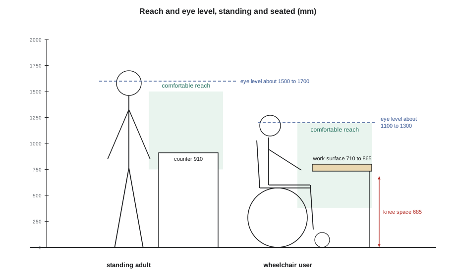
Every activity has a posture, and every posture has its dimensions. Standing work, such as chopping vegetables or washing dishes, is most comfortable at a surface about 10 to 15 cm (4 to 6 in) below the elbow, which is why the standard kitchen counter is about 910 mm (36 in) high. Seated work, such as writing or eating, uses a table of about 730 to 760 mm (29 to 30 in) with clear knee space beneath. A seated person in a wheelchair needs a work surface between about 710 and 865 mm (28 and 34 in) high with knee clearance at least about 685 mm (27 in) high beneath it, and a clear depth for the knees and toes.
Eye levels matter for views and for privacy. A standing adult's eyes are roughly 1.5 to 1.7 m (4 ft 11 in to 5 ft 7 in) above the floor; a seated adult's, including a wheelchair user's, roughly 1.1 to 1.3 m (3 ft 7 in to 4 ft 3 in). A window sill set at 1.0 m (3 ft 3 in), common in many houses, blocks much of the view from a chair or bed. For Margit, sills in the living room and bedroom should be no higher than about 600 to 750 mm (24 to 30 in) so that she can see the river from her chair and the ground from her bed. Elias, at fifteen and still growing, will enjoy the same windows.
Reach
Reach is the range in which people can grasp, push and see things easily. For a standing adult, the comfortable range for frequently used items is from about hip height to shoulder height, roughly 750 mm to 1.5 m (2 ft 6 in to 5 ft). For a person seated in a wheelchair, a forward reach over no obstruction is roughly 380 mm to 1.2 m (15 to 48 in) above the floor, and a side reach covers a similar range. Reaching over a counter or a deep obstruction reduces the high limit sharply. This is why accessible design rules place controls, door hardware and switches in a narrow band, and why the top shelves of an ordinary kitchen are useless to many people.
For Margit, the students learn to sort storage by reach. Things used daily, such as plates, glasses, spices and the kettle, belong in the band she can reach from her chair, between about knee and shoulder height when seated. Deep lower cabinets are better replaced by drawers, which bring their contents forward. High cabinets can hold things used a few times a year, or be fitted with pull-down shelves. A pantry with open shelves at the right height can hold more usable storage than a wall of upper cabinets.
Clearances and turning space
Furniture and fixtures need space around them to be used. A bed needs room to walk or roll along at least one side and the foot; a dining chair needs space to pull back; a door needs room to swing and to be approached. The space a person occupies while using something is called the clear floor space, and the space needed to turn around is the turning space.
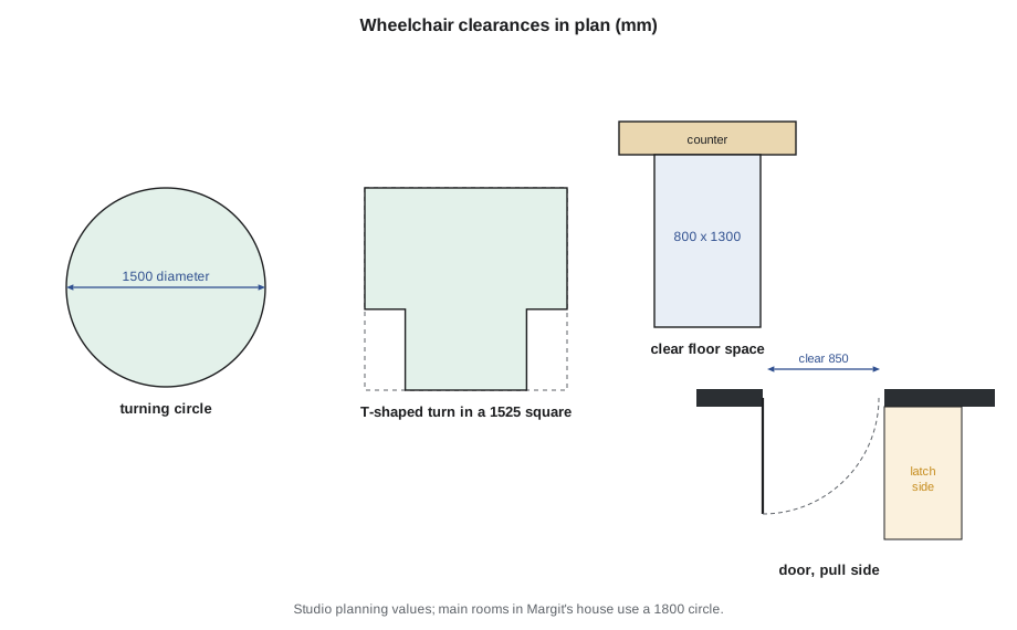
The National Building Code of Canada, in its section on accessibility, and the CSA standard B651, Accessible Design for the Built Environment (current edition 2023), set out these spaces for buildings that must be accessible. A wheelchair user generally needs a clear turning circle of at least 1500 mm diameter, a clear floor space of roughly 800 by 1300 mm in front of a fixture or control, and doors with a clear opening of at least about 850 mm. Recent editions of CSA B651 have enlarged several spaces to suit the larger power wheelchairs and scooters now common, so the studio plans Margit's main rooms for a turning circle of 1800 mm wherever it fits without waste.
Private houses are usually not required to meet these standards in full, though many jurisdictions now ask for some accessible or 'visitable' features in new homes. For Margit the question is not what the minimum is, but what will make her daily life easy. The standards are the best collected knowledge of what wheelchair users need, and the students use them as a starting point.
Doors and the latch side
Doors cause more trouble for wheelchair users than almost anything else. The clear opening, measured from the face of the open door to the stop on the other side, is narrower than the door leaf by the thickness of the door and the hinges. A door that is nominally 864 mm (34 in) wide gives a clear opening of only about 810 mm (32 in). On the pull side, the person must be able to reach the handle and swing the door past their footrests, which requires clear floor space beside the latch, typically at least about 600 mm beyond the latch edge. A door crammed into a corner, as Callum found on the third floor, fails this test even if it is wide enough.
Lever handles are easier to use than knobs for everyone with hands full or weak grip. Sliding and pocket doors save space and need no latch-side clearance, but they must be light and their handles reachable. Thresholds should be level or nearly so, with any change of level bevelled and no more than about 13 mm (1/2 in). Automatic door operators are worth considering at the main entry of Margit's house, where she will often arrive carrying shopping or clay.
The kitchen as an ergonomic system
The kitchen is the most intensively studied room in the house. Since the 1940s, research at universities and institutes in the United States has described it in terms of three work centres: storage (the refrigerator), preparation and cleaning (the sink) and cooking (the stove). The lines joining them form the work triangle. Long-standing guidelines suggest that each side of the triangle be about 1.2 to 2.7 m (4 to 9 ft) and that the three sides together total no more than about 8 m (26 ft), with no traffic passing through it.
# Check a kitchen layout's work triangle (positions in m, measured on the plan)
import math
fridge = (0.3, 0.3)
sink = (2.4, 0.3)
stove = (2.4, 2.2)
pts = {"fridge-sink": (fridge, sink), "sink-stove": (sink, stove), "stove-fridge": (stove, fridge)}
total = 0.0
for name, (a, b) in pts.items():
    d = math.dist(a, b)
    total += d
    ok = "ok" if 1.2 <= d <= 2.7 else "check"
    print(f"{name:<13} {d:5.2f} m  {ok}")
print(f"total {total:5.2f} m {'ok' if total <= 8.0 else 'too long'}")fridge-sink 2.10 m ok sink-stove 1.90 m ok stove-fridge 2.83 m check total 6.83 m ok
The triangle is a rule of thumb from an era when one person cooked alone. Margit cooks with friends; Elias makes toast at midnight. Many designers now think in terms of work zones, so that two people can work without colliding, with an aisle of about 1.2 to 1.5 m (4 to 5 ft) between counters. For a wheelchair user, the aisle should allow a full turn, 1500 to 1800 mm (60 to 72 in), the sink and part of the counter should have knee space beneath, the cooktop should have front controls, and the oven should be wall-mounted with its door at a reachable height and a pull-out shelf beneath. A side-opening oven door is easier to reach past than one that folds down.
Bathrooms
Bathrooms concentrate many ergonomic problems in a small, hard, wet space. The key dimensions for an accessible bathroom are a turning space, clear floor space beside the toilet for a sideways transfer from the chair, a toilet seat at about 430 to 485 mm (17 to 19 in), grab bars beside and behind the toilet at about 840 to 920 mm (33 to 36 in) above the floor, a roll-in shower with no curb, a fold-down seat and a hand shower on a slide bar, and a basin with knee space below and an insulated drain pipe. Walls should be reinforced with blocking during construction so that grab bars can be added anywhere later, a cheap precaution in any house.
Visser warns against the clinical bathroom. Grab bars come in wood, brass and painted finishes; a roll-in shower can be a beautiful room of tile and light rather than a stainless steel stall; good lighting and a mirror that a seated person can use make the space feel generous rather than special.
Precedent: Le Cabanon
In 1951 and 1952 Le Corbusier built himself a tiny holiday cabin at Roquebrune-Cap-Martin on the Mediterranean coast of France. Le Cabanon is a single room about 3.66 m (12 ft) square and 2.26 m (7 ft 5 in) high, dimensions taken from the Modulor. In this space he fitted a bed, a table, a washbasin, storage, a toilet behind a curtain and windows placed precisely for views and ventilation. It shows how a small space, carefully measured against the body, can feel complete. It also shows the limits of a single standard body: the cabin fits a fit middle-aged man on holiday, not a family or a wheelchair user.
Precedent: the Maison à Bordeaux
In 1998 the Dutch office OMA, led by Rem Koolhaas, completed a house near Bordeaux, France, for a client who had been left using a wheelchair after a car accident. He asked for a complex house, not a simple one, because the house would define his world. The design is organized around a moving platform about 3 by 3.5 m (10 by 11 ft 6 in), an open room that rises and falls through three floors like an elevator, carrying his desk and passing a wall of bookshelves that runs the full height of the house. Accessibility here is not a ramp added at the end; it is the central idea of the architecture.
Worked problem
Fitting a turning circle into the bathroom
Ingrid's first bathroom plan is 2.1 by 2.4 m with a toilet, basin and roll-in shower. Can Margit turn around in it, and can she transfer to the toilet?
Show solution
- The 1500 mm turning circle needs a clear space 1.5 by 1.5 m at floor level, though it can pass under the knee space of a wall-hung basin.
- With the shower at one end, 0.9 m deep, the remaining floor is 2.1 by 1.5 m, so the circle fits only if the basin is wall-hung and the toilet takes no more of the width.
- The toilet needs a clear space beside it of about 900 mm for a side transfer; with the basin on the same wall, that space disappears.
- Moving the basin to the opposite wall, and making the roll-in shower floor part of the turning space, frees the transfer space and enlarges the circle to the 1800 mm the studio is aiming for.
- The plan also needs a door that swings out, or slides, so a person who falls inside cannot block it.
Answer: The room size works, but only with a wall-hung basin, the transfer space kept clear, the shower floor used as turning space and an outward-swinging or sliding door.
Exercise 2: measuring for Margit
This exercise takes about six hours.
- Spend two hours in a wheelchair, as Callum did, and record every place where a dimension made a task hard. Note the dimension and the correct value from the standard.
- Measure Margit's furniture and equipment: her bed, her reading chair, the pottery wheel, the kiln, the dining table and her wheelchair, which is 680 mm wide and 1050 mm long.
- Draw the kitchen, bathroom and Margit's bedroom at 1:50 with furniture, clear floor spaces and turning circles shown.
- Draw an elevation of the kitchen counter showing reach ranges for Margit seated and for a standing adult.
- Deliverable: the wheelchair log, the three plans and the elevation.
Self-critique checklist
- Have I shown the turning circle and clear floor spaces on every plan?
- Is there latch-side space at every door Margit will use?
- Are frequently used items within the seated reach range?
- Could a standing adult also use these spaces comfortably?
- Does any part of the design look clinical, and can it be made otherwise?
Common mistakes
MistakeDesigning for one average body.
InsteadDesign for a range, and check both the large and the small user.
MistakeMeasuring the door leaf instead of the clear opening.
InsteadThe clear opening is narrower by the door thickness and the stop.
MistakeForgetting the latch-side clearance.
InsteadA wide door in a corner can still be impossible to open from a chair.
MistakeFitting a turning circle that is blocked by a toilet or vanity.
InsteadDraw the circle with fixtures in place, and allow only knee-space overlaps.
MistakeTreating accessibility as a set of bolt-on devices.
InsteadBuild it into the plan's dimensions and the choice of fittings.
Summary and key terms
- Anthropometry measures the body; ergonomics fits objects and spaces to people.
- Design for a range, typically the 5th to 95th percentile: clearances for the large user, reaches for the small.
- Seated eye level and reach are lower than standing values, which affects window sills, shelves and controls.
- Wheelchair users need turning space, clear floor space at fixtures, wide doors and latch-side clearance.
- Universal design aims for spaces everyone can use without special adaptation.
- Anthropometry
- The measurement of the human body.
- Ergonomics
- The design of objects and spaces to fit the people who use them.
- Percentile
- The value below which a given share of a population falls.
- Clear floor space
- The space a person needs in front of a fixture or control to use it.
- Universal design
- Design that everyone can use without special adaptation.
Practice problems
Work each problem on paper first, then reveal the answer to check.
Should a shelf height be set by the small or the large user?
Show answer
The small user: if the shortest people can reach it, everyone can.
Why are drawers better than deep lower cabinets for a wheelchair user?
Show answer
Drawers bring their contents forward within reach; deep cabinets require bending and reaching far back.
A door leaf is 915 mm wide. Roughly what clear opening will it give?
Show answer
About 860 mm, after subtracting the door thickness and stop.
Why set living room window sills low in Margit's house?
Show answer
Her seated eye level is about 1.1 to 1.3 m, so a high sill would block the view of the river.
What did the moving platform in the Maison à Bordeaux show about accessibility?
Show answer
That access can be the central idea of a design rather than an addition.
Lesson quiz · 5 questions
Score 60% or more to complete this lesson.
Create a free account to save your progress, take quizzes and earn a certificate.