
JS-250 · Lesson 4 of 12 · 30 min
Optimizing images and assets
▶ Video coming soon A video version of this lesson is on the way.
On Thursday, August 31, Mira finally gets to shrink the photos. The baseline made the priorities obvious: images are about three quarters of the home page's bytes, the first slideshow photo is the page's Largest Contentful Paint element, and the photos arriving without reserved space cause part of its layout shift. Fonts and CSS are smaller, but they sit in front of the text appearing at all. This lesson covers all of them, because the same few ideas apply to every kind of asset: send only what the visitor's screen can use, in the most efficient format the browser accepts, compressed, and in an order that lets the page draw early.
Images are usually the biggest win
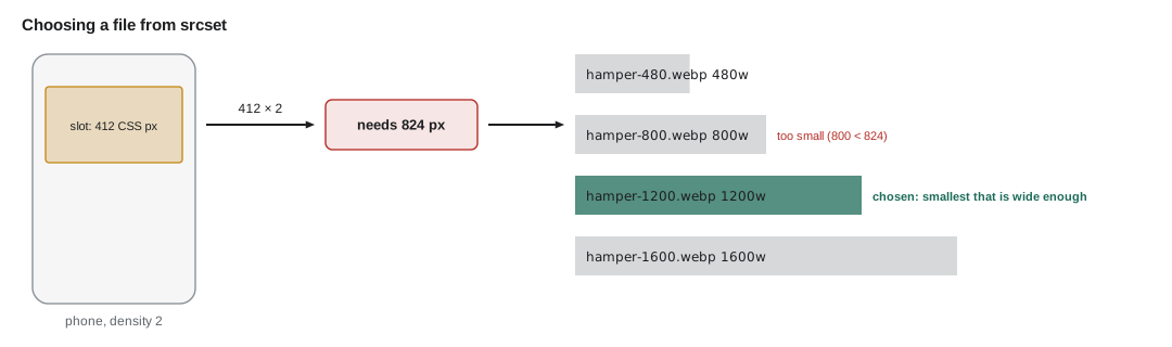
A photo is a grid of pixels. What it costs to send depends on how many pixels it has and how well the format compresses them. Dev's photos come off his phone at 4,032 × 3,024 pixels, about twelve million pixels, and a phone's camera saves them as high-quality JPEG files of 2 to 5 MB. On a phone screen the slideshow is 412 CSS pixels wide. With a screen density of 2, that is 824 device pixels across, so the browser receives about five times as many pixels in each direction as it can show, roughly 24 times the pixels in total, and throws the rest away after decoding them.
The fix has two parts. First, make several smaller versions of each photo at sensible widths, so that each device can download one close to the size it will display. Second, encode those versions in a modern format with a quality setting chosen for the web rather than for printing. Gareth shows Mira the commands the studio's build will run for every new photo Dev uploads, using ImageMagick on one of his photos.
$ identify -format "%f %wx%h %b\n" IMG_2041.jpg
IMG_2041.jpg 4032x3024 2.90616MB
$ for w in 480 800 1200 1600; do convert IMG_2041.jpg -resize ${w}x -strip -quality 75 hero-$w.jpg; convert IMG_2041.jpg -resize ${w}x -strip -quality 70 hero-$w.webp; done
$ ls -l hero-* | awk '{printf "%-16s %7.1f kB\n", $9, $5 / 1000}'
hero-1200.jpg       47.0 kB
hero-1200.webp      22.6 kB
hero-1600.jpg       71.4 kB
hero-1600.webp      31.2 kB
hero-480.jpg        16.6 kB
hero-480.webp        9.4 kB
hero-800.jpg        29.1 kB
hero-800.webp       15.0 kB
What this code does
The first command shows the original's size in pixels and bytes, and the loop makes a JPEG and a WebP version at four widths. The -strip option removes camera metadata such as the phone model and, importantly, the GPS location where the photo was taken, which should never be published by accident. The resulting files are a small fraction of the original, and each WebP version is roughly half the size of the JPEG at the same width.
The numbers are dramatic but not unusual. The 800-pixel JPEG, which is what a typical phone actually needs for the slideshow, is about one hundredth of the size of the original, and on the phone profile it downloads in a fraction of a second instead of about fifteen. The photo still looks the same on the screen, because the screen could never show the detail that was removed.
Choosing a format
Browsers support several image formats, and each is good at different things. The modern formats, WebP and AVIF, compress photos much better than JPEG at the same visible quality. Both are supported in every current major browser, so they can be the default for photos, with JPEG kept as a fallback for unusual or old browsers.
| Format | Best for | Notes |
|---|---|---|
| JPEG | Photos, as a universal fallback | Supported everywhere; no transparency |
| PNG | Screenshots, images with sharp edges and few colors | Lossless and often large for photos |
| WebP | Photos and graphics, with transparency if needed | Usually 25 to 35 in 100 smaller than JPEG for photos; supported in all current browsers |
| AVIF | Photos where the smallest size matters | Often smaller than WebP; slower to encode; supported in all current browsers |
| JPEG XL | Photos, including lossless recompression of JPEG files | Supported in Safari and, from Chrome 155 in October 2026, in Chrome; not yet in Firefox by default |
| SVG | Logos, icons, simple illustrations | Vector, scales to any size; compress it like text |
For the Food Hub's logo and the program icons, SVG is the right choice: one small file that looks sharp at every size. For photos, the studio's build makes AVIF and WebP versions with a JPEG fallback. JPEG XL is promising, and Chrome began shipping support for it in October 2026, but a format is only safe to rely on alone when every browser the audience uses supports it, so for now it would be an extra choice rather than a replacement.
The HTML picture element lets the browser choose. It lists sources in order of preference, and the browser takes the first one whose type it supports. The img element inside it is the fallback, and it is also the element that carries the alt text, the dimensions and the loading attributes.
<picture>
  <source type="image/avif"
          srcset="/photos/hamper-480.avif 480w, /photos/hamper-800.avif 800w, /photos/hamper-1200.avif 1200w, /photos/hamper-1600.avif 1600w"
          sizes="(min-width: 960px) 900px, 100vw">
  <source type="image/webp"
          srcset="/photos/hamper-480.webp 480w, /photos/hamper-800.webp 800w, /photos/hamper-1200.webp 1200w, /photos/hamper-1600.webp 1600w"
          sizes="(min-width: 960px) 900px, 100vw">
  <img src="/photos/hamper-800.jpg"
       srcset="/photos/hamper-480.jpg 480w, /photos/hamper-800.jpg 800w, /photos/hamper-1200.jpg 1200w, /photos/hamper-1600.jpg 1600w"
       sizes="(min-width: 960px) 900px, 100vw"
       width="1600" height="900" alt="Volunteers packing grocery hampers at long tables"
       fetchpriority="high">
</picture>
What this code does
Each source offers the same photo at four widths in one format, and the browser picks the first format it supports and then the width that suits the screen. The img element is the fallback for browsers without AVIF or WebP and holds everything that is not about choosing a file: the alt text, the intrinsic width and height, and the fetch priority. Because this photo is the page's LCP element, it is not lazy-loaded and its priority is raised.
Responsive images: srcset and sizes
The srcset attribute lists candidate files with their real widths in pixels, written with a w after the number. The sizes attribute tells the browser how wide the image will be displayed, in CSS pixels, before the CSS has even loaded. The browser combines the two with the screen's density to choose a file. It is a hint, not a command: the browser may choose a smaller file on a slow connection or reuse a larger one it already has in its cache.
The sizes attribute is a list of media conditions, each followed by a width, ending with a default width with no condition. The browser uses the first condition that matches. Mira writes the rule out as code to be sure she understands it, using the home page's slideshow, which is full width on small screens and 900 pixels wide in a centered column on larger ones.
// Evaluate a sizes attribute for a given viewport width (supports min-width and vw/px widths).
function slotWidth(sizes, viewport) {
  for (const entry of sizes.split(',').map((s) => s.trim())) {
    const m = entry.match(/^\(min-width:\s*(\d+)px\)\s+(.+)$/);
    const [condition, width] = m ? [Number(m[1]), m[2]] : [0, entry];
    if (viewport >= condition) {
      return width.endsWith('vw') ? (parseFloat(width) / 100) * viewport : parseFloat(width);
    }
  }
}

// The browser picks the smallest candidate at least as wide as slot × density.
function choose(srcset, slot, density) {
  const need = slot * density;
  const candidates = srcset.map((w) => ({ w, url: `hamper-${w}.webp` })).sort((a, b) => a.w - b.w);
  return (candidates.find((c) => c.w >= need) ?? candidates.at(-1)).url;
}

const sizes = '(min-width: 960px) 900px, 100vw';
const srcset = [480, 800, 1200, 1600];
for (const [device, viewport, density] of [['small phone', 360, 2], ['phone', 412, 2.625], ['tablet', 820, 2], ['laptop', 1350, 1], ['desktop 4K', 1920, 2]]) {
  const slot = slotWidth(sizes, viewport);
  console.log(`${device.padEnd(11)} slot ${String(slot).padStart(4)} px  needs ${String(Math.round(slot * density)).padStart(4)}  -> ${choose(srcset, slot, density)}`);
}small phone slot 360 px needs 720 -> hamper-800.webp phone slot 412 px needs 1082 -> hamper-1200.webp tablet slot 820 px needs 1640 -> hamper-1600.webp laptop slot 900 px needs 900 -> hamper-1200.webp desktop 4K slot 900 px needs 1800 -> hamper-1600.webp
What this code does
slotWidth() tries each entry in the sizes list and returns the width of the first whose condition matches, converting vw units to pixels. choose() multiplies the slot by the screen density and takes the smallest candidate that is at least that wide, or the largest one if none is big enough. A typical phone gets the 1,200-pixel file because its density is high, while a laptop at density 1 gets the 1,200-pixel file for its 900-pixel slot.
Two results are worth a second look. The 4K desktop needs 1,800 pixels but the largest candidate is 1,600, so it gets the largest available, and the photo is very slightly soft on a screen most visitors do not have. And the phone with a density of 2.625 needs 1,082 pixels, so it downloads the 1,200 version, which is still dozens of times smaller than the original. Gareth suggests one more refinement that many sites use: there is little visible benefit beyond a density of about 2 for photos, so the studio caps the density it plans for at 2 when choosing which widths to produce.
Reserving space with width and height
A photo's file arrives after the HTML. If the img element does not say how big the image is, the browser lays the page out with a zero-height image, draws the text below it, and then pushes the text down when the image arrives. That is a layout shift, and on the home page it is worth more than 0.1 of CLS by itself. The fix is to put the image's intrinsic width and height in the HTML. Browsers use the two numbers to calculate the image's aspect ratio and reserve the right amount of space, even when CSS makes the image fluid so that it fills its column with height: auto.
// The space a browser reserves for an image, from its width and height attributes.
function reservedHeight(attrWidth, attrHeight, displayedWidth) {
  const ratio = attrWidth / attrHeight;
  return Math.round(displayedWidth / ratio);
}

const photos = [
  ['slideshow photo', 1600, 900],
  ['recipe photo', 1200, 1200],
  ['portrait of a volunteer', 800, 1000],
];
for (const [name, w, h] of photos) {
  console.log(`${name.padEnd(24)} ratio ${(w / h).toFixed(3)}  at 412 px wide reserve ${reservedHeight(w, h, 412)} px, at 900 px reserve ${reservedHeight(w, h, 900)} px`);
}slideshow photo ratio 1.778 at 412 px wide reserve 232 px, at 900 px reserve 506 px recipe photo ratio 1.000 at 412 px wide reserve 412 px, at 900 px reserve 900 px portrait of a volunteer ratio 0.800 at 412 px wide reserve 515 px, at 900 px reserve 1125 px
What this code does
The width and height attributes do not set the displayed size when CSS makes the image fluid; the browser uses them only to compute the aspect ratio. Dividing the displayed width by that ratio gives the height to reserve, before a single byte of the image has arrived. A square recipe photo reserves as much height as it is wide, and the portrait photo reserves more.
The CSS aspect-ratio property does the same job for elements that are not images, such as the box where the donation form's frame will appear, or a video. Together they are the single most effective fix for layout shift on image-heavy pages.
Loading images at the right time
Not every image needs to load immediately. The second and third slideshow photos, the recipe thumbnails further down the page and the photos in the news list are not visible when the page opens. The loading="lazy" attribute tells the browser to delay those images until the visitor scrolls near them, which saves bytes for people who never scroll and leaves the connection free for the images that are visible.
- Lazy-load images below the fold. loading="lazy" on img and iframe elements is supported in every current browser.
- Never lazy-load the LCP image. A lazy image waits for layout before it is requested, which adds directly to the resource load delay.
- Raise the priority of the LCP image. fetchpriority="high" tells the browser to fetch it before other images. It is supported in every current browser.
- Decode off the critical path. decoding="async" lets the browser decode an image without holding up other rendering work; it is a hint and rarely matters for small images.
With those changes Mira measures the top of the home page again with the scripted test from lesson 2. The only difference between the two runs is the photo file: the original from Dev's phone, then the 800-pixel version the build produced.
$ node measure.cjs IMG_2041.jpg
photo 2906 kB
time to first byte   0.3 s
DOM content loaded   0.3 s
largest paint (LCP)  15.2 s  <img>
load event           15.2 s
$ node measure.cjs hero-800.jpg
photo 29 kB
time to first byte   0.3 s
DOM content loaded   0.3 s
largest paint (LCP)  0.8 s  <img>
load event           0.8 s
What this code does
The same test page and simulated connection are used for both runs, so the only thing that changes is the size of the photo the page asks for. With the original photo the largest paint waits for almost three megabytes to crawl over the slow connection. With the resized photo it arrives in under a second, a change no visitor could miss.
Fonts
The Food Hub's design uses two font families, Merriweather for headings and Open Sans for text, each in two weights, loaded from the site's own server as WOFF2 files. Web fonts cost bytes, but their bigger cost is timing. Until a font file arrives, the browser does not know how to draw text set in that font, and depending on the rules it may draw nothing, draw a fallback font and swap later, or give up on the web font for this visit.
| font-display | Before the font arrives | When it arrives late | Good for |
|---|---|---|---|
| auto / block | Invisible text for up to about 3 s | Swaps in | Icon fonts only |
| swap | Fallback font shown at once | Swaps in at any time | Headings and brand fonts |
| fallback | Invisible for about 0.1 s, then fallback | Swaps in only within about 3 s | Body text |
| optional | Invisible for about 0.1 s, then fallback | Used only if it arrived almost at once; otherwise next visit | Body text where stability matters most |
The studio's choices follow from the table. Body text uses font-display: optional, so that on a slow first visit the text appears at once in the fallback font and never changes, and the web font is used from the cache on later pages. Headings use swap, because the brand font matters more there, and the swap is made almost invisible by giving the fallback font the same proportions as the web font with the size-adjust and ascent-override descriptors. That stops the heading from changing size when the swap happens, which removes the font part of the home page's layout shift.
/* The web font, with swap: show the fallback at once and swap when ready. */
@font-face {
  font-family: 'Merriweather';
  src: url('/fonts/merriweather-latin-700.woff2') format('woff2');
  font-weight: 700;
  font-display: swap;
  unicode-range: U+0000-00FF, U+0131, U+0152-0153, U+2018-201F, U+2026;
}

/* A fallback adjusted to take up the same space as Merriweather. */
@font-face {
  font-family: 'Merriweather Fallback';
  src: local('Georgia');
  size-adjust: 106%;
  ascent-override: 92%;
  descent-override: 25%;
  line-gap-override: 0%;
}

h1, h2, h3 { font-family: 'Merriweather', 'Merriweather Fallback', Georgia, serif; }
What this code does
The first rule loads only the Latin subset of the bold heading font and shows the fallback until it arrives. The second rule defines a local font, Georgia, scaled and given new line metrics so that a line of fallback text is the same height and close to the same width as a line of Merriweather. The adjustment values come from comparing the two fonts' metrics, which tools such as font fallback generators calculate.
Three more font habits complete the picture. Subsetting removes characters a site never uses; the Latin subset of a font that also covers Cyrillic, Greek and Vietnamese is often less than half the size of the full file. Fewer files help too: Mira replaces the two weights of Open Sans with one variable font file that contains every weight. And the one font file needed for the first screen, the heading font, is preloaded so the browser requests it as soon as it reads the HTML instead of waiting for the CSS.
Compressing text
HTML, CSS, JavaScript, JSON and SVG are text, and text compresses well. The browser says which compression formats it accepts in the Accept-Encoding request header, and the server answers with a Content-Encoding header naming the one it used. Every browser accepts gzip and Brotli, and Zstandard is now supported in Chrome, Firefox and, since Safari 26.3 in early 2026, Safari. Gareth runs all three on the site's main stylesheet to compare them.
// compress.mjs: how much do gzip, Brotli and Zstandard shrink the site's CSS?
import { readFileSync } from 'node:fs';
import { gzipSync, brotliCompressSync, zstdCompressSync, constants } from 'node:zlib';

const css = readFileSync('site.css');
const results = [
  ['none', css.length],
  ['gzip (level 6)', gzipSync(css, { level: 6 }).length],
  ['gzip (level 9)', gzipSync(css, { level: 9 }).length],
  ['brotli (quality 11)', brotliCompressSync(css, { params: { [constants.BROTLI_PARAM_QUALITY]: 11 } }).length],
  ['zstd (level 19)', zstdCompressSync(css, { params: { [constants.ZSTD_c_compressionLevel]: 19 } }).length],
];
for (const [name, bytes] of results) {
  console.log(`${name.padEnd(20)} ${(bytes / 1000).toFixed(1).padStart(6)} kB  ${(bytes / css.length).toFixed(2)} of original`);
}
What this code does
Each function from node:zlib compresses the same stylesheet, and the script prints the compressed size and its fraction of the original. All three formats remove about four fifths of the bytes; Brotli at its highest quality is smallest, and Zstandard comes close while being much faster to compress. For files that are built once and served many times, the build can compress them in advance at the highest level so the server only has to send the stored file.
$ node compress.mjs
none                   72.6 kB  1.00 of original
gzip (level 6)         14.9 kB  0.20 of original
gzip (level 9)         14.8 kB  0.20 of original
brotli (quality 11)    12.7 kB  0.17 of original
zstd (level 19)        13.7 kB  0.19 of original
Images such as JPEG, WebP and AVIF are already compressed, so compressing them again wastes the server's time for almost no saving. The usual server setting is to compress text types and leave image, video and font files alone; WOFF2 fonts are compressed internally with Brotli.
How does the server pick an encoding? It reads the browser's Accept-Encoding header, which lists the encodings it accepts, optionally with a quality value from 0 to 1 saying how much it prefers each one, and chooses the best one it can produce. Mira writes the choice out for the files the build stores in advance: the original plus a Brotli, a Zstandard and a gzip copy.
// Choose a stored encoding for a request's Accept-Encoding header.
const stored = ['br', 'zstd', 'gzip'];          // copies made by the build, in the server's order of preference

function parseAccept(header) {
  return header.split(',').map((part) => {
    const [name, ...params] = part.trim().split(';');
    const q = params.map((p) => p.trim()).find((p) => p.startsWith('q='));
    return { name: name.trim().toLowerCase(), q: q ? Number(q.slice(2)) : 1 };
  });
}

function chooseEncoding(header) {
  const accepted = parseAccept(header).filter((a) => a.q > 0);
  const quality = (name) => (accepted.find((a) => a.name === name) ?? accepted.find((a) => a.name === '*'))?.q ?? 0;
  const best = stored
    .map((name) => ({ name, q: quality(name) }))
    .filter((c) => c.q > 0)
    .sort((a, b) => b.q - a.q)[0];   // sort is stable, so equal q keeps the server's order
  return best ? best.name : 'identity';
}

for (const h of ['gzip, deflate, br, zstd', 'gzip, deflate, br', 'gzip;q=1, br;q=0.5', 'br;q=0, gzip;q=0', '*']) {
  console.log(`${h.padEnd(26)} -> ${chooseEncoding(h)}`);
}gzip, deflate, br, zstd -> br gzip, deflate, br -> br gzip;q=1, br;q=0.5 -> gzip br;q=0, gzip;q=0 -> identity * -> br
What this code does
parseAccept() splits the header into names with their quality values, treating a missing q as 1. chooseEncoding() gives each stored copy the quality the browser assigned to it, or to the * wildcard, drops anything with quality 0 and keeps the highest; because the sort is stable, ties keep the server's preferred order. A browser that refuses everything gets the uncompressed original, called identity.
Worked problem
What the slideshow should cost
The slideshow shows one photo at a time, 412 CSS pixels wide on a phone with a density of 2, in a 16:9 frame. A well-compressed WebP photo costs about 0.15 bytes per displayed pixel. Roughly how big should the first photo be, and how does that compare with the 2,480 kB original?
Show solution
- Displayed width in device pixels: 412 × 2 = 824 pixels.
- Height for a 16:9 frame: 824 × 9 ÷ 16 ≈ 464 pixels.
- Pixels: 824 × 464 ≈ 382,000.
- Bytes: 382,000 × 0.15 ≈ 57,000 bytes, or about 57 kB.
- Compared with the original: 2,480 ÷ 57 ≈ 43 times smaller.
Answer: About 57 kB, roughly 43 times smaller than the photo the page sends now.
Common mistakes
MistakeUploading phone photos straight to the site.
InsteadResize and re-encode every photo at build or upload time, and strip its metadata.
MistakeLazy-loading every image, including the first photo.
InsteadLoad the LCP image eagerly with fetchpriority="high" and lazy-load only images below the fold.
MistakeLeaving out width and height because CSS sets the size.
InsteadAlways set them; the browser uses them for the aspect ratio and reserves the space.
MistakeLoading many font families and weights.
InsteadUse few fonts, subset them, prefer a variable font and match the fallback's metrics.
MistakeCompressing images again on the server.
InsteadCompress text types only; image formats are already compressed.
Summary and key terms
- Images are usually the largest part of a page.
- Resize photos to the widths screens can use, re-encode them in WebP or AVIF with a JPEG fallback, and strip metadata. srcset lists candidates with their widths and sizes says how wide the image will be shown, and the browser picks a file for the screen's density.
- The picture element offers formats in order of preference. width and height attributes give the aspect ratio so the browser reserves space and avoids layout shift.
- Lazy-load images below the fold but never the LCP image, which should have fetchpriority="high".
- Fonts delay text; use font-display, subsets, variable fonts, preloading and fallbacks adjusted with size-adjust and the override descriptors.
- Compress text with gzip, Brotli or Zstandard, but not images.
- srcset
- An attribute listing candidate image files with their widths, from which the browser chooses one.
- sizes
- An attribute telling the browser how wide an image will be displayed, using media conditions.
- Device pixel ratio
- The number of device pixels per CSS pixel on a screen, often 2 or 3 on phones.
- Aspect ratio
- The ratio of width to height, used to reserve an image's space before it loads.
- Lazy loading
- Delaying the download of off-screen images and frames until the visitor scrolls near them.
- fetchpriority
- An attribute that raises or lowers the priority of a resource's download.
- font-display
- A font-face descriptor that controls what the browser shows while a web font loads.
- Content-Encoding
- The response header naming the compression the server applied, such as gzip, br or zstd.
Practice problems
Work each problem on paper first, then reveal the answer to check.
A phone shows a photo 412 CSS pixels wide at a density of 3. Which candidate does it need from 480w, 800w, 1200w and 1600w?
Show answer
It needs 1,236 pixels, so the browser takes the 1600w file, the smallest candidate at least that wide.
Why must the LCP image not be lazy-loaded?
Show answer
A lazy image is requested only after layout, which adds to the resource load delay and makes LCP later.
What do the width and height attributes do when CSS makes the image fill its column with height: auto?
Show answer
They give the browser the aspect ratio, so it reserves the right height before the image arrives.
Why does the studio use font-display: optional for body text?
Show answer
On a slow first visit the text appears at once in the fallback and never changes, so there is no shift and no invisible text.
Try it yourself
Choose a candidate
Complete choose(widths, slot, density) so that it returns the smallest width in widths that is at least slot × density. If no width is big enough, return the largest width.
The widths may be in any order.
function choose(widths, slot, density) {
  return widths[0];
}

const widths = [1200, 480, 1600, 800];
console.log(choose(widths, 412, 2));
console.log(choose(widths, 360, 1));
console.log(choose(widths, 900, 2));
console.log(choose(widths, 412, 2.625));
Try it yourself
Build a srcset
Complete srcset(name, format, widths) so that it returns a srcset string such as /photos/hamper-480.webp 480w, /photos/hamper-800.webp 800w for the given photo name, format and widths.
List the widths from smallest to largest, whatever order they are given in.
function srcset(name, format, widths) {
  return '';
}

console.log(srcset('hamper', 'webp', [800, 480]));
console.log(srcset('soup-pot', 'avif', [1600, 480, 1200, 800]));
Lesson quiz · 5 questions
Score 60% or more to complete this lesson.
Create a free account to save your progress, take quizzes and earn a certificate.