
ARCH-220 · Lesson 7 of 12 · 21 min
Minimalism
Dr. Arslan has booked a quiet hour in the Walker Art Center before it opens. She leads the students into one of the galleries of Edward Larrabee Barnes's building of 1971, a series of plain, square, top-lit rooms in a dark brick block, linked by a spiral of half-landings. A single sculpture stands in an empty room under even light. 'Sit,' she says, 'and do not speak for five minutes.' When the time is up, Joon-ho says he noticed the sound of the air system for the first time, and then the texture of the floor, and then the way the light changed as a cloud passed over the skylight. 'That,' Dr. Arslan says, 'is the effect minimalist architecture wants. When there is almost nothing to look at, you begin to notice everything.'
Minimalism in architecture is the pursuit of maximum effect through minimum means. Minimalist buildings reduce form, material and detail to essentials, eliminate visible ornament and clutter, and rely on proportion, light, material and silence to create their effect. The movement became prominent in the 1980s and 1990s, partly as a reaction against the noisy signs of postmodernism and the visual chaos of deconstructivism. But it has deep roots in modernism, in Japanese tradition and in the visual art of the 1960s.
Roots: Mies, Japan and Minimal art
The phrase less is more is associated with Ludwig Mies van der Rohe, who used it often and said he had first heard it from his early employer Peter Behrens. Mies's Barcelona Pavilion of 1929 and Farnsworth House of 1951, which you studied in ARCH-121, are the great precedents for minimalist architecture: a few planes of stone, glass and steel, precisely proportioned and detailed, defining space without enclosing it. Mies devoted enormous effort to details that most people never notice, such as the junction of a column and a ceiling or the way a marble wall meets the floor, so that the whole would seem effortless.
A second root is Japanese architecture and aesthetics. Traditional buildings such as the Katsura Imperial Villa in Kyoto, built in the seventeenth century, impressed modern architects, including Bruno Taut and Walter Gropius, with their modular plans, sliding screens, unpainted wood and paper and their careful framing of gardens. The Japanese writer Jun'ichirō Tanizaki, in his essay In Praise of Shadows (1933), praised the beauty of dim interiors, lacquer glimmering in candlelight and the patina of age, against the bright, uniform light of the West. Minimalist architects found in these traditions a model of restraint that was rich, not empty.
A third root is Minimal art, the movement in American sculpture and painting of the 1960s associated with Donald Judd, Carl Andre, Dan Flavin, Agnes Martin and others. These artists made works from simple geometric units, industrial materials and repetition, rejecting expression and composition in favor of the direct presence of objects in space. Judd later bought buildings in the small town of Marfa, Texas, including a former army fort, and installed his works and those of other artists permanently in carefully restored spaces, a project that became the Chinati Foundation. Marfa shows how the art and the architecture of minimalism converge: the room becomes part of the work.
Tadao Ando: concrete and light
The Japanese architect Tadao Ando, self-taught and a former boxer, became the best-known minimalist architect in the world. His material is smooth, precisely cast concrete, with the regular pattern of formwork joints and tie holes left visible like a grid. His forms are simple: rectangles, cylinders, long walls. His subject is light and nature, admitted in carefully controlled ways. Azuma House in Osaka (1976), a small row house, is a concrete box with a courtyard open to the sky in the middle, so that residents must go outside, even in rain, to pass from one room to another. Ando argued that this contact with weather was part of the house's meaning.
Ando's Church of the Light in Ibaraki, near Osaka (1989), is a concrete box cut by a wall at an angle. Behind the altar, two slots in the concrete wall, one vertical and one horizontal, form a cross of light. The church has no other ornament. The building was made on a small budget, and the pews and floor are of rough timber from scaffolding. Ando received the Pritzker Prize in 1995. His work shows that minimalism need not be cold: its few elements can carry deep emotion.
Zumthor and the atmosphere of materials
The Swiss architect Peter Zumthor, trained as a cabinetmaker, developed a minimalism of materials and atmosphere rather than of white surfaces. His thermal baths at Vals in the Swiss Alps (1996), which you met in Lesson 5, are built from thin layers of local gneiss stone, with pools of different temperatures set in a cave-like interior lit by narrow slots in the roof. His Kolumba art museum in Cologne (2007), built over the ruins of a Gothic church destroyed in the Second World War, uses a pale gray brick laid with gaps so that filtered light enters the space over the ruins. The Bruder Klaus Field Chapel in Germany (2007) was made by building a tent of tree trunks, casting concrete around it in layers and then burning the trunks out, leaving a blackened interior open to the sky.
Zumthor's book Atmospheres (2006) describes how architecture moves people through the body of the building, the harmony of materials, the sound of a space, its temperature, the tension between interior and exterior and the light on things. He received the Pritzker Prize in 2009. Zumthor's minimalism links back to Frampton's emphasis on the tactile: the few elements must be extraordinary in their material presence.
Proportion and the discipline of detail
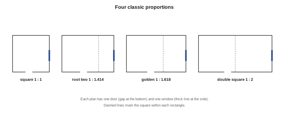
Because minimalist buildings have so few elements, their success depends almost entirely on proportion and detail. The ratio between a room's length, width and height, the size and placement of an opening, and the alignment of joints in floor and wall become the main design decisions. Architects have used proportional systems since antiquity, as you saw in ARCH-120 with Palladio's ratios and in ARCH-121 with Le Corbusier's Modulor. Minimalist architects use them too, though often by eye rather than by rule.
# Which classic proportion is a room closest to?
ratios = {"square 1:1": 1.0, "root-two 1:1.414": 2 ** 0.5,
          "golden 1:1.618": (1 + 5 ** 0.5) / 2, "double square 1:2": 2.0}
rooms = {"gallery A": (6.0, 6.2), "gallery B": (5.0, 7.1), "chapel": (7.5, 12.1), "corridor room": (3.0, 6.1)}

for name, (w, l) in rooms.items():
    r = max(w, l) / min(w, l)
    best = min(ratios, key=lambda k: abs(ratios[k] - r))
print(f"{name:14s} {w} x {l}: ratio 1:{r:.3f}, closest to {best} (off by {abs(ratios[best] - r):.3f})")gallery A 6.0 x 6.2: ratio 1:1.033, closest to square 1:1 (off by 0.033) gallery B 5.0 x 7.1: ratio 1:1.420, closest to root-two 1:1.414 (off by 0.006) chapel 7.5 x 12.1: ratio 1:1.613, closest to golden 1:1.618 (off by 0.005) corridor room 3.0 x 6.1: ratio 1:2.033, closest to double square 1:2 (off by 0.033)
Proportion is not magic. A room close to the golden ratio is not automatically beautiful, and many fine rooms follow no rule. But checking proportions is a useful discipline, especially in buildings where proportion is nearly all there is. The dimensions in the script work in any unit, because ratios have none.
Detail is the other discipline. In a minimalist interior there are no skirting boards, architraves or cornices to hide imperfect junctions. Walls must meet floors in a clean line, doors must close flush with the wall, and lights, grilles and switches must be aligned or concealed. This requires precise construction and therefore money: the paradox of minimalism is that making things look simple is often expensive. The British architect John Pawson, whose book Minimum (1996) gathered examples of simplicity from monasteries to Japanese gardens, designed the Cistercian monastery of Our Lady of Nový Dvůr in the Czech Republic (completed 2004), where the monks' austere life and the architecture's restraint coincide.
Lightness: SANAA and the dematerialized box
A different minimalism, light and transparent rather than heavy and grounded, was developed by the Japanese partnership SANAA, founded by Kazuyo Sejima and Ryue Nishizawa in 1995. The 21st Century Museum of Contemporary Art in Kanazawa (2004) is a circular glass building with no front or back, containing galleries of different sizes as separate boxes, with courtyards between them, so that visitors wander freely. Their buildings use thin columns, white surfaces and curved glass to make architecture seem to dissolve. SANAA received the Pritzker Prize in 2010, and Sejima was the second woman to receive it.
| Building | Place | Architect | Date | Minimalist idea |
|---|---|---|---|---|
| Farnsworth House | Plano, Illinois | Mies van der Rohe | 1951 | A few planes of glass and steel in a landscape |
| Azuma House | Osaka | Tadao Ando | 1976 | Concrete box with an open courtyard |
| Church of the Light | Ibaraki | Tadao Ando | 1989 | A cross of light cut into concrete |
| Therme Vals | Switzerland | Peter Zumthor | 1996 | Layered stone, water and slots of light |
| Nový Dvůr monastery | Czech Republic | John Pawson | 2004 | Austere life, austere architecture |
| 21st Century Museum | Kanazawa | SANAA | 2004 | A circle of glass with galleries as boxes |
| Kolumba museum | Cologne | Peter Zumthor | 2007 | Perforated brick over Gothic ruins |
The critique of minimalism
Minimalism has been criticized as an aesthetic of luxury. In expensive apartments, shops and hotels, the empty, perfect room became a status symbol: only the rich can afford so much space with so little in it, and so much hidden storage to keep it that way. Fashion stores of the 1990s used minimalist interiors to make a few garments look precious. Critics argue that this turned an ethic of restraint into a brand. Others argue that minimalist interiors are hostile to ordinary life, with its clutter, children and changing needs; Venturi's phrase less is a bore applies here too. Defenders reply that the best minimalist buildings, such as Ando's churches and Zumthor's chapel, were made on small budgets for spiritual or communal purposes, and that the discipline of reduction is valuable for any designer, even one who later adds richness.
There is also an environmental argument for a kind of minimalism: using less material, building less and making buildings that can last because they are simple and adaptable. This sufficiency, building only what is needed, has become part of the sustainability debate you will study in Lesson 9. In that sense the old phrase less is more may acquire a new meaning.
Worked problem
Reducing a design
Wren's design for a small lakeside chapel has a pitched roof, three kinds of windows, two materials on the outside and a decorative screen behind the altar. Dr. Arslan asks her to make a minimalist version without losing what the chapel is for.
Show solution
- Identify the essential purpose: a quiet place for gathering, reflection and ceremony, related to the water.
- Identify essential elements: a floor, an enclosure, a roof, an entry, a source of light and a view of the water.
- Reduce materials to one or two, chosen for touch and durability, such as concrete and timber.
- Replace three kinds of windows with one carefully placed opening facing the water and a single slot of light above the altar, so that light becomes the decoration.
- Check proportion: test the plan and section against simple ratios and adjust the height so that the space feels calm rather than cramped or vast.
Answer: Reduction is not removal for its own sake. Wren keeps every element the chapel needs, removes everything else and makes the remaining elements, especially light, do more work.
Exercise 7: five minutes of silence
This exercise takes about two hours.
- Choose a quiet room you can sit in for five minutes: a gallery, a chapel, a library reading room.
- Sit without your phone and note everything you notice, in order: sounds, light, temperature, textures, smells.
- Draw a plan and section of the room with dimensions estimated by pacing, and calculate its proportions.
- Deliverable: the list, the drawings, the ratios and a paragraph on which elements create the room's atmosphere.
Self-critique checklist
- Did I notice things other than what I could see?
- Have I measured or estimated the proportions rather than guessing?
- Have I identified the details that make the room look simple?
- Have I asked who can use this room comfortably and who might not?
Common mistakes
MistakeThinking minimalism means empty or cheap.
InsteadIt concentrates effort on proportion, light, material and detail, which often costs more, not less.
MistakeTreating less is more as a rule that applies everywhere.
InsteadIt is a discipline; some buildings and uses need richness and complexity.
MistakeIgnoring the senses other than sight.
InsteadMinimalist architecture relies on sound, touch and temperature as much as on appearance.
MistakeAssuming all minimalism is white.
InsteadAndo works in gray concrete, Zumthor in stone and brick; minimalism concerns reduction, not a single finish.
Summary and key terms
- Minimalism seeks maximum effect from minimum means, relying on proportion, light, material and silence.
- Its roots include Mies van der Rohe, Japanese tradition and the Minimal art of the 1960s.
- Tadao Ando's Church of the Light (1989) and Peter Zumthor's Therme Vals (1996) are central works; both architects received the Pritzker Prize.
- SANAA developed a light, transparent minimalism; Sejima became the second woman to receive the Pritzker Prize in 2010.
- Critics see minimalism as an aesthetic of luxury; defenders value its discipline and its spiritual and environmental potential.
- Minimalism
- An architecture that reduces form, material and detail to essentials to heighten perception.
- Proportion
- The relationship of dimensions within a form or space, often expressed as a ratio.
- Golden ratio
- A ratio of about 1 to 1.618, in which the larger part relates to the smaller as the whole to the larger.
- Atmosphere
- Zumthor's term for the overall sensory and emotional quality of a space.
- Minimal art
- A movement in American art of the 1960s using simple geometric forms, industrial materials and repetition.
Practice problems
Work each problem on paper first, then reveal the answer to check.
Who is associated with the phrase less is more?
Show answer
Ludwig Mies van der Rohe, who said he heard it from Peter Behrens.
How does light enter Ando's Church of the Light?
Show answer
Through a cross-shaped slot cut into the concrete wall behind the altar.
What material is Therme Vals built from?
Show answer
Thin layers of local gneiss stone.
A room is 16 ft by 22.7 ft. Which classic proportion is it closest to?
Show answer
The root-two rectangle, 1 to about 1.414.
Why can minimalism be expensive?
Show answer
Without trim and ornament, every junction must be precise, and hidden storage and concealed services are needed.
Lesson quiz · 5 questions
Score 60% or more to complete this lesson.
Create a free account to save your progress, take quizzes and earn a certificate.