
ARCH-101 · Lesson 7 of 12 · 22 min
Section as a design tool
By the fifth week every student has a plan for Margit's house that works. Visser walks along the wall of pinned-up drawings and stops at each one. 'Good plan,' she says to Callum. 'Now show me the house.' Callum points at the plan. 'That is the house.' 'That is the floor of the house,' says Visser. 'Where is the sky? Where does the light come from? How high is the room where Margit reads, and how low is the alcove where her bed goes? Where is the ground outside, and the snow, and the retaining wall? A plan tells you where you can go. A section tells you what it feels like when you get there.' She hands out long rolls of paper. 'This week, nobody draws a plan.'
What a section shows
A section is a drawing of a building cut by an imaginary vertical plane, looking at the cut face and at whatever lies beyond it. Walls, floors and roofs that are cut are drawn in heavy line or filled solid; things seen beyond the cut are drawn in lighter line. Where a plan shows horizontal relationships, a section shows vertical ones: the height and shape of rooms, the thickness of floors and roofs, the relationship of one level to another and to the ground, the way light enters, where people stand and what they can see.
Plans dominate the way many students design, because a plan describes the program so directly. But people experience buildings in section as much as in plan: the lift of a high ceiling, the shelter of a low one, light falling from above, a view down into a room or up to the sky. Many of the most memorable spaces in architecture are sectional ideas: the Pantheon's dome with its open oculus, the stepped section of a theater, the long sloping roof of a Prairie house pulling the eye toward the horizon. Designers who draw sections early design better buildings, because they think about space in three dimensions from the start.
Kinds of section
- A building section cuts through the whole building to show its overall organization, usually at 1/8 or 1/4 in = 1 ft.
- A site section extends the cut well beyond the building to show its relationship to the ground, neighbors, trees, the street or the river.
- A wall section, or detail section, cuts through one wall from foundation to roof at a large scale such as 1 or 1-1/2 in = 1 ft, to show construction.
- A section perspective combines a section cut with a perspective view of the space beyond, showing both the measured cut and the experience of the interior.
- A sectional model is a physical model cut open to reveal the interior, often the most useful study model of all.
In design, sections are usually drawn where they reveal the most: through the main space, through changes in level or ceiling height, through the entrance, and through the building and its site in both directions. Visser asks for two sections across Margit's house, north to south, and one along it, east to west, extending at least 65 ft beyond the house to the riverbank.
Ceiling height and the character of rooms
In a single-story house, the section is mostly about ceiling height. A ceiling of about 8 ft is standard for small rooms and feels neutral. A higher ceiling, 10 to 13 ft or more, makes a room feel grand, airy and public, and suits gathering spaces. A lower ceiling, around 7 ft to 7 ft 6 in, makes a space feel intimate and sheltering, suiting alcoves, window seats, beds and entries. Christopher Alexander recommended ceiling height variety, arguing that rooms of different heights, related to their size and their degree of intimacy, make a house feel natural and comfortable, while uniform ceilings make every room feel the same.
The section can create a sequence of heights along a route: a low entry, a medium hall and a tall living room, so that each space is felt in contrast to the last. Frank Lloyd Wright used this technique constantly, compressing visitors in low entries before releasing them into high, light-filled living rooms. Margit's house uses the same sequence along its entrance route, and Joon-ho adds a lowered ceiling above the window seat in the living room, so that the seat becomes a sheltered nook inside the tall room.
The Raumplan
The Viennese architect Adolf Loos developed a way of designing in section that he called the Raumplan, or plan of volumes. Instead of stacking floors of equal height, he gave each room the height suited to its importance and use, and fitted them together in three dimensions with short flights of stairs between them, so that rooms opened onto one another at different levels. In the Moller House in Vienna (1928) and the Villa Müller in Prague (1930), the living spaces interlock in a continuous sequence of levels, with views from one room down into another. The Raumplan is the clearest example of design that begins in section rather than plan. For Margit the change of level is not possible, but the principle survives: each room gets the ceiling height its use deserves.
Light in section
Daylight is designed in section. A window lights the floor of a room to a depth of roughly two to two and a half times the height of its head above the floor; beyond that, the room becomes dim and needs electric light even on a bright day. Higher windows push light deeper. Light from two sides of a room balances its brightness and reduces glare, which is why Alexander recommended light on two sides of every room where possible. Light from above, through skylights, roof monitors or clerestories, is stronger and more even still.
Building codes set a minimum amount of window in habitable rooms. The International Residential Code asks for glazing of at least 8 out of every 100 units of floor area in habitable rooms, with half of that able to open for natural ventilation, unless mechanical ventilation and electric lighting are provided. These are minimums. Most good houses have far more, and the question is not how much glass but where it is.
# Daylight checks for three rooms in section: depth of daylight and glazing ratio
rooms = [  # name, floor area, depth from window wall, window head height, glazing area, code ratio
    ("living", 170, 18, 9, 70, 0.08),
    ("bedroom 1", 130, 14, 7, 22, 0.08),
    ("workroom", 110, 13, 8, 18, 0.08),
]
for name, area, depth, head, glass, ratio in rooms:
    reach = 2.5 * head
    lit = "whole room" if reach >= depth else f"only {reach:.1f} of {depth:.1f} ft"
    share = glass / area
print(f"{name:<10} daylight reaches {lit:<22} glazing {share:.2f} of floor (code {ratio:.2f})")living daylight reaches whole room glazing 0.41 of floor (code 0.08) bedroom 1 daylight reaches whole room glazing 0.17 of floor (code 0.08) workroom daylight reaches whole room glazing 0.16 of floor (code 0.08)
The living room, with tall south windows and clerestories under the rising shed roof, is lit right through. Margit's bedroom, with a normal window head, is lit almost to its back wall, which suits a room that should be calm and slightly dim. The workroom is lit through most of its depth, but the potter's wheel needs even light, so the students add a north-facing roof light above it.
Ground, snow and water in section
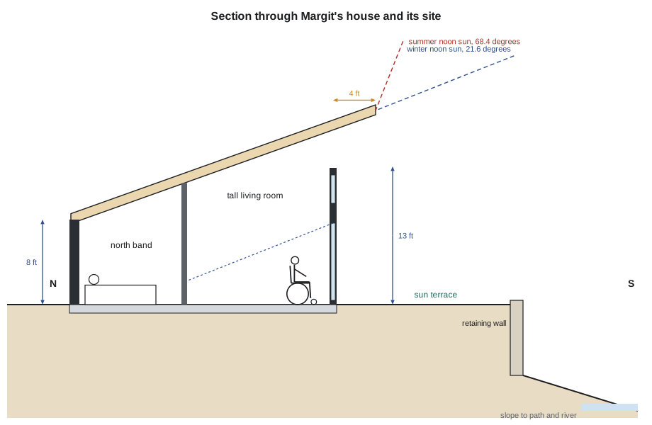
A site section shows how a building meets the ground, and in Minneapolis that means showing frost, snow and water. The section through Margit's house shows the terrace, the retaining wall to the south, the slope down to the path and the river, the spring flood level and the depth of frost. It shows that the house floor sits about 18 in above the gravel at the entry, on an insulated slab or crawlspace, and that the roof slopes so snow slides off the north side, away from the entry and the porch.
It also shows the low winter sun entering deep into the living room over the sun terrace, and the high summer sun stopped by the overhang, using the angles calculated in Lesson 5. On a single sheet, the section ties together the structure (Lesson 4), the site (Lesson 5) and the thresholds (Lesson 6). That is why architects call it a design tool: problems that are invisible in plan become obvious in section.
Air and sound in section
Warm air rises. A tall room with high openable windows will draw warm air up and out in summer while cooler air enters through low windows, a natural ventilation pattern called the stack effect. In winter the same tall room collects warm air under the ceiling, so ceiling fans or a return air grille high up help bring it back down. A section shows where these openings are and how air will move.
Sound travels through openings and lightweight construction. Elias's bedroom is placed at the far end of the house, behind the storage and mechanical core, and the section through it shows double stud walls, a separate ceiling and a solid door, so that the drums are heard in the living room only as a distant thump. In section, students can check that sound does not bypass the walls through a shared attic or ceiling space, a common failure in houses with open roof spaces above interior walls.
Precedent: Sea Ranch Condominium One
On the windswept coast of northern California, the architects Moore, Lyndon, Turnbull and Whitaker completed Condominium One at The Sea Ranch in 1965. It is a cluster of ten units under a group of steep shed roofs that slope with the land and turn their backs to the prevailing wind, so the building looks like a rocky outcrop or a group of farm buildings. Inside, the section is the main event: each unit has a tall main room under the sloping roof, with sleeping lofts, alcoves and a freestanding four-poster structure called an aedicula that forms a room within a room. The design shows how roofs shaped by climate and landscape can create rich interior sections in simple, small dwellings.
Drawing sections well
A good design section is clear about what is cut and what is seen. The cut elements, such as walls, floors, roofs and the ground, are the darkest lines or fills. Elements seen beyond the cut are lighter, and distant ones lighter still. The ground line should extend well beyond the building and show what is under it. Human figures, drawn to scale and in characteristic positions such as sitting, standing and in a wheelchair, give the section its scale and show how spaces are used. Light can be shown with lines or tones; sun angles should be drawn accurately for the site. Sections should be drawn at the same scale as the plans, with section lines marked on the plans so that a reader can see where each cut was taken.
Visser insists on one more thing. 'Draw Margit into every section,' she says. 'In her chair, at the window, at the counter, in bed. If you cannot see what she sees, you have not finished the drawing.'
Worked problem
Using the section to fix the bedroom
Wren's plan puts Margit's bedroom on the south side with a large window toward the river. In section the problem appears. What is it, and how is it fixed?
Show solution
- Drawing the low winter sun shows it entering the bedroom at no more than 22 degrees even at noon and falling straight across the bed through much of the short winter day, a glare Margit will find uncomfortable whenever she rests.
- The tall south side of the shed roof, which Wren had placed above the bedroom, gives the room a ceiling of 12 ft that feels too lofty and is hard to heat.
- Swap the bedroom and the reading corner: the bedroom moves to the north-east under the low side of the roof, with a ceiling of 8 ft and an east window for gentle morning light.
- The reading corner moves into the tall south room, under a lowered ceiling over the window seat, where the morning sun is welcome.
- Redraw the section to confirm that the bedroom is calm and sheltered and the reading corner bright.
Answer: The section revealed glare and a lofty, cold bedroom. Moving the bedroom under the low roof and the reading corner into the tall room suits both.
Exercise 7: designing in section
This exercise takes about eight hours.
- Draw two north-south sections and one east-west section of your design at 1/4 in = 1 ft, extended to the riverbank. Include Margit in every room.
- Mark the winter and summer noon sun angles and the daylight reach from each window.
- Develop at least three variations of the roof and ceiling section and compare them.
- Build a sectional model of the living room and bedroom at 1/4 in = 1 ft and photograph it in sunlight or with a lamp at the correct winter and summer angles.
- Deliverable: the sections, the variations and photographs of the sectional model.
Self-critique checklist
- Does each room have a ceiling height suited to its use?
- Does daylight reach the back of the rooms where it is needed?
- Have I shown the ground, frost, snow and flood levels?
- Is Margit drawn in, and can I see what she sees?
Common mistakes
MistakeDesigning only in plan and drawing the section at the end.
InsteadDraw sections from the first week; they change the plan.
MistakeGiving every room the same ceiling height.
InsteadVary heights with the size, use and intimacy of each space.
MistakeCutting the section where nothing interesting happens.
InsteadCut through the main spaces, level changes and entrances.
MistakeStopping the ground line at the building's walls.
InsteadExtend the site section to show the land, trees and neighbors.
MistakeLeaving people out of sections.
InsteadDraw figures to scale, seated and standing, to show use and views.
Summary and key terms
- A section is a vertical cut that shows heights, levels, light, ground and the experience of space.
- Building, site and wall sections, section perspectives and sectional models each serve different purposes.
- Ceiling height variety, as in Loos's Raumplan, gives each room a character suited to its use.
- Daylight reaches about two to two and a half times the window head height into a room; light from two sides balances it.
- Sections reveal sun angles, snow, frost, air movement and sound paths that plans hide.
- Section
- A drawing of a building cut by a vertical plane.
- Site section
- A section extended beyond the building to show its relationship to the land.
- Raumplan
- Adolf Loos's method of composing rooms of different heights in three dimensions.
- Stack effect
- The movement of warm air upward and out of a tall space, drawing cooler air in below.
- Clerestory
- A high window that brings light deep into a room.
Practice problems
Work each problem on paper first, then reveal the answer to check.
A window head is 8 ft above the floor. Roughly how deep will useful daylight reach?
Show answer
About 2.5 × 8 = 20 ft.
What is the Raumplan?
Show answer
Loos's method of giving each room its own height and linking rooms at different levels.
Why might Margit's bedroom be better under the low side of the roof?
Show answer
A lower ceiling feels sheltering, is easier to heat and suits a calm room for sleep.
What does a site section show that a building section may not?
Show answer
The relationship to the land beyond: slope, retaining wall, trees, path, river and flood level.
Name two ways a section can help with natural ventilation.
Show answer
It can place low inlets and high outlets for stack ventilation, and show cross-ventilation paths through the rooms.
Lesson quiz · 5 questions
Score 60% or more to complete this lesson.
Create a free account to save your progress, take quizzes and earn a certificate.