
VIS-110 · Lesson 8 of 12 · 24 min
How we see colour
Colour is not a property of light alone, nor of objects alone; it is an experience created by the visual system from the light that reaches the eye. The same light can look different colours in different surroundings, two physically different lights can look identical, and some people perceive colours differently from others. Image makers who understand how vision works can predict how audiences will perceive their images, avoid colour choices that fail for viewers with colour vision deficiencies, and use perceptual effects deliberately. This lesson covers the structure of the eye, rods and cones, trichromatic and opponent-process theories, adaptation and colour constancy, simultaneous contrast and other context effects, metamerism, colour vision deficiencies, and changes in vision with age and light level.
The eye
Light enters the eye through the cornea and the pupil, which changes size to control the amount of light, and is focused by the lens onto the retina at the back of the eye. The retina contains photoreceptors that convert light into nerve signals, processed in the retina itself and then in the brain's visual cortex. The centre of the retina, the fovea, packs receptors densely and provides our sharpest vision and best colour perception over only a few degrees of the visual field; we build our impression of a detailed, coloured scene by constantly moving our eyes and combining glimpses. This is one reason composition matters: viewers look at a few points in an image, guided by contrast, faces and lines, rather than taking in the whole frame at once.
Rods and cones
The retina has two kinds of photoreceptors:
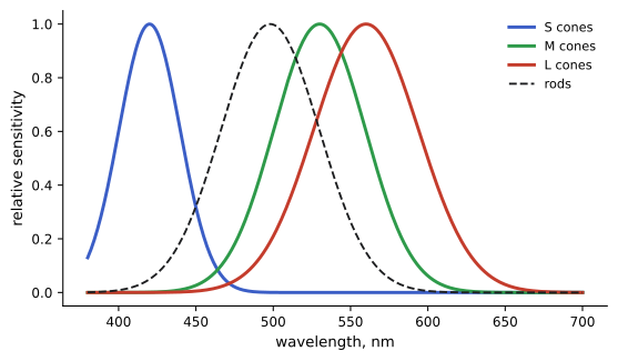
- Rods, about 90 million or more, are extremely sensitive and handle vision in dim light (scotopic vision). They do not distinguish colour, which is why moonlit scenes look grey, and they are absent from the fovea, which is why a faint star can be easier to see by looking slightly to one side of it.
- Cones, about 5 to 6 million, work in brighter light (photopic vision) and provide colour. There are three types, sensitive to short (S, peak around 420 nm), medium (M, around 530 nm) and long (L, around 560 nm) wavelengths, often loosely called blue, green and red cones, though their sensitivities overlap broadly.
In twilight (mesopic vision), both work together. As light fades, sensitivity shifts toward shorter wavelengths, the Purkinje shift: red flowers look darker and blue and green relatively brighter at dusk. Filmmakers simulating night often reduce saturation and tint the image toward blue, imitating this shift.
Trichromacy and opponent processes
Because there are three cone types, colour vision is fundamentally three-dimensional: any colour we see can be matched by mixing three suitable primary lights. This trichromacy is why displays use red, green and blue pixels and why colour is described with three numbers (Lesson 9). The cones do not tell the brain about wavelength directly; each cone type simply responds more or less strongly. The brain compares their responses.
Beyond the cones, the visual system encodes colour as opponent signals: a light-dark channel, a red-green channel and a blue-yellow channel. This explains why we never see a "reddish green" or a "yellowish blue", why afterimages appear in opponent colours (stare at a red patch and then a white wall, and a cyan-green afterimage appears), and why the hue circle has the structure artists know from the colour wheel.
Adaptation and colour constancy
The visual system continually adapts to the light around us. Light adaptation and dark adaptation adjust sensitivity across the enormous range of light levels: entering a dark cinema, it takes minutes to see clearly, and full dark adaptation of the rods takes 20 to 30 minutes. Chromatic adaptation adjusts the relative sensitivity of the cone types to the colour of the prevailing light, so that white objects continue to look white under warm lamps or cool daylight. The result, colour constancy, makes objects appear to keep their colours under different lighting.
Colour constancy is useful for living in the world but misleading for image makers. The eye adapts to the warm light of a living room and reports that the white wall is white, but a camera set to daylight records it orange. Learning to see the actual colour of light, rather than the adapted perception, is an important skill: compare the light with a known reference, glance between rooms with different lights, or look at the camera's monitor with care. Adaptation also affects viewing: an image edited on a cool monitor in a blue-lit room may look warm when seen elsewhere, which is why colour-critical work uses controlled viewing environments (Lesson 9).
Context effects
The colour and brightness we perceive depend heavily on surroundings:
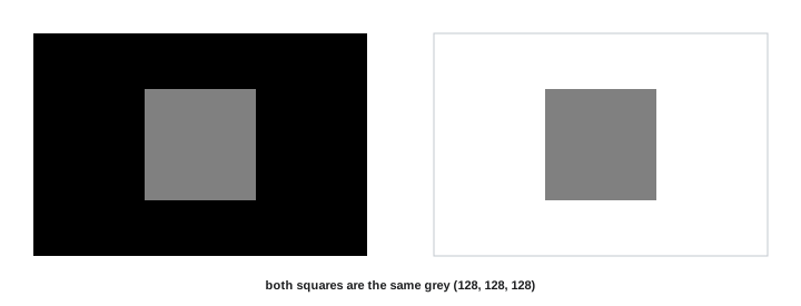
- Simultaneous contrast: a grey square looks lighter on a black background and darker on a white one, and a neutral grey looks slightly greenish on a red background and reddish on a green one.
- Assimilation: in fine patterns, colours can shift toward their neighbours rather than away from them.
- Edge and shadow interpretation: the brain interprets shading as illumination rather than surface colour, so the same pixel value can look like a white surface in shadow or a grey surface in light, depending on context.
- Viral illusions, such as a famous photograph of a dress seen by some as blue and black and by others as white and gold, show how people's assumptions about the lighting determine what colours they see.
For image makers, context effects mean that colours must be judged in their final context, that background colours change how a subject's colours read, and that skin tones can look sickly or healthy depending on surrounding colours.
Metamerism
Because colour vision reduces a whole spectrum to three cone responses, different spectra can produce the same cone responses and therefore look identical: metamers. Metamerism is what makes colour reproduction possible at all, since a display with only three narrow primaries can match the appearance of a rainbow of real-world spectra. It also causes problems: two fabrics that match under shop lights may not match in daylight (illuminant metamerism), and a camera, whose sensor sensitivities differ from human cones, may see two colours as different that a person sees as the same, or vice versa (observer metamerism). Spiky LED spectra make such mismatches more likely, which is one reason colour rendering metrics matter (Lesson 7).
Colour vision deficiency
About 8 % of males and about 0.5 % of females of Northern European ancestry have some form of colour vision deficiency (CVD), with lower rates in many other populations. The most common forms affect red-green discrimination: protan types (reduced or absent L cones) and deutan types (reduced or absent M cones). Tritan deficiencies (affecting blue-yellow) are rare, and complete colour blindness is very rare. People with CVD often confuse reds, greens, browns and oranges, and may find colour-coded information impossible to read.
Worked problem
Planning for audiences with colour vision deficiency
An infographic for a public health campaign will be seen by about 100,000 people, half male and half female, mostly of Northern European ancestry. Roughly how many may have difficulty if key information is coded only by red versus green?
Show solution
- Males: 50,000 × 0.08 = 4,000.
- Females: 50,000 × 0.005 = 250.
- Total: about 4,250 people, over 4 % of the audience.
- Mitigation: use differences in lightness as well as hue, add labels, patterns or icons, and choose colour pairs such as blue and orange that remain distinguishable for most forms of CVD.
Answer: About 4,000 to 4,500 people. Never rely on hue alone; check designs with CVD simulation tools.
Vision, age and light level
Vision changes with age: the lens yellows, reducing blue sensitivity and shifting colour perception slightly warmer; the pupil gets smaller, admitting less light, so older viewers need more light to see detail; and glare sensitivity increases. Colour discrimination falls in dim light, so dark images lose apparent saturation, and very bright images can look washed out. Display brightness and viewing conditions therefore affect how colourful and contrasty an image looks, which is why colourists grade for specific viewing environments, such as dark cinemas versus bright living rooms, and why high dynamic range (HDR) delivery uses different standards from standard dynamic range (Lesson 9).
Designing for how people see
Practical consequences of vision science appear throughout image making. Because viewers look first at faces, contrast and saturated colour, these elements should be placed and controlled deliberately. Because adaptation changes perception, images are judged on calibrated displays in controlled surroundings, and long editing sessions include breaks to refresh the eyes. Because some viewers have colour vision deficiencies, important distinctions use lightness and shape as well as hue. Because context changes perception, colours are checked in their final setting, for example a product photograph on the actual website background.
Image makers can also use perception creatively: a small area of saturated colour draws the eye; a warm subject against a cool background advances; desaturating a scene and shifting it blue suggests night; and simultaneous contrast can make a neutral grey look cool or warm depending on its surroundings.
Viewing conditions
Professional colour work specifies viewing conditions precisely: display brightness, white point, the brightness and colour of the room, and the angle and distance of viewing. Colour grading suites for cinema use dark rooms and projectors calibrated to cinema standards; television grading uses displays at about 100 nits in dim surroundings for standard dynamic range and much brighter displays for HDR. Print evaluation uses viewing booths with standardized lighting near 5,000 K. These controlled conditions exist because perception depends so strongly on context and adaptation that uncontrolled viewing makes consistent decisions impossible.
Our understanding of colour vision continues to develop, and individual differences are larger than often assumed: even among people with normal colour vision, cone sensitivities vary slightly, so two people may disagree about whether a colour is more blue or green. For image makers, this is a reminder to rely on measurement and calibrated tools for critical decisions, while remembering that the final judge of an image is always a human viewer, with all the richness and quirks of human perception.
Vision and storytelling
Filmmakers and photographers can use knowledge of vision to guide the audience. Viewers adapt to the overall colour of a scene within seconds, so a strong colour cast held for a long time becomes less noticeable, while a sudden change of colour between scenes is striking. Darkness reduces the ability to see colour and detail, so night scenes are usually lit with enough light for the camera but graded to feel dark, often cool and desaturated, matching how people remember night. Bright, saturated colours draw attention and can feel energetic or overwhelming. These perceptual effects can be used deliberately to shape the audience's experience.
Common mistakes
MistakeTrusting adapted perception to judge the colour of light.
InsteadUse references, meters and calibrated monitors.
MistakeJudging colours out of context.
InsteadCheck colours against their final backgrounds.
MistakeCoding information only by red versus green.
InsteadAdd lightness differences, labels or patterns.
MistakeMatching products under one light only.
InsteadCheck matches under several light sources.
MistakeGrading images in uncontrolled viewing conditions.
InsteadUse calibrated displays and controlled surroundings.
Summary and key terms
- Colour is an experience created by the visual system from light.
- Rods handle dim light without colour; three cone types (S, M, L) provide colour in brighter light.
- Trichromacy means three numbers describe colour; opponent channels encode red-green and blue-yellow.
- Adaptation and colour constancy hide the true colour of light from us but not from cameras.
- Context effects such as simultaneous contrast change perceived colours.
- Metamerism lets displays reproduce colours but causes mismatches under different lights.
- About 8 % of males have colour vision deficiency; design without relying on hue alone.
- Retina
- The light-sensitive layer at the back of the eye.
- Fovea
- The central retina area of sharpest vision.
- Rods
- Sensitive receptors for dim, colourless vision.
- Cones
- Receptors for colour vision in brighter light.
- Trichromacy
- Colour vision based on three receptor types.
- Opponent process
- Encoding colour as red-green and blue-yellow differences.
- Chromatic adaptation
- Adjustment of colour sensitivity to the prevailing light.
- Simultaneous contrast
- Perceived colour shifts caused by surrounding colours.
- Metamerism
- Different spectra producing the same colour appearance.
- Colour vision deficiency
- Reduced ability to distinguish certain colours.
Practice problems
Work each problem on paper first, then reveal the answer to check.
Why do moonlit scenes look grey?
Show answer
Only rods work in dim light, and they do not see colour.
Where are the three cone peaks?
Show answer
About 420, 530 and 560 nm.
What is the Purkinje shift?
Show answer
Greater relative sensitivity to blue-green in dim light.
Why are displays based on three primaries?
Show answer
Human colour vision is trichromatic.
Why do afterimages appear in opponent colours?
Show answer
The visual system encodes colour in opponent channels.
Why does a camera record a white wall as orange under tungsten?
Show answer
It does not adapt like the eye unless white-balanced.
What is simultaneous contrast?
Show answer
Surroundings shift the perceived colour or lightness of an area.
What is metamerism?
Show answer
Different spectra producing the same colour appearance.
How common is CVD among males of Northern European ancestry?
Show answer
About 8 %.
How does ageing affect colour vision?
Show answer
The lens yellows and pupils shrink, reducing blue sensitivity and light.
Lesson quiz · 5 questions
Score 60% or more to complete this lesson.
Create a free account to save your progress, take quizzes and earn a certificate.