
CINE-301 · Lesson 2 of 12 · 25 min
The frame: aspect ratio and composition
The frame is the cinematographer's canvas. Its shape, set by the aspect ratio, determines how subjects can be arranged, how much of the world can be shown, and how the eye travels across the image. Within it, composition places people, objects, lines and light to direct attention and express meaning. Unlike a painting or still photograph, the film frame changes constantly as actors and camera move, so composition in cinema is a matter of designing frames that work at every moment. This lesson covers aspect ratios and their history, choosing an aspect ratio, compositional principles adapted for the moving image, balance and weight, headroom and lead room, framing faces, frames within frames, negative space, and composing for multiple delivery formats.
Aspect ratios and their history
The aspect ratio is the ratio of the frame's width to its height. Silent films used a ratio of about 1.33:1, close to the 4:3 shape of 35 mm film frames. With the arrival of sound on film, the Academy of Motion Picture Arts and Sciences standardized a ratio of about 1.37:1 in 1932, known as the Academy ratio. In the 1950s, partly to compete with television, studios introduced widescreen formats: CinemaScope, launched by 20th Century Fox with The Robe in 1953, used anamorphic lenses for an aspect ratio originally about 2.55:1, later standardized for anamorphic projection at about 2.35:1 and then 2.39:1; spherical widescreen ratios of 1.66:1 and 1.85:1 were created by masking the frame; and large-format systems such as 70 mm and VistaVision offered higher image quality. Television adopted 4:3, then 16:9 (1.78:1) with high definition. Today, common ratios include 1.85:1 and 2.39:1 for theatrical films, 1.78:1 and 2.00:1 for streaming series, 1.43:1 and 1.90:1 for IMAX, and vertical 9:16 for mobile platforms.
| Aspect ratio | Common name or use | Character |
|---|---|---|
| 1.33:1 / 1.37:1 | Silent era, Academy ratio | Tall, portrait-friendly, intimate |
| 1.43:1 | IMAX film | Very tall, immersive on huge screens |
| 1.66:1 | European widescreen | Moderate width |
| 1.78:1 | 16:9 television and streaming | Versatile, neutral |
| 1.85:1 | Flat theatrical widescreen | Balanced for people and spaces |
| 2.00:1 | Univisium, many streaming dramas | Cinematic width, TV friendly |
| 2.39:1 | Scope, anamorphic | Wide, epic, strong horizontal emphasis |

Choosing an aspect ratio
The aspect ratio is one of the first visual decisions on a project, and it affects lenses, sets, locations and coverage. Considerations include:
- Story and subject: wide ratios suit landscapes, groups, isolation within large spaces and epic scale; taller ratios suit single figures, faces, vertical architecture and intimacy. Xavier Dolan's Mommy (2014) used a square 1:1 frame to confine its characters, opening it wider in moments of freedom.
- Genre and tradition: epics and westerns often use scope; many dramas and comedies use 1.85:1; period films may evoke earlier eras with Academy ratio.
- Delivery: a streaming series viewed on televisions may favour 1.78:1 or 2.00:1; theatrical releases may use 2.39:1; content for phones may need vertical versions.
- Practicalities: scope ratios need wider sets and more background dressing; taller ratios need more headroom and ceilings; anamorphic capture involves different lenses (CINE-210).
Some films change aspect ratio for effect, such as expanding to IMAX ratios for spectacular sequences, or using different ratios for different time periods, as in Wes Anderson's The Grand Budapest Hotel (2014), which used three ratios for three eras.
Composition principles for the moving image
Many principles of composition come from painting and photography and apply to cinema with adjustments:
- The rule of thirds: placing subjects and horizons along lines dividing the frame into thirds often creates more dynamic images than centring, and leaves room for looking and movement.
- Centred and symmetrical framing: placing subjects in the middle creates formality, stability or confrontation, and can be striking when used deliberately.
- Leading lines: roads, corridors, railings and architectural edges guide the eye to the subject and create depth.
- Shapes and geometry: triangles of figures, diagonals and curves give structure; diagonals suggest energy, horizontals calm, verticals strength.
- Contrast and brightness: the eye goes first to the brightest, sharpest and most contrasting area, and to faces and eyes.
- Foreground, middle ground and background: layering creates depth (Lesson 5).
In film, the frame changes over time, so a composition must work across a shot: at the start, during movement and at the end, often called the frame at rest. Operators and DPs design frames that resolve into strong compositions at key moments, such as when a character stops or delivers an important line.
Balance and visual weight
Elements in a frame carry visual weight. Larger, brighter, more saturated, sharper or more expressive elements weigh more, as do faces and text. A frame is balanced when weight is distributed so that it feels stable, either symmetrically or asymmetrically, for example a person on one side balanced by a lamp or window on the other. Deliberate imbalance creates tension or unease: a character pushed to the edge of a wide frame with empty space beside them may feel lonely or vulnerable. In coverage, balance also works across cuts: in shot-reverse-shot, characters are usually placed on opposite sides of their frames, so that cutting between them feels like looking back and forth across a space.
Headroom and lead room
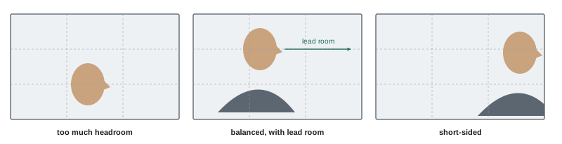
Headroom is the space between the top of a subject's head and the top of the frame. Too much headroom makes subjects look small and sinking; too little feels cramped. As shots get closer, headroom decreases, and in tight close-ups the top of the head is often cropped, keeping the eyes around the upper third of the frame. Lead room, also called look room or nose room, is space in the direction a character is facing or moving. Placing a character facing the edge of the frame with no lead room feels confined and is sometimes used to suggest being trapped; giving generous lead room creates openness and anticipation. When characters move, the frame leads them, keeping space ahead.
Framing faces
Faces are the centre of most dramatic scenes, and framing them well is essential. Conventions include placing the eyes roughly on the upper third line; keeping the near eye sharp; giving the face lead room in the direction of the look; and choosing between clean singles, which show only one character, and dirty singles, which include a sliver of the other character's shoulder or head in the foreground to maintain their presence. The angle of the face to the camera matters: a frontal face connects directly with the audience, a three-quarter view feels natural and dimensional, and a profile feels observational or distant. The eyeline, how close to the lens the character looks, determines how intimate the shot feels (Lesson 9).
Frames within frames
Doorways, windows, mirrors, arches, car windows and gaps between objects create frames within the frame. They focus attention, add depth and often carry meaning: a character seen through a doorway may seem observed, separated or trapped; a character framed in a window may seem isolated or longing to escape. Mirrors can show two views at once or suggest a divided self. Frames within frames are a powerful tool for expressing relationships without dialogue, and they also help in coverage by adding foreground interest and depth to otherwise flat locations.
Worked problem
Choosing framing for isolation
A screenplay describes a widowed character eating alone at a dining table set for two. The director wants the audience to feel her loneliness without dialogue. How could the frame and composition express this?
Show solution
- Choose a wide shot from the end of the table, with the empty chair and second place setting in the foreground.
- Place the character small in the frame, near one edge, with large negative space around her.
- Frame her through a doorway from the hall, creating a frame within a frame that separates her from the viewer.
- Hold the shot longer than usual, letting stillness emphasize the silence.
Answer: A wide, asymmetrical frame with the empty place setting prominent, negative space around her and a doorway frame expresses isolation visually.
Negative space
Negative space is the empty area around a subject. It is not wasted space: it gives the eye room to rest, emphasizes the subject by contrast, and expresses emotional states such as isolation, freedom, anticipation or threat. In horror, negative space behind a character invites the audience to wonder what might appear; in drama, it can suggest someone missing. In wide ratios, negative space is especially prominent and must be designed deliberately: an empty side of the frame should mean something. Negative space also leaves room for titles and subtitles, a practical consideration in some projects.
Composing for multiple formats
Many productions deliver in more than one aspect ratio: a theatrical 2.39:1 version and a 1.78:1 or 16:9 television version, or a horizontal film and vertical social clips. Cinematographers protect for alternative ratios by marking frame lines on monitors and keeping essential action within the common area. Shooting with a sensor area larger than the delivery frame allows reframing in post. Some productions choose a "common top" or "common centre" approach for extracting different ratios. Protecting for many formats can compromise composition in the primary ratio, so productions must decide which version takes priority. Vertical versions for mobile platforms are often reframed from horizontal footage with keyframed crops, or shot separately for important promotional content.
Symmetry and the centred frame
Centred, symmetrical compositions have a long history in painting and architecture, where they suggest order, authority and the sacred. In film, they can create formality, as in courtroom or religious scenes; confrontation, when a character faces the camera directly; and unease, when symmetry feels too perfect, as in many of Stanley Kubrick's corridors. Symmetry also creates a strong sense of design, which can make a film feel controlled, theatrical or comic. Because the eye notices any deviation from symmetry, small imbalances in a symmetrical frame, such as one character slightly off axis, become expressive. Wide aspect ratios make centred single figures look isolated, with large equal spaces on each side, while tall ratios make centred figures look monumental.
Composition and editing
Composition also works across cuts. Graphic matches, in which a shape, colour or movement in one shot is echoed in the next, create visual continuity and can link ideas; the famous cut in Stanley Kubrick's 2001: A Space Odyssey (1968) from a bone thrown into the air to a spacecraft is a celebrated example. Placing the subject in a similar area of the frame across consecutive shots helps the audience's eye find it quickly, an approach sometimes called eye-trace continuity; jumping the subject from one side of the frame to the other forces the eye to search, which can be jarring or energizing. Editors and cinematographers consider these relationships when planning coverage, especially for fast-cut sequences where viewers have little time to locate subjects.
Composing for the screen and the audience
Cinematographers also consider where audiences look. On large screens, viewers cannot take in the whole frame at once, so important action placed near the edges may be missed; on small screens, details become hard to read. Studies using eye tracking have shown that viewers of narrative films tend to look at the same areas at the same moments, mostly faces and moving objects, a phenomenon researchers call attentional synchrony. Shot designers use this tendency to guide attention, placing key information where the eye will be, especially just after a cut.
When composing, operators and DPs often check the frame on a larger monitor as well as in the viewfinder, since small screens hide distracting background details that become obvious on a cinema screen. Taking a moment to scan the edges and corners of the frame before each take catches stray equipment, reflections and unwanted objects.
Common mistakes
MistakeChoosing an aspect ratio by habit.
InsteadChoose it for story, genre, delivery and practicalities.
MistakePlacing every subject in the centre.
InsteadVary placement deliberately; centre for effect.
MistakeExcessive headroom in close-ups.
InsteadKeep the eyes near the upper third and crop the top of the head as shots tighten.
MistakeIgnoring empty areas of wide frames.
InsteadDesign negative space so it carries meaning.
MistakeForgetting alternative delivery ratios.
InsteadMark and protect frame lines for all deliverables.
Summary and key terms
- Aspect ratios evolved from Academy 1.37:1 to widescreen 1.85:1 and scope 2.39:1, plus 16:9 and vertical formats.
- Ratio choice depends on story, genre, delivery and practical considerations.
- Rule of thirds, symmetry, leading lines and geometry adapt to moving frames.
- Visual weight and balance create stability or tension.
- Headroom and lead room shape how characters sit in the frame.
- Frames within frames and negative space express relationships and emotions.
- Protect frame lines when delivering several aspect ratios.
- Aspect ratio
- Ratio of frame width to height.
- Academy ratio
- About 1.37:1, standardized in 1932.
- Scope
- Widescreen ratio of about 2.39:1.
- Rule of thirds
- Placing elements along lines dividing the frame into thirds.
- Visual weight
- How strongly an element attracts the eye.
- Headroom
- Space above a subject's head.
- Lead room
- Space in the direction a subject looks or moves.
- Dirty single
- Single shot with part of another character in the foreground.
- Negative space
- Empty area around a subject.
- Frame lines
- Guides marking alternative aspect ratios.
Practice problems
Work each problem on paper first, then reveal the answer to check.
What was the Academy ratio?
Show answer
About 1.37:1.
Which film launched CinemaScope?
Show answer
The Robe (1953).
Name two reasons to choose a wide ratio.
Show answer
Landscapes, groups, isolation in space, epic scale.
Why did Mommy use a square frame?
Show answer
To confine its characters.
What does a frame at rest mean?
Show answer
The composition when movement resolves.
Name three things that add visual weight.
Show answer
Size, brightness, saturation, sharpness, faces.
Where are the eyes usually placed?
Show answer
Near the upper third line.
What is short-siding?
Show answer
Framing with no lead room, the face near the edge it looks toward.
What can a frame within a frame suggest?
Show answer
Observation, separation, entrapment, focus.
How do productions protect for 16:9 when shooting 2.39:1?
Show answer
Frame lines and keeping action in the common area.
Lesson quiz · 5 questions
Score 60% or more to complete this lesson.
Create a free account to save your progress, take quizzes and earn a certificate.