
ARCH-300 · Lesson 5 of 12 · 22 min
Ground floor and public realm
Adeyemi begins week five with a walk of exactly one hundred steps along the avenue, from the café on the far side of the street to the corner of the studio site. She asks the students to note, step by step, what they can see: a door, a window with something behind it, a blank wall, a garage door, a parking lot. On the café side, almost every step passes a window or a door. On the site's side, the steps pass the parking garage's concrete wall, the parking lot and the side of the Harland Building. 'Most people will never enter your building,' she says. 'They will walk past it every day for fifty years. For them, the building is its ground floor.' This lesson is about the ground floor and its relationship with the public realm.
The public realm
The public realm is the network of spaces open to everyone: streets, sidewalks, squares, parks, lanes, transit stops and the publicly accessible interiors of buildings such as lobbies, shops and libraries. Its quality depends on the buildings that line it as much as on its own design. The Danish architect and urbanist Jan Gehl, who spent decades observing how people use public spaces, found that people walk further, linger longer and feel safer along building fronts with many doors, windows, details and activities at eye level, and that they hurry past long blank walls. He summarized his findings in the phrase that life between buildings matters as much as the buildings themselves.
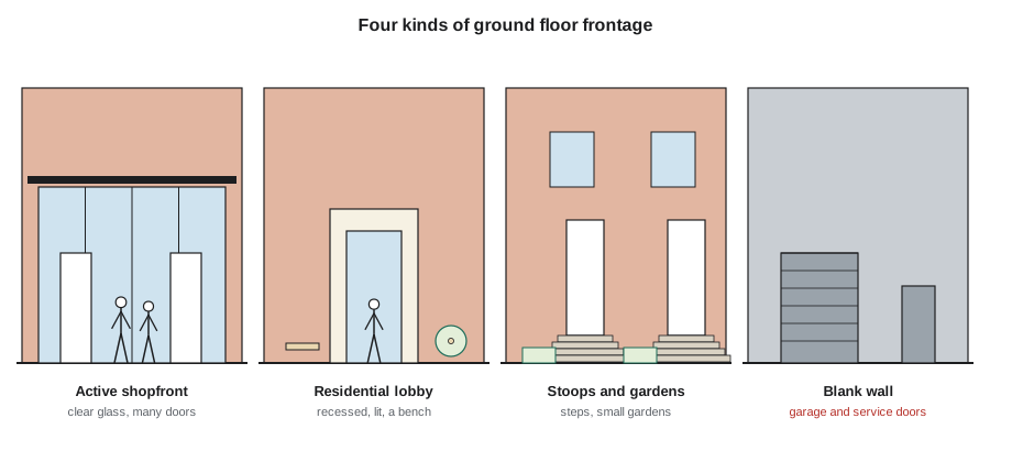
The ground floor is where a building contributes to the public realm or takes from it. A ground floor with active uses, generous windows, frequent doors, shelter and places to sit adds to the street. A ground floor of blank walls, parking, service doors and dark glass subtracts from it, however handsome the floors above.
Active frontage
Active frontage is a ground floor edge where the inside and the outside interact: people can see in and out, doors open onto the street, and activity spills onto the sidewalk. Gehl and others have graded frontages from active to inactive. An active frontage has small units with many doors, perhaps fifteen to twenty-five per hundred metres of street, transparent windows, varied functions and details that reward a slow walk. An inactive frontage has large units with few doors, little or no transparency and no variety. Most zoning codes for downtowns now require a minimum share of active uses and transparent glazing on main streets, as the studio code does.
# Ground floor frontage check against the studio code (avenue frontage of 40 m)
front = 40
segments = [
    # name, length along the avenue (m), active use?, glazed length between 0.6 and 3 m above the sidewalk
    ("cafe at the corner", 12.0, True, 10.5),
    ("grocery", 19.0, True, 15.0),
    ("grocery entrance", 3.0, True, 2.4),
    ("electrical room", 4.0, False, 0.0),
    ("garbage room door", 2.0, False, 0.0),
]
length = sum(l for _, l, _, _ in segments)
assert abs(length - front) < 0.01
active = sum(l for _, l, a, _ in segments if a)
glazed = sum(gl for _, _, _, gl in segments)
doors = 3                                    # cafe, grocery, grocery entrance
print(f"active frontage {active:.1f} of {front} m = {active / front:.2f} (code: at least 0.60)")
print(f"transparent frontage {glazed:.1f} m = {glazed / front:.2f} (code: at least 0.60)")
print(f"doors per {100} m of frontage: {doors / front * 100:.1f}")
for name, l, a, gl in segments:
print(f" {name:20s} {l:5.1f} m {'active' if a else 'inactive':8s} glazed {gl:5.1f}")active frontage 34.0 of 40 m = 0.85 (code: at least 0.60) transparent frontage 27.9 m = 0.70 (code: at least 0.60) doors per 100 m of frontage: 7.5 cafe at the corner 12.0 m active glazed 10.5 grocery 19.0 m active glazed 15.0 grocery entrance 3.0 m active glazed 2.4 electrical room 4.0 m inactive glazed 0.0 garbage room door 2.0 m inactive glazed 0.0
Wren's first ground floor plan puts the electrical room and a garbage room on the avenue, because the utility company's transformer connection is on that side. The check shows that the frontage still passes the code, with about 0.85 of it active and about 0.70 transparent, but the numbers hide a problem: the inactive segments sit together at the west end, next to the Harland Building, creating a blank stretch 6 m long where the street most needs a link between the old building and the new. And three doors on 40 m is few by Gehl's standard. Adeyemi asks her to move the electrical room and garbage to the lane, where they belong, negotiate with the utility, and add a second door to the grocery and a door to a small shop or a flower stand at the west end.
Ground floor height and level
Ground floors need height. The studio code requires at least 4.5 m floor to floor, and the students choose 4.8 m to match the Harland Building and leave room for the grocery's ducts and refrigeration lines. Height gives shopfronts presence, lets light deep into the plan, accommodates mezzanines and makes the space adaptable to future uses.
The ground floor should also meet the sidewalk at the same level. A floor raised a few steps above the sidewalk, common in older buildings, creates a barrier for wheelchair users, people with strollers and delivery carts, and needs ramps that eat into the sidewalk or the interior. On the studio site, the sidewalk falls about 300 mm from the corner to the west end. Callum proposes stepping the ground floor slab by 150 mm between the café and the grocery and grading the entrances so that every door has a level threshold, with an accessible slope of no more than 1 in 20 along the shopfront where needed. Residential lobbies are an exception where a few steps can give privacy, but the main entrance must still be accessible.
Shopfronts and windows
A good shopfront lets people see the goods and activity inside, frames them with a sturdy base and a sign band, and has a door that is easy to find. In the warehouse district, the historic shopfronts have a pattern: a low base of stone or wood, large glass panes divided by slender mullions, a transom above the door, a sign band and a cornice or canopy marking the top of the ground floor. New shopfronts need not copy it, but the elements serve real purposes. The base protects the glass from snow and salt and gives a place to lean; the transom lets daylight deep into the shop; the sign band gives tenants a consistent place for their names.
Glass must be clear to be transparent. Tinted, reflective or frosted glass, and windows covered with posters or shelving, defeat the purpose. The studio code measures transparency between 0.6 and 3 m above the sidewalk, the zone a passerby's eyes actually see. The grocery's layout matters here: if the shelving faces the windows, the street sees the backs of cereal boxes. Riverlot's grocer agrees to put the produce displays and checkout along the avenue windows and the storage at the back.
Entrances
Entrances are where the public realm and the building meet. Each use in the studio building needs its own: the café at the corner, the grocery on the avenue, the residential lobby on Tessier Street and the Foundry Collective's showroom farther along Tessier. Entrances should be easy to find, sheltered from the weather, lit at night and wide enough for the flows they serve. A recessed entrance, set back from the facade, gives shelter and a place to shake off snow, but a recess deeper than about 1.5 m can become a hiding place or a shelter for people sleeping rough, which raises questions of design and of compassion that Joon-ho's interview with the shelter worker brought into the studio.
The residential lobby deserves particular care. It is the front door of sixty-five households, and residents will pass through it several times a day. A lobby that is visible from the street, with clear glass, good lighting, a bench and mailboxes or a parcel room in view, is welcoming and safe. It should be close enough to the elevators that residents carrying groceries do not walk far, and it needs a vestibule with two sets of doors to keep winter air out.
Shelter, climate and winter
In a northern city, the ground floor must make the sidewalk usable in every season. Canopies and awnings over entrances and shopfronts protect people from rain and snow and give shade in summer. They should project at least 1.5 to 2 m, be high enough to clear signs and people, about 3 m above the sidewalk, and drain away from the walking zone. The studio building's south face on the avenue gets the sun all day, so a café terrace there can be used from April to October, and on sunny winter days, with the building behind it blocking the northwest wind.
Wind is a real concern for buildings taller than their neighbours. When wind strikes a tall face, part of it is deflected down to the street, accelerating around the base and corners. The studio building is about as tall as the Harland Building, so the effect should be modest, but the stepped upper floors, the canopy along the avenue and the trees in the furnishing zone all help. Snow must have somewhere to go: plows push it to the curb, and the building's canopies and roof drains should not drop snow and ice onto the sidewalk. Heated sidewalks, used in some downtown areas, are a costly but effective option at entrances.
The corner
The corner of the avenue and Tessier Street is the building's most important point of contact with the city. The students test several treatments: a sharp corner with the café's glass wrapping around it; a chamfered corner with the café door on the diagonal; and a recessed corner where the ground floor is set back under the floors above to widen the sidewalk. Wren's chamfer, 3 m across, gives the café a door on the diagonal facing the intersection, widens the space where people wait to cross, and echoes the chamfered corners of two historic buildings nearby. Above it, the residential floors hold the corner, so the street edge stays continuous.
Lanes and the back of house
The ground floor's lane side holds the building's services: the shared loading bay, garbage and recycling rooms, the bike room entrance, the Foundry Collective's freight door and electrical and water service rooms. A good lane side is organized, durable and safe: doors are recessed or protected by bollards from turning trucks, lighting is generous, and garbage is inside the building, not in dumpsters on the lane. The Foundry Collective's large freight door can open in summer, letting the lane see the work inside and turning the service side into a modest public face of its own.
Designing for everyone
The public realm belongs to everyone, and the ground floor should welcome everyone. That means level entrances, doors that open automatically or easily, tactile and visual cues for people with low vision, benches for people who need to rest, lighting that avoids glare and dark corners, and signs that are easy to read. It also means thinking about people who are not customers. Hostile architecture, such as spikes on ledges, slanted benches and bars that prevent lying down, pushes people experiencing homelessness elsewhere without solving anything. Joon-ho proposes instead that Riverlot partner with the shelter nearby to fund outreach and a public washroom accessible from the lane, a modest gesture that the developer agrees to price.
Worked problem
Redesigning the Tessier Street frontage
Ingrid's plan for Tessier Street has the residential lobby, then 18 m of blank wall containing the bike room and the stairs, then the Foundry Collective's showroom. The street is quieter than the avenue, but the blank stretch faces the parking garage's own blank wall across the street. How can she improve it?
Show solution
- Move the bike room to the lane side, where cyclists arrive, and bring the showroom closer to the lobby, so that the two active uses are continuous.
- Give the exit stair a window on the street, so that the stair is lit and people see movement; stairs with daylight are also more likely to be used.
- Make the showroom's windows large and clear, with displays of the members' work and a view into a demonstration bench.
- Add a door from the showroom to the street, a bench and planting at the lobby, and street trees along the curb.
- Where some blank wall remains, treat it with a durable, detailed material at eye level, such as brick with patterns, or a wall for public art chosen with the Coach House artists.
Answer: By relocating service rooms and grouping active uses, Ingrid reduces the blank stretch to a few metres, and the street gains a lit lobby, a working showroom and a stair with a view.
Exercise 5: the ground floor
This exercise takes one and a half weeks.
- Draw the ground floor plan at 1:100, including the sidewalks to the curb, the lane and the edges of the neighbouring buildings.
- Draw elevations of both street frontages at 1:50 with people, signs, canopies and trees.
- Calculate active and transparent frontage and doors per unit of length on each street.
- Draw a detailed section through the avenue shopfront and sidewalk, showing the floor level, canopy, sign band and snow.
- Draw the lane elevation, showing loading, garbage, bike and freight doors and lighting.
Self-critique checklist
- Would I enjoy walking past this building every day?
- Is every entrance level, visible, sheltered and lit?
- Have I moved service rooms off the streets?
- Does the corner do something special?
Common mistakes
MistakePutting service rooms on the main street.
InsteadLocate electrical, garbage and loading rooms on the lane.
MistakeRaising the ground floor above the sidewalk.
InsteadMeet the sidewalk at the same level for every entrance.
MistakeSpecifying tinted or reflective glass at street level.
InsteadUse clear glass so people can see in and out.
MistakeTreating the lane side as an afterthought.
InsteadDesign the lane frontage for safety, durability and, where possible, activity.
MistakeUsing hostile features to deter people experiencing homelessness.
InsteadDesign for everyone and pair the building with services and partnerships.
Summary and key terms
- For most people, a building is its ground floor; active frontage makes streets lively and safe.
- Codes often require minimum shares of active uses and transparent glazing on main streets.
- Ground floors need height, level entrances, clear glass and well-designed shopfronts.
- Entrances, canopies and corners shape how a building meets the street, in every season.
- Lanes hold the services; the public realm should welcome everyone, including people who are not customers.
- Public realm
- The network of spaces open to everyone, including streets, sidewalks, squares and public interiors.
- Active frontage
- A ground floor edge where inside and outside interact through doors, windows and activity.
- Transparency
- The share of a facade, at eye level, made of clear glass.
- Shopfront
- The street face of a shop, typically with a base, glazing, door, sign band and canopy.
- Vestibule
- An entrance space with two sets of doors that limits drafts and heat loss.
- Hostile architecture
- Design features intended to prevent people from sitting, lying or sheltering in public space.
Practice problems
Work each problem on paper first, then reveal the answer to check.
A frontage of 50 m has 36 m of active uses. Does it meet a requirement of three-fifths?
Show answer
Yes: 36 ÷ 50 = 0.72.
Why should the grocery's produce displays face the avenue windows?
Show answer
So the windows show activity and goods rather than the backs of shelves, keeping the frontage transparent and inviting.
How far should an entrance canopy project, and how high should it be?
Show answer
About 1.5 to 2 m out and about 3 m above the sidewalk.
What problem can a deep recessed entrance create?
Show answer
It can become a hiding place and an unsupervised shelter, so recesses should be shallow, lit and visible.
Why did Adeyemi ask Wren to move the electrical room?
Show answer
It created a blank stretch on the avenue where active frontage was most needed; service rooms belong on the lane.
Lesson quiz · 5 questions
Score 60% or more to complete this lesson.
Create a free account to save your progress, take quizzes and earn a certificate.