
ARCH-300 · Lesson 1 of 12 · 25 min
Urban context
On the first morning of third year, Professor Ruth Adeyemi does not show the students a single drawing. She walks Wren, Callum, Ingrid and Joon-ho out of Elmhurst School, onto a bus and downtown, and stops them on a cracked sidewalk beside a surface parking lot. To the west stands a six-storey brick warehouse from 1904, its blank side wall still carrying the ghost of a painted sign. Across the back lane is a three-storey former stable now full of artists' studios. Across the avenue are a bank with stone columns, a café in an old hardware store and a row of warehouses converted to lofts. 'For two years you have designed buildings that stood in open sites: a boathouse on a lake, a hub on a bus-garage lot, housing by a greenway,' she says. 'This term your building has neighbours on every side, a street in front of it, a history around it and rules over it. A city building is not an object. It is a piece of a larger fabric, and the first job is to read that fabric.' This lesson is about reading urban context before drawing anything.
The studio project
Adeyemi practised for eighteen years in Toronto and Chicago, designing mid-rise buildings that mix shops, workspaces and homes on tight downtown lots. The studio project this term is that kind of building. The site is a fictional surface parking lot at the corner of Bannatyne Avenue and Tessier Street, at the western edge of Winnipeg's Exchange District (Tessier Street is invented for the studio). The lot measures 40 m along the avenue and 36 m along Tessier Street, an area of 1,440 m². A back lane 6 m wide runs along its north side.
The client is Riverlot Development, a small developer that builds rental housing with a social mission, working with a tenant for the second floor: the Foundry Collective, a co-operative of furniture makers, metalworkers and designers who share tools and a showroom. The brief asks for a building of six to eight storeys with shops and public uses on the ground floor, the Foundry Collective's workspace on the second, and about sixty-five rental homes above. The students will design it over twelve weeks, and the final review will be in the Exchange District's own council chamber, with neighbours invited.
The neighbours matter. The 1904 warehouse to the west, which the studio calls the Harland Building, is on the city's list of historical resources and inside the Exchange District National Historic Site. The former stable across the lane, the Coach House, is home to twenty artists. Across Tessier Street is a parking garage from the 1970s, the kind of building that no one now would design. The studio's building will be judged by all of them.
What urban context means
Context is everything around a site that shapes what should be built on it: the physical fabric of streets, blocks and buildings; the movement of people, transit and vehicles; the uses and activities of the area; its history and heritage; its climate; its people and communities; and the rules that govern it. An architect who ignores context designs a building that might suit any site and therefore suits none. An architect who only copies context designs a pastiche. The goal is a building that understands its surroundings well enough to belong and to add something they lack.
Adeyemi divides context into layers, each of which the students will map in the first two weeks.
- Form: the pattern of streets, blocks, lots and buildings, their heights, setbacks and materials.
- Movement: sidewalks, transit, bike routes, traffic, loading, and where people actually walk.
- Use and activity: what happens in the ground floors and upper floors around the site, at what times of day and in which seasons.
- History: how the area developed, what buildings and stories survive, and what has been lost.
- Environment: sun, wind, snow, noise, trees and drainage.
- People: who lives, works and spends time in the area, and who is missing.
- Policy: zoning, heritage rules, plans and incentives.
Reading the fabric: the figure-ground plan
The oldest tool for reading a city is the figure-ground plan, which shows buildings in black and everything else, streets, yards and open spaces, in white. The Italian architect Giambattista Nolli drew a famous map of Rome in 1748 that went a step further: he showed the interiors of public buildings such as churches in white, as part of the public realm. Figure-ground plans reveal the grain of a place at a glance. In a historic warehouse district, the black is dense and continuous, with buildings lining every street and narrow lanes between them. In a district of towers and parking, the black breaks into isolated objects floating in white, and the streets lose their edges.
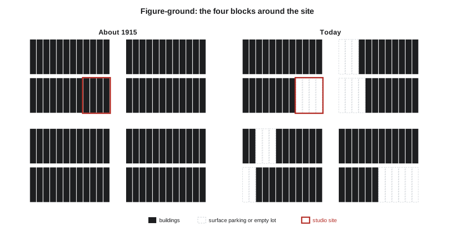
Joon-ho draws the figure-ground for the four blocks around the site from old fire insurance maps of about 1915 and from today's aerial photographs. The comparison is startling. In 1915, the blocks were almost solid: warehouses, a hotel, shops and stables filled every lot, with lanes behind. Today, roughly a third of the land is surface parking, much of it created when buildings burned or were demolished in the decades after the Second World War. The studio site is one of those gaps. 'Every one of these white holes is a missing tooth,' Adeyemi says. 'Your building is a crown.'
Measuring the context
Figure-ground plans show pattern; measurements show scale. The students photograph and measure the buildings on the four blocks: number of storeys, height to the cornice or parapet, width of each building's street front, ground floor height, material and the share of each facade that is window. Callum builds a table of the twenty-four buildings that face the avenue and Tessier Street.
# Street frontage survey: buildings facing the avenue and Tessier Street
# name, floors, cornice height (m), frontage width (m), ground floor height (m)
survey = [
    ("Harland Building", 6, 24.0, 30, 4.8),
    ("hardware store, now cafe", 3, 12.5, 12, 4.5),
    ("bank", 2, 11.0, 20, 6.0),
    ("loft warehouse A", 7, 27.5, 40, 5.0),
    ("loft warehouse B", 5, 20.5, 25, 4.6),
    ("hotel", 6, 23.0, 35, 5.2),
    ("parking garage", 4, 12.0, 50, 3.0),
    ("Coach House", 3, 11.5, 18, 4.2),
]
total = sum(w for _, _, _, w, _ in survey)
avg = sum(h * w for _, _, h, w, _ in survey) / total     # height weighted by frontage
tall = max(survey, key=lambda r: r[2])
print(f"frontage surveyed: {total} m")
print(f"frontage-weighted cornice height: {avg:.1f} m")
print(f"tallest cornice: {tall[0]} at {tall[2]} m")
for name, floors, h, w, g in survey:
print(f"{name:26s} {floors} floors, cornice {h:5.1f} m, ground floor {g:4.1f} m, {h / floors:4.1f} m per floor")frontage surveyed: 230 m frontage-weighted cornice height: 18.8 m tallest cornice: loft warehouse A at 27.5 m Harland Building 6 floors, cornice 24.0 m, ground floor 4.8 m, 4.0 m per floor hardware store, now cafe 3 floors, cornice 12.5 m, ground floor 4.5 m, 4.2 m per floor bank 2 floors, cornice 11.0 m, ground floor 6.0 m, 5.5 m per floor loft warehouse A 7 floors, cornice 27.5 m, ground floor 5.0 m, 3.9 m per floor loft warehouse B 5 floors, cornice 20.5 m, ground floor 4.6 m, 4.1 m per floor hotel 6 floors, cornice 23.0 m, ground floor 5.2 m, 3.8 m per floor parking garage 4 floors, cornice 12.0 m, ground floor 3.0 m, 3.0 m per floor Coach House 3 floors, cornice 11.5 m, ground floor 4.2 m, 3.8 m per floor
Three patterns stand out. First, the warehouses and the hotel, which make up most of the frontage, have cornices between about 20 and 28 m, and the frontage-weighted average is roughly 19 m. Second, the older buildings have tall ground floors, 4.5 to 6 m, which gave the warehouses loading docks and showrooms and now give them generous shops and restaurants; the parking garage has a ground floor of only 3 m, and it shows. Third, the frontages are narrow by modern standards: most buildings occupy 12 to 40 m of street, so a walk along the avenue passes a new building every half minute or so. A single building occupying the whole studio frontage of 40 m would be at the upper end of that range, which is a warning the students will remember when they design the facade.
Movement and activity
Ingrid spends three days counting. She stands at the corner at 8 a.m., noon, 5 p.m. and 9 p.m. on a weekday and at noon on Saturday, and counts people walking past in each direction, people waiting at the bus stop, cyclists and vehicles turning into the lane. The counts show that most pedestrians walk along the avenue toward the transit stops and the restaurants to the east; Tessier Street is quieter, used mainly by people heading to the parking garage. In the evening, foot traffic on the avenue is heavy until about 10 p.m., when the restaurants close, and then falls sharply. On Saturday, the café across the street spills onto the sidewalk and the avenue is busy all afternoon.
She also maps what happens in the ground floors of the surrounding buildings: restaurants and cafés, a bookstore, a bicycle shop, two galleries, a hair salon, several vacant storefronts and the blank wall of the parking garage. Upper floors hold lofts, offices, artists' studios and the hotel. The mix is lively but uneven: the blocks to the east are full and active, while the blocks around the site have long dead stretches next to parking. The studio building's ground floor can extend the active edge of the avenue westward, or it can add another dead stretch.
Climate and environment
Downtown climate is local. Tall buildings create wind at their bases, especially when strong winds strike a broad face and are deflected down to the sidewalk. In winter, the avenue's sunny north side, where the site sits, is noticeably warmer and drier than its shaded south side; snow melts there first, and pedestrians cross the street to walk in the sun. Tessier Street, running north to south, gets sun on its east side in the morning and its west side in the afternoon. The lane behind the site is in shade for most of the winter day. Wren maps sun, shade and the direction of the prevailing winds, which in Winnipeg come mostly from the south in summer and from the northwest in winter, and marks where snow piles up when the plows clear the street.
Noise is another environmental layer. The avenue carries buses and traffic, and the bar across the lane has a patio that is noisy until midnight in summer. Homes facing the avenue will need good windows and mechanical ventilation that lets residents keep them closed; homes facing the lane may be quieter during the day than at night.
History and heritage
The area around the site grew in a single burst, roughly from the 1880s to the First World War, when Winnipeg was the wholesale and railway gateway to the Canadian West and its warehouse district filled with brick and stone buildings. The buildings were designed by a few busy architects using a shared vocabulary: load-bearing brick walls, heavy timber or later steel and concrete frames inside, large windows in regular bays, and cornices of brick, stone or pressed metal. When the wholesale trade declined in the middle of the century, the buildings emptied; many were demolished for parking, and the survivors were saved by the heritage movement of the 1970s and later converted to lofts, offices and restaurants. ARCH-121 told part of this story; this term the students will build within it.
Heritage is not only old buildings. It includes the pattern of narrow lots, the rhythm of window bays, the tall ground floors, the lanes and the ghost signs on side walls. It also includes histories that are less visible: the workers who loaded the freight, the immigrant families who lived nearby, and the Indigenous people for whom the meeting of the rivers was a gathering place long before the city existed. Lesson 10 returns to heritage in detail.
People and community
Context includes the people who use a place and the people who could. Joon-ho interviews the owner of the café across the street, two artists in the Coach House, a staff member at a nearby shelter, the manager of the hotel and a resident of one of the loft buildings. They want different things. The café owner wants more people on the street, especially in the evening. The artists worry that new housing will bring residents who complain about noise and push rents up. The shelter worker points out that people experiencing homelessness use the area's doorways and lanes for warmth and asks that the building not simply drive them away. The loft resident wants a grocery store within walking distance. None of these voices is the client, but all of them are the building's neighbours.
Adeyemi asks the students to record not only what people say but also who they did not hear from: children, older people, people who work night shifts, people who arrive by wheelchair. 'Every context map has a blank area,' she says. 'Find out what is in it.'
Policy context
Every urban site sits under layers of rules. The most important for this studio are the zoning by-law, which sets uses, height, density and setbacks (Lesson 4); the heritage rules for buildings and districts (Lesson 10); the building code, which governs safety (Lessons 6 and 7); and the city's plans for the area. Winnipeg's downtown is governed by its own downtown zoning by-law and by plans for the Exchange District, and the city's housing reforms of 2023 to 2025, made under the federal Housing Accelerator Fund, have encouraged more homes in the centre.
For the studio, Adeyemi has written a simplified zoning code modelled on real downtown rules, so that every student designs to the same constraints. The rules appear in Lesson 4. For now, she gives the students only the headline: a maximum height of 30 m, a floor area ratio of up to 5.5 and a requirement to build along the street.
Worked problem
Writing a context statement
At the end of week one, each student writes a one-page context statement that summarizes what the building must respond to. Callum's first draft lists facts: the heights of the neighbours, the bus stop, the traffic counts, the parking garage. Adeyemi asks him to turn the facts into conclusions. How should he do it?
Show solution
- For each layer of context, state what the survey found and what it means for the design. The facts become reasons.
- Form: neighbouring cornices are 20 to 28 m and frontages are narrow, so the building should hold a streetwall at about the Harland Building's cornice and break its long avenue frontage into smaller parts.
- Movement: most pedestrians walk along the avenue toward the east, so the main public entrances belong on the avenue near the corner; Tessier Street suits the residential entrance and the Foundry Collective's loading.
- Activity: the dead stretch around the site needs a ground floor that is active morning to evening, and a grocery would serve the residents the loft owner described.
- Environment: the site is on the sunny side of the avenue, so a café terrace on the south face would catch winter sun.
- People: the artists and the shelter worker raise questions about noise, rents and the use of doorways that the design and the operations plan must answer.
Answer: A context statement is a short argument: these are the conditions, and this is what the building should do about them. It becomes the yardstick for every review that follows.
Exercise 1: context atlas
This exercise takes two weeks and is done in pairs, with each pair responsible for two layers.
- Draw figure-ground plans of the four blocks around the site at 1:1000 for about 1915 and for today.
- Survey and photograph every building facing the site's two streets, recording height, floors, frontage, ground floor height, materials and window share.
- Count pedestrians, cyclists and vehicles at the corner at five times of day, and map the ground floor uses of the four blocks.
- Map sun, shade, wind, snow and noise around the site in winter and summer.
- Interview at least four people who live, work or spend time near the site, and note whose voices are missing.
- Write a one-page context statement with conclusions for the design.
Self-critique checklist
- Have I turned every observation into a conclusion for the design?
- Do my drawings show the site's neighbours, not only the site?
- Have I visited the site at different times of day and in bad weather?
- Have I identified the voices I did not hear?
Common mistakes
MistakeDrawing the site as an empty rectangle.
InsteadDraw the neighbours, the street, the lane and the sidewalks: they are part of the design problem.
MistakeTreating context as a list of facts.
InsteadDraw conclusions from each layer about what the building should do.
MistakeVisiting the site once, on a sunny afternoon.
InsteadVisit at different times, days and seasons, and in bad weather.
MistakeCopying the neighbours' style.
InsteadLearn the patterns, such as height, rhythm and ground floor scale, then interpret them.
MistakeListening only to the client.
InsteadInterview neighbours and users, and note who is missing.
Summary and key terms
- A city building is a piece of a larger fabric; the first step in designing one is to read its context.
- Context has layers: form, movement, use, history, environment, people and policy.
- Figure-ground plans reveal the grain of a place and the gaps that parking and demolition have created.
- Measured surveys show the scale of the street: cornice heights, frontage widths and ground floor heights.
- A context statement turns observations into conclusions that guide the design.
- Context
- Everything around a site that shapes what should be built on it.
- Figure-ground plan
- A plan showing buildings in black and open space in white.
- Nolli map
- Giambattista Nolli's 1748 plan of Rome, which showed public interiors as part of the open public realm.
- Cornice
- The projecting band at the top of a facade, which sets the height of a streetwall.
- Frontage
- The length of a lot or building along a street.
- Context statement
- A short written argument stating what a building must respond to and how.
Practice problems
Work each problem on paper first, then reveal the answer to check.
A survey of four buildings records frontages of 20, 30, 10 and 40 m and cornice heights of 12, 24, 9 and 27 m. What is the frontage-weighted cornice height?
Show answer
(20 × 12 + 30 × 24 + 10 × 9 + 40 × 27) ÷ 100 = 21.3 m.
What did Nolli's map of Rome add to the ordinary figure-ground plan?
Show answer
It showed the interiors of public buildings such as churches in white, as part of the public realm.
Why do pedestrians in a northern city often walk on the north side of an east-west street in winter?
Show answer
The north side faces south and receives the sun, so it is warmer and its snow melts first.
Name three layers of urban context other than form.
Show answer
Any three of movement, use and activity, history, environment, people and policy.
Why is a ground floor of only 3 m a weakness on a downtown street?
Show answer
It is too low for good shops and restaurants, feels cramped, and cannot match the tall ground floors of the historic buildings.
Lesson quiz · 5 questions
Score 60% or more to complete this lesson.
Create a free account to save your progress, take quizzes and earn a certificate.