
WEB-101 · Lesson 9 of 12 · 18 min
Layout with CSS Grid
▶ Video coming soon A video version of this lesson is on the way.
Sana's home page design was laid out on a twelve-column grid, as most of her designs are: a wide hero section across the top, the main content in the left eight columns with the urgent-needs box in the right four, a band of three news stories, and the footer. "You could build this with nested Flexbox containers," Gareth said on Monday, November 2, "and people did for years. But the design is a grid, so write it as one."
CSS Grid Layout places items in rows and columns at the same time. Flexbox, from Lesson 8, works along one axis and lets content decide sizes; Grid works on two axes and lets the container define the structure. This lesson covers defining columns and rows, the fr unit, placing items by line numbers and by named areas, grids that adapt to the screen without media queries, alignment, and when to choose Grid or Flexbox.
Defining a grid
display: grid makes an element a grid container and its direct children grid items. On its own, that gives one column, so the next step is to define the tracks: the columns with grid-template-columns and, if needed, the rows with grid-template-rows. The lines between tracks are grid lines, numbered from 1 at the start edge. A grid of three columns has four column lines.
.news {
  display: grid;
  grid-template-columns: 1fr 1fr 1fr;
  gap: 1.5rem;
}
The fr unit, short for fraction, shares out the space left in the container after fixed-size tracks and gaps are taken. 1fr 1fr 1fr gives three equal columns; 2fr 1fr gives a column twice as wide as the other. Tracks can mix units: 15rem 1fr gives a fixed sidebar and a flexible main column. repeat(3, 1fr) is shorthand for 1fr 1fr 1fr, and repeat(12, 1fr) gives Sana's twelve columns.
function trackSizes(container, gap, tracks) {
  const gaps = gap * (tracks.length - 1);
  let fixed = 0;
  let fractions = 0;
  for (const t of tracks) {
    if (t.endsWith('fr')) fractions += parseFloat(t);
    else fixed += parseFloat(t);
  }
  const perFr = (container - gaps - fixed) / fractions;
  return tracks.map(t => t.endsWith('fr') ? parseFloat(t) * perFr : parseFloat(t));
}

console.log(trackSizes(1104, 24, ['1fr', '1fr', '1fr']).join(' | '));
console.log(trackSizes(1104, 24, ['2fr', '1fr']).join(' | '));
console.log(trackSizes(1104, 24, ['240px', '1fr', '2fr']).join(' | '));352 | 352 | 352 720 | 360 240 | 272 | 544
What this code does
The function works out column widths the way Grid does for simple cases. It first subtracts the gaps (one fewer than the number of tracks) and any fixed tracks such as 240px from the container width. What remains is divided by the total number of fr units, and each fr track gets its share. parseFloat reads the number at the start of text such as '2fr' or '240px'. For three equal columns in 1,104 pixels with 24-pixel gaps, each column is (1,104 minus 48) divided by 3, which is 352 pixels.
Placing items on lines
By default, grid items fill the cells one by one, left to right and top to bottom, which is called auto-placement. To place an item deliberately, give the lines it should start and end on with grid-column and grid-row. grid-column: 1 / 9 means from column line 1 to column line 9, which spans eight columns; grid-column: 1 / -1 means from the first line to the last, the whole width; and grid-column: span 4 means four columns wide, starting wherever auto-placement puts it.
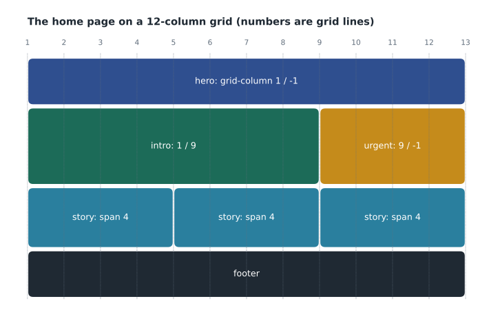
.home {
  display: grid;
  grid-template-columns: repeat(12, 1fr);
  gap: 1.5rem;
}

.home .hero   { grid-column: 1 / -1; }
.home .intro  { grid-column: 1 / 9; }
.home .urgent { grid-column: 9 / -1; }
.home .story  { grid-column: span 4; }
When content needs more rows than were defined, the grid creates implicit tracks automatically. Their size is set with grid-auto-rows; grid-auto-rows: minmax(10rem, auto) makes each new row at least 10rem tall and taller if its content needs it.
Named areas
A second way to place items is to draw the layout as text. grid-template-areas takes one quoted string per row, with a name for each cell; items are then assigned to areas with grid-area. A dot marks an empty cell. Every area must be a rectangle.
.page {
  display: grid;
  grid-template-columns: 2fr 1fr;
  grid-template-areas:
    "header header"
    "main   aside"
    "footer footer";
  gap: 1.5rem;
}

.page > header { grid-area: header; }
.page > main   { grid-area: main; }
.page > aside  { grid-area: aside; }
.page > footer { grid-area: footer; }
Named areas are easy to read and easy to rearrange: changing the strings inside a media query, as Lesson 10 does, can stack the areas in a single column on a phone. As with Flexbox, the visual arrangement should still follow the HTML order, so that screen readers and keyboard focus make sense; areas should be moved only in ways that keep the reading order meaningful.
Grids that adapt by themselves
One of Grid's most useful patterns builds a responsive row of cards without any media queries. minmax(min, max) gives a track a size range, and auto-fit inside repeat() creates as many columns as will fit.
.cards {
  display: grid;
  grid-template-columns: repeat(auto-fit, minmax(15rem, 1fr));
  gap: 1.5rem;
}
Read the column definition from the inside out: each column is at least 15rem and at most 1fr; auto-fit makes as many such columns as fit the width, and when there are fewer items than columns, it collapses the empty tracks so the items stretch to fill the row. Its sibling auto-fill keeps the empty tracks, so items keep their minimum width and leave space at the end. On a phone the pattern gives one column, on a tablet two, and on a desktop four, with no breakpoints at all.
Worked problem
How many columns fit?
The cards container uses repeat(auto-fit, minmax(240px, 1fr)) with gap: 24px. How many columns are there at container widths of 360, 768 and 1,104 pixels, and how wide is each column at 768 pixels?
Show solution
- n columns need n × 240 pixels plus (n − 1) gaps of 24, so find the largest n that fits.
- \[n \times 240 + (n-1) \times 24 \le W \;\Rightarrow\; n \le \frac{W + 24}{264}\]
- Apply this to each width and round down.
- \[\frac{384}{264} \approx 1.45 \to 1, \quad \frac{792}{264} = 3 \to 3, \quad \frac{1{,}128}{264} \approx 4.27 \to 4\]
- At 768 pixels, share the width among 3 columns after the 2 gaps.
- \[(768 - 2 \times 24) \div 3 = 240 \text{ px}\]
Answer: The grid has 1 column at 360 pixels, 3 at 768 pixels (exactly 240 pixels each, so the fit is tight) and 4 at 1,104 pixels. The same single line of CSS produces all three layouts.
Alignment in Grid
Grid uses the same alignment words as Flexbox, but in two directions at once. justify-items aligns items horizontally inside their cells and align-items vertically; both default to stretch, so items fill their cells. place-items: center sets both and centers every item in its cell. justify-self and align-self do the same for one item. justify-content and align-content position the whole grid inside the container when the tracks do not fill it.
Subgrid lets a nested grid use its parent's tracks: a card with grid-template-rows: subgrid lines up its heading, text and button rows with those of the cards beside it, even when the headings wrap to different numbers of lines. All major browsers have supported subgrid since 2023.
Overlapping items and the Grid inspector
Unlike Flexbox, Grid lets two items occupy the same cells. If the hero section's photo and its heading are both placed at grid-column: 1 / -1 and grid-row: 1, they sit on top of each other, and the heading can be aligned to the bottom of the photo with align-self: end. Items later in the HTML are drawn on top; the z-index property changes the stacking order when needed. This replaces older techniques that used absolute positioning, which took the heading out of the layout entirely, so that long headings on narrow screens ran off the photo. When text sits over a photo, it still needs a contrast ratio of 4.5 to 1 against every part of the image behind it, which in practice means a solid or semi-transparent band behind the text, as Lesson 11 explains.
.hero {
  display: grid;
}

.hero > img,
.hero > .hero-text {
  grid-column: 1;
  grid-row: 1;
}

.hero > .hero-text {
  align-self: end;
  padding: 1rem 1.5rem;
  background-color: rgb(28 107 88 / 0.92);
  color: #ffffff;
}
Every major browser's developer tools include a Grid inspector. Selecting a grid container shows its lines, numbers and named areas drawn over the page, which makes it easy to see why an item has landed in the wrong place. Mira used it constantly in her first week with Grid: almost every placement mistake turned out to be an off-by-one error between lines and tracks, such as writing 1 / 8 when she meant to cover eight columns and needed 1 / 9.
Grid or Flexbox?
| Situation | Better tool | Why |
|---|---|---|
| A row of menu links of different lengths | Flexbox | One direction; each item sized by its content |
| The overall page layout with header, main, aside and footer | Grid | Two directions; the container defines the structure |
| A set of cards that should line up in columns and rows | Grid | Columns stay aligned from row to row |
| Centering one thing | Either | Both do it in two or three declarations |
| A form label beside its input, repeated down a form | Grid | Labels and inputs line up in two columns |
| A button pushed to the end of a toolbar | Flexbox | An auto margin does it in one declaration |
A useful test is to ask where the sizes come from. If the content should decide, as with menu links, use Flexbox. If the layout should decide and items should line up across rows, use Grid. The two work together: the Food Hub home page is a grid, and inside it the header and each card use Flexbox.
The Contact page brought a small surprise. Its form had labels of very different lengths, and Mira's first layout put each label and input on one Flexbox row, so the inputs started at ragged positions. A two-column grid, grid-template-columns: max-content 1fr, lined every input up along the longest label. On phones, a single column put each label above its box, which Lesson 10 shows how to switch.
Common mistakes
MistakeForgetting that a grid with no column template has only one column.
InsteadDefine the columns with grid-template-columns.
MistakeCounting tracks instead of lines when placing items.
InsteadLines are numbered from 1 and there is one more line than tracks: 1 / -1 spans every column.
MistakeUsing percentages for columns and then adding a gap that makes the grid overflow.
InsteadUse fr units, which share the space left after the gaps.
MistakeDrawing an L-shaped named area.
InsteadEvery named area must be a rectangle.
MistakeRearranging areas so the visual order no longer matches the HTML.
InsteadKeep the source order meaningful; move areas only in ways that preserve reading and focus order.
MistakeUsing auto-fill when the items should stretch to fill the row.
Insteadauto-fit collapses empty tracks so items stretch; auto-fill keeps them.
Practice problems
Work each problem on paper first, then reveal the answer to check.
A grid has grid-template-columns: 200px 1fr 1fr in a 1,000-pixel container with a 20-pixel gap. How wide is each fr column?
Show answer
1,000 − 2 × 20 − 200 = 760 pixels shared by 2 fr, so 380 pixels each.
Which line numbers make an item span the last four of twelve columns?
Show answer
grid-column: 9 / 13, or 9 / -1.
Build this: a two-column layout for the Contact page with the form in a column twice as wide as the column for the address and map, 2rem apart, using named areas form and details.
Show answer
See the model answer below.
.contact {
  display: grid;
  grid-template-columns: 2fr 1fr;
  grid-template-areas: "form details";
  gap: 2rem;
}

.contact form     { grid-area: form; }
.contact .details { grid-area: details; }
Try it yourself
Count the auto-fit columns
Write a function columns(width, min, gap) that returns how many columns repeat(auto-fit, minmax(min, 1fr)) creates, at least 1.
Print the result for widths 320, 700 and 1,200 with a minimum of 250 and a gap of 20.
function columns(width, min, gap) {
  // your code here
}

console.log(columns(320, 250, 20));
console.log(columns(700, 250, 20));
console.log(columns(1200, 250, 20));
Summary and key terms
- display: grid makes a grid container; grid-template-columns and grid-template-rows define its tracks.
- The fr unit shares the space left after fixed tracks and gaps; repeat() shortens repeated tracks.
- Grid lines are numbered from 1; grid-column: 1 / -1 spans the full width and span n spans n tracks.
- grid-template-areas draws the layout with named rectangular areas assigned by grid-area.
- repeat(auto-fit, minmax(min, 1fr)) builds responsive card grids with no media queries.
- justify-items, align-items and place-items align items in their cells; subgrid lets nested grids share tracks.
- Use Grid when the layout defines sizes in two directions and Flexbox when content defines sizes in one.
- Grid container
- An element with display: grid.
- Track
- A column or row of a grid.
- Grid line
- A numbered dividing line between tracks.
- fr unit
- A fraction of the free space in a grid container.
- minmax()
- A function giving a track a minimum and maximum size.
- auto-fit
- A repeat() keyword that creates as many tracks as fit and collapses empty ones.
- Named area
- A rectangular region of a grid named in grid-template-areas.
- Implicit track
- A row or column the grid creates automatically for extra items.
- Subgrid
- A nested grid that uses its parent grid's tracks.
Lesson quiz · 5 questions
Score 60% or more to complete this lesson.
Create a free account to save your progress, take quizzes and earn a certificate.