
VIS-130 · Lesson 6 of 12 · 28 min
Impressionism and color
In the 1860s and 1870s, a group of young painters in Paris rejected the official art world's polished studio pictures and took their easels outdoors to catch fleeting effects of light, weather and modern life. Their loose, visible brushstrokes and bright colors shocked critics, who called them Impressionists after a painting of a harbor at sunrise. Impressionism changed how artists thought about color, light and the moment, and it grew up alongside photography, borrowing from it and competing with it. This lesson explains the Impressionists' methods, the color theory that supported them, the influence of Japanese prints and photography, the Post-Impressionists who followed, and the practical color lessons that image makers still use every day.
The Salon, the independents and the 1874 exhibition
In nineteenth-century France, the Académie des Beaux-Arts controlled artistic success through the annual Salon, a huge official exhibition with a jury that favored smooth, carefully finished paintings of historical, mythological and religious subjects. Artists rejected by the Salon struggled to find buyers.
In 1874, a group including Claude Monet, Pierre-Auguste Renoir, Edgar Degas, Camille Pissarro, Alfred Sisley, Berthe Morisot and Paul Cézanne organized their own independent exhibition in the former studio of the photographer Nadar in Paris. Monet showed a painting of the port of Le Havre with an orange sun rising through mist, titled Impression, Sunrise. A critic, Louis Leroy, mocked the show in a satirical review, using "Impressionists" as an insult. The group held eight exhibitions between 1874 and 1886 and eventually embraced the name.
The independent exhibition is a lesson in itself. When established institutions ignore new work, artists can create their own venues, a pattern repeated by photographers' collectives, independent film festivals and online platforms.
Painting outdoors and the moment
Impressionists painted en plein air, outdoors, to capture the effects of natural light as it changed. New technology helped: portable easels and paint sold in collapsible metal tubes, introduced in the 1840s, made outdoor painting practical. Working quickly, they used broken brushstrokes, placing dabs of color side by side rather than blending them smoothly, which gave a vibrant, flickering surface and suggested movement and atmosphere.
Monet pushed the study of changing light furthest in his series paintings of the 1890s: haystacks, poplars and the façade of Rouen Cathedral, each painted many times at different hours and seasons. The series showed that the same subject could look completely different depending on the light. A building could be gray-violet in early morning fog and glowing orange at sunset.
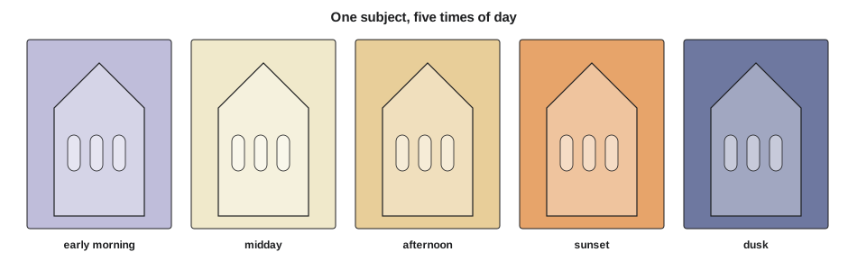
For photographers and cinematographers, the series idea is central. Golden hour, blue hour, overcast light and harsh noon sun transform a location. Planning a shoot around time of day, as VIS-110 and PHOT-311 explain, is the photographic version of Monet's series.
Color theory behind Impressionism
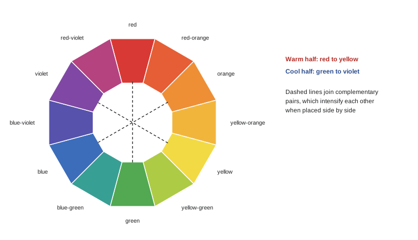
Impressionist color drew on scientific ideas about color that circulated in the nineteenth century. The French chemist Michel Eugène Chevreul, director of dyes at the Gobelins tapestry works, published a book in 1839 on the law of simultaneous contrast: a color looks different depending on the colors next to it. A gray placed beside red appears slightly greenish; beside blue, it appears slightly orange. Complementary colors, pairs opposite each other on the color wheel such as red and green, blue and orange, or yellow and violet, intensify each other when placed side by side.
Impressionists used these effects. They painted shadows not as brown or black but as blue and violet, observing that shadows on snow or in sunlight take on cool colors from the sky. They placed complementary colors next to each other to make both vibrate.
| Harmony | How it is built | Effect | Image-making example |
|---|---|---|---|
| Complementary | two hues opposite on the wheel | strong contrast, vibrancy | orange skin tones against a teal background |
| Analogous | three or so neighboring hues | calm, unified | autumn reds, oranges and yellows |
| Split complementary | one hue plus the two neighbors of its complement | contrast with less tension | blue with red-orange and yellow-orange accents |
| Triadic | three hues equally spaced | lively, balanced | primary red, yellow and blue graphics |
| Monochromatic | one hue in different values and saturations | mood, simplicity | a blue-tinted night scene |
The orange-and-teal look that dominated many films and advertisements from the 2000s onward is a complementary scheme: warm skin tones are pushed toward orange while shadows and backgrounds shift toward teal, maximizing contrast and making faces stand out.
Worked problem
Analyzing a color scheme
A described painting shows a woman in a bright orange dress standing in a garden of blue-green foliage, with violet shadows on a pale path. Identify the color harmony and explain its effect.
Show solution
- Locate the main hues on the wheel: orange in the dress and blue-green in the foliage sit roughly opposite each other.
- Identify the harmony: this is a complementary scheme, orange against blue-green.
- Note the shadows: violet shadows follow Impressionist practice, painting shadows with cool color instead of brown or black.
- State the effect: the complement makes the dress vibrate against the foliage, drawing the eye to the figure, while the cool violet shadows suggest bright sunlight.
Answer: The painting uses a complementary harmony of orange and blue-green, which makes the woman's dress stand out vividly against the foliage. The violet shadows show the Impressionist habit of painting shadows in cool colors, which makes the sunlight feel bright and warm by contrast.
Modern life as subject
Impressionists painted the modern city as well as the countryside. Paris had been rebuilt under Baron Haussmann in the 1850s and 1860s with wide boulevards, cafés, railway stations and parks. Monet painted the steam-filled Gare Saint-Lazare railway station. Gustave Caillebotte painted rainy streets and men at work planing a floor. Degas painted dancers in rehearsal, racecourses and café scenes. Mary Cassatt, an American who worked in Paris and exhibited with the Impressionists, and Berthe Morisot painted women's lives, domestic interiors, mothers and children, subjects often dismissed as minor but treated with great seriousness.
This focus on contemporary everyday life, leisure and the city connects directly to street photography and to cinema, which was born in Paris in 1895 when the Lumière brothers screened short films of everyday scenes such as workers leaving a factory and a train arriving at a station.
Photography and Impressionism
Photography, publicly announced in 1839, and Impressionism developed in close relation. Photographs freed painters from the duty of exact record, encouraging them to explore what photography could not yet do: color, the feeling of light and personal vision. At the same time, photography influenced composition. Degas, a keen amateur photographer, used cropped, off-center compositions in which figures are cut off by the frame edges, as in his paintings of dancers and of the Place de la Concorde, where figures walk out of the frame. Such framing suggests a snapshot, a fragment of a continuous world.
Early photographs with long exposures blurred moving figures into ghostly streaks, and some critics compared Impressionist brushwork to these effects. Painters also used photographs as references, though many did so quietly because it was considered a form of cheating.
Japonisme: the influence of Japanese prints
After Japan opened to Western trade in the 1850s, Japanese woodblock prints, called ukiyo-e, pictures of the floating world, flooded into Europe. Prints by artists such as Katsushika Hokusai, including his series of views of Mount Fuji from the early 1830s with its famous image of a great wave, and Utagawa Hiroshige, with his views of Edo and the Tōkaidō road, fascinated European artists. The craze, called Japonisme, influenced Monet, Degas, Cassatt, Vincent van Gogh and many others.
Japanese prints offered radical compositional ideas: flat areas of bold color, strong outlines, asymmetry, high or unusual viewpoints, figures cut off at the edges, diagonal compositions and large foreground objects framing distant views. These ideas reshaped European painting and, through it, graphic design, poster art and photography.
| Device | Description | Modern use |
|---|---|---|
| Flat color areas | bold shapes without modeling | poster design, flat illustration, minimalist photography |
| Asymmetry | key subject off-center, empty space | negative space in portraits and landscapes |
| Cropping | figures and objects cut by frame edges | snapshot aesthetics, editorial photography |
| High viewpoint | looking down on scenes | overhead shots, drone photography |
| Foreground framing | large near object frames distant view | shooting through branches, doorways, windows |
Post-Impressionism: structure, expression and symbol
In the 1880s and 1890s, several painters who had passed through Impressionism took it in new directions. Georges Seurat developed pointillism, building images from tiny dots of pure color that blend optically in the viewer's eye, as in his large painting of Parisians relaxing on the island of La Grande Jatte, completed in 1886. His method anticipated the way screens and printed halftones build images from dots and pixels.
Paul Cézanne sought solid structure, building landscapes and still lifes from planes of color and showing objects from slightly different viewpoints in the same picture, a move that led toward Cubism. Vincent van Gogh used color and brushwork expressively, with swirling skies and intense complementary contrasts conveying emotion rather than literal appearance. Paul Gauguin used flat, symbolic color, influenced by Japanese prints and by his travels, and his romanticized images of Tahiti are now also criticized for their colonial view of the people he depicted.
Worked problem
Optical mixing from dots to pixels
Seurat placed small dots of pure color close together so that they blend at a distance. A modern phone display has a pixel density of about 460 pixels per inch. At what viewing distance does a single pixel subtend about one arcminute, the approximate limit of normal visual acuity?
Show solution
- One pixel at 460 pixels per inch is \(1 \div 460 \approx 0.00217\) inch wide.
- One arcminute is \(1/60\) of a degree, about \(0.000291\) radians.
- For small angles, distance ≈ size ÷ angle: \(0.00217 \div 0.000291 \approx 7.5\) inches.
- Convert: 7.5 inches is about 19 cm.
Answer: Beyond about 19 cm (7.5 inches), individual pixels blend into continuous color for a viewer with normal acuity, the same optical mixing Seurat relied on at a much larger scale and viewing distance.
Impressionism in Canada and the United States
American painters absorbed Impressionism through study in France and through dealers who brought French work to New York. Mary Cassatt exhibited with the French Impressionists, and painters such as Childe Hassam, John Henry Twachtman and William Merritt Chase developed American Impressionism, painting New York streets, flag-draped avenues and coastal light. A group known as The Ten exhibited together from 1898. Their city scenes are a useful study for street photographers interested in weather and atmosphere.
What image makers take from Impressionism
Impressionism teaches that light changes everything and that the moment matters. Plan around time of day and weather. Remember that shadows have color, often cool blue and violet in daylight. Use complementary and analogous harmonies deliberately, and remember that colors change according to their neighbors. Learn cropping, asymmetry and high viewpoints from Degas and Japanese prints. And remember that the Impressionists' independent exhibition showed how new movements can create their own venues when institutions ignore them.
Common mistakes
MistakePainting or grading every shadow neutral gray or black
InsteadObserve that shadows in daylight often take on cool colors from the sky, as Impressionists observed
MistakeAssuming a color looks the same wherever it is placed
InsteadRemember simultaneous contrast: neighboring colors change how a hue appears
MistakeTreating cropped figures at the frame edge as mistakes
InsteadUse cropping deliberately, as Degas and Japanese printmakers did, to suggest a continuous world
MistakeThinking photography made painting obsolete
InsteadRecognize that photography pushed painters to explore color, light and personal vision
MistakeUsing orange and teal grading automatically
InsteadChoose color harmonies to fit the story rather than following a trend
Summary and key terms
- Impressionists held independent exhibitions from 1874 after being excluded from the official Salon; the name began as a critic's insult.
- Painting outdoors with tube paints and broken brushstrokes captured changing light and atmosphere.
- Monet's series paintings showed the same subject transformed by light at different times and seasons.
- Chevreul's law of simultaneous contrast explained how complementary colors intensify each other.
- Photography and Japanese prints influenced cropping, asymmetry, flat color and unusual viewpoints.
- Post-Impressionists developed pointillism, structural color and expressive color, leading toward modern art.
- Impressionism spread to Canada and the United States through painters trained in France.
- Impressionism
- A movement from the 1870s capturing fleeting effects of light and modern life with visible brushstrokes
- En plein air
- Painting outdoors, directly from nature
- Broken color
- Placing separate dabs of color side by side instead of blending them
- Simultaneous contrast
- The effect by which a color's appearance changes according to neighboring colors
- Complementary colors
- Hues opposite each other on the color wheel that intensify one another side by side
- Analogous colors
- Neighboring hues on the color wheel that create harmony
- Japonisme
- The European fascination with Japanese art, especially woodblock prints, from the 1850s
- Ukiyo-e
- Japanese woodblock prints and paintings of the floating world of urban life and landscape
- Pointillism
- Painting with small dots of pure color that blend optically at a distance
- Salon
- The official annual exhibition of the French Académie des Beaux-Arts
Practice problems
Work each problem on paper first, then reveal the answer to check.
Why did the Impressionists organize their own exhibition in 1874?
Show answer
The official Salon rejected or ignored their work, so they created an independent venue.
What technological change made painting outdoors easier?
Show answer
Paint sold in portable collapsible metal tubes, along with portable easels.
What did Monet's series paintings demonstrate?
Show answer
That the same subject changes dramatically with the light of different times and seasons.
Name three complementary color pairs.
Show answer
Red and green, blue and orange, yellow and violet.
How did Impressionists paint shadows in sunlight?
Show answer
With blue and violet tones rather than brown or black.
What does simultaneous contrast mean?
Show answer
A color looks different depending on the colors around it.
How did photography influence Degas's compositions?
Show answer
He used cropped, off-center framing that suggests a snapshot.
Name two compositional devices from Japanese prints.
Show answer
Examples include flat color, asymmetry, cropping, high viewpoints and foreground framing.
How is pointillism related to digital screens?
Show answer
Both build images from small dots of color that blend optically.
Name an Impressionist-influenced painter from your country.
Show answer
Examples include Maurice Cullen or Helen McNicoll in Canada, or Childe Hassam or Mary Cassatt for the United States.
Lesson quiz · 5 questions
Score 60% or more to complete this lesson.
Create a free account to save your progress, take quizzes and earn a certificate.