
CRE-230 · Lesson 9 of 12 · 27 min
Templates and design systems
Creators publish constantly, often several graphics a day across platforms. Designing each one from scratch is slow and produces inconsistent results. Templates and design systems solve this: reusable layouts, components and rules that make every new graphic faster to produce and recognizably part of the same brand. This lesson covers why systems matter, the difference between templates and design systems, building templates for common formats, components and styles, naming and organizing files, resizing and adapting across formats, working with collaborators, avoiding sameness, and maintaining a system over time.
Why systems matter
A system brings several benefits. Speed: filling in a template takes minutes rather than an hour. Consistency: every graphic uses the same typefaces, colors, spacing and layouts, building recognition. Quality: decisions about legibility, contrast and safe areas are made once, carefully, rather than repeatedly under time pressure. Delegation: assistants, editors and agencies can produce on-brand graphics without the creator designing each one. Scalability: a system makes it practical to publish on several platforms and to launch new series. The trade-off is upfront time to build the system and the risk that rigid templates make content repetitive, which the rest of this lesson addresses.
Templates and design systems
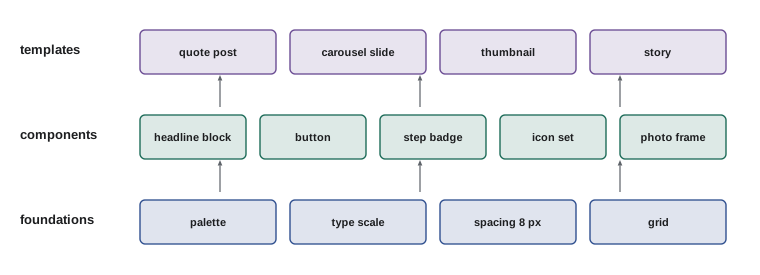
A template is a ready-made layout for a specific format, such as a quote post, a YouTube thumbnail or a carousel slide, with placeholders for text and images. A design system is the broader set of rules and components from which templates are built: the color palette, type styles, spacing scale, grid, icon set, image treatments, logo usage and the principles that govern them. A brand kit (Lesson 12) documents the system for others. Small creators may need only a handful of templates and a simple style guide; larger creators and media companies benefit from a fuller system with documented components.
Foundations
Foundations are the basic decisions on which everything else rests:
- Colors: the palette with hex values and usage rules (Lesson 5).
- Typography: typefaces, a type scale, weights and line heights for each text role (Lesson 4).
- Spacing: a spacing scale and standard margins for each format (Lesson 2).
- Grids: column and row structures for each format.
- Imagery: photo style, filters or grades, cut-out treatments and illustration style (Lesson 6).
- Shape language: corner radius, stroke weight, shadows and decorative elements.
Recording foundations as saved styles in your design tool, such as color swatches, text styles and layout grids, means they are applied consistently and can be updated globally.
Components
Components are reusable building blocks assembled from foundations: a headline block with a title and subtitle, a numbered step badge, a quote with attribution, a call-to-action button, a logo lock-up with handle, a progress indicator for carousels, a chart style, a photo frame with a specific border. Professional tools such as Figma support components and variants, in which changing the master component updates every instance; Canva and similar tools offer brand kits, saved elements and locked template elements. Components should be designed to work at the sizes and formats you use most, and tested with long and short content, since real text rarely matches the placeholder.
Building templates for common formats
Start with the formats you publish most often. A typical creator template set includes:
- Feed post templates: a headline post, a quote post, a photo with caption overlay, and an announcement.
- Carousel templates: a cover, an inner content slide in two or three variations, a summary slide and a closing slide.
- Thumbnail and cover templates: a layout for faces and text, and a layout for objects and text, each with a series variation.
- Story templates: a question box background, a link sticker frame and a countdown or announcement.
- Platform assets: profile picture, banners, podcast cover and link preview.
For each template, define fixed elements (logo, margins, color bands) and flexible elements (headline, image, background color from a defined set). Lock fixed elements where your tool allows, so they are not moved accidentally. Include guides showing safe areas.
Worked problem
Planning a weekly template set
A personal finance creator posts three feed carousels, two quote graphics, five stories and two YouTube videos each week. Which templates should be built first, and how much time might they save?
Show solution
- Highest volume: stories (5 per week) and carousels (3 per week, about 8 slides each, 24 slides).
- Build first: carousel cover, two inner slide layouts and a closing slide; one story background set; a quote post; a thumbnail layout.
- If designing a carousel from scratch takes 90 minutes and with templates 30 minutes, three carousels save 3 × 60 = 180 minutes a week.
- Over a year (50 weeks), carousels alone save about 150 hours.
Answer: Build carousel, story, quote and thumbnail templates first; carousels alone could save around three hours a week, about 150 hours a year.
Naming and organizing
Systems only help if assets can be found. Organize design files and assets into clear folders, such as "brand foundations", "templates by platform", "photos", "icons" and "exports by date". Name templates descriptively, such as "IG-carousel-cover-v3" or "YT-thumb-face-left", and include version numbers. Keep a single source of truth for logos and brand colors, so collaborators do not use outdated versions. In cloud-based tools, use shared folders and team libraries with permissions that prevent accidental edits to master templates.
| Item | Example name | Where |
|---|---|---|
| Carousel cover template | IG-carousel-cover-v3 | Templates / Instagram |
| Thumbnail layout | YT-thumb-face-left-v2 | Templates / YouTube |
| Logo files | logo-primary.svg, logo-mark.png | Brand foundations / Logos |
| Exported carousel | 2026-10-12_budget-meals_01.png | Exports / 2026-10 |
| Brand photos | photo-portrait-studio-03.jpg | Photos / Portraits |
Resizing and adapting across formats
Many tools offer automatic resizing from one format to another, but automatic results rarely work without adjustment: headlines wrap differently, images crop badly and safe areas change. A better approach is to design key layouts for each aspect ratio, sharing components and styles, so that converting a feed post to a story means placing the same elements into the story template rather than stretching the original. Designing a "master" version at the most important format, then adapting, keeps the system manageable. Keep text in editable layers rather than flattening it into images, so it can be reflowed.
Working with collaborators
When others produce graphics for you, the system becomes a shared language. Provide templates, the brand kit and a short guide with examples of correct and incorrect use; set permissions so collaborators can edit content but not foundations; agree on review steps before publishing; and give feedback with reference to the system, such as "use the 64-pixel heading style" rather than "make it bigger". For sponsored work, brands may supply their own guidelines, which must be combined respectfully with your own style; agree in advance whose system takes precedence for which elements.
Avoiding sameness
A common criticism of template-driven feeds is that every post looks identical, so viewers stop noticing them. Strategies to keep a system fresh include building several layout variations within each template type; allowing flexible elements, such as background colors from a set, different image crops and occasional illustrated or photographic covers; designing special templates for series and campaigns; leaving room for one-off designs for important posts; and refreshing templates periodically, perhaps each season, while keeping foundations stable. The goal is a recognizable family resemblance, not identical twins.
Maintaining the system
Design systems evolve. Review templates every few months: which are used, which perform well, which feel tired; retire unused templates; update templates when platforms change dimensions or interfaces; and record changes in the brand kit. When you change foundations, such as introducing a new brand color or typeface, update all templates together to avoid a confusing mixture. Keep an archive of older templates, which can be useful for anniversaries and for understanding how the brand developed.
Templates in different tools
Each design tool handles templates differently. In Canva and Adobe Express, templates are designs saved to a brand folder or published as brand templates, with brand kits supplying fonts, colors and logos, and locked elements protecting fixed parts; collaborators duplicate a template to start each new design. In Figma, templates are built from components and auto layout, which resizes containers automatically as text changes, and published libraries share components across files; designers duplicate frames or use variants. In Photoshop and Illustrator, templates are files with smart objects, linked assets and saved styles, sometimes automated with actions or scripts. Choose the approach that matches your tool and team, and document how to use it.
Worked problem
Creating data-driven graphics in bulk
A sports creator wants to make 30 match result graphics each weekend with team names, scores and logos. How can a template system speed this up?
Show solution
- Build one master template with placeholders for home team, away team, scores, logos and date.
- Prepare a spreadsheet with one row per match and columns matching the placeholders.
- Use the design tool's bulk create or data merge feature to generate 30 graphics automatically.
- Review each output for long team names that overflow, then export with names generated from the spreadsheet.
Answer: Combine a master template with a spreadsheet and the tool's bulk create or data merge feature, then review outputs for overflow.
Documentation for templates
A template without instructions invites misuse. Include short notes with each template: what it is for, the maximum number of characters for headlines, which elements can be changed, which color options are allowed, recommended image types, and an example of a finished graphic. Many teams place these notes on a hidden layer, a separate page in the file, or the brand kit. Clear documentation reduces review time and helps new collaborators produce good work quickly.
Measuring a system's value
Track whether the system is working: time spent per graphic, the number of revisions needed, consistency across the feed, and performance of templated content compared with one-off designs. If certain templates consistently underperform or require heavy editing, redesign them. If collaborators frequently break the rules, the rules may be unclear or too restrictive. A design system is a tool to serve the content; it should evolve with the creator's goals.
Templates for series and campaigns
Series and campaigns benefit from their own template variations within the main system. A weekly "Myth or Fact" series might use a distinctive split layout and an accent color reserved for it; a product launch campaign might use a countdown template, a feature highlight template and a testimonial template, all sharing the launch's key visual. Designing these as a coordinated set before the campaign starts ensures consistency across platforms and makes it possible to prepare and schedule content in advance, reducing stress during busy launch periods.
Starting small
A design system does not need to be complete to be useful. Start with a palette, two typefaces, a spacing scale and templates for the two or three formats you publish most. Use them for a month, note what you change repeatedly, and fold those changes back into the system. Expand gradually, adding components and templates as needs arise. A small system that is actually used is more valuable than an elaborate one that sits unused in a folder.
Version control
Templates change over time, and collaborators may keep using old copies. Mark versions clearly in file names and inside templates, keep a short change log in the brand kit noting what changed and why, and archive superseded versions in a separate folder rather than deleting them. When a major update happens, such as a new typeface or logo, announce it to collaborators, update all templates at once, and set a date after which old versions should no longer be used. Cloud design tools with shared libraries make this easier, because updating the library updates linked designs, but published graphics remain as they were, which is expected and fine.
Common mistakes
MistakeDesigning every graphic from scratch.
InsteadBuild templates for high-volume formats.
MistakeRelying only on automatic resizing.
InsteadDesign layouts for each aspect ratio from shared components.
MistakeUnnamed, scattered files.
InsteadUse clear folders, names and versions.
MistakeRigid templates that make every post identical.
InsteadBuild variations and flexible elements.
MistakeNever updating templates.
InsteadReview and refresh regularly.
Summary and key terms
- Systems bring speed, consistency, quality, delegation and scalability.
- Templates are layouts; design systems are the foundations and components behind them.
- Foundations include colors, type, spacing, grids, imagery and shape language.
- Components are reusable blocks tested with real content.
- Build templates for the formats you publish most.
- Organize and name assets clearly and adapt designs per aspect ratio.
- Avoid sameness with variations and maintain the system over time.
- Template
- Reusable layout with placeholders.
- Design system
- Rules, foundations and components behind templates.
- Foundations
- Basic decisions such as color, type and spacing.
- Component
- Reusable design building block.
- Variant
- Alternative version of a component.
- Locked element
- Template element protected from editing.
- Single source of truth
- One authoritative location for assets.
- Brand kit
- Documented brand assets and rules.
- Master layout
- Primary version adapted to other formats.
- Family resemblance
- Recognizable consistency with variety.
Practice problems
Work each problem on paper first, then reveal the answer to check.
Name three benefits of a design system.
Show answer
Speed, consistency, quality, delegation, scalability.
How does a template differ from a design system?
Show answer
A template is a layout; a system is the rules and components.
List four foundations.
Show answer
Color, type, spacing, grids, imagery, shape language.
Give an example of a component.
Show answer
Headline block, step badge, CTA button, logo lock-up.
Why test components with long text?
Show answer
Real text rarely matches placeholders.
Weekly time saved if 4 carousels drop from 90 to 30 minutes?
Show answer
240 minutes.
Give a good template name.
Show answer
IG-carousel-cover-v3.
Why avoid relying on automatic resizing?
Show answer
Text wraps and crops change badly.
How can collaborators be prevented from changing foundations?
Show answer
Locked elements and permissions.
Name two ways to avoid sameness.
Show answer
Variations, flexible elements, series templates, refreshes.
Lesson quiz · 5 questions
Score 60% or more to complete this lesson.
Create a free account to save your progress, take quizzes and earn a certificate.