
CRE-230 · Lesson 2 of 12 · 27 min
Layout, grids and alignment
Layout is the arrangement of text, images and shapes within a frame. A good layout feels organized and calm even when it contains a lot of information; a poor one feels cluttered, however attractive its individual parts. On small screens, where every pixel counts, layout decisions about margins, alignment and spacing make the difference between a graphic that reads instantly and one that people skip. This lesson covers margins and safe areas, grids for social formats, alignment, proximity and grouping, spacing systems, white space, common layout patterns for social graphics, and how to keep layouts consistent across a series.
Margins
Margins are the empty space between the content and the edge of the frame. Generous margins make graphics look professional and protect content from cropping and interface overlays. On a 1080-pixel-wide graphic, margins of about 60 to 100 pixels (roughly 6 to 9 % of the width) work well for feed posts; stories and vertical covers need larger top and bottom margins, often 200 to 250 pixels, to stay clear of the interface. Margins should usually be equal on the left and right, and may be slightly larger at the bottom than at the top, because the eye perceives a frame as balanced when the content sits a little above the geometric middle. Consistent margins across every graphic in a series are one of the simplest ways to look professional.
Grids
A grid is an invisible framework of columns, rows and gutters (the gaps between them) that guides where elements are placed. Grids give layouts structure, make alignment easy, and let different graphics in a series share a common skeleton. Common grids for social formats include:
- A single column with margins, for simple quote and headline graphics.
- Two or three columns, for comparisons, lists and image-and-text combinations.
- A modular grid of columns and rows, for infographics and carousels with several elements.
- A baseline grid, a set of horizontal lines spaced at the line height of body text, so that text in different columns aligns.
Most design tools let you add guides, columns and layout grids, and save them in templates. A 12-column grid is popular because it divides easily into halves, thirds, quarters and sixths.
Worked problem
Building a grid for a 1080 × 1350 post
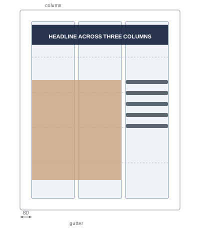
A designer wants a three-column grid with 80-pixel side margins and 30-pixel gutters on a 1080-pixel-wide feed post. How wide is each column?
Show solution
- Content width: 1080 − 2 × 80 = 920 pixels.
- Gutters: two gutters between three columns, 2 × 30 = 60 pixels.
- Column width: (920 − 60) ÷ 3 = 286.7 pixels, about 287 pixels.
- An element spanning two columns is 2 × 287 + 30 = 604 pixels wide.
Answer: Each column is about 287 pixels wide; a two-column element is about 604 pixels wide.
Alignment
Alignment means placing elements so that their edges or centers line up. Aligned elements look intentional and connected; misaligned elements, even by a few pixels, look careless. Common choices include left alignment, which creates a strong left edge and suits most text in English and other left-to-right languages; center alignment, which suits short headlines, quotes and symmetrical layouts but makes long text harder to read because each line starts in a different place; and right alignment, used sparingly for small details or in right-to-left languages. Choose one dominant alignment for each graphic rather than mixing them. Align elements to the grid, to the margins and to each other: the left edge of a headline, the left edge of a photo and the left edge of a logo can all share one vertical line, creating a clean axis. Use your tool's alignment and distribution commands and smart guides rather than eyeballing.
Proximity and grouping
People perceive elements that are close together as related, a principle from Gestalt psychology known as proximity. Use it to group information: a headline and its subheading sit close together; a photo and its caption sit close together; separate groups have more space between them. A common error is spreading elements evenly across a graphic, which makes everything look equally related and nothing grouped. Instead, the space within a group should be clearly smaller than the space between groups, often about half. Other Gestalt principles also help: similarity (elements with the same color, shape or style look related), enclosure (a box or background color groups its contents) and continuity (elements arranged along a line or curve read as a sequence).
Spacing systems
Consistent spacing makes layouts feel ordered. Many designers use a spacing scale based on a single unit, such as 8 pixels, and choose all margins, gaps and padding from multiples of it: 8, 16, 24, 32, 48, 64, 96. This removes guesswork, keeps spacing consistent across templates and makes layouts easier to adjust. In a social template, for example, the gap between a headline and subheading might be 24 pixels, the gap between text and an image 48 pixels, and the outer margin 80 or 96 pixels. Padding inside boxes and buttons follows the same scale.
| Spacing use | Typical value at 1080 px wide (8-px scale) |
|---|---|
| Outer margin (feed) | 80–96 px |
| Outer margin top/bottom (story) | 200–256 px |
| Between unrelated groups | 48–64 px |
| Between headline and subheading | 16–24 px |
| Padding inside a text box | 32–48 px |
| Gutter between columns | 24–32 px |
White space
White space, also called negative space, is empty space around and between elements. It does not have to be white; it is any area without content. White space gives elements room to breathe, directs attention to what remains, and signals quality and confidence: luxury brands and editorial designers often use generous white space, while discount retailers fill every gap. On small screens, it is tempting to fill the frame with as much information as possible, but crowded graphics are harder to read and less likely to be noticed. If a graphic feels busy, the solution is usually to remove elements or split them across several slides rather than shrinking everything.
Common layout patterns
Several layout patterns recur across social graphics because they work reliably:
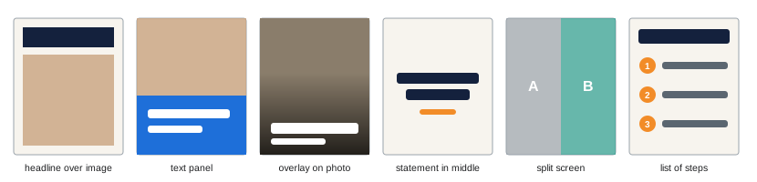
- Headline over image: a large headline at the top with a photo filling the rest, common for feed posts and covers.
- Image with text panel: a photo on one side or top, with a solid color panel holding the text, ensuring legibility.
- Full-bleed image with overlay text: text placed directly on a photo, with a darkening gradient or shape behind it for contrast.
- Centered statement: a large quote or statement in the middle of a plain background, for quotes and announcements.
- Split screen: two halves comparing before and after, this versus that, or two options.
- List or steps: a headline with numbered points stacked vertically, for tips and checklists.
- Frame and border: a colored border or frame around content, building brand recognition in a grid.
Using a small set of patterns consistently makes a creator's feed recognizable while keeping production fast.
Layout in sequences and grids
Social graphics are rarely seen alone. A profile grid shows posts side by side; a carousel shows slides in sequence; a series of thumbnails appears together on a channel page. Layout consistency across these views matters: the same margins, alignments and positions for headlines, logos and page numbers make a series feel unified. Some creators design profile grids deliberately, alternating photo posts with text posts or using a repeating color pattern, though this can become restrictive and depends on viewers visiting the profile. More important is that each post works on its own in the feed, where most people see it, while fitting the overall look.
Checking a layout
A quick checklist helps catch layout problems: are the margins generous and equal; do all elements align to the grid or to each other; are related items grouped and unrelated items separated; is there one clear focal point; is the spacing consistent; is anything important near the edges or under interface overlays; and does the graphic still read when viewed small? Squinting at the graphic or blurring it slightly shows its structure: a good layout reveals clear groups and a strong focal point even when details are not visible.
Layout for different aspect ratios
The same layout principles apply across formats, but each aspect ratio changes the options. Square and 4:5 formats suit stacked layouts, with a headline above an image or text panel below. Vertical 9:16 formats suit tall stacks with a headline in the upper third, an image or illustration in the middle, and supporting text or a sticker area below, leaving top and bottom margins clear. Horizontal 16:9 formats, such as thumbnails and banners, suit side-by-side layouts: a subject on one side and text on the other. Wide banners such as YouTube channel art need key content compressed into the central safe area, with decorative background extending to the edges. Planning a layout family for each ratio in advance makes adapting content quick.
Worked problem
Adapting a layout from 4:5 to 9:16
A creator has a 1080 × 1350 feed post with a headline at the top, a photo in the middle and a short tip at the bottom. How should it be adapted to a 1080 × 1920 story?
Show solution
- The story is 570 pixels taller; add top and bottom margins of about 220 pixels to stay clear of the interface.
- Keep the headline in the upper third, starting about 250 pixels from the top.
- Enlarge the photo to use the extra height, keeping faces in the middle third.
- Place the tip above the bottom margin, leaving room for a link or question sticker.
Answer: Use the extra height for larger margins and a larger photo, keeping the headline in the upper third and the tip above a clear bottom area.
Alignment details that matter
Some alignment details are easy to miss. Optical alignment adjusts elements so they look aligned rather than being mathematically aligned: round letters such as O and C and pointed shapes such as triangles appear smaller than square shapes of the same size, so they may need to extend slightly beyond a margin to look correct. Text boxes in design tools often include padding, so aligning boxes is not the same as aligning text; align the visible edges. Hanging punctuation, placing opening quotation marks outside the text block, keeps the left edge of quotes clean. Icons beside text should align with the text's x-height or cap height, not the top of the text box.
Layout and reading order for screen readers
When graphics are exported as images, screen readers cannot see their layout, which is why alt text matters (Lesson 11). In documents and PDFs, however, reading order follows the structure of the file, so text boxes should be ordered logically: headline first, then subheading, then body, then captions. Design tools that export PDFs often allow setting reading order; checking it makes documents more accessible.
Layout systems from print
Social layout borrows from centuries of print design. Book and magazine designers developed margins, columns, grids and spacing systems long before screens; Swiss designers of the mid-twentieth century, such as Josef Müller-Brockmann, formalized grid systems that remain influential. Studying posters, magazine covers and editorial spreads offers a rich source of layout ideas that translate well to social formats, especially carousels and covers, where the frame behaves much like a printed page viewed at arm's length.
Practicing layout
A good exercise is to take one piece of content, such as a tip with a headline, a sentence and a photo, and design it in five different layouts using the patterns above, keeping the same grid and spacing scale. Comparing them at phone size quickly reveals which arrangements communicate best for your style.
Common mistakes
MistakeContent crammed against the edges.
InsteadUse generous, consistent margins.
MistakeMixing left, center and right alignment.
InsteadChoose one dominant alignment.
MistakeSpacing everything evenly.
InsteadGroup related items closer than unrelated ones.
MistakeRandom spacing values.
InsteadUse a spacing scale based on one unit.
MistakeFilling every gap with content.
InsteadUse white space and split dense content across slides.
Summary and key terms
- Margins protect content and make graphics look professional.
- Grids of columns, rows and gutters give layouts structure.
- Align elements to the grid and to each other with one dominant alignment.
- Proximity groups related elements; space between groups should exceed space within.
- A spacing scale based on one unit keeps layouts consistent.
- White space directs attention and signals quality.
- Reliable layout patterns speed production and build recognition.
- Layout
- Arrangement of elements within a frame.
- Margin
- Space between content and the frame edge.
- Grid
- Framework of columns, rows and gutters.
- Gutter
- Gap between columns or rows.
- Baseline grid
- Horizontal lines aligning text across columns.
- Alignment
- Lining up edges or centers of elements.
- Proximity
- Gestalt principle that close items appear related.
- Spacing scale
- Set of spacing values based on one unit.
- White space
- Empty space around and between elements.
- Full-bleed
- Image extending to the edges of the frame.
Practice problems
Work each problem on paper first, then reveal the answer to check.
Typical side margins on a 1080 px feed post?
Show answer
About 60–100 px.
Why are 12-column grids popular?
Show answer
They divide into halves, thirds, quarters and sixths.
Column width for W = 1080, m = 60, n = 2, g = 40?
Show answer
(1080 − 120 − 40) ÷ 2 = 460 px.
Why avoid centering long text?
Show answer
Each line starts in a different place.
What does proximity mean?
Show answer
Close items are perceived as related.
Name two other Gestalt principles.
Show answer
Similarity, enclosure, continuity.
Give an 8-px spacing scale.
Show answer
8, 16, 24, 32, 48, 64, 96.
What does white space signal?
Show answer
Focus and quality.
Name three layout patterns.
Show answer
Headline over image, text panel, overlay, centered statement, split, list.
How can you check a layout's structure?
Show answer
Squint or blur it.
Lesson quiz · 5 questions
Score 60% or more to complete this lesson.
Create a free account to save your progress, take quizzes and earn a certificate.