
CRE-230 · Lesson 6 of 12 · 27 min
Images, cut-outs, icons and illustration
Most social graphics combine type and color with images: photographs of the creator, products, places and food; cut-out subjects placed on colored backgrounds; icons that label ideas; illustrations and shapes that add personality. Choosing and preparing these visual elements well, and using them legally, is a large part of graphic design for social media. This lesson covers choosing photos for graphics, cropping and framing for each format, cut-outs and background removal, shapes and frames, icons, illustration and stickers, mockups, sourcing images legally and safely, AI-generated images, and file preparation.
Choosing photos for graphics
A photo that works well on its own may not work in a graphic. Good photos for graphics have a clear subject that reads at small sizes; simple or blurred backgrounds, or space for text; good light and sharp focus on the important part; expressions or actions that fit the message; and enough resolution to crop. Plan photos for graphics when shooting: leave space above or beside the subject for headlines, shoot both horizontal and vertical versions, capture several expressions for thumbnails, and photograph products on clean backgrounds that are easy to extend or remove (CRE-130 and PHOT-202 cover shooting and editing). Building a library of your own brand photos, organized by subject and orientation, makes designing faster and more consistent.
Cropping and framing for formats
The same photo usually needs different crops for different formats. A horizontal photo may be cropped tightly to a face for a 1:1 profile image, to a medium shot for a 16:9 thumbnail, and to a vertical slice for a 9:16 cover. When cropping, keep the subject's eyes roughly on the upper third line, avoid cutting through joints such as wrists and knees, leave lead room in the direction of gaze or movement, and keep important details out of safe-area margins. Cropping enlarges the remaining pixels, so check that the result still has enough resolution for the output size; a crop smaller than the final pixel dimensions will look soft.
Worked problem
Is there enough resolution?
A creator wants to crop a face from a 4032 × 3024 phone photo to fill a 1080 × 1350 feed post. The face occupies a region about 900 pixels wide in the original. Will a crop showing just the head and shoulders, about 1400 × 1750 pixels, be sharp enough?
Show solution
- The crop is 1400 × 1750 pixels, which is larger than the 1080 × 1350 output.
- The crop will be scaled down by 1080 ÷ 1400 ≈ 0.77, which preserves sharpness.
- A tighter crop of only 800 × 1000 pixels would have to be enlarged by 1080 ÷ 800 = 1.35, softening the image.
Answer: Yes; a 1400 × 1750 crop is larger than the output and will be scaled down, staying sharp, whereas an 800 × 1000 crop would be enlarged and soften.
Cut-outs and background removal
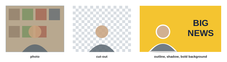
Cut-outs, subjects separated from their backgrounds, are a staple of thumbnails, covers and branded graphics: a creator's head and shoulders placed over a bold color, a product floating on a gradient, a dish isolated on a plain background. Design tools and phone apps now remove backgrounds automatically with machine learning, often well, but results need checking around hair, fingers, transparent objects and edges, where halos or missing pieces appear. Refining edges manually, softening them slightly, and adding a subtle outline, shadow or glow help cut-outs sit naturally on new backgrounds. A white or colored outline around a cut-out, sometimes called a sticker effect, is a popular thumbnail style that separates the subject from busy backgrounds. PHOT-202 covers precise masking and selection in Photoshop.
Shapes, frames and backgrounds
Simple shapes, such as rectangles, circles, rounded boxes, lines and blobs, structure graphics and carry brand character. Solid shapes behind text improve legibility; frames and borders unify a series; circles crop profile photos; arrows and lines direct attention; organic shapes soften technical content. Backgrounds can be solid brand colors, gradients, subtle textures, blurred photos or patterns. Choose a small set of shape styles consistent with your brand, such as rounded corners with a set radius or sharp geometric forms, and use them consistently. Overusing decorative shapes clutters a design; every shape should do a job.
Icons
Icons are small symbols representing ideas, actions or objects: a clock for time, a heart for health, a lightbulb for ideas, a checkmark for completion. They help viewers scan information quickly, especially in lists, steps and infographics. Effective icon use requires a consistent style, with the same stroke weight, corner style, level of detail and fill style across all icons in a graphic or brand; mixing styles from different sources looks messy. Icons should be simple enough to read at small sizes and familiar enough to be understood without explanation, but they should usually be paired with text labels, since meanings are not universal. Icon libraries offer large, consistent sets under various licenses; check the license terms for commercial use and attribution.
Illustration, stickers and emoji
Illustrations add personality and can explain ideas that photos cannot: processes, concepts, imaginary scenes. A consistent illustration style, whether hand-drawn, flat, line-based or textured, becomes part of a brand. Creators can commission illustrators, use licensed illustration libraries, or create their own. Stickers and GIFs in story tools, and emoji in graphics, add playful, native-feeling elements but date quickly and may look unprofessional in some niches. Emoji also render differently across devices and are announced by name by screen readers, which can be confusing when many are used.
Mockups
Mockups show designs in context: a book cover on a book, an app screenshot on a phone, a t-shirt design on a model, a printable planner on a desk. They help audiences imagine digital and physical products and are widely used in promoting courses, merchandise and templates. Mockup templates are available for many products; screenshots placed into device frames should be accurate, without misrepresenting the product. For physical products, real photos are usually more trustworthy than mockups once the product exists.
Sourcing images legally and safely
Using an image you did not create requires permission, through a license or a legal exception. Common sources include:
- Your own photos and graphics, which you own (unless created for a client under an agreement transferring rights).
- Stock libraries, which sell or provide licenses; read the terms, as many restrict uses such as merchandise, sensitive subjects or logos.
- Free image sites with permissive licenses; check each site's terms, verify that uploaders had the right to share, and avoid images with recognizable people or trademarks for commercial use unless releases are provided.
- Creative Commons licensed images, which may require attribution or prohibit commercial use or modification, depending on the license (CC BY, CC BY-SA, CC BY-NC and others).
- Public domain images, whose copyright has expired or been waived, though related rights such as photographs of artworks or trademarks may still apply.
Images found through search engines or on social media are not free to use simply because they are visible. Using someone else's photo without permission can lead to takedowns, account penalties and legal claims. Images of identifiable people used commercially may also require their consent (CRE-320). Lesson 12 covers copyright and licensing in more depth.
| Source | Typical permissions | Check |
|---|---|---|
| Own photos | Full use | Client contracts if commissioned |
| Paid stock | Licensed uses | Restrictions on merchandise, sensitive uses |
| Free stock sites | Broad free license | Site terms, releases, trademarks |
| Creative Commons | Depends on license type | Attribution, non-commercial, no derivatives |
| Public domain | Generally free | Related rights, trademarks, people |
| Search engine results | None by default | Seek permission or license |
AI-generated images
Generative AI tools can create images, backgrounds, illustrations and variations from text prompts, and are built into many design tools. They can speed up production for concepts, abstract backgrounds and illustrations, but raise several concerns: generated images may contain errors such as distorted hands or text; they may imitate the styles of living artists or reproduce elements of training data; their copyright status is uncertain and varies by country, with some offices declining to register purely machine-generated works; some platforms and clients require labels for realistic AI-generated content; and realistic fake images of real people or events can mislead audiences. Use AI images thoughtfully, avoid realistic depictions that could be mistaken for photographs of real events or people, check platform and client policies, and disclose where appropriate (CRE-320).
Preparing images for design
Good preparation saves time and protects quality. Keep originals at full resolution and work on copies; edit photos for exposure and color before placing them, so graphics look consistent; remove backgrounds on high-resolution versions; use PNG or other formats with transparency for cut-outs and logos; use vector formats such as SVG for icons and logos, which scale without losing quality; name files clearly; and organize brand assets in folders or a design tool's asset library. Exporting final graphics as high-quality JPEG or PNG at the exact pixel dimensions gives the platform the best material to compress.
Building a brand photo library
A library of your own photos solves many design problems. Plan a photo session every few months to capture assets: portraits with different expressions and gestures, both horizontal and vertical, with space for text on either side; photos pointing at empty space where text or products can go; shots of your workspace, tools and products; and backgrounds such as textured walls, desks and locations that suit your brand. Shoot against plain backgrounds for easy cut-outs, and keep lighting consistent so photos match across graphics. Organize the library by type and orientation, tag images with keywords, and refresh it as your appearance, workspace or brand changes.
Screenshots and user-generated content
Screenshots of apps, websites, messages and comments are common in creator graphics, especially for tutorials, reviews and social proof. Make them legible by cropping to the relevant part, enlarging, and placing them in a device frame or on a clean background. Hide personal information such as names, profile pictures, email addresses and phone numbers unless you have permission to show them. When featuring comments or posts from followers, ask permission where possible, credit them as they prefer, and never edit their words in misleading ways. Screenshots of other creators' or companies' content may raise copyright and trademark issues if used for more than commentary or review.
Worked problem
Preparing a screenshot for a carousel
A productivity creator wants to show a phone app screen (1170 × 2532 pixels) on a 1080 × 1350 carousel slide, with a headline above it. How can the screenshot fit?
Show solution
- Reserve about 350 pixels at the top for the headline and margins, leaving about 900 pixels of height for the screenshot.
- Scale the screenshot to 900 pixels tall: width becomes 1170 × 900 ÷ 2532 ≈ 416 pixels.
- At that size, interface text may be too small, so crop to the relevant section of the app, for example the top half, and scale that up instead.
- Place it in a simple device frame or with rounded corners and a soft shadow, and add an arrow or highlight on the key feature.
Answer: Crop to the relevant part of the screen, scale it to fit about 900 px of height, frame it and highlight the key feature.
Consistent image treatment
Images from different sources look disconnected unless treated consistently. A brand image treatment might specify a color grade or filter, a level of contrast, a crop style (tight faces, wide scenes), a border or corner radius, a cut-out style with outlines or shadows, and an overlay color for text areas. Applying the same treatment to every image in a series turns a mix of photos into a coherent set. Save treatments as presets or reusable components in your tools.
Image quality checks
Before using any image, check it at 100 % for focus, noise, compression artifacts and cut-out edges, and confirm it has enough resolution for the largest format you will use.
Common mistakes
MistakeUsing photos with no space for text.
InsteadPlan and shoot photos with text space and both orientations.
MistakeEnlarging small crops.
InsteadCheck crops are at least as large as the output.
MistakeLeaving halos around cut-outs.
InsteadRefine edges and add outlines or shadows.
MistakeMixing icon styles.
InsteadUse one consistent icon set with labels.
MistakeUsing images found online without permission.
InsteadUse own, licensed or properly attributed images.
Summary and key terms
- Choose and shoot photos with clear subjects and space for text.
- Crop for each format while preserving resolution and safe areas.
- Cut-outs need clean edges and often an outline or shadow.
- Shapes, frames and backgrounds structure graphics and carry brand style.
- Use consistent, labeled icons and illustration styles.
- Source images legally: own, licensed, Creative Commons or public domain.
- Use AI images thoughtfully and prepare files at full quality.
- Crop
- Selecting part of an image.
- Cut-out
- Subject separated from its background.
- Halo
- Fringe of old background around a cut-out.
- Sticker effect
- Outline around a cut-out subject.
- Icon
- Small symbol representing an idea or action.
- Mockup
- Design shown in a realistic context.
- Stock image
- Image licensed from a library.
- Creative Commons
- Family of standard public licenses.
- Public domain
- Works no longer protected by copyright.
- Vector graphic
- Graphic defined by shapes that scale without loss.
Practice problems
Work each problem on paper first, then reveal the answer to check.
Name three qualities of a good graphic photo.
Show answer
Clear subject, simple background, good light, space for text.
Why shoot both orientations?
Show answer
To crop for different formats.
Scale factor for an 800 px crop to 1080 px?
Show answer
1.35 (enlargement).
Where do automatic cut-outs often fail?
Show answer
Hair, fingers, transparent objects, edges.
What is a sticker effect?
Show answer
An outline around a cut-out.
What should icons in a set share?
Show answer
Stroke weight, corners, detail and fill style.
What does CC BY-NC require?
Show answer
Attribution and non-commercial use.
Are search results free to use?
Show answer
No.
Name two concerns with AI images.
Show answer
Errors, style imitation, uncertain copyright, misleading realism.
Which format suits logos and icons?
Show answer
Vector formats such as SVG.
Lesson quiz · 5 questions
Score 60% or more to complete this lesson.
Create a free account to save your progress, take quizzes and earn a certificate.