
ARCH-110 · Lesson 12 of 12 · 20 min
Portfolio presentation
At the end of term, the four students spread their work across the big table in the studio: sketchbooks, measured plans, sections, rendered perspectives, diagrams, CAD sheets, models and photographs. There is far too much of it. Professor Visser picks up a single sheet from Ingrid's pile, a section through the boathouse with the winter sun reaching under the overhang, and holds it up. 'If you had one page to show someone what kind of designer you are, would it be this?' Ingrid thinks so. 'Then your portfolio starts here,' Visser says. 'Everything else has to earn its place next to it. A portfolio is not an archive of what you did. It is an argument about who you are.'
What a portfolio is for
An architectural portfolio is a curated collection of your work, designed to show your abilities, interests and way of thinking to a particular audience. Students make portfolios to apply to schools, scholarships, exchanges and internships; graduates make them to apply for jobs; practitioners make them to win commissions. The same work may appear in all of them, but each portfolio is edited and arranged for its reader. An admissions committee wants to see curiosity, observation and potential; an employer wants to see skill, judgment and the ability to produce clear drawings.
Most portfolios today are delivered as PDF files, viewed on a screen, often quickly. Many readers will spend only a few minutes on each portfolio on a first pass. Design for that: a strong opening, a clear sequence, legible pages and a reason to keep going. A printed version for interviews, often at 11 by 17 in or smaller, is still valuable, and the two should share the same layout.
Editing: choose less, show better
Editing is the hardest and most important step. Choose your strongest projects, usually four to six for a student portfolio, and within each project choose the drawings that tell its story best. Every page should show something the others do not. Leave out weak work, even if it took a long time; one mediocre drawing lowers the reader's impression of the strong ones around it. Include a range: design projects, but also sketches, observation drawings, models and perhaps work from other disciplines, such as photography, furniture or graphic design, that shows how you see.
For each project, show the process as well as the result. Readers want to see how you think: the site analysis and diagrams that led to the idea, the study models and sketches that tested it, and then the finished plans, sections and images. A project that shows three or four stages of development is more convincing than one that shows only polished final images.
Sequencing
The order of projects and pages shapes how the reader understands you. Open with your strongest project, because first impressions color everything after. End with something strong too, so the reader closes the portfolio on a high note. In between, vary the pace: a full-page image after several pages of drawings, a page of sketches between two design projects. Some designers order projects chronologically to show growth; others by theme. Either works if the reason is clear.
Within each project, follow the logic a reader needs: title and short description, context and site, the idea in a diagram, the main drawings, then images and details. Keep the same structure for each project, so that the reader knows where to look.
Grids and layout
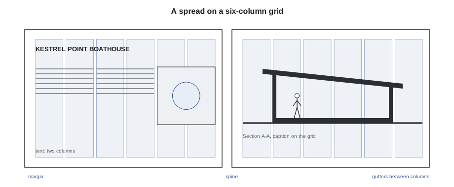
A layout grid is a set of invisible guides, such as margins, columns, gutters and rows, that organizes everything on the page. Using one grid across the whole portfolio makes it feel unified and calm, even when the content varies. A common grid for a landscape page has six or twelve columns, so that images can span two, three, four or six columns, with gutters of a few millimeters between them and generous margins around the edge. Align the edges of images and text blocks to the grid lines, and leave empty space deliberately rather than filling every corner.
The spread, two facing pages seen together, is the unit of design in a printed portfolio and often on screen as well. Design spreads, not pages: a large drawing can bleed across both, or the left page can carry text and small drawings while the right page carries one strong image. Keep the reading direction consistent, with the most important image in the same place on each spread.
# Portfolio grid: column width and the width of images spanning n columns
page_w = 17                               # page width
margin_in, margin_out = 0.75, 0.5          # inside (spine) and outside margins
cols, gutter = 6, 0.1875
text_w = page_w - margin_in - margin_out
col = (text_w - (cols - 1) * gutter) / cols
print(f"text area {text_w} in, column {col:.3f} in")
for n in range(1, cols + 1):
    span = n * col + (n - 1) * gutter
print(f"image across {n} column(s): {span:.3f} in")text area 15.75 in, column 2.469 in image across 1 column(s): 2.469 in image across 2 column(s): 5.125 in image across 3 column(s): 7.781 in image across 4 column(s): 10.438 in image across 5 column(s): 13.094 in image across 6 column(s): 15.750 in
The script works out the column width for a page from its width, margins, number of columns and gutter, then lists the widths of images that span one to six columns. Set your images to these exact widths and every edge on every page will line up. Changing the margins or the number of columns and rerunning the script is a quick way to compare grids before you commit to one.
Typography
Use one or two typefaces for the whole portfolio: often one sans-serif family in a few weights, or one serif for text and one sans-serif for titles and labels. Choose a small set of sizes and use them consistently: one for project titles, one for headings, one for body text and one for captions and labels. On an 11 by 17 in page read on screen, body text of about 9 to 10 points is comfortable; captions can be smaller, but not so small that they cannot be read on a laptop screen without zooming.
Keep text short. A project description of 100 to 150 words, a few captions and labels on the drawings are usually enough; the drawings should do most of the talking. Align text to the grid, set it left-aligned rather than justified to avoid uneven spacing, and keep line lengths to about 50 to 75 characters. Check spelling and grammar carefully; a typo in a portfolio suggests carelessness in the work.
Drawings on the page
Drawings in a portfolio are seen at a different size than when they were made, and often on a screen. A plan drawn at 1/8 in = 1 ft on a large sheet may be reduced to a third of that size on a portfolio page; its finest lines may vanish and its text become unreadable. Redraw or re-export drawings for the portfolio: adjust line weights so the hierarchy survives the reduction, remove clutter, enlarge key labels and add a graphic scale bar, because a stated scale is meaningless once a drawing is resized.
Use a consistent graphic language. If plans in one project have black poché and plans in another have gray, make them match, or at least make the difference deliberate. Use the same north arrow, scale bar style, title format and label size throughout. Photograph models consistently, against the same background and with similar lighting.
Producing the PDF
Assemble the portfolio in a page-layout program, with the grid set up as guides, styles defined for each kind of text and images placed rather than pasted. Export to PDF with fonts embedded. Line drawings should stay as vectors where possible, so they remain crisp at any zoom; raster images should be at a resolution suited to their use, about 150 to 300 pixels per inch at their printed size. Check the file size: many schools and employers set a limit for submitted portfolios, and a file that is too large may not be accepted. Compress images, not line work, to reduce it.
Before sending, open the PDF on a laptop and a phone, page through at the speed a busy reader would, and ask a friend to do the same. Check that the first page says who you are, that the sequence makes sense, that every drawing is legible and that the file name is clear, such as your name and the word portfolio.
Worked problem
Fitting a drawing to the grid
Callum wants to place his section of the boathouse across four columns of the six-column grid in the script. The section is 24 ft long at full size. At what scale does it fit, and is the scale reasonable?
Show solution
- From the script, four columns span 4 × 2.469 + 3 × 0.1875 = 10.438 in.
- At 1/4 in = 1 ft the section would be 6 in long; at 1/2 in = 1 ft it would be 12 in, too long.
- A scale between the two fits best; he exports at a scale that makes the section about 9 in long and adds a graphic scale bar, because the reader cannot measure an odd scale.
- He checks that the thinnest lines are still visible at that size and enlarges the labels.
Answer: The section fits across four columns at about 3/8 in = 1 ft, with a graphic scale bar. Choosing the grid first and the scale second keeps the page layout consistent.
Exercise 12: the portfolio
This exercise takes about ten hours.
- Gather all your work from the course and choose the strongest pieces; write one sentence on why each one is in.
- Set up a grid with the script and a page-layout file with margins, columns and text styles.
- Lay out a portfolio of 16 to 24 pages: a cover, a contents page or short introduction, the boathouse project showing process and result, at least two other pieces of work from the course and a page of sketches.
- Redraw or re-export drawings for the page size, with scale bars and adjusted line weights.
- Export a PDF with fonts embedded and check it on a laptop and a phone.
- Deliverable: the PDF and a printed copy of two spreads at full size.
Self-critique checklist
- Does the first spread make a strong impression and say who I am?
- Is every page aligned to the same grid?
- Is the typography consistent, with few typefaces and sizes?
- Is every drawing legible at the page size, with a graphic scale bar?
- Did I leave out weaker work, even work that took a long time?
Beyond the PDF
Many designers also keep a portfolio website or a page on a portfolio-sharing platform. The same principles apply: edit hard, open strong and keep a consistent graphic language. A website adds two things a PDF cannot: it can be updated as new work arrives, and it can be found by people you have never contacted. It also adds risks. Large images load slowly on phones, so export them at sensible sizes; layouts reflow on narrow screens, so check that drawings remain legible when the page becomes a single column. Keep the website and the PDF consistent, so that a reader who sees both recognizes the same designer.
Prepare a short version too. Many applications ask for a sample of a few pages, and many conversations begin with a single image sent by email or shown on a phone. Choose the one spread that best represents you, and a five-page sample built around it, before anyone asks. Wren chooses her winter-shadow site plan of Kestrel Point, the contour model photographed from river level and one page of urban sketches. Together they show observation, analysis and making, the three things she most wants a reader to remember.
Finally, treat the portfolio as a living document. Update it at the end of every term while the work is fresh, replace weaker pieces as stronger ones arrive and keep the original files, drawings and model photographs organized so that you can re-export them at any size. The portfolio you make at the end of this course is the first of many.
Common mistakes
MistakeIncluding everything.
InsteadEdit hard: show only the strongest work and let each page earn its place.
MistakePlacing drawings at random sizes and positions.
InsteadUse one grid throughout and size images to the column spans.
MistakeShrinking large drawings without adjusting them.
InsteadRedraw or re-export with heavier lines, larger labels and a graphic scale bar.
MistakeShowing only polished final images.
InsteadShow process too: diagrams, sketches and study models.
Summary and key terms
- A portfolio is an edited argument about who you are as a designer, tailored to its reader.
- Choose fewer, stronger projects and show process as well as results.
- Sequence for impact: strong opening, varied pace, strong ending.
- Use one layout grid and a small typographic system throughout; design spreads, not pages.
- Adapt drawings to the page size, add graphic scale bars, embed fonts and check the PDF on several screens.
- Portfolio
- A curated collection of work designed for a particular reader.
- Layout grid
- A set of margins, columns, gutters and rows that organizes a page.
- Gutter
- The space between columns in a grid.
- Spread
- Two facing pages seen together.
- Graphic scale bar
- A drawn bar showing lengths at the drawing's scale, which stays correct when the drawing is resized.
Practice problems
Work each problem on paper first, then reveal the answer to check.
Why open with your strongest project?
Show answer
First impressions shape how the rest of the portfolio is read.
Why use a graphic scale bar rather than a stated scale in a portfolio?
Show answer
A stated scale is wrong once the drawing is resized; a scale bar resizes with it.
What is a spread?
Show answer
Two facing pages seen together.
How many typefaces should a portfolio usually use?
Show answer
One or two.
Why keep line drawings as vectors in the PDF?
Show answer
So they stay crisp at any zoom.
Lesson quiz · 5 questions
Score 60% or more to complete this lesson.
Create a free account to save your progress, take quizzes and earn a certificate.