
VIS-410 · Lesson 3 of 12 · 28 min
Sequencing and presentation formats
Once you have chosen your images, the order in which you show them and the format you show them in become part of the message. The same 20 photographs can feel like a confident professional statement or a random slideshow depending on how they are sequenced, paired and presented. This lesson covers the principles of sequencing, practical methods for testing a sequence, and the main presentation formats: the print box, the book, the PDF and the tablet, along with exhibition and projection formats you may meet in art contexts.
Why order matters
Viewers read a sequence the way they read a story or listen to music: they notice beginnings and endings, they feel rhythm and repetition, and they make connections between neighboring images. A good sequence guides attention, builds interest and leaves a clear final impression. A poor sequence forces the viewer to work out what connects the images, and most will not bother.
Photo editors at magazines and photobook designers spend days on sequencing for good reason. Two images placed side by side create a third meaning that neither has alone: a visual rhyme of shape or color, a contrast of scale, a suggestion of cause and effect. Sequencing is where photographs become a body of work rather than a pile.
Principles of sequencing
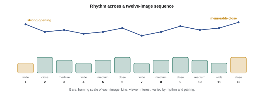
- Open strong: the first image must say who you are and what you do. It is usually your most characteristic image, not necessarily your most dramatic.
- Close strong: the last image is the one people remember. Many photographers save a quieter but resonant image for the end, one that sums up the work.
- Create rhythm: alternate scale (wide, medium, close), density (busy and calm frames) and orientation so that the eye is refreshed.
- Make connections: place images next to each other because of shared shapes, colors, gestures or ideas, so that each transition feels intended.
- Avoid repetition: two images that make the same point in the same way should rarely sit together; one probably belongs out of the edit.
- Group by logic: commercial portfolios often group by type of work (products, then lifestyle, then campaigns); art sequences group by idea, place or time.
Pairing images
Many presentation formats show images in pairs: facing pages in a book, two-up layouts in a PDF, side-by-side frames on a wall. A pair should work as a unit. Common strategies include echo (similar forms or colors), contrast (near and far, light and dark, crowded and empty), continuity (the same subject at different moments) and tension (images that question each other). A single image on a spread, facing a blank page, gives that photograph extra weight and a pause in the rhythm.
Avoid pairing images that compete: two very strong, busy frames side by side tend to cancel each other out. Avoid pairs where one image is technically much weaker or in a different color treatment; the comparison exposes the difference immediately.
A simple method for testing a sequence
Make small work prints, about 10 by 15 cm or 4 by 6 inches, of your selection and lay them out on a table or pin them to a wall. Move them around until the order feels right, then photograph the arrangement so you can return to it. Look at the sequence the next day with fresh eyes. Ask someone else to flip through without explanation and watch where they slow down, linger or skip. Repeat until changes feel like small refinements rather than big rearrangements.
Worked problem
Scoring transitions
To compare two possible openings, Priya scores each transition between neighboring images from 0 (no connection, jarring) to 3 (strong, intended connection). In sequence A the first five transitions score 3, 1, 2, 0, 2. In sequence B they score 2, 2, 3, 2, 1. Which opening flows better, and where is the weak point?
Show solution
- Sequence A total: \( 3 + 1 + 2 + 0 + 2 = 8 \); average \( 8 / 5 = 1.6 \).
- Sequence B total: \( 2 + 2 + 3 + 2 + 1 = 10 \); average \( 10 / 5 = 2.0 \).
- Sequence A has a 0, a jarring transition between images 4 and 5, which will feel like a break even if other transitions are strong.
Answer: Sequence B flows better on average (2.0 against 1.6) and has no jarring break. Sequence A could be repaired by moving or replacing image 5.
Scoring is a thinking tool rather than a rule: a deliberate break can be powerful, for example to start a new section. What matters is that every jolt is intended.
Presentation formats
The right format depends on the audience, how they will view the work and the practical constraints of meetings, portals and postage. Professional photographers usually maintain several formats of the same core selection.
| Format | Strengths | Limitations | Typical use |
|---|---|---|---|
| Print box (loose prints) | Shows print quality; viewers can arrange and compare prints | Bulky, expensive to make and ship, prints wear | Gallery visits, fine art reviews |
| Bound book or portfolio case | Controlled sequence and pairings, feels finished | Fixed order, costly to update | Agency and art director meetings |
| Cheap, easy to email and tailor, fixed layout | Color and size vary by screen; attachments may be blocked | Pitches, job applications, follow-ups | |
| Tablet or laptop | Easy to update, can include video | Screen glare and brightness vary; feels less special | In-person meetings, quick reviews |
| Website | Always available, searchable | Viewers control the order and may skim | Discovery and first impressions |
| Projection or screen in a jury room | Large, controlled viewing | Little control over timing | Grant and competition juries |
Printed portfolios
Prints show something screens cannot: the quality of your printing, paper choice and tonal control. For fine art photographers and many commercial specialists, a printed portfolio still signals seriousness. Common sizes for portfolio prints are about 28 by 36 cm (11 by 14 inches) or A3, with consistent borders and paper across the set. Print from properly profiled files (see PHOT-301 on color management), handle prints with clean hands or cotton gloves, and protect them with interleaving tissue or sleeves.
Worked problem
Planning a print portfolio budget
A photographer wants a portfolio box of 20 prints on fine art paper at about 28 by 36 cm. Each print costs $14 in ink and paper (or $9 from a lab with a volume discount). A clamshell box costs $120 and sleeves cost $2 each. She plans to remake 5 damaged prints per year. What is the first-year cost if she prints herself?
Show solution
- Prints: \( 20 \times 14 = 280 \) dollars, plus 5 replacements at \( 5 \times 14 = 70 \) dollars.
- Box and sleeves: \( 120 + 20 \times 2 = 160 \) dollars.
- Total: \( 280 + 70 + 160 = 510 \) dollars.
Answer: About $510 in the first year, or about $410 using lab prints at $9. Prices are illustrative and vary by paper, lab and region.
Books and portfolio cases
A bound book or screw-post case fixes the sequence and pairings, which is useful when you want every viewer to see the work the way you intend. Screw-post and refillable cases let you replace pages as the portfolio evolves. Print-on-demand books are cheaper but harder to update; some photographers make a new book each year. Layout matters as much as images: consistent margins, generous white space, simple captions and no more than one or two type families.
PDF portfolios
The PDF is the workhorse of modern portfolio delivery. It lets you build a tailored version for each client in an hour, keep the layout fixed and send it by email or link. Good practice:
- Size pages for screens: a landscape page roughly 1920 by 1080 pixels displays well on most laptops.
- Keep files small enough to send: many email systems limit attachments to about 10 to 25 MB, so a link to a file-sharing service is often safer for larger files.
- Export images in sRGB, the safest color space for unmanaged screens.
- Include your name and contact details on the first and last pages, and a simple caption with client or project and year where useful.
- Name the file clearly, such as "Lastname-Food-Portfolio-2026.pdf", so the recipient can find it later.
Worked problem
Will the PDF fit?
A PDF portfolio contains 24 images exported at 1920 pixels wide in sRGB with JPEG compression, averaging about 0.6 MB each after compression in the PDF, plus about 1 MB of layout and fonts. Will it fit under a 15 MB email limit?
Show solution
- Images: \( 24 \times 0.6 = 14.4 \) MB.
- Total: \( 14.4 + 1 = 15.4 \) MB, just over the limit.
- Reducing the image quality setting slightly to an average of 0.5 MB gives \( 24 \times 0.5 + 1 = 13 \) MB.
Answer: At 0.6 MB per image it is just over 15 MB; slightly stronger compression brings it to about 13 MB, or you can send a link instead.
Tablets, laptops and screens
A tablet is convenient for in-person meetings and lets you show video, which many clients now expect alongside stills (PHOT-440 covers video for photographers). Calibrate or at least check the display, set brightness high, turn off notifications, use a dedicated portfolio app or folder with only the selected images, and avoid swiping through personal photos or unrelated work by accident. Clean the screen before every meeting.
Exhibition and art formats
For gallery and exhibition contexts, presentation extends to print size, framing or mounting, spacing on the wall and the relationship between images in a room. Lesson 7 covers editions and print sales, and PHOT-430 covers exhibition planning, framing and photobooks in more depth. At the portfolio stage, curators mainly want to see the work clearly, often as a PDF or through a submission portal, with installation views if the work has already been exhibited.
Matching format to situation
A practical approach is to maintain a master selection and generate formats from it: a website gallery, a tailored PDF template, a tablet folder and, if your audience values it, a printed set. When you get a request, ask how the recipient prefers to view work and follow any instructions exactly. Many portals and calls for submissions specify image count, file size, pixel dimensions and naming conventions; ignoring them can disqualify an application before anyone looks at the images.
Common mistakes
MistakeOpening with a dramatic image that does not represent your usual work
InsteadOpen with your most characteristic image, the one that says what you do.
MistakePlacing two images that make the same point side by side
InsteadSeparate or remove repetitive images and vary scale, density and rhythm.
MistakeSending a huge PDF as an email attachment
InsteadCompress images sensibly, keep files under common limits or send a link.
MistakeShowing a tablet portfolio with personal photos nearby
InsteadUse a dedicated folder or app holding only the selected work, and turn off notifications.
MistakeIgnoring a portal's file specifications
InsteadFollow image count, size, dimension and naming instructions exactly.
Summary and key terms
- Sequence and format are part of a portfolio's message, not packaging added at the end.
- Open with your most characteristic image and close with one that sums up the work.
- Vary scale, density and orientation to create rhythm, and make each transition intentional.
- Test sequences with small prints, fresh eyes and other viewers.
- Print boxes, books, PDFs, tablets and websites each suit different audiences and situations.
- PDFs should be screen-sized, sRGB, reasonably small and clearly named.
- Maintain one master selection and generate tailored formats from it, following every submission instruction.
- Sequence
- The order in which images are presented
- Spread
- Two facing pages in a book, viewed together
- Pairing
- Placing two images together so they work as a unit
- Visual rhyme
- A repeated shape, color or gesture that links two images
- Rhythm
- The pattern of variation in scale, density and pace across a sequence
- Print box
- A box of loose prints presented for viewers to handle
- Screw-post case
- A refillable portfolio binder whose pages can be replaced
- sRGB
- A standard color space suited to unmanaged screens and web viewing
- Work print
- A small, inexpensive print used for editing and sequencing
- Installation view
- A photograph showing how work looked in an exhibition space
Practice problems
Work each problem on paper first, then reveal the answer to check.
Why does the first image of a portfolio matter so much?
Show answer
It tells the viewer at once what you do and sets their expectations for the rest.
Name three ways to create rhythm in a sequence.
Show answer
Vary scale, vary density between busy and calm frames, and vary orientation or color.
Transitions score 2, 3, 0, 2. What is the average, and what does the 0 mean?
Show answer
\( 7/4 = 1.75 \); the 0 is a jarring break that needs fixing unless it is deliberate.
What are two pairing strategies?
Show answer
Echo of shapes or colors, and contrast of scale, light or density (also continuity and tension).
A PDF has 30 images at 0.4 MB each and 1.5 MB of layout. What is its size?
Show answer
\( 30 \times 0.4 + 1.5 = 13.5 \) MB.
Why export portfolio images in sRGB for screens?
Show answer
Most screens and browsers are unmanaged or sRGB-based, so sRGB displays most predictably.
What is a disadvantage of a bound book portfolio?
Show answer
Its fixed order makes it costly to update.
Give two good practices for a tablet portfolio.
Show answer
Use a dedicated folder with only the selection and turn off notifications (also check brightness and clean the screen).
What does a print portfolio show that a screen cannot?
Show answer
Print quality, paper choice and tonal control.
Why should you follow submission portal instructions exactly?
Show answer
Portals can reject or disqualify applications that ignore image count, size or naming rules.
Lesson quiz · 5 questions
Score 60% or more to complete this lesson.
Create a free account to save your progress, take quizzes and earn a certificate.