
CMPUT-421 · Lesson 4 of 12 · 35 min
Mental models and interaction design principles
Lessons 2 and 3 described the human as a perceiver and a mover. This lesson describes the human as an interpreter: someone who forms beliefs about how a system works, plans actions based on those beliefs, and judges from the system's responses whether the plan succeeded. When beliefs and system match, interaction feels effortless; when they diverge, users make errors, get lost or give up. The lesson covers Donald Norman's account of action and its gulfs, the vocabulary of affordances, signifiers, mappings, feedback and constraints, the psychology of human error, and two widely used sets of design principles, Nielsen's ten usability heuristics and Shneiderman's eight golden rules. It ends with a computing scientist's tool: modeling an interface as a state machine and checking it automatically.
Mental models and conceptual models
A mental model is a person's internal representation of how something works. It is usually incomplete, sometimes wrong and always simpler than the real system, but it is what people use to predict what their actions will do. Norman distinguishes three models. The designer's model is the designer's conception of the system. The system image is everything the system presents: its interface, behavior, documentation and packaging. The user's model is what the user builds from the system image. The designer cannot talk to the user directly; communication happens only through the system image. If the system image does not make the designer's model visible, users will build a different model, and the designer will be surprised by their 'errors'.
A classic example is the household thermostat. Many people believe that turning a thermostat higher makes a room heat up faster, as if it were a valve controlling the flow of heat. Most thermostats are on–off switches: the furnace runs at full output until the set temperature is reached. The valve model leads people to overshoot the setting and waste energy. Similar mismatches abound in software: users who believe that closing an app saves their work, that a sync service keeps one copy of a file rather than several, or that a trip planner's 'arrive by' time is a departure time.
A designer's job is therefore to choose a good conceptual model, a simplified explanation of the system that users can learn, and to make it visible. Good conceptual models often borrow from familiar domains through metaphor: the desktop, folders and the trash can; the shopping cart; the playlist. Metaphors help early learning but can mislead when the system departs from them, as when dragging a disk icon to the trash on early Macintosh computers ejected the disk instead of erasing it. In RideLine, the redesign team chose the conceptual model of a wallet holding fare products: passes and tickets appear as cards in a wallet, each with a visible validity period, replacing an old model in which purchases appeared only as entries in a transaction history.
The seven stages of action and the two gulfs
Norman describes action as a cycle with seven stages. The user forms a goal. Then, on the execution side, they form an intention (plan), specify an action sequence, and perform it. On the evaluation side, they perceive the state of the world, interpret it, and compare it with the goal. Between the user and the system lie two gulfs. The gulf of execution is the gap between what the user wants to do and the actions the system allows: how hard is it to figure out how to do what I want? The gulf of evaluation is the gap between the system's state and the user's ability to perceive and interpret it: can I tell what happened and whether I succeeded?
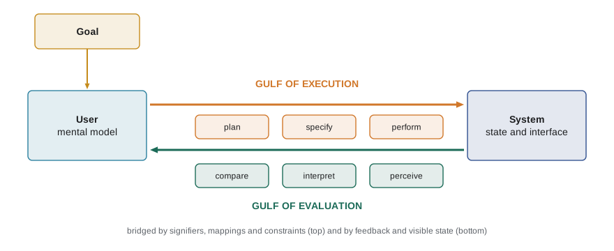
Design bridges the gulf of execution with clear signifiers, sensible mappings, constraints and a visible conceptual model, and bridges the gulf of evaluation with feedback and a visible system state. The framework is also a diagnostic tool. When observing a usability test (lesson 9), it helps to ask at each stumble which stage failed. Did the user not know what was possible (forming the intention)? Know what they wanted but not how (specifying the action)? Fail to notice the result (perceiving)? Misread it (interpreting)? Each failure suggests a different fix.
Affordances, signifiers, mapping, feedback and constraints
The psychologist James Gibson coined affordance for the action possibilities that an environment offers an animal: a flat, rigid surface affords standing; a handle affords grasping. Norman brought the term to design in 1988, and it became so widely misused, as a synonym for 'visual cue', that in 2013 he introduced signifier for the perceivable indication of where and how to act. An affordance is a relationship between object and person; a signifier communicates it. A screen affords tapping almost anywhere; a raised, labeled button shape is a signifier that tapping there does something. Flat design trends that removed shadows and borders from buttons weakened signifiers, and studies by the Nielsen Norman Group found users took longer to find clickable elements on flat interfaces with weak signifiers.
Mapping is the relationship between controls and their effects. Natural mappings exploit spatial analogy or cultural convention: a cooktop whose knobs are laid out like its burners needs no labels; one with four knobs in a row next to a two-by-two grid of burners invites errors. In software, scroll direction, slider orientation and the position of 'next' and 'back' buttons are mappings. Feedback is information about the result of an action, and it must be immediate (within about 100 milliseconds for direct manipulation), informative and proportionate: too little and users repeat actions, such as pressing a 'Pay' button twice; too much and important feedback drowns in noise. Constraints limit the actions possible: physical constraints (a USB-C plug fits either way up, removing a constraint that users got wrong), logical constraints (a date picker that grays out past dates), semantic and cultural constraints. Good constraints prevent errors before they happen.
Consistency underlies all of these. Internal consistency means the same action means the same thing everywhere in a product; external consistency means following platform conventions so that knowledge transfers from other apps. Apple's Human Interface Guidelines, Google's Material Design and the Windows design guidelines encode external conventions for their platforms. Breaking convention sometimes pays, but the burden of proof is on the designer.
Human error
James Reason's work on human error, developed from studies of industrial accidents, distinguishes errors by their place in the action cycle. Slips occur when the intention is right but the execution goes wrong: pressing the adjacent button, typing a word from a habitual sequence (a capture error), or forgetting a step after an interruption. Lapses are memory failures, such as leaving the original in the photocopier. Mistakes occur when the intention itself is wrong because of a faulty mental model or rule: a rider buys a zone 1 fare for a trip that crosses into zone 2 because they misunderstand the zone map. Mode errors, where the same action does different things in different modes, are a notorious slip: typing text while the editor is in command mode, or entering a dose in milliliters per hour on a pump that is set to milliliters.
The design response differs by type. Slips are reduced by spacing and sizing targets well (Fitts's law), avoiding modes or making them highly visible, avoiding similar-looking actions with very different consequences, and making destructive actions reversible. Mistakes are reduced by better conceptual models, clearer information at the point of decision (show which zones a trip crosses before payment) and constraints that prevent invalid choices. In every case, the system should help users recognize, diagnose and recover from errors, with messages that say what happened in plain language, why, and how to fix it. Reason's Swiss cheese model, in which accidents occur when holes in several layers of defense line up, reminds designers that blaming the last person in the chain, the user, rarely fixes anything.
Nielsen's ten usability heuristics
In 1990 Jakob Nielsen and Rolf Molich proposed a short list of usability principles to guide inspection; Nielsen refined it in 1994 by analyzing a large set of usability problems, producing ten heuristics that remain the most widely used checklist in the field. They are used for heuristic evaluation in lesson 8.
| Heuristic | In brief | RideLine example |
|---|---|---|
| 1. Visibility of system status | Keep users informed with timely feedback | Show "Payment processing" and then a clear receipt |
| 2. Match between system and the real world | Use users' language and concepts | "Day pass", not "24H-PRD-A" |
| 3. User control and freedom | Provide clearly marked exits and undo | A cancel button on every step of purchase |
| 4. Consistency and standards | Follow platform and internal conventions | Back navigation behaves the same everywhere |
| 5. Error prevention | Prevent problems before they occur | Warn if a fare does not cover the planned trip's zones |
| 6. Recognition rather than recall | Make options and information visible | Recent trips and saved stops on the home screen |
| 7. Flexibility and efficiency of use | Accelerators for experienced users | A one-tap "Buy again" for a regular pass |
| 8. Aesthetic and minimalist design | Remove irrelevant information | Arrival screen shows times, not promotions |
| 9. Help users recognize, diagnose and recover from errors | Plain-language messages with a solution | "Card declined: try another card or check your bank" |
| 10. Help and documentation | Easy to search, task-focused help | A "How fares work" page linked from the fare screen |
Shneiderman's eight golden rules
Ben Shneiderman's eight golden rules of interface design, from his textbook Designing the User Interface (first edition 1987), overlap heavily with Nielsen's list but frame them as rules for designers. Strive for consistency. Seek universal usability (design for novices and experts, diverse abilities and contexts). Offer informative feedback. Design dialogs to yield closure: organize sequences of actions into groups with a beginning, middle and end, so that users get the satisfaction and relief of completion, as when a receipt ends a purchase. Prevent errors. Permit easy reversal of actions. Keep users in control. Reduce short-term memory load. Shneiderman also championed direct manipulation: continuous representation of objects of interest, physical actions (dragging, pinching) instead of complex syntax, and rapid, incremental, reversible operations whose effects are immediately visible. Direct manipulation narrows both gulfs at once, because the action is the object and the feedback is the object changing.
No list of principles is complete, and principles conflict: minimalist design (heuristic 8) can hide options that recognition (heuristic 6) wants visible; flexibility for experts can undermine consistency for novices. Principles are tools for generating and critiquing designs, not rules that guarantee usability. Their value is in giving teams a shared vocabulary for problems and in catching common mistakes cheaply.
Checking an interface as a state machine
Computing scientists can check some principles mechanically. An interface's navigation can be modeled as a finite state machine whose states are screens (or dialog states) and whose transitions are user actions. Graph algorithms then answer questions directly: Is every screen reachable? Can the user always get back to a safe state (user control and freedom)? Which screens lack an exit? How many actions does the shortest path to each goal take, a crude measure of efficiency? Researchers such as Harold Thimbleby have used such models to find serious problems in medical devices, including infusion pumps whose number entry and mode logic allowed dangerous sequences. The program below applies the idea to RideLine's old purchase flow.
# Treating an interface as a state machine: check the RideLine fare-purchase flow for
# unreachable screens, dead ends (no way back or forward), and missing escape routes,
# and compute the fewest actions from Home to every screen with breadth-first search.
from collections import deque
flow = {
    "Home":        {"buy fare": "ChooseFare", "plan trip": "Planner", "menu": "Menu"},
    "Menu":        {"fares": "ChooseFare", "account": "Account", "back": "Home"},
    "ChooseFare":  {"pick pass": "Quantity", "back": "Home"},
    "Quantity":    {"next": "Payment", "back": "ChooseFare"},
    "Payment":     {"pay": "Processing"},                    # no back or cancel here
    "Processing":  {"ok": "Receipt", "declined": "PayError"},
    "PayError":    {"retry": "Payment"},                     # cannot leave except by retrying
    "Receipt":     {"done": "Home", "add to wallet": "Wallet"},
    "Wallet":      {"done": "Home"},
    "Planner":     {"back": "Home"},
    "Account":     {"back": "Menu"},
    "OldPromo":    {"back": "Home"},                         # left over from a past campaign
}
def bfs(start):
    dist = {start: 0}; q = deque([start])
    while q:
        s = q.popleft()
        for t in flow[s].values():
            if t not in dist:
                dist[t] = dist[s] + 1; q.append(t)
    return dist
d = bfs("Home")
print("fewest actions from Home:", {s: d[s] for s in flow if s in d})
print("unreachable screens:", [s for s in flow if s not in d])
print("screens with no way back toward Home:",
      [s for s in flow if s != "Home" and "Home" not in bfs(s)])
escape = {"back", "cancel", "done"}
print("screens with no back, cancel or done action:", [s for s, acts in flow.items() if s != "Home" and not escape & set(acts)])fewest actions from Home: {'Home': 0, 'Menu': 1, 'ChooseFare': 1, 'Quantity': 2, 'Payment': 3, 'Processing': 4, 'PayError': 5, 'Receipt': 5, 'Wallet': 6, 'Planner': 1, 'Account': 2}
unreachable screens: ['OldPromo']
screens with no way back toward Home: []
screens with no back, cancel or done action: ['Payment', 'Processing', 'PayError']The analysis finds a leftover promotion screen that no transition reaches, and it finds that the payment, processing and payment-error screens offer no cancel or back action. Every screen can eventually reach Home, but only by going forward: a rider who changes their mind at the payment screen has no way out except to pay, and a rider whose card is declined can only retry, violations of user control and freedom. (A processing screen without cancel may be acceptable for a few seconds, but it should time out to an error with an exit.) These are precisely the kinds of problems that slip through when many people edit a product over years. The model is simple, but the same approach scales: automated testing frameworks can crawl real interfaces to build the graph, and model checkers can verify properties such as 'from every state, a cancel action leads back to Home within two steps'.
Worked examples
Worked problem
Diagnosing with the gulfs
In a test, a rider taps the arrivals list repeatedly, expecting it to refresh, but nothing visible happens; the list actually refreshes every 30 seconds automatically. Which gulf is involved, and what would you change?
Show solution
- The user's action had no visible result, so they cannot tell whether the system responded: a gulf of evaluation.
- There is also a mismatch in the mental model: the user believes refreshing is manual.
- Show the time of the last update ("Updated 12 s ago") and a brief animation when it refreshes.
- Optionally support pull-to-refresh, a familiar convention, with feedback.
Answer: Primarily a gulf of evaluation; make system status visible and align the interaction with a familiar convention.
Worked problem
Classifying errors
Classify each error: (a) a rider taps "Delete card" instead of the adjacent "Edit card"; (b) a rider buys an adult fare for a child because they assume children ride free; (c) a rider forgets to activate a ticket before boarding after being interrupted by a call.
Show solution
- (a) The intention was right but the action went wrong: a slip, likely helped by small, adjacent targets.
- (b) The intention was based on a wrong belief: a mistake.
- (c) A memory failure after interruption: a lapse.
- Fixes: separate and confirm destructive actions with undo; show fare rules at the point of choice; remind the user before boarding or auto-activate.
Answer: Slip, mistake and lapse; each calls for a different design response.
Worked problem
Mapping
A RideLine map has zoom buttons labeled + and − stacked vertically, with − on top. Users often press the wrong one. Explain and fix.
Show solution
- Convention (external consistency) places + above −, because "up" maps to "more" in many cultures and platforms.
- The reversed layout violates both the natural mapping and platform conventions.
- Swap the buttons, and also support pinch-to-zoom, a direct manipulation alternative.
Answer: The mapping contradicts convention; put + on top and offer direct manipulation.
Common mistakes
MistakeUsers who make errors with the interface need more training.
InsteadMost errors reveal mismatches between the system image and users' mental models; redesign first.
MistakeAn affordance is a visual hint like a shadow on a button.
InsteadAn affordance is an action possibility; the perceivable hint is a signifier.
MistakeA confirmation dialog for every action prevents errors.
InsteadFrequent confirmations become automatic and are clicked through; prefer reversibility (undo) and confirm only rare, irreversible actions.
MistakeModes are fine as long as the manual explains them.
InsteadMode errors are common slips; avoid modes or make the current mode highly visible where the action is performed.
MistakeFollowing all ten heuristics guarantees a usable design.
InsteadHeuristics catch common problems but conflict with one another and cannot replace evaluation with real users.
Summary and key terms
- Users act on mental models built from the system image; designers communicate only through that image.
- Norman's seven stages of action describe a cycle of goals, execution and evaluation, with gulfs of execution and evaluation between user and system.
- Affordances are action possibilities, signifiers make them perceivable, mappings relate controls to effects, feedback reports results and constraints prevent errors.
- Reason distinguishes slips, lapses and mistakes; mode errors are a common slip.
- Nielsen's ten heuristics and Shneiderman's eight golden rules summarize widely accepted design principles.
- Direct manipulation narrows both gulfs by making objects visible and actions rapid, incremental and reversible.
- Modeling an interface as a state machine lets graph algorithms find unreachable screens, dead ends and missing exits.
- Mental model
- A user's internal representation of how a system works, used to predict the effects of actions.
- Conceptual model
- The simplified explanation of a system that a designer intends users to learn.
- System image
- Everything a system presents to users, through which they build their mental models.
- Gulf of execution
- The gap between a user's intention and the actions a system allows.
- Gulf of evaluation
- The gap between a system's state and the user's ability to perceive and interpret it.
- Affordance
- An action possibility arising from the relationship between an object and a person.
- Signifier
- A perceivable indication of where and how to act.
- Mapping
- The relationship between controls and their effects.
- Slip
- An error in which the intention is correct but the action is carried out wrongly.
- Mode error
- An error caused by performing an action appropriate to one mode while the system is in another.
Practice problems
Work each problem on paper first, then reveal the answer to check.
Name Norman's three models.
Show answer
The designer's model, the system image and the user's model.
Why does turning a thermostat up higher not heat a room faster?
Show answer
Most thermostats switch the heater fully on until the set point; the valve mental model is wrong.
What is the difference between an affordance and a signifier?
Show answer
An affordance is a possibility for action; a signifier communicates where and how to act.
Give an example of a logical constraint in a booking form.
Show answer
Graying out return dates earlier than the departure date.
Distinguish a slip from a mistake.
Show answer
A slip is a correct intention badly executed; a mistake is a wrong intention.
Which Nielsen heuristic is violated by an error message reading "Error 0x80070005"?
Show answer
Help users recognize, diagnose and recover from errors (also match with the real world).
What does "design dialogs to yield closure" mean?
Show answer
Organize action sequences with a clear beginning, middle and end so users know when a task is complete.
List the three properties of direct manipulation.
Show answer
Continuous visible objects, physical actions instead of syntax, and rapid, incremental, reversible operations with visible effects.
In the state-machine check, how was an orphaned screen detected?
Show answer
Breadth-first search from Home did not reach it.
Why can frequent confirmation dialogs fail to prevent errors?
Show answer
Users learn to click through them automatically without reading.
Lesson quiz · 5 questions
Score 60% or more to complete this lesson.
Create a free account to save your progress, take quizzes and earn a certificate.