
CMPUT-404 · Lesson 3 of 12 · 32 min
CSS and responsive design
Cascading Style Sheets (CSS) control how HTML looks: color, typography, spacing, layout, animation and adaptation to screens from a 360-pixel phone to a 4K monitor. CSS is declarative. You state rules, each a selector plus declarations, and the browser works out which declarations apply to each element through the cascade, inheritance and specificity, then lays out and paints the result. Many developers find CSS frustrating because they treat it as a list of commands rather than a system of rules; once the system is understood, modern CSS with flexbox, grid, custom properties and container queries makes layouts that once needed hacks or JavaScript straightforward.
This lesson covers the cascade and specificity, the box model, flexbox and grid, responsive design with media and container queries, units, accessibility considerations, and how teams organize CSS in large applications. Like the HTML in lesson 2, the CSS here applies to the study-room booking page and carries forward into the capstone.
Rules, the cascade and inheritance
A stylesheet is a list of rules. Each rule has a selector, which picks elements, and declarations, which set properties. When several rules set the same property on the same element, the cascade decides: first by origin and importance (browser defaults, user styles, author styles, and !important declarations reversing that order), then by cascade layers if used, then by specificity, and finally by source order, where the later rule wins. Some properties, such as font-family and line-height, are inherited by default from parent to child; others, such as margin and border, are not.
/* site.css - the cascade in action */
:root {
  --brand: #1a5fb4;            /* custom properties (CSS variables) */
  --space: 1rem;
  --radius: 0.5rem;
}
body { font: 1rem/1.5 system-ui, sans-serif; color: #1d1d1d; margin: 0; }
a { color: var(--brand); }
nav a[aria-current="page"] { font-weight: 700; text-decoration: underline; }
.button, button {
  background: var(--brand); color: #fff;
  padding: calc(var(--space) / 2) var(--space);
  border: 0; border-radius: var(--radius);
}
button:focus-visible { outline: 3px solid #e66100; outline-offset: 2px; }  /* never remove focus styles */
@media (prefers-reduced-motion: reduce) {
  * { animation: none !important; transition: none !important; }
}
Custom properties, written --name and read with var(--name), are inherited like other properties and can change at run time, which makes them ideal for themes such as dark mode. The prefers-reduced-motion and prefers-color-scheme media features let a page respect operating-system settings; reduced motion matters for people with vestibular disorders, for whom large animations can cause nausea. The focus-visible rule shows a strong outline when users navigate by keyboard. Removing focus outlines, which many old style guides recommended, makes a site unusable without a mouse and fails WCAG.
Specificity
Specificity measures how precise a selector is. It is compared as a triple: the number of ID selectors, then the number of class, attribute and pseudo-class selectors, then the number of element and pseudo-element selectors. A selector with one ID beats any number of classes. The universal selector and combinators add nothing. Inline style attributes beat all selectors, and !important beats normal declarations. The program below computes specificity for common selectors and shows which rule would win.
# CSS specificity: which rule wins when two selectors match the same element?
# Specificity is a triple (ids, classes/attributes/pseudo-classes, elements/pseudo-elements),
# compared left to right. Inline styles and !important sit above this scheme.
import re

def specificity(sel):
    s = re.sub(r":(?:not|is|has)\(([^)]*)\)", r" \1", sel)   # :not(x), :is(x), :has(x) count their argument
    ids = len(re.findall(r"#[\w-]+", s))
    classes = len(re.findall(r"\.[\w-]+|\[[^\]]+\]|(?<!:):(?!:)[\w-]+", s))
    elems = len(re.findall(r"(?:^|[\s>+~(])([a-zA-Z][\w-]*)", s)) + len(re.findall(r"::[\w-]+", s))
    return (ids, classes, elems)

rules = ["a", "nav a", "nav a[aria-current=page]", ".button", "button.primary:hover",
         "#booking button", "main form > fieldset label", "ul li::marker"]
for r in sorted(rules, key=specificity):
    print(f"{str(specificity(r)):10} {r}")
print()
print("Winner for a hovered <button class=primary> inside #booking:",
max(["button.primary:hover", "#booking button", ".button"], key=specificity))(0, 0, 1) a (0, 0, 2) nav a (0, 0, 3) ul li::marker (0, 0, 4) main form > fieldset label (0, 1, 0) .button (0, 1, 2) nav a[aria-current=page] (0, 2, 1) button.primary:hover (1, 0, 1) #booking button Winner for a hovered <button class=primary> inside #booking: #booking button
High specificity is a maintenance hazard. A rule such as #booking button can only be overridden by another rule with an ID or by !important, which starts an arms race. Most teams therefore style with single classes, avoid IDs in CSS and reserve !important for utilities and accessibility overrides. Cascade layers, declared with @layer, give an explicit ordering (for example reset, base, components, utilities) that takes precedence over specificity, which tames large codebases and third-party CSS.
The box model
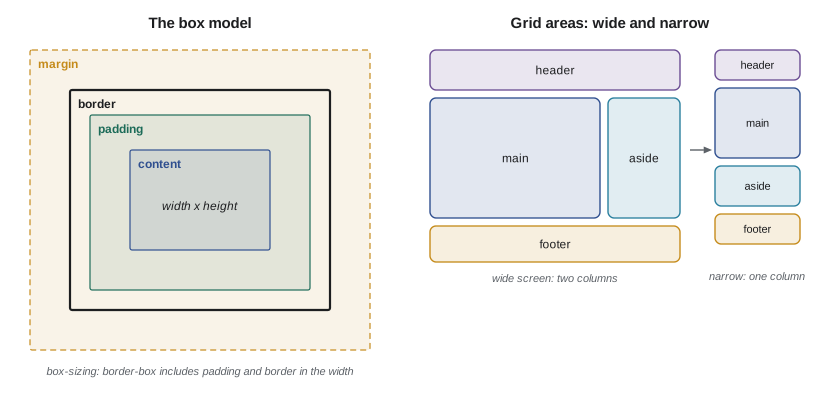
Every element generates a box with four areas: content, padding, border and margin. By default, width and height set the content area only, so adding padding or a border makes the element wider than its declared width; most stylesheets therefore set box-sizing: border-box on all elements, so width includes padding and border. Vertical margins between blocks can collapse into one. Elements participate in a formatting context: block boxes stack vertically, inline content flows in lines, and flex and grid containers lay out their children with their own rules.
Flexbox and grid
Flexbox lays out items in one dimension, a row or a column. It shines for toolbars, navigation bars, button groups and centering: justify-content distributes space along the main axis, align-items aligns across it, gap spaces items, and flex-grow, flex-shrink and flex-basis decide how items share space. Grid lays out items in two dimensions, rows and columns together, which suits page layouts, card galleries and forms. With grid-template-areas you can name regions and rearrange them for different screen sizes without touching the HTML, as long as the visual order still makes sense to keyboard and screen-reader users, who follow the source order.
/* Layout with flexbox (one dimension) and grid (two dimensions) */
.toolbar {                         /* a row of controls that wraps on small screens */
  display: flex;
  flex-wrap: wrap;
  gap: 0.5rem;
  align-items: center;
  justify-content: space-between;
}
.rooms {                           /* a responsive card grid with no media queries at all */
  display: grid;
  grid-template-columns: repeat(auto-fill, minmax(16rem, 1fr));
  gap: 1rem;
}
.page {                            /* named areas: a two-column page that collapses on phones */
  display: grid;
  grid-template-areas: "header" "main" "aside" "footer";
}
@media (min-width: 48rem) {        /* about 768 px at the default font size */
  .page {
    grid-template-columns: 1fr 18rem;
    grid-template-areas: "header header" "main aside" "footer footer";
  }
}
.page > header { grid-area: header; }
.page > main   { grid-area: main; }
.page > aside  { grid-area: aside; }
.page > footer { grid-area: footer; }
.card-list { container-type: inline-size; }     /* container queries: style by the parent's width */
@container (min-width: 30rem) {
  .card { display: grid; grid-template-columns: 8rem 1fr; }
}
The repeat(auto-fill, minmax(16rem, 1fr)) pattern deserves attention: it creates as many columns of at least 16rem as fit, sharing leftover space, so a card gallery adapts from one column on a phone to four or five on a monitor with no media query. Container queries, supported in all major browsers since 2023, let a component respond to the width of its container rather than the viewport, so the same card can be compact in a sidebar and spacious in the main column.
Responsive design and units
Responsive design, a term Ethan Marcotte introduced in 2010, means one site that adapts to every screen rather than separate mobile and desktop sites. It rests on three ideas: fluid layouts sized in relative units, flexible images (max-width: 100%), and media queries that adjust the layout at breakpoints. The viewport meta tag from lesson 2 is essential; without it, phones pretend to be about 980 pixels wide and shrink the page. Most teams design mobile first, writing base styles for small screens and adding min-width media queries for larger ones, because it forces focus on essential content and usually yields simpler CSS.
Units matter for accessibility. The rem unit is relative to the root font size, which users can change in browser settings; sizing text and media-query breakpoints in rem respects that choice, while pixel sizes can ignore it. The em unit is relative to the element's own font size, useful for padding that should scale with text. Viewport units (vw, vh, and the newer dvh for the dynamic viewport that excludes mobile browser toolbars) size things relative to the screen. The clamp() function combines them: a value that grows with the viewport but never below a minimum or above a maximum.
# Fluid typography: font-size: clamp(min, preferred, max) with a viewport-relative middle term.
# We want 1.125rem at a 360 px wide phone and 1.5rem at a 1280 px wide laptop (1rem = 16 px).
min_px, max_px = 1.125 * 16, 1.5 * 16
vw_min, vw_max = 360, 1280
slope = (max_px - min_px) / (vw_max - vw_min)          # px of font per px of viewport
intercept = min_px - slope * vw_min
print(f"font-size: clamp(1.125rem, {intercept / 16:.4f}rem + {slope * 100:.4f}vw, 1.5rem);")
for vw in (320, 360, 768, 1024, 1280, 1920):
    size = min(max(intercept + slope * vw, min_px), max_px)
    print(f"viewport {vw:5d} px -> {size:5.2f} px")
print()
# Why rem rather than px: if a user sets the browser default to 20 px, rem-based sizes scale too.
for default in (16, 20):
print(f"browser default {default} px: 1.5rem = {1.5 * default:.0f} px; media query 48rem = {48 * default} px")font-size: clamp(1.125rem, 0.9783rem + 0.6522vw, 1.5rem); viewport 320 px -> 18.00 px viewport 360 px -> 18.00 px viewport 768 px -> 20.66 px viewport 1024 px -> 22.33 px viewport 1280 px -> 24.00 px viewport 1920 px -> 24.00 px browser default 16 px: 1.5rem = 24 px; media query 48rem = 768 px browser default 20 px: 1.5rem = 30 px; media query 48rem = 960 px
Images and media
Images are usually the heaviest part of a page. Responsive images let the browser choose: the srcset and sizes attributes list several widths of the same image so a phone downloads a small file, and the picture element offers modern formats such as AVIF and WebP with a JPEG fallback. Setting width and height attributes (or the aspect-ratio property) reserves space before the image arrives, preventing the layout from jumping, which lesson 6 measures as cumulative layout shift. The loading='lazy' attribute delays off-screen images until the user scrolls near them.
CSS at scale
Small sites can live with one stylesheet. Large applications with dozens of developers need conventions so that changing one component does not break another. Common approaches include naming conventions such as BEM (block__element--modifier), which keep selectors flat and specific to a component; CSS Modules and scoped styles in frameworks, which rewrite class names so they cannot collide; utility-first frameworks such as Tailwind CSS, which compose small single-purpose classes in the HTML; and design tokens, named values for colors, spacing and type shared between design tools and code. Preprocessors such as Sass added variables and nesting long before CSS had them; native CSS now supports custom properties, nesting (in all major browsers since 2023) and cascade layers, so many teams need less tooling than before.
Whatever the approach, two practices pay off everywhere: a small set of reusable components with documented variants, and automated visual or accessibility checks in continuous integration (CMPUT-301) so that a color change that breaks contrast or a layout change that hides a focus outline is caught before release.
Worked examples
Worked problem
Resolving a specificity conflict
A button inside the booking form stays blue even though the developer added .danger { background: #c01c28 }. The existing rule is #booking button { background: #1a5fb4 }. Why, and what is the best fix?
Show solution
- Specificity of #booking button is (1,0,1); .danger is (0,1,0).
- Any ID beats any number of classes, so the blue rule wins regardless of source order.
- Adding !important would work but escalates future conflicts.
- Better: replace #booking button with a class such as .booking-button, giving (0,1,0), and place .danger later or in a later cascade layer.
Answer: Lower the original rule's specificity by using classes instead of IDs; then source order or layers decide predictably.
Worked problem
A mobile-first page layout
Write the essential grid rules so the booking page shows header, main, an aside of room rules and footer stacked on phones, and main beside an 18rem aside from 48rem upward.
Show solution
- Base rule: display: grid with grid-template-areas "header" "main" "aside" "footer".
- Assign each child its area with grid-area.
- In @media (min-width: 48rem), set grid-template-columns: 1fr 18rem and areas "header header" "main aside" "footer footer".
- Keep the source order header, main, aside, footer so keyboard and screen-reader order matches the visual order.
Answer: The LAYOUT listing above implements exactly this; only the media query changes the arrangement.
Worked problem
Choosing units for a heading
A heading is set to 32px. A user with low vision sets the browser default font to 24 px. What happens, and what should be used instead?
Show solution
- Pixel font sizes ignore the browser default, so the heading stays 32 px while the user expected larger text.
- At the 16 px default, 32 px equals 2rem.
- Setting font-size: 2rem makes the heading 48 px for this user, preserving the intended proportion.
- For smooth scaling across screens, use clamp(1.75rem, 1.2rem + 2vw, 2.5rem).
Answer: Use rem (optionally inside clamp()) so text scales with the user's settings.
Common mistakes
MistakeSetting outline: none on focus makes buttons look cleaner.
InsteadIt removes the only visual cue for keyboard users; style a clear :focus-visible outline instead.
MistakeMore specific selectors are safer.
InsteadHigh specificity makes future overrides hard; prefer single classes and cascade layers.
MistakeGrid can reorder content freely without consequences.
InsteadKeyboard and screen-reader users follow source order; keep visual order consistent with it.
MistakePixels are the most precise unit, so use them for text.
InsteadPixel text ignores user font settings; rem respects them.
MistakeResponsive design means a separate mobile site.
InsteadIt means one site whose fluid layout and media or container queries adapt to every screen.
Summary and key terms
- CSS is declarative: rules with selectors and declarations, resolved by the cascade, specificity and source order.
- Specificity compares (ids, classes, elements); keep it low and use cascade layers for ordering.
- border-box sizing makes widths predictable; flexbox handles one dimension and grid two.
- auto-fill with minmax and container queries create layouts that adapt without many breakpoints.
- Mobile-first media queries in rem respect user settings; clamp() gives fluid but bounded sizes.
- Responsive images, explicit dimensions and lazy loading keep pages fast and stable.
- Large codebases need conventions: BEM, scoped styles, utilities or design tokens, plus automated checks.
- Cascade
- The algorithm that decides which declaration applies when several rules set the same property.
- Specificity
- A ranking of selectors by the number of IDs, classes and elements they contain.
- Custom property
- A CSS variable written --name and read with var(--name).
- Box model
- The content, padding, border and margin areas of every element's box.
- Flexbox
- A one-dimensional layout model for rows or columns.
- Grid
- A two-dimensional layout model with rows, columns and named areas.
- Media query
- A condition, such as a minimum width or a user preference, under which rules apply.
- Container query
- A condition based on the size of an element's container rather than the viewport.
- rem
- A unit relative to the root element's font size.
- Cascade layer
- A named layer declared with @layer that orders groups of rules above specificity.
Practice problems
Work each problem on paper first, then reveal the answer to check.
What is the specificity of nav ul li a.active?
Show answer
(0,1,4): one class and four elements.
Which wins: #main p or .content .note p.highlight?
Show answer
#main p, specificity (1,0,1) beats (0,3,1).
Why do stylesheets often set box-sizing: border-box globally?
Show answer
So declared widths include padding and border, making sizes predictable.
When would you choose grid over flexbox?
Show answer
For two-dimensional layouts such as page regions or card galleries.
What does repeat(auto-fill, minmax(16rem, 1fr)) produce?
Show answer
As many columns of at least 16rem as fit, sharing remaining space equally.
Why size media-query breakpoints in rem?
Show answer
So layouts adapt when users change their default font size.
What does prefers-reduced-motion allow?
Show answer
Disabling or reducing animations for users who set that preference in their operating system.
Name two ways to deliver smaller images to phones.
Show answer
srcset with sizes, and the picture element with modern formats such as AVIF or WebP.
What problem do container queries solve that media queries cannot?
Show answer
Styling a component by its container's width, so it adapts wherever it is placed.
Name one convention for organizing CSS in a large codebase.
Show answer
BEM naming, CSS Modules or scoped styles, utility-first classes, or design tokens.
Lesson quiz · 5 questions
Score 60% or more to complete this lesson.
Create a free account to save your progress, take quizzes and earn a certificate.