
VIS-101 · Lesson 6 of 12 · 29 min
Colour in composition
Colour is the element viewers respond to fastest and most emotionally. A splash of red pulls the eye across a grey street; a frame bathed in teal and orange feels cinematic; a palette of pale pastels feels gentle and nostalgic. VIS-110 explains the physics and perception of colour: wavelengths, colour spaces, white balance and colour management. This lesson treats colour as a compositional tool: how it creates contrast and focal points, how it carries visual weight and depth, how colour schemes unify an image, how colour sets mood and meaning, and how to design with colour so that images and graphics work for viewers with colour vision deficiencies.
Describing colour: hue, saturation and value
Artists and designers describe any colour by three properties:
- Hue: the colour family, such as red, yellow, green, blue, named by its position on the colour wheel.
- Saturation (also called chroma or intensity): how pure or vivid the colour is, from grey to fully saturated.
- Value (lightness): how light or dark it is, independent of hue (Lesson 1 showed that value contrast does most of the work of separating subject from background).
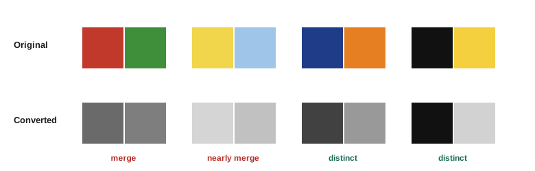
A useful insight is that these three properties act somewhat independently in composition. Two colours of different hue but the same value merge into one shape when converted to black and white, and can be hard to distinguish for some viewers; colours of very different value always separate. Saturation controls how loudly a colour calls for attention.
Colour contrast
The painter and teacher Johannes Itten, at the Bauhaus in the 1920s, described seven kinds of colour contrast that remain a useful checklist:
| Contrast | What differs | Effect and use |
|---|---|---|
| Hue | different hues at full saturation | bold, energetic, primary-colour graphics and children's products |
| Light-dark (value) | lightness | the strongest separation; drama and clarity |
| Warm-cool | warm (red to yellow) against cool (green to violet) | depth and mood; warm advances, cool recedes |
| Complementary | hues opposite on the wheel | maximum vibrancy; each makes the other look more intense |
| Simultaneous | perceived shift caused by neighbouring colours | a grey looks warm next to blue and cool next to orange |
| Saturation | vivid against muted | a saturated subject stands out against a desaturated scene |
| Extension (proportion) | relative area of colours | a small area of strong colour balances a large area of weak colour |
In photography and film, the most useful are value, warm-cool, complementary and saturation contrast. A subject in a saturated colour against a muted background becomes an immediate focal point (Lesson 9), which is why a red coat or a yellow raincoat appears in so many street photographs and films. Complementary pairs, such as orange skin tones against a teal or blue background, separate subjects strongly and are the basis of the "teal and orange" look common in contemporary films and advertising, popular partly because skin tones fall in the orange range and the complement pushes them forward.
Worked problem
Creating a colour focal point
A travel photographer is shooting a village street of grey stone houses on an overcast day. The scene is coherent but flat. Suggest two ways to use colour to create a focal point, and how to control it in editing.
Show solution
- Wait for or include a subject in a saturated colour: a person with a red umbrella, a blue door, a flower box.
- Place it on a strong point such as a third (Lesson 3), with nothing else saturated in the frame.
- In editing, lower overall saturation slightly and raise only the accent hue, or use a selective adjustment, keeping changes subtle enough to look natural.
Answer: A single saturated accent in a muted scene uses saturation and hue contrast together; the overcast light actually helps by keeping the rest of the scene soft and desaturated. Overdone selective colour, where everything except one object is grey, now looks clichéd, so moderation is usually better.
Colour weight and balance
Colours carry visual weight (Lesson 5). In general, warm colours weigh more than cool, saturated more than muted, and, against a light background, dark more than light. A small area of intense red can balance a large area of pale blue. Goethe proposed proportions for balancing colours by their apparent brightness, such as yellow to violet in about 1:3 and red to green 1:1; the exact ratios matter less than the principle that strong colours need less area to hold their own. A common design guideline, the 60-30-10 rule, uses a dominant colour for about 60% of a layout, a secondary colour for 30%, and an accent for 10%, giving a clear hierarchy.
Colour also affects apparent position in depth. Warm, saturated colours seem to advance toward the viewer, while cool, desaturated colours recede. Landscape painters exploited this with aerial perspective: distant hills are painted bluer, lighter and less saturated because the atmosphere scatters light, and the effect makes them read as far away (Lesson 7). A photographer can strengthen depth by placing warm subjects in front of cool, hazy backgrounds and weaken it by doing the reverse.
Colour schemes
Colour schemes, or harmonies, are combinations that tend to look coherent:
- Monochromatic: tints and shades of one hue. Calm, unified and elegant, but risks monotony; value contrast does the separating.
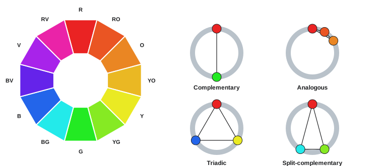
- Analogous: three or four neighbouring hues, such as yellow, orange and red in an autumn forest, or blues and greens in a seascape. Harmonious and natural; one hue usually dominates.
- Complementary: two opposite hues. Vibrant and high-contrast; usually one dominates and the other is an accent, as equal areas of saturated complements can clash.
- Split-complementary: a hue and the two neighbours of its complement, such as blue with yellow-orange and red-orange. Strong contrast with less tension than a direct complement.
- Triadic: three hues equally spaced on the wheel, such as red, yellow and blue. Lively and balanced; often used with one dominant and two accents.
A photographer cannot always choose the colours of a scene, but can choose what to include and exclude, when to shoot, and what the subject wears. Filmmakers go further: production designers, costume designers and colourists plan a film's palette, often assigning colours to characters, places or emotional states, and changing the palette as the story develops.
Colour, mood and meaning
Colours carry associations that come partly from nature and partly from culture:
| Colour | Common associations in North American culture | Notes |
|---|---|---|
| Red | passion, danger, urgency, energy, love | luck and celebration in Chinese culture |
| Orange | warmth, enthusiasm, autumn, caution | safety equipment uses it for visibility |
| Yellow | happiness, optimism, warning | high visibility; harder to read as text on white |
| Green | nature, growth, health, go | money in the US; associated with Islam in many countries |
| Blue | calm, trust, stability, cold, sadness | the most common corporate colour |
| Purple | luxury, mystery, spirituality | historically costly dye, hence royalty |
| White | purity, cleanliness, simplicity | mourning in parts of East and South Asia |
| Black | elegance, power, mystery, mourning | luxury branding and formal design |
Beyond individual colours, the overall palette sets mood. Warm, saturated palettes feel energetic and inviting; cool palettes feel calm, clinical or melancholy; desaturated palettes feel serious, gritty or nostalgic; high-key pastel palettes feel light and gentle. Light itself has colour (VIS-110): the warm light of early morning and late afternoon, the "golden hour", feels romantic and nostalgic, while the blue light just after sunset, the "blue hour", feels quiet and mysterious. Choosing when to shoot is often choosing a palette.
Colour grading as composition
In film, video and much photography, colour is adjusted after capture in colour correction and grading. Correction fixes technical problems, making white balance and exposure consistent between shots. Grading is creative: it shapes the palette to direct attention and set mood. Compositional uses of grading include:
- Separating subject and background with complementary colours, such as warming skin and cooling shadows.
- Using power windows (masks) to brighten or saturate the subject slightly and darken the edges of the frame, guiding the eye inward like a vignette.
- Reducing saturation in distracting background colours, such as a bright green sign behind a speaker.
- Keeping a consistent palette across a sequence so that the story, not colour changes, carries attention (Lesson 11).
Grading is most effective when it reinforces choices made earlier in production design, costume and lighting. Heavy grading cannot rescue a scene whose colours fight the composition.
Worked problem
Planning a palette for a short film
A student film follows a nurse through a long night shift that ends with good news at dawn. The director wants colour to carry the emotional arc without the audience noticing. Propose a palette plan for production design, costume and grading.
Show solution
- Night scenes in the hospital: a cool, desaturated palette of blue-greens and greys, with fluorescent-looking light, conveying fatigue and tension.
- Give the nurse one warm accent, such as a red cardigan or a warm lamp at the nurses' station, so she remains the focal point in cool frames.
- Midnight crisis: push contrast and coolness further, with harsh white light and deep shadows.
- Dawn: introduce warm, low sunlight through a window; let the grade shift toward analogous yellows and oranges, raising saturation gently.
- Keep skin tones natural throughout so that the shifts read as mood rather than error.
Answer: A cool, desaturated world with one warm accent, building to harsher contrast at the crisis and resolving into warm analogous colours at dawn, carries the story through colour. Planning it across design, costume and lighting means the grade only has to refine choices already in the frame, which looks more natural than imposing a look in post-production.
Palette plans like this are often summarized in a colour script, a strip of small frames or swatches showing the dominant colours of each scene in order. Animation studios use colour scripts to plan entire films, and live-action productions use mood boards and reference stills in the same way, so that every department works toward the same visual arc.
Colour accessibility
About 8% of men and 0.5% of women of Northern European ancestry have some form of colour vision deficiency, most commonly reduced sensitivity to red or green. For them, red and green of similar value can look alike, and colour-coded information, such as a red and green chart, a map legend, or a "go" button distinguished only by hue, can be unreadable. Good practice:
- Never rely on hue alone to carry meaning; add value contrast, labels, patterns or shapes.
- Check designs in greyscale: if important elements merge, increase their value contrast.
- Use colour-blind-safe palettes for charts and diagrams, for example blue and orange rather than red and green.
- For text, meet contrast guidelines: the Web Content Accessibility Guidelines (WCAG) require a luminance contrast ratio of at least 4.5:1 for normal text and 3:1 for large text, calculated as in Lesson 1.
Worked problem
Checking text contrast on a thumbnail
A designer places yellow text (relative luminance 0.80) on a light blue background (relative luminance 0.45) for a video thumbnail. Does it meet the WCAG 3:1 ratio for large text? What change would fix it?
Show solution
- Contrast ratio \(= (0.80 + 0.05)/(0.45 + 0.05) = 0.85/0.50 = 1.7\).
- This fails 3:1 by a wide margin; the text will be hard to read, especially for viewers with low vision or on a small screen in sunlight.
- Darken the background to a deep blue (luminance about 0.05): \((0.85)/(0.10) = 8.5\), which passes easily; or add a dark outline or shadow behind the text.
Answer: The ratio is only 1.7:1. Yellow on deep blue (8.5:1) or a dark stroke around the text makes it readable. Hue contrast between yellow and blue looked strong to the designer, but it is value contrast that makes text legible.
Common mistakes
MistakeRelying on hue contrast alone to separate subject and background.
InsteadCheck value contrast in greyscale as well.
MistakeUsing equal areas of saturated complementary colours.
InsteadLet one colour dominate and use the other as an accent.
MistakeLetting a bright background colour compete with the subject.
InsteadExclude it, change angle, or desaturate it in editing.
MistakeCoding information in red and green only.
InsteadAdd labels, patterns or value differences; use colour-blind-safe palettes.
MistakeAssuming colour meanings are universal.
InsteadCheck associations for the intended audience and culture.
Summary and key terms
- Hue, saturation and value describe colour; value contrast separates elements most reliably.
- Itten's contrasts include hue, value, warm-cool, complementary, simultaneous, saturation and extension.
- A saturated accent in a muted scene creates a strong focal point.
- Warm and saturated colours weigh more and advance; cool and muted colours recede.
- Monochromatic, analogous, complementary, split-complementary and triadic schemes create harmony.
- Palettes set mood; colour meanings vary by culture.
- Grading reinforces composition; accessible design never relies on hue alone and meets contrast guidelines.
- Hue
- The colour family, such as red or blue.
- Saturation
- The purity or vividness of a colour.
- Value
- The lightness or darkness of a colour.
- Complementary colours
- Hues opposite each other on the colour wheel.
- Analogous colours
- Hues next to each other on the colour wheel.
- Simultaneous contrast
- The shift in perceived colour caused by neighbouring colours.
- Aerial perspective
- The bluer, lighter, less saturated appearance of distant objects.
- Colour grading
- Creative adjustment of colour after capture.
- 60-30-10 rule
- A guideline for proportions of dominant, secondary and accent colours.
- Colour vision deficiency
- Reduced ability to distinguish certain colours.
Practice problems
Work each problem on paper first, then reveal the answer to check.
What are the three properties of colour?
Show answer
Hue, saturation and value.
What is the complement of blue on a traditional colour wheel?
Show answer
Orange.
Which colours tend to advance?
Show answer
Warm, saturated colours.
Name an analogous scheme found in nature.
Show answer
Yellows, oranges and reds of autumn leaves.
Why is teal and orange popular in film?
Show answer
Skin tones are orange, so a teal complement separates people from backgrounds.
What does the 60-30-10 rule describe?
Show answer
Proportions of dominant, secondary and accent colours.
Contrast ratio of luminances 0.6 and 0.1?
Show answer
0.65/0.15 = 4.3:1.
Why check a design in greyscale?
Show answer
To verify value contrast, which carries legibility and accessibility.
What is aerial perspective?
Show answer
Distant objects appear bluer, lighter and less saturated.
What is the difference between colour correction and grading?
Show answer
Correction fixes technical consistency; grading creates a look.
Lesson quiz · 5 questions
Score 60% or more to complete this lesson.
Create a free account to save your progress, take quizzes and earn a certificate.