
VIS-101 · Lesson 1 of 12 · 34 min
Elements of visual design
Every photograph, film frame, poster and social media post is a flat rectangle filled with marks of light and colour. What makes some rectangles hold our attention, tell a story or move us, while others are confusing or dull, is largely composition: the arrangement of visual elements within the frame. Painters, photographers and cinematographers have studied composition for centuries, and psychologists have since explained much of why it works by studying how the eye and brain organize what they see. This course teaches composition as a practical toolkit. This first lesson introduces the basic building blocks, the elements of visual design, and the principles by which the brain groups them into meaningful wholes. Later lessons apply them to every part of composition; the section at the end of this lesson shows how the twelve lessons fit together.
Why composition matters
A viewer looks at an image for a short time: a few seconds for a photograph in a gallery, less than a second for a thumbnail scrolling past on a phone, and a fraction of a second for each shot in a fast-cut film sequence. In that time the image must communicate what it is about, where to look and how to feel. Composition does this work. It is not decoration added after the subject is chosen; it is how the subject is presented. The same person photographed small in a vast empty landscape and filling the frame in a tight close-up tells two different stories.
Composition is also a language shared by image makers and audiences. Viewers have absorbed its conventions from a lifetime of images, so they read a low camera angle as power, a tilted horizon as unease and empty space in front of a moving subject as anticipation, usually without noticing. Learning composition means making these choices deliberately instead of by accident.
The elements of visual design
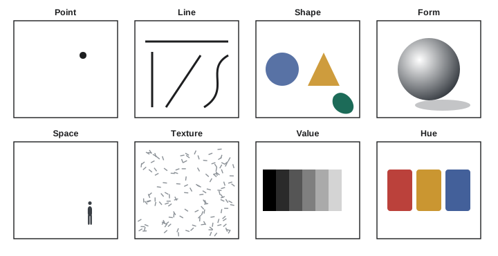
Designers traditionally list a small set of elements from which any image is built:
- Point: a small, distinct mark, such as a distant figure, a star or a light. A single point in an empty field draws attention immediately; two points create a relationship and an implied line between them.
- Line: a mark longer than it is wide, or the edge where two areas meet. Lines have direction and character: horizontal lines feel calm and stable, vertical lines strong and upright, diagonal lines dynamic, and curves graceful or flowing. Lines can also be implied, by the direction of a gaze, a pointing finger or a row of objects.
- Shape: an enclosed two-dimensional area defined by edges, colour or value. Geometric shapes (circles, triangles, rectangles) feel constructed and ordered; organic shapes feel natural. A silhouette reduces a subject to pure shape.
- Form: the illusion of three-dimensional volume, created mainly by light and shadow on a subject. Side light reveals form; flat frontal light hides it.
- Space: the areas around and between objects. Positive space is occupied by the subject; negative space is the emptiness around it. Negative space is not wasted: it isolates the subject, gives it room to breathe and can carry meaning, such as loneliness or freedom.
- Texture: the surface quality of things, rough or smooth, that the viewer seems able to feel. Raking light, which skims across a surface at a low angle, emphasizes texture.
- Value: lightness and darkness, independent of hue. Value contrast is the strongest tool for separating a subject from its background and is what remains when an image is converted to black and white.
- Colour: hue, saturation and value together. Colour carries emotion and draws attention, and is studied in detail in VIS-110.
Value and contrast
Of all the elements, value contrast does the most to determine what the viewer sees first. The eye is drawn to the area of greatest contrast, usually where the lightest light meets the darkest dark. Painters such as Caravaggio and Rembrandt built their compositions on strong value contrast (chiaroscuro), and film noir and much modern cinematography do the same. A useful test of any composition is to squint at it, or view it in black and white: the arrangement of light and dark masses that remains is the image's underlying structure.
Contrast can be measured. For digital images, relative luminance \(L\) combines the red, green and blue channels weighted by the eye's sensitivity, which is highest for green and lowest for blue. The contrast ratio between two areas is then:
where \(L_1\) is the lighter area and \(R\), \(G\), \(B\) are linear (not gamma-encoded) channel values from 0 to 1. Accessibility guidelines for screen text (WCAG) require a contrast ratio of at least 4.5:1 for normal text and 3:1 for large text, standards that matter whenever images carry text, such as thumbnails, titles and posters.
Worked problem
Contrast ratio of text on an image
White title text (relative luminance 1.0) is placed over a sky whose relative luminance is 0.35. Does it meet the 4.5:1 guideline? What luminance would a darkened band behind the text need to reach 4.5:1?
Show solution
- Contrast \(= (1.0 + 0.05)/(0.35 + 0.05) = 1.05/0.40 = 2.6\).
- For 4.5:1: \((1.05)/(L + 0.05) = 4.5\), so \(L + 0.05 = 0.233\) and \(L = 0.183\).
Answer: The contrast is only 2.6:1, below the guideline, so the text would be hard to read for many viewers. Darkening the area behind the text to a luminance of 0.18 or less (for example with a translucent dark band or a gradient) brings the contrast to 4.5:1.
Worked problem
Luminance of colours
Compute the relative luminance of pure red (1, 0, 0), pure green (0, 1, 0) and pure blue (0, 0, 1). Which pair has the greatest contrast?
Show solution
- Red: 0.2126. Green: 0.7152. Blue: 0.0722.
- Green versus blue: \((0.7152 + 0.05)/(0.0722 + 0.05) = 0.765/0.122 = 6.3\).
- Red versus blue: \(0.263/0.122 = 2.2\); green versus red: \(0.765/0.263 = 2.9\).
Answer: Pure green appears about ten times as bright as pure blue, giving a contrast of 6.3:1, while pure red and pure blue, both vivid, contrast only 2.2:1 in value. Two colours can look very different in hue yet have similar values, so they separate poorly in black and white and for people with colour vision deficiencies.
Gestalt principles of perception
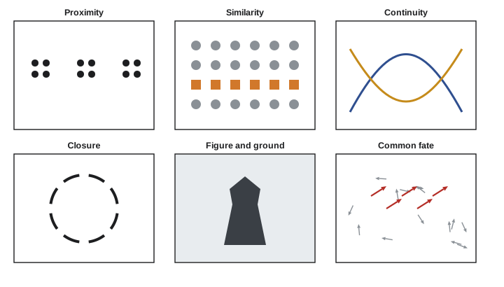
Early twentieth-century German psychologists of the Gestalt school ("Gestalt" means shape or whole) showed that the brain does not see an image as a collection of separate marks. It automatically groups elements into wholes according to consistent rules. These principles explain why compositions work:
- Figure and ground: we separate an image into a figure (the object of attention) and a ground (the background). Strong compositions make the figure-ground relationship clear; ambiguous ones, like the famous vase that can also be seen as two faces, let the two swap.
- Proximity: elements close together are seen as a group. Spacing controls grouping in layouts, crowds and still lifes.
- Similarity: elements that share colour, shape, size or texture are grouped. A single element that differs, such as one red umbrella in a crowd of black ones, stands out sharply.
- Continuity: the eye follows lines and curves smoothly and prefers continuous paths to abrupt changes, which is why leading lines work (Lesson 9).
- Closure: the brain completes incomplete shapes, filling gaps to see a whole circle or a face from a few marks. Cropping part of a subject relies on closure: viewers imagine the rest beyond the frame.
- Common fate: elements moving in the same direction are seen as a group, important for film and video.
- Prägnanz (simplicity): the brain prefers the simplest, most stable interpretation of an image.
Worked problem
Using similarity to create emphasis
A photographer shoots a parking lot of 200 grey cars with one yellow taxi. Using the Gestalt principles, explain why the taxi dominates the image even though it occupies only 0.5% of the cars, and suggest how to strengthen the effect.
Show solution
- Similarity groups the 199 grey cars into a single texture or pattern, which the brain treats as ground.
- The taxi breaks the pattern in hue, so it becomes the figure.
- To strengthen it: frame so the pattern fills the frame edge to edge (no competing elements), place the taxi off-centre on a strong point (Lesson 3), and avoid other saturated colours.
Answer: The taxi dominates because it is the only element that breaks a strong pattern of similarity. The larger and more uniform the pattern, the more the exception stands out, a principle used constantly in photography, design and advertising.
Aspect ratio and the frame
Composition always happens inside a frame of a particular shape, given by its aspect ratio (width to height). Common ratios include:
| Ratio | Decimal | Where it is used |
|---|---|---|
| 4:3 | 1.33 | Early television and film, many compact cameras and phone sensors |
| 3:2 | 1.50 | 35 mm film and most interchangeable-lens camera sensors |
| 4:5 | 0.80 | Portrait-oriented social media feed posts |
| 16:9 | 1.78 | High-definition and 4K video, most screens |
| 9:16 | 0.56 | Vertical short-form video and stories on phones |
| 1.85:1 | 1.85 | Flat widescreen cinema |
| 2.39:1 | 2.39 | Anamorphic widescreen (scope) cinema |
| 1:1 | 1.00 | Square format: medium-format film, some social posts |
The frame's shape suggests its content: wide frames suit landscapes, groups and horizontal movement, and emphasize the space around people; tall frames suit standing figures, buildings and single subjects. Because the same content must often be delivered in several ratios (a film in 2.39:1 for cinemas and 16:9 for television, a video in 16:9 and 9:16), image makers frequently compose with "safe areas", keeping essential elements where they will survive every crop.
Worked problem
Cropping between aspect ratios
A 16:9 video frame is 3840 × 2160 pixels. It must be cropped to 9:16 vertical at full height. How wide is the crop, and what fraction of the original frame's area is kept?
Show solution
- Full height 2160 px; width for 9:16 \(= 2160 \times 9/16 = 1215\) px.
- Area kept \(= (1215 \times 2160)/(3840 \times 2160) = 1215/3840 = 0.316\).
Answer: The vertical crop is 1215 pixels wide and keeps only 32% of the frame. Unless the subject stays inside a central band about a third of the frame wide, it will be cut off, which is why shooters who deliver both formats keep the action near the centre or film vertical versions separately.
Worked problem
Fitting a wide film on a screen
A 2.39:1 film is shown on a 16:9 television 1920 pixels wide without cropping. How tall is the picture, and how tall are the black bars above and below?
Show solution
- Picture height \(= 1920/2.39 = 803\) px.
- Screen height \(= 1920 \times 9/16 = 1080\) px; bars \(= (1080 - 803)/2 = 138\) px each.
Answer: The picture is 803 pixels tall with 138-pixel letterbox bars top and bottom; the image fills only 74% of the screen. Streaming versions sometimes crop or reframe instead, which changes the composition the cinematographer intended.
Simplicity and the subject
The most common problem in beginners' images is not a lack of technique but a lack of a clear subject. Before composing, decide what the image is about. Then every element in the frame either supports that subject or competes with it. Practical steps include:
- Move closer, or use a longer lens, to fill the frame with what matters. The photojournalist Robert Capa's advice, "If your pictures aren't good enough, you're not close enough," still applies.
- Check the edges of the frame for distractions: bright patches, cut-off objects and lines that lead the eye out of the picture.
- Simplify the background by changing the angle, opening the aperture to blur it (Lesson 7), or waiting for distractions to move.
- Use value and colour contrast to separate the subject from its background.
Simplicity does not mean minimalism. A crowded street scene can be well composed if its many elements are organized by a clear structure; the goal is that the viewer can read the image, not that it contains little.
How this course is organized
The twelve lessons build a complete compositional toolkit:
- Lesson 1 (this lesson): the elements of visual design, value contrast, Gestalt principles, aspect ratio and simplicity.
- Lesson 2: line, shape, texture and pattern.
- Lesson 3: framing, the rule of thirds and related grids, shot sizes and camera angle.
- Lesson 4: composing people: portraits, groups, posing and ethics.
- Lesson 5: balance, symmetry, tension, rhythm and negative space.
- Lesson 6: colour in composition.
- Lesson 7: depth, perspective, focal length and depth of field.
- Lesson 8: light and shadow as composition.
- Lesson 9: leading the eye: focal points, hierarchy, leading lines and small screens.
- Lesson 10: typography and graphic layout.
- Lesson 11: composition in motion and sequence.
- Lesson 12: critique, style, ethics and a portfolio project.
Common mistakes
MistakePlacing text on an image without checking contrast.
InsteadMeasure or test the contrast ratio and add a band, shadow or gradient where needed.
MistakeRelying on hue alone to separate a subject.
InsteadCheck value contrast in black and white; similar values blend together.
MistakeIgnoring the edges of the frame.
InsteadScan all four edges for distractions before shooting.
MistakeComposing for one aspect ratio when the work will be shown in several.
InsteadPlan safe areas or reframe for each delivery format.
MistakeIncluding everything in the frame "to be safe".
InsteadDecide on the subject and remove or exclude elements that compete with it.
Summary and key terms
- Composition is the arrangement of visual elements in a frame and determines how an image is read.
- The elements are point, line, shape, form, space, texture, value and colour.
- Value contrast draws the eye most strongly and forms an image's underlying structure.
- Relative luminance and contrast ratio quantify contrast; text needs 4.5:1 for normal sizes.
- Gestalt principles (figure-ground, proximity, similarity, continuity, closure, common fate) explain how the brain groups elements.
- Aspect ratio shapes composition; cropping between ratios can discard most of a frame.
- A clear subject and a simplified frame are the foundation of strong composition.
- Composition
- The arrangement of visual elements within a frame.
- Negative space
- Empty area around and between subjects.
- Value
- The lightness or darkness of a tone, independent of hue.
- Contrast ratio
- The ratio of the luminances of two areas, offset by 0.05.
- Chiaroscuro
- Strong contrast between light and dark used to model form and focus attention.
- Gestalt principles
- Rules by which perception groups elements into wholes.
- Figure-ground
- The separation of an image into a subject and its background.
- Closure
- The tendency to complete incomplete shapes.
- Aspect ratio
- The ratio of a frame's width to its height.
- Safe area
- The part of a frame that remains visible in every intended crop.
Practice problems
Work each problem on paper first, then reveal the answer to check.
Name the eight elements of visual design.
Show answer
Point, line, shape, form, space, texture, value and colour.
What does each line direction tend to suggest?
Show answer
Horizontal: calm; vertical: strength; diagonal: energy; curves: grace or flow.
Contrast ratio between luminances 0.6 and 0.1?
Show answer
0.65/0.15 = 4.3:1.
Black text (luminance 0) on a background of 0.2. Contrast ratio, and does it meet 4.5:1?
Show answer
0.25/0.05 = 5:1; yes.
Why convert an image to black and white when checking composition?
Show answer
It reveals the value structure, showing what will draw the eye regardless of colour.
Which Gestalt principle makes one red umbrella stand out in a crowd of black ones?
Show answer
Similarity (the exception breaks the pattern).
A 6000 × 4000 photo is cropped to 4:5 portrait at full height. Crop width?
Show answer
4000 × 4/5 = 3200 px.
A 1.85:1 film on a 1920 × 1080 screen without cropping: picture height and bar height?
Show answer
1038 px; 21 px bars.
What is negative space and what can it do?
Show answer
Empty area around a subject; it isolates the subject and can carry mood or meaning.
Give three ways to simplify a busy background.
Show answer
Change angle, move closer or use a longer lens, blur with a wide aperture, wait for distractions to move.
Lesson quiz · 5 questions
Score 60% or more to complete this lesson.
Create a free account to save your progress, take quizzes and earn a certificate.