
PHOT-430 · Lesson 4 of 12 · 34 min
Photobook design: grid, layout and typography
Good photobook design is often invisible. Readers notice the photographs, the pace and the feel of the object, not the margins or the typeface, yet those quiet decisions shape every page. This lesson covers the anatomy of a page for print, including trim, bleed, safe area and gutter allowance; layout grids and placement strategies; how image size and white space create rhythm; the specific problems of saddle-stitched creep and tight bindings; effective resolution when images are placed in a layout; and typography for captions, essays, covers and bilingual books. It assumes you have a format edit and a flatplan from lessons 2 and 3. Software is mentioned neutrally: Adobe InDesign is the industry standard, Affinity (now a free unified application from Canva since late 2025) is a common alternative, and Scribus is a free, open-source option.
Anatomy of a page for print
A page layout has several boundaries that a designer must respect.
- Trim: the final cut edge of the page. Cutting machines are accurate but not perfect, typically within about a millimetre.
- Bleed: image or colour that extends beyond the trim so that, after cutting, there is no white sliver at the edge. Printers commonly ask for 3 mm of bleed in Canada and Europe and 0.125 in in the United States, which is about the same distance.
- Safe area: an inner boundary, usually 3 to 5 mm or about 0.125 to 0.25 in inside the trim, within which important elements such as text and faces should stay so they are not cut off.
- Margins: the deliberate white space between the safe area and the text or image area, chosen for design reasons rather than safety.
- Gutter allowance: extra inner margin to compensate for the part of the page lost into the binding.
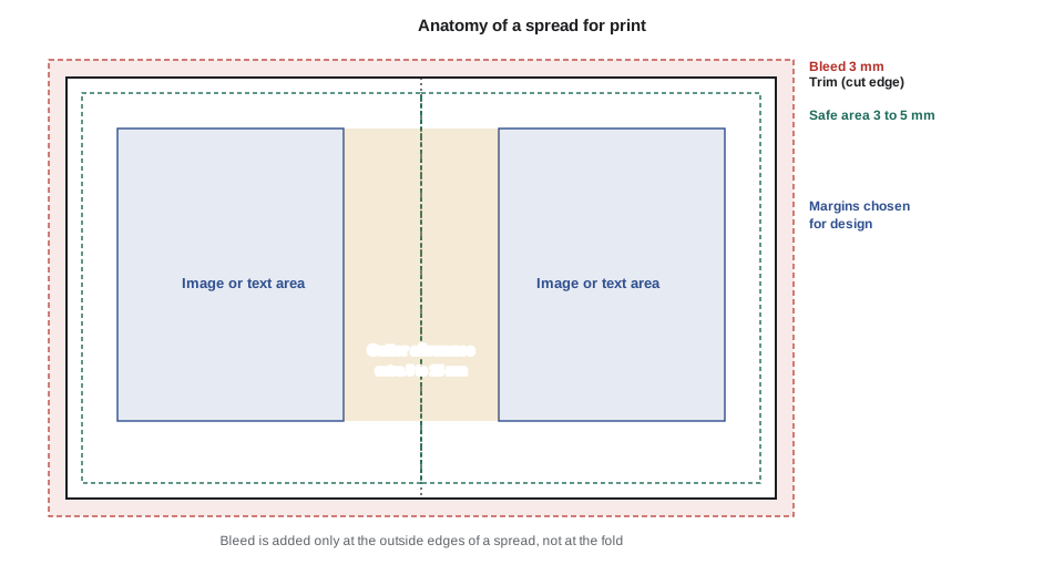
Set up your document with the trim size as the page size and bleed added as a separate setting, rather than enlarging the page. Layout applications export PDF files with bleed and crop marks so the printer can see exactly where to cut. Any image meant to run to the edge must extend to the outer edge of the bleed, not just to the trim.
Worked problem
Document size with bleed
A book has a trim of 240 × 300 mm. The printer asks for 3 mm bleed. A full-bleed spread image must cover both pages. What size must the image area be in the exported file?
Show solution
- Spread trim: \( 2 \times 240 = 480 \) mm wide and 300 mm high.
- Add bleed on the outer edges: \( 480 + 2 \times 3 = 486 \) mm wide and \( 300 + 2 \times 3 = 306 \) mm high.
Answer: The image must cover 486 × 306 mm. Bleed is not added at the gutter between the two pages of a spread, only at the outside edges.
Margins and their proportions
Margins frame the photographs and give the eye room to rest. Generous margins suggest calm and value; tight margins and full-bleed images suggest immediacy and abundance. Classical book design used unequal margins: the inner margin smallest, the top a little larger, the outer larger again, and the bottom largest, so that the two pages of a spread read as a unit and the text block sits slightly above centre. Many photobooks follow a version of this, with a larger bottom margin that anchors images visually and leaves room for a page number or caption if needed.
In photobooks, the inner margin needs more care than in text books, because photographs are less forgiving of being pulled into the fold. A practical approach is to design the visual margins you want, then add gutter allowance on top according to the binding. Keep margins consistent across the book unless you have a reason to change them; consistency lets readers stop noticing the frame and see the pictures.
Gutter allowance and binding
Different bindings lose different amounts of the inner page. A saddle-stitched zine opens nearly flat and loses little. A perfect-bound softcover, where pages are glued at the spine, often does not open flat and can hide 10 mm or more of the inner page, especially in thick books with stiff paper. A section-sewn hardcover opens better, and lay-flat bindings open fully. Lesson 5 describes bindings in detail; here the point is that gutter allowance depends on the binding.
| Binding | Opening behaviour | Typical extra inner margin |
|---|---|---|
| Saddle stitch | Opens nearly flat | 0 to 3 mm (0 to 0.125 in) |
| Section-sewn, softcover or hardcover | Opens reasonably well | 5 to 8 mm (0.2 to 0.3 in) |
| PUR perfect binding | Opens better than standard glue | 6 to 10 mm (0.25 to 0.4 in) |
| Standard perfect binding (hot-melt glue) | Often stiff, does not open flat | 10 to 15 mm (0.4 to 0.6 in) |
| Lay-flat or layflat photo binding | Opens fully flat | 0 to 3 mm (0 to 0.125 in) |
If an image must cross the gutter, choose a binding that opens well, avoid placing faces or key details at the centre, and consider shifting the image slightly so that the important area falls on one page. Some designers duplicate a few millimetres of the image at the gutter on each side so that the visible image looks continuous when the book opens into a curve; ask your printer before doing this.
Creep in saddle-stitched books
When sheets are nested inside each other and stapled through the fold, the inner sheets stick out slightly further than the outer ones, because each sheet wraps around those inside it. When the book is trimmed, the inner pages lose a little more from their outer edges. This effect is called creep or shingling. In a thin zine on light paper it is negligible; in a thick zine on heavier paper it can move content near the outer edge by a millimetre or more.
Here \( S \) is the number of nested sheets and \( t \) is the paper thickness, or caliper. Printers can compensate by shifting pages toward the spine progressively, a setting in imposition software, but designers should still keep text and key details well inside the safe area on inner pages.
Worked problem
Estimating creep
A 48-page saddle-stitched zine is printed on paper 0.12 mm thick. How many sheets are nested, and roughly how much do the innermost pages creep relative to the outermost?
Show solution
- Each folded sheet carries 4 pages, so \( S = 48 / 4 = 12 \) sheets.
- Creep: \( (12 - 1) \times 0.12 = 1.32 \) mm.
Answer: About 1.3 mm. Text placed 3 mm from the outer trim on the centre pages could end up less than 2 mm from the edge, so a safe area of 5 mm is wiser, or the printer can apply creep compensation.
Layout grids
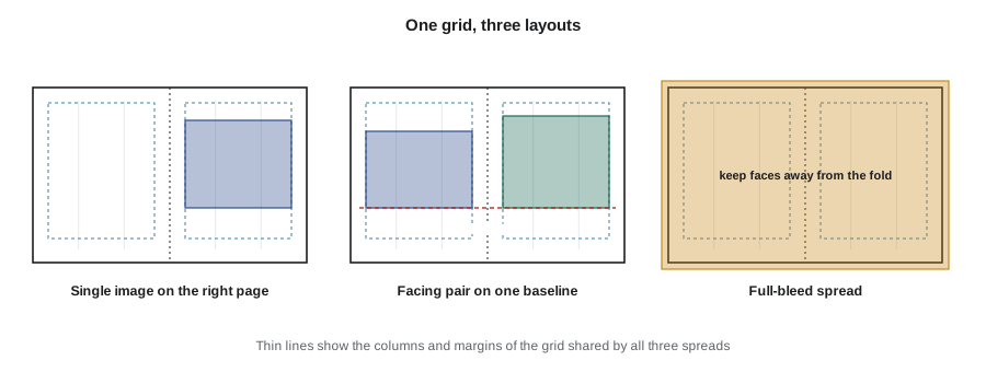
A grid is a set of invisible guides that divides the page into columns, rows and margins. It helps a designer place images and text consistently and make decisions quickly. Photobooks often use simple grids.
- Single-field grid: one image area per page within fixed margins. Images are placed in the same position, often centred or aligned to a baseline, giving calm consistency.
- Two-column or modular grid: the page is divided into columns and rows, allowing pairs, small groups and text blocks to align.
- Spread grid: the spread is treated as one field, allowing images to cross the gutter or sit asymmetrically.
A grid does not mean every page looks the same. It provides a structure against which variation becomes meaningful. A book might place most images in a consistent window on the recto, then break the pattern with a full-bleed spread at a climax. The break works because the grid has trained the reader's eye.
Placement strategies and image size
How images sit on the page communicates as much as which images are chosen. Consistent placement, with every image the same size in the same position, invites comparison and suits typologies and serial work. Variable placement, with images changing size and position, creates movement and emphasis but can look arbitrary if not controlled. Many books use a small vocabulary of layouts, for example a full page, a centred window and a small image low on the page, and repeat them in patterns.
| Layout | Effect on the reader |
|---|---|
| Single image on recto, blank verso | Emphasis and pause; slow pace |
| Facing pair at equal size | Comparison, dialogue or contrast |
| Full-bleed single page | Immersion; images feel larger than the book |
| Full-bleed spread | Climax or breath of scale; gutter risk |
| Small image with wide margins | Intimacy, quiet, close looking |
| Grid of several small images | Accumulation, typology, contact-sheet feel |
| Image with facing text | Context and reading; slows the visual flow |
Image size in a book should relate to the image itself. Dense, detailed images may need size to be read; simple graphic images can be small and still strong. Scale changes also create rhythm: a small image after a full-bleed spread feels intimate; a full-bleed spread after several small images feels like a burst of space.
Effective resolution
When an image is placed in a layout, its effective resolution depends on the size at which it is placed. Effective resolution, in pixels per inch (ppi), is the image's pixel width divided by its placed width in inches. For offset printing, about 300 ppi at final size is the common target; print-on-demand services often accept 200 to 300 ppi. PHOT-301 covered sizing and resampling for inkjet prints; the same principles apply here, but the effective resolution must be checked in the layout file, because designers often scale images up or down while designing.
Worked problem
Checking effective resolution in a layout
An image 5,400 pixels wide is placed as a full-bleed spread on a book with a 240 mm trim width per page and 3 mm bleed. What is its effective resolution, and is it enough for offset printing at 300 ppi?
Show solution
- Placed width: \( 2 \times 240 + 6 = 486 \) mm, which is \( 486 / 25.4 \approx 19.1 \) in.
- Effective resolution: \( 5400 / 19.1 \approx 283 \) ppi.
- Pixels needed for 300 ppi: \( 19.1 \times 300 \approx 5740 \) pixels.
Answer: About 280 ppi, slightly under the 300 ppi target. This is usually acceptable for a photographic image viewed at reading distance; upsampling the file modestly with a good algorithm before sending, as discussed in PHOT-301, is an option, but check a printed proof rather than relying on the number alone.
Typography for photobooks
Type in a photobook does several jobs: titling, captions, essays, page numbers, the copyright page and the cover. In most photobooks the type should support the images rather than compete with them. A few principles help.
- Choose one or two typefaces. A single family with several weights is often enough. A typeface with a range of weights and italics covers titles, captions and essays.
- Use readable sizes. Body text for essays is commonly 9 to 11 points; captions and lists of works 7 to 9 points; the copyright page can be smaller but should remain legible.
- Keep comfortable line lengths. Around 45 to 75 characters per line, including spaces, is easy to read. Long lines across a wide page tire the eye; use narrower columns.
- Set leading, the space between lines, at roughly 120 to 145 per cent of the type size for body text.
- Establish a clear hierarchy using size, weight and space rather than many different fonts or colours.
- Check licensing. Font licences specify how fonts can be used in print, ebooks and websites. Free fonts from reputable libraries, such as many open-licence families, are convenient for self-publishing.
Captions deserve particular attention. Decide early whether captions appear on image pages, at the end of chapters, or in a list of works. Write captions in a consistent format, for example title, place, year, and keep factual information accurate. PHOT-401 discussed writing titles and captions; here the concern is how they look and where they sit.
Worked problem
Choosing a column width
An essay is set in a typeface whose characters, including spaces, average about 1.8 mm wide at 10 points. The designer wants about 65 characters per line. How wide should the column be, and would a single column across a 200 mm text area work?
Show solution
- Column width: \( 65 \times 1.8 = 117 \) mm.
- A 200 mm single column would hold about \( 200 / 1.8 \approx 111 \) characters per line, far too long.
- Two columns of 95 mm with a 10 mm gap give \( 95 / 1.8 \approx 53 \) characters per line.
Answer: Use a column of roughly 65 characters, or split the wide text area into two columns of about 53 characters each. A single full-width column would produce lines of more than 110 characters, which readers find tiring.
Typography in bilingual books
In Canada, books that serve both English- and French-speaking readers, or that receive certain public funding, are often bilingual. Common solutions include parallel columns with English and French side by side, sequential sections with all English text followed by all French text, and tête-bêche books, where the book is printed so that one language reads from the front and the other from the back, upside down relative to each other, meeting in the middle. French typically runs about 15 to 20 per cent longer than English, so allow space. In the United States, bilingual English and Spanish publications follow similar patterns. Whatever the solution, give both languages equal typographic care.
French typography has its own conventions, such as spaces before certain punctuation marks and the use of guillemets for quotations. Work with a translator or editor who knows them, and ask the printer to proof both languages carefully.
Covers and type at small sizes
A cover must work at two scales: as a physical object on a table, and as a thumbnail on a web page or in a social media post. Strong covers often use a single image or a simple typographic treatment that remains legible when reduced to the width of a phone screen column. Test the cover by viewing it at about 150 pixels wide. If the title disappears, enlarge it, simplify it or move it to a contrasting area. Spine type should be large enough to read on a shelf; even a narrow spine of 6 mm can carry a title in a condensed typeface at 8 to 9 points.
Parent pages, styles and linked files
Layout software saves time and prevents errors when you use its structural features. Parent pages (called master pages in older versions) hold repeated elements such as page numbers and guides. Paragraph and character styles keep typography consistent, so a change to the caption style updates every caption at once. Linked images remain separate files referenced by the layout, so you can update an image in your editing software and relink it. Keep all links and fonts in one project folder and use the software's packaging function before sending files to a designer or printer. A missing link or font is one of the most common causes of delays at prepress.
Common mistakes
MistakePlacing faces or text close to the trim
InsteadKeep important elements inside a safe area of at least 3 to 5 mm or 0.125 to 0.25 in.
MistakeUsing the same inner margin for every binding
InsteadAdd gutter allowance according to how the chosen binding opens.
MistakeEnlarging images in the layout without checking effective resolution
InsteadCheck effective ppi at placed size and aim for about 300 ppi for offset printing.
MistakeUsing many typefaces to create hierarchy
InsteadUse one or two families and build hierarchy with size, weight and space.
MistakeDesigning the cover only at full size
InsteadTest the cover as a small thumbnail so it works online.
Summary and key terms
- Pages for print have trim, bleed, safe area, margins and gutter allowance.
- Bleed is about 3 mm or 0.125 in beyond the trim on outside edges only.
- Gutter allowance depends on how the binding opens; perfect binding needs the most.
- Creep in saddle-stitched books is roughly the number of sheets minus one times the paper caliper.
- Grids create consistency so that deliberate variations carry meaning.
- Effective resolution equals pixel width divided by placed width in inches; about 300 ppi suits offset printing.
- Typography should support the images, with readable sizes, comfortable line lengths and a clear hierarchy.
- Bleed
- Image or colour extending beyond the trim to avoid white edges after cutting.
- Safe area
- The zone inside the trim where important content stays.
- Gutter allowance
- Extra inner margin to compensate for binding.
- Creep
- The outward shift of inner pages in a saddle-stitched book.
- Caliper
- The thickness of a sheet of paper.
- Grid
- A set of guides dividing the page into columns, rows and margins.
- Effective resolution
- The pixels per inch of an image at its placed size in a layout.
- Leading
- The vertical space between lines of type.
- Tête-bêche
- A book printed with two texts reading from opposite ends.
- Parent page
- A layout template holding repeated elements for many pages.
Practice problems
Work each problem on paper first, then reveal the answer to check.
A trim of 210 × 280 mm needs 3 mm bleed. What is the single-page size with bleed?
Show answer
\( 216 \times 286 \) mm.
Is bleed added at the gutter of a full-bleed spread?
Show answer
No; only at the outside edges.
A 32-page zine on 0.1 mm paper: estimate creep.
Show answer
8 sheets, so \( (8-1) \times 0.1 = 0.7 \) mm.
An image 4,800 px wide is placed 12 in wide. What is its effective ppi?
Show answer
\( 4800 / 12 = 400 \) ppi.
How many pixels wide must an image be to print 10 in wide at 300 ppi?
Show answer
3,000 pixels.
Which binding needs the most gutter allowance?
Show answer
Standard perfect binding with hot-melt glue.
What line length in characters is comfortable for body text?
Show answer
Around 45 to 75 characters.
Give two ways to lay out a bilingual English and French book.
Show answer
Parallel columns, sequential sections or tête-bêche.
Why test a cover at about 150 pixels wide?
Show answer
To ensure it remains legible as an online thumbnail.
What does packaging a layout file do?
Show answer
Collects the layout, linked images and fonts into one folder for handoff.
Lesson quiz · 5 questions
Score 60% or more to complete this lesson.
Create a free account to save your progress, take quizzes and earn a certificate.