
PHOT-430 · Lesson 2 of 12 · 34 min
Editing and sequencing for a format
PHOT-401 taught editing as authorship and introduced the main models of sequence: openings, pairs, rhythm and endings. This lesson applies those ideas to specific formats. The central idea is that you make one master edit of the project and then a separate format edit for each output. A 32-page zine, a 128-page monograph, a twenty-print exhibition and a ten-image online feature each impose different limits on how many images you can use, how they meet each other and how viewers move through them. Editing for a format means working within those limits deliberately. You will learn to calculate image counts from page extent, think in spreads rather than single pages, chart pacing, make dummies, and sequence for walls and screens as well as books.
The master edit and the format edits
The master edit is the set of images that represent the project at its fullest: every photograph you would be willing to show under your name, typically 40 to 120 images for a mature project. It is not tied to any output. Format edits are subsets and arrangements of the master edit, made for a particular book, exhibition or screen. A book might use 64 of the master edit's 90 images; an exhibition might use 18 of them, including two that do not appear in the book because they work only at large scale.
Keeping these separate prevents two common problems. The first is cutting good work from the project permanently just because one format had no room for it. The second is forcing an exhibition to follow a book sequence, or vice versa. Record the master edit in a catalogue or spreadsheet with a stable identifier for each image, such as a short code, and record each format edit as a list of those identifiers. This makes it easy to compare outputs, track which prints exist at which sizes, and update captions in one place.
| Output | Images used | Constraint that drives the edit |
|---|---|---|
| Master edit | 90 | Quality and coherence of the project |
| Monograph, 128 pages | 64 | Page extent, spreads, text pages |
| Zine, 32 pages | 22 | Short extent, low cost, one idea |
| Exhibition, 24 m of wall | 18 | Wall length, print sizes, sightlines |
| Online feature | 10 | Vertical scrolling, small screens, short attention |
From extent to image count
Book extents come in fixed multiples because pages are printed on large sheets that are folded into sections called signatures, commonly of 16 pages (lesson 3 explains imposition). Not every page carries a picture. Front matter (half-title, title page, copyright page, contents) and back matter (captions, essays, acknowledgements, colophon) take pages, and many photobooks leave the left page of a spread blank or use white space to slow the pace. A useful planning formula is:
where \( E \) is the extent, \( F \) and \( B \) are front and back matter pages, and \( d \) is the average number of images per page across the picture section. A book with one image per spread and every left page blank has \( d = 0.5 \); a book with one image on every page has \( d = 1 \); a book mixing full spreads, singles and occasional grids might have \( d \) between 0.6 and 1.2.
Worked problem
How many images fit in a 128-page monograph?
A monograph has 128 pages. Front matter takes 6 pages and back matter, including an essay and captions, takes 18 pages. The designer plans mostly one image per spread with some facing pairs, giving an average density of 0.62 images per page. How many images can the book hold?
Show solution
- Picture pages: \( 128 - 6 - 18 = 104 \) pages.
- Images: \( 104 \times 0.62 = 64.5 \), so about 64 images.
- If the photographer insists on 80 images, the density must rise to \( 80 / 104 \approx 0.77 \), meaning more facing pairs and fewer blank left pages.
Answer: About 64 images. Holding 80 would change the book's rhythm noticeably, with more pairs and less breathing space, or would require 16 more pages.
Worked problem
Choosing an extent for a target image count
A zine should hold 22 images, one per page, with 2 pages of front matter and 2 of back matter. Extents must be a multiple of 4 for saddle stitching. What is the smallest extent, and what happens to the spare pages?
Show solution
- Pages needed: \( 22 + 2 + 2 = 26 \).
- The next multiple of 4 is 28.
- Two spare pages remain; they can carry a blank pause, a short text or a contact-sheet page.
Answer: A 28-page zine. The two spare pages should be planned as deliberate pauses, not filled with weaker images.
Thinking in spreads
Readers experience an open book as a spread: the left page (verso) and right page (recto) seen together. The spread, not the page, is the basic unit of photobook design. Every image you place affects the image facing it, and the gutter, the fold in the middle, divides the spread physically. Some practical consequences follow.
- Facing images form pairs whether you intend them to or not. Decide consciously whether each spread is a single image, a pair, or an image with a blank or text page.
- The recto is the stronger position. Readers' eyes land first on the right page as they turn, so an image alone on a recto with a blank verso gets particular emphasis.
- Images that cross the gutter lose detail in the fold, especially in tightly bound books. Never place a face or key detail in the centre of a full-spread image.
- Turning the page is a cut, like a cut in film. What disappears and what appears next create rhythm and surprise.
- Orientation matters. A landscape-format image on a portrait-format page is smaller than a vertical one, which changes its weight.
A good exercise is to print small copies of the format edit and lay them out in spreads on a table or wall, paying attention to what each pair says. Pairs can rhyme through shape, colour or gesture; contrast through scale, light or subject; or create a third meaning that neither image carries alone. PHOT-401 introduced pairing; here you apply it under the constraint that every page in the book will be seen alongside another.
Pacing and the pacing chart
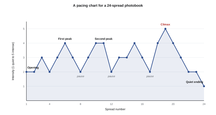
Pacing is how intensity, density and rhythm change across the length of a book. A book that is uniformly intense becomes exhausting; one that is uniformly quiet becomes flat. Designers often draw a pacing chart: a simple graph with spreads along the horizontal axis and a subjective intensity score on the vertical axis. Intensity might combine visual energy, emotional weight and density. Peaks are strong, dense or dramatic spreads; valleys are quiet images, white space or text. A well-paced book usually opens with a clear invitation, builds through rising and falling waves, has one or more climaxes, and ends with a resolving or open image.
Worked problem
Reading a pacing chart
A photographer scores the 12 spreads of a zine for intensity from 1 to 5: 2, 3, 3, 4, 4, 4, 5, 5, 4, 5, 5, 2. What problems does the chart reveal, and what changes would help?
Show solution
- Average intensity: \( (2+3+3+4+4+4+5+5+4+5+5+2) / 12 = 46 / 12 \approx 3.8 \), high for a short zine.
- From spread 4 to 11, every score is 4 or 5, with no valley for 8 spreads.
- The climax is not distinct, because spreads 7, 8, 10 and 11 all score 5.
Answer: The middle is a long plateau of high intensity, and there is no single climax. Inserting one or two quiet spreads around spread 6 and spread 9, for example a calm image opposite a blank page, and keeping only one score of 5 near the end would create waves and a clear peak.
scores = [2, 3, 3, 4, 4, 4, 5, 5, 4, 5, 5, 2]
run, longest = 1, 1
for a, b in zip(scores, scores[1:]):
    run = run + 1 if (a >= 4 and b >= 4) else 1
    longest = max(longest, run)
jumps = [abs(b - a) for a, b in zip(scores, scores[1:])]
print("average intensity:", round(sum(scores) / len(scores), 2))
print("longest run of spreads scoring 4 or more:", longest)
print("largest jump between adjacent spreads:", max(jumps))
print("spreads scoring 5:", [i + 1 for i, s in enumerate(scores) if s == 5])average intensity: 3.83 longest run of spreads scoring 4 or more: 8 largest jump between adjacent spreads: 3 spreads scoring 5: [7, 8, 10, 11]
A few lines of code can check a sequence plan for long plateaus, abrupt jumps and crowded peaks. The scores are subjective, but recording them makes your intentions explicit and helps when you discuss the sequence with a designer or editor.
Why heuristics beat brute force
It is tempting to think a computer could try every possible order and pick the best. The number of possible sequences is far too large. Twenty images can be arranged in \( 20! \), roughly \( 2.4 \times 10^{18} \), different orders. Even if a computer could evaluate a billion sequences a second, checking them all would take about 77 years. More importantly, there is no reliable formula for what makes a sequence good. Sequencing is done with heuristics: fix the opening and closing images, build pairs and small groups, arrange groups into chapters or movements, then test and refine. Tools that sort images by colour or similarity can suggest groupings, but the final order depends on meaning, which only you and your readers can judge.
Dummies and maquettes
A dummy is a physical mock-up of the book used to test the edit, sequence, size and feel before printing. Photographers and designers usually make several, increasing in fidelity.
| Dummy | Made with | Used to test |
|---|---|---|
| Thumbnail or rough dummy | Small prints or photocopies taped into a folded blank booklet | Sequence, pairs and pacing |
| Working dummy | Inkjet prints of real layouts trimmed and bound simply | Size, layout, type, margins, page turns |
| Final dummy or maquette | Accurate prints on similar paper, bound close to final | Overall object for publishers, funders or the printer |
| Printer's blank dummy | Supplied by the printer on the chosen paper and binding, without printing | Weight, thickness, opening, spine width |
Do not skip the rough dummy. It is quick, cheap and reveals problems that screens hide: pairs that clash, page turns that fall flat, images that are too small at book size. A working dummy then tests design. Many photographers send a final dummy to publishers, festivals' dummy awards and portfolio reviews; a well-made maquette is often more persuasive than a PDF. Ask printers for a blank dummy on your chosen paper as soon as you have a provisional specification. Holding the real weight and thickness of the book often changes decisions about paper and binding.
Sequencing for walls
An exhibition is experienced in space, not on pages. Visitors enter, scan the room, choose where to walk and see several works at once. Sequencing for walls involves different decisions.
- The entry or key image: the first work visible from the entrance sets expectations. Many curators place a strong, representative work on the wall facing the entrance.
- Groupings: works hung close together read as a group; larger gaps separate groups. Walls and rooms act like chapters.
- Sightlines: visitors see works across the room and through doorways. Images seen together across space create pairs just as facing pages do.
- Direction of travel: in many Western galleries visitors tend to move clockwise or follow the reading direction, but layout, doors and lighting strongly influence movement.
- Scale and spacing: large prints need viewing distance; small prints draw people close. Mixing sizes changes pace in the same way that full-bleed spreads and small images do in a book.
- Rest points: benches, text panels and empty wall act like blank pages.
Because visitors do not move in a fixed order, a wall sequence should work in several directions. Test it by printing small versions of each work at a consistent scale and arranging them on a scale drawing of the walls. Lesson 10 develops wall layout in detail, including hanging heights and spacing calculations.
Worked problem
How many works fit on the walls?
A gallery offers 24 m of usable wall. The photographer plans framed works 80 cm wide and wants about 60 cm between frames, with 1.2 m left clear at each end of each of 4 walls. How many works fit?
Show solution
- Clear space at wall ends: \( 4 \text{ walls} \times 2 \times 1.2 = 9.6 \) m, leaving \( 24 - 9.6 = 14.4 \) m.
- Each work needs its width plus one gap: \( 0.8 + 0.6 = 1.4 \) m, with one gap fewer than works on each wall, so per wall roughly \( (L + 0.6) / 1.4 \).
- With \( 14.4 / 4 = 3.6 \) m per wall, each wall holds \( (3.6 + 0.6) / 1.4 = 3 \) works, so 12 works in total.
Answer: About 12 works of this size. To show 18, the photographer could reduce some frame sizes, group smaller works more tightly, or reduce the clear space at corners.
Sequencing for screens
Online sequences are usually experienced on phones, scrolling vertically, often with sound and notifications competing for attention. Short sequences of eight to twelve images usually work better than long ones. Vertical and square images fill a phone screen; horizontal images appear small. Pairs are rarely seen together on a phone, so the meaning a pair carries in a book may be lost. Captions and short text between images can provide context that a book or wall would give through design and space. Treat the screen as its own format rather than a reduced copy of the book; VIS-410 covers websites and online portfolios in more detail.
Testing a sequence
Test sequences with real viewers before committing to print or production. Hand someone the rough dummy and watch silently: where do they slow down, where do they flip back, where do they skip? Ask afterward what they remember and what the book seemed to be about. Compare their answers with your stated intention. For exhibitions, walk a colleague through a scale model or a mock hang in a studio. Repeat with several people, including someone unfamiliar with your work. Record changes to the sequence and why you made them; that record helps when you defend choices to publishers or curators and when you plan later projects.
Working with editors and curators
Many books and exhibitions are shaped by collaboration. A book editor or a publisher's art director may propose cuts and changes; a curator may select works and determine the hang. Collaboration can greatly improve a project, because an experienced outside eye sees what you cannot. It also requires clear agreements about who decides what. Discuss early whether you have final approval of the sequence, cover and text, and record the answer in the publishing or exhibition agreement. Prepare for meetings with a dummy, a list of essential images and a clear statement of intent, and be willing to try suggestions in a dummy before rejecting them.
Common mistakes
MistakeForcing the exhibition to follow the book sequence
InsteadMake a separate format edit and sequence for each output from the master edit.
MistakePlanning image counts without accounting for front and back matter
InsteadSubtract front and back matter from the extent before calculating images.
MistakeIgnoring the facing page when placing an image
InsteadTreat the spread as the unit and decide whether each spread is a single, pair or pause.
MistakePutting a face or key detail across the gutter
InsteadKeep important detail away from the fold or use a lay-flat binding.
MistakeSkipping physical dummies and judging sequences only on screen
InsteadMake rough and working dummies and test them with real readers.
Summary and key terms
- Keep one master edit and make a separate format edit for each output.
- Image count depends on extent, front and back matter and average image density.
- The spread is the basic unit of book design, and every page turn acts like a cut.
- A pacing chart reveals plateaus, crowded climaxes and weak openings or endings.
- Dummies of increasing fidelity test sequence, size, design and the finished object.
- Wall sequencing depends on entry views, groupings, sightlines, scale and spacing.
- Screen sequences should be short and designed for vertical scrolling on phones.
- Master edit
- The full set of images representing a project, independent of any output.
- Format edit
- A selection and arrangement of images for one specific output.
- Spread
- Two facing pages seen together when a book is open.
- Verso
- The left-hand page of a spread.
- Recto
- The right-hand page of a spread.
- Gutter
- The fold or inner margin where pages meet the binding.
- Pacing chart
- A graph of intensity across the spreads of a sequence.
- Dummy
- A physical mock-up of a book used to test sequence, design and materials.
- Maquette
- A high-fidelity dummy close to the finished book.
- Sightline
- A line of view across a space, linking works seen together.
Practice problems
Work each problem on paper first, then reveal the answer to check.
A 96-page book has 4 front-matter and 12 back-matter pages with density 0.7. How many images fit?
Show answer
\( (96 - 4 - 12) \times 0.7 = 56 \).
A zine needs 18 images, one per page, plus 4 pages of other matter. What extent is needed if it must be a multiple of 4?
Show answer
\( 22 \) pages rounds up to 24.
Why is the recto considered the stronger position?
Show answer
Readers' eyes land first on the right page as they turn.
How many orders are possible for 10 images?
Show answer
\( 10! = 3\,628\,800 \).
What does a long run of high pacing scores suggest?
Show answer
A plateau with no rest; insert quiet spreads to create waves.
Name the four kinds of dummy in this lesson.
Show answer
Rough, working, final or maquette, and printer's blank dummy.
Why might an exhibition include an image not in the book?
Show answer
Some images work only at large scale or in a spatial pairing.
A wall has 4.2 m clear for 70 cm frames with 50 cm gaps. How many frames fit?
Show answer
\( (4.2 + 0.5) / 1.2 \approx 3.9 \), so 3 frames.
Give two features of sequencing for phones.
Show answer
Short sequences, vertical scrolling, pairs rarely seen together, small horizontals.
What should be agreed with a publisher about sequencing?
Show answer
Who has final approval of the sequence, cover and text.
Lesson quiz · 5 questions
Score 60% or more to complete this lesson.
Create a free account to save your progress, take quizzes and earn a certificate.