
ENGG-160 · Lesson 8 of 12 · 29 min
Human-centred and accessible design
Every engineered thing is used, operated, maintained or lived with by people. A control panel that operators misread, a medical device whose alarms are ignored, a door that people push when it should be pulled, a transit platform a wheelchair user cannot reach, a tool that injures the wrists of the workers who use it all day: each is a design failure, however sound its engineering. Human-centred design puts the people who will use a product or system at the centre of the design process, from understanding their needs to testing prototypes with them. This lesson covers the human-centred design process and user research methods, anthropometry and the use of percentiles, cognitive ergonomics and the principles of usable design, usability testing, and accessibility and universal design, including the codes that set minimum requirements.
The human-centred design process
Human-centred design, also called user-centred design or design thinking, follows the same overall loop as the design process of Lesson 1, with particular emphasis on the people involved. A widely used version has five overlapping modes:
- Empathize: observe and talk with users in their real environment to understand their needs, tasks, constraints and frustrations.
- Define: turn what you learned into a clear statement of the users' needs (Lessons 1 and 2).
- Ideate: generate many possible solutions.
- Prototype: build quick, cheap representations to make ideas tangible (Lesson 7).
- Test: put prototypes in front of real users, watch what happens, and learn.
The process is iterative: testing usually sends the team back to redefine the need or try new ideas. Its essential insight is that designers are not typical users. Engineers know how their designs are meant to work, are usually healthy adults of working age, and are comfortable with technology; the people who will use a product may be older, younger, tired, distracted, stressed, unfamiliar with the technology, working in gloves or poor light, or living with a disability. Designing for yourself means designing for a small and unrepresentative group.
Understanding users
User research methods include:
- Observation: watching people do the task in their real setting, ideally without interrupting. People often do things differently from how they describe them, and the workarounds they invent (tape over a confusing switch, notes stuck to a machine) reveal design problems.
- Interviews: open-ended conversations about goals, tasks and problems. Ask about specific recent experiences ("tell me about the last time you...") rather than hypothetical preferences.
- Surveys: useful for measuring how common a need or problem is once interviews have identified it.
- Personas: short descriptions of fictional but realistic users, based on research, that keep the team focused on real people with different needs, such as an experienced maintenance technician, a new operator on night shift and a visitor with low vision.
- Journey maps: step-by-step diagrams of a user's experience over time, showing actions, thoughts, feelings and pain points at each stage.
Include the full range of people affected: not just the purchaser or primary user but operators, maintainers, cleaners, installers, people nearby and people with disabilities. Many design flaws affect the people who service a product rather than those who buy it.
Anthropometry: designing for human dimensions
Anthropometry is the measurement of the human body: heights, reaches, grip sizes, seated dimensions and strength. Because people vary, designers use percentiles. The 5th percentile stature is the height below which 5 % of a population falls; the 95th percentile, the height below which 95 % falls. For a measurement that is roughly normally distributed with mean μ and standard deviation σ, the 5th and 95th percentiles are μ − 1.645σ and μ + 1.645σ.
Which percentile to design for depends on the type of limit:
- Clearances, such as door heights, legroom and escape hatches, should accommodate large people: design for the 95th or 99th percentile (or more, for safety-critical openings).
- Reaches, such as controls, shelves and emergency stops, should accommodate small people: design for the 5th percentile or lower.
- Where possible, make dimensions adjustable, as with office chairs, car seats and workbenches, to fit a range, typically the 5th percentile woman to the 95th percentile man.
There is no "average person": someone average in height is rarely average in reach, weight and hand size too. A design for the 50th percentile excludes half the population on that dimension.
import math

def cdf(z):                                   # standard normal cumulative probability
    return 0.5 * (1 + math.erf(z / math.sqrt(2)))

# Illustrative adult data (cm): mean and standard deviation
stature = {"men": (175.5, 7.0), "women": (162.5, 6.5)}
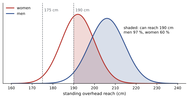
reach = {"men": (206.0, 8.5), "women": (192.0, 8.0)}   # standing overhead grip reach

for g, (m, s) in stature.items():
    print(f"Stature, {g}: 5th {m - 1.645 * s:.1f}, 50th {m:.1f}, 95th {m + 1.645 * s:.1f}, 99th {m + 2.326 * s:.1f} cm")

print("Shelf height   men can reach   women can reach   everyone (50/50)")
for h in [200, 190, 180, 175, 170]:
    pm = 1 - cdf((h - reach["men"][0]) / reach["men"][1])
    pw = 1 - cdf((h - reach["women"][0]) / reach["women"][1])
print(f"{h:8d} cm {pm:14.1%} {pw:17.1%} {(pm + pw) / 2:18.1%}")Stature, men: 5th 164.0, 50th 175.5, 95th 187.0, 99th 191.8 cm
Stature, women: 5th 151.8, 50th 162.5, 95th 173.2, 99th 177.6 cm
Shelf height men can reach women can reach everyone (50/50)
200 cm 76.0% 15.9% 45.9%
190 cm 97.0% 59.9% 78.4%
180 cm 99.9% 93.3% 96.6%
175 cm 100.0% 98.3% 99.2%
170 cm 100.0% 99.7% 99.9%The output shows why the choice matters. A shelf at 190 cm, which most men can reach, excludes two women in five; at 175 cm, nearly everyone standing can reach it. Wheelchair users have a much lower comfortable reach, typically around 120 cm for a forward reach, so frequently used controls and storage in public spaces are placed lower still. Real design uses measured anthropometric data for the relevant population, such as a national survey or a standard for a particular workforce, rather than the illustrative values here, and allows for clothing, footwear, gloves and posture.
Physical ergonomics
Physical ergonomics designs tasks, tools and workplaces to fit the body and prevent injury. Musculoskeletal disorders, injuries to muscles, tendons and nerves such as back injuries, tendinitis and carpal tunnel syndrome, are among the most common workplace injuries. Their main risk factors are forceful exertions, awkward postures, repetition and vibration. Engineering controls, the upper levels of the hierarchy of controls (ENGG-100), include adjustable work heights, lift-assist devices, tools with handles that keep the wrist straight, reduced force requirements, and job rotation. Work surfaces should be at about elbow height for light work, lower for heavy work and higher for precision work. Lifting from the floor or above the shoulders, with the body twisted or reaching far forward, sharply increases the load on the lower back.
Cognitive ergonomics: designing for the mind
Many accidents blamed on "human error" are better described as design-induced errors: the design made the wrong action easy and the right one hard. The cognitive scientist Don Norman, in The Design of Everyday Things, described principles that make products understandable and usable:
- Affordances and signifiers: a design should show what actions are possible and where. A flat plate on a door signals push; a vertical handle signals pull. A door with a pull handle on the push side, a "Norman door", will be pulled by most people however large the PUSH sign.
- Mapping: controls should relate naturally to what they control. Stove knobs arranged in the same pattern as the burners need no labels; four knobs in a row for burners in a square cause constant errors.
- Feedback: every action should produce an immediate, clear response, such as a click, a light or a sound, so users know it worked.
- Constraints: physical, logical and cultural limits that prevent wrong actions, such as connectors that fit only one way (the poka-yoke of Lesson 7).
- Consistency and conventions: follow established conventions (red for stop or danger, clockwise to close a valve, up for on in North America) unless there is a strong reason not to.
- Error tolerance: make errors hard to commit, easy to detect and easy to undo, and make dangerous actions require confirmation.
Worked problem
An alarm that was ignored
At a water treatment plant, operators repeatedly silenced a high-turbidity alarm without investigating it. A review finds that the control system generates about 300 alarms per shift, most of them low-priority, all with the same tone and display colour. Using human-centred principles, what should be changed?
Show solution
- Recognize the design problem: alarm flooding. With hundreds of identical alarms, operators cannot tell which matter; silencing becomes a habit (normalization of deviance, ENGG-100).
- Rationalize: review every alarm, removing those that require no operator action and combining duplicates. Industry guidance suggests an operator can handle only a few alarms per hour in normal operation.
- Prioritize: assign priorities, with distinct tones and colours, so critical alarms stand out.
- Give feedback and guidance: show the cause and the required response with each critical alarm, and log silenced alarms for review.
Answer: The fix is a redesign of the alarm system, not a reprimand. Alarm management standards for process industries are based on these principles, adopted after accidents in which critical alarms were lost in floods of minor ones. Usability testing with operators confirms whether the new system works.
Usability testing
The most reliable way to find out whether people can use a design is to watch them try. In a usability test, representative users attempt realistic tasks with a prototype while observers record where they hesitate, make errors or need help, without coaching them. Users are asked to think aloud. Measures include task success rate, time, errors and satisfaction. Research by the usability specialist Jakob Nielsen suggested that testing with about five users reveals most of the major problems in a design, so several small rounds of testing, with fixes between them, find more problems than one large test. Testing should include users with a range of abilities and experience, including people with disabilities.
Accessibility and universal design
About one in four adults in Canada and the United States has a disability, affecting mobility, vision, hearing, cognition, dexterity or other functions, and the share rises with age. Accessible design ensures that people with disabilities can use buildings, transportation, products and information independently and with dignity. Universal design goes further, aiming for designs usable by all people, to the greatest extent possible, without the need for adaptation. Its seven principles, developed at North Carolina State University in 1997, are: equitable use, flexibility in use, simple and intuitive use, perceptible information, tolerance for error, low physical effort, and size and space for approach and use.
Universal design often benefits everyone. Curb cuts, made for wheelchair users, help people with strollers, carts, bicycles and luggage; captions help people in noisy places; lever door handles help anyone with full hands; step-free building entrances help delivery workers and people with temporary injuries. Designing accessibility in from the start costs far less than retrofitting it later.
In Canada, accessibility requirements for buildings appear in the National Building Code and provincial codes, many of which reference CSA B651, Accessible design for the built environment, which specifies requirements such as clear floor spaces, reach ranges, door widths, ramp slopes, tactile walking surface indicators and accessible washrooms. The Accessible Canada Act (2019) applies to federally regulated sectors such as banking, telecommunications and transportation, and several provinces, including Ontario, Manitoba and British Columbia, have their own accessibility laws. Digital content is commonly required to meet the Web Content Accessibility Guidelines (WCAG).
Codes set minimums. Engineers should treat them as a floor and consult people with disabilities directly; many organizations now include accessibility consultants and users with lived experience in design reviews. Lesson 2's ramp example showed how an accessibility requirement can shape a whole design.
Worked problem
Reviewing a transit kiosk design
A ticket kiosk design places its touch screen centred 1,450 mm above the floor, uses small grey text on a white background, requires a pinch gesture to zoom a map, and gives no audio output. Identify accessibility problems and solutions.
Show solution
- Reach: 1,450 mm is above the comfortable reach of many seated users and shorter people. Lower the screen, and place key controls within about 380 to 1,200 mm of the floor.
- Perceptible information: small low-contrast text fails users with low vision. Use larger text and high contrast, meeting WCAG contrast ratios.
- Low physical effort and flexibility: pinch gestures are difficult for users with limited dexterity. Provide buttons for zoom and allow tactile keypad input.
- Audio: provide audio output through a headphone jack and speech for blind users, with a tactile keypad, as many transit agencies already do.
Answer: Four changes make the kiosk usable by far more people, including tourists, older adults, people carrying luggage and people in bright sunlight. Testing the revised prototype with users who are blind, have low vision, use wheelchairs or have limited dexterity would confirm the design.
Designing with communities
For infrastructure and community projects, the "users" are a community. Human-centred design here means engaging residents early, listening to their priorities, sharing information in accessible formats and languages, and respecting their knowledge of local conditions. With Indigenous communities, it means recognizing their rights and their authority over decisions affecting their lands, as ENGG-100 discusses. Projects designed with communities, rather than for them, are more likely to be accepted, used and maintained.
Common mistakes
MistakeDesigning for yourself or for an "average" user.
InsteadResearch real users across the full range of ages, sizes and abilities.
MistakeDesigning reaches for the 95th percentile.
InsteadDesign reaches for small users and clearances for large users, or make them adjustable.
MistakeBlaming accidents on operator error.
InsteadLook for design-induced errors and fix the design.
MistakeLeaving usability testing until the design is finished.
InsteadTest early prototypes with a few users, fix, and repeat.
MistakeTreating accessibility codes as the goal.
InsteadCodes are minimums; design inclusively and involve people with disabilities.
Summary and key terms
- Human-centred design cycles through empathizing, defining, ideating, prototyping and testing with real users.
- Designers are not typical users; observe and interview the full range of people affected.
- Use percentiles: 5th for reaches, 95th or 99th for clearances, adjustability where possible.
- Physical ergonomics reduces force, awkward posture, repetition and vibration.
- Affordances, signifiers, mapping, feedback, constraints and error tolerance make designs usable.
- Small, repeated usability tests with about five users find most major problems.
- Universal design benefits everyone; accessibility codes set minimum requirements.
- Human-centred design
- A design approach centred on the needs and abilities of users.
- Persona
- A research-based description of a representative user.
- Journey map
- A diagram of a user's experience over time.
- Anthropometry
- Measurement of human body dimensions.
- Percentile
- The value below which a given percentage of a population falls.
- Affordance
- A property suggesting how an object can be used.
- Mapping
- The relationship between controls and their effects.
- Usability test
- Observing representative users attempting realistic tasks.
- Universal design
- Design usable by all people without adaptation, as far as possible.
- Alarm flooding
- Too many alarms for operators to respond to effectively.
Practice problems
Work each problem on paper first, then reveal the answer to check.
Why are engineers often poor judges of whether their own designs are easy to use?
Show answer
They know how the design is meant to work and are not representative of all users.
Name three user research methods.
Show answer
For example: observation, interviews, surveys, personas, journey maps.
Stature has mean 175.5 cm and SD 7.0 cm. Find the 95th percentile.
Show answer
175.5 + 1.645 × 7.0 = 187.0 cm.
Which percentile should set the height of an emergency stop button: 5th or 95th?
Show answer
A small-user percentile (5th or lower), so everyone can reach it.
From the code output, what share of women can reach a 180 cm shelf?
Show answer
About 93 %.
What is a "Norman door"?
Show answer
A door whose design signals the wrong action, such as a pull handle on a push door.
Give an example of good mapping.
Show answer
Stove knobs laid out in the same pattern as the burners.
About how many users does Nielsen suggest per round of usability testing?
Show answer
About five.
Name three of the seven principles of universal design.
Show answer
For example: equitable use, flexibility in use, simple and intuitive use, perceptible information, tolerance for error, low physical effort, size and space for approach and use.
Give an example of an accessibility feature that benefits nearly everyone.
Show answer
Curb cuts, captions, lever handles or step-free entrances.
Lesson quiz · 5 questions
Score 60% or more to complete this lesson.
Create a free account to save your progress, take quizzes and earn a certificate.