
PHOT-301 · Lesson 3 of 12 · 25 min
Working spaces, bit depth and conversions
Every image you edit lives in a working space: an RGB color space that defines what its numbers mean while you work. The working space determines which colors can exist in the file, how smoothly tones are encoded and how easily the image can be converted for different outputs. Choosing working spaces and managing conversions well preserves the colors your camera captured and gives each output the best possible starting point. This lesson covers what defines an RGB working space, the main working spaces used in photography, gamut and the trade-offs of large and small spaces, bit depth and quantization, application color settings, converting between spaces, grayscale and black-and-white working spaces, and a practical working space strategy for print and screen.
What defines an RGB working space
An RGB working space is defined by three components, as Lesson 2 of CINE-202 explained for video: the chromaticities of its red, green and blue primaries, which set its gamut; its white point; and its tone response curve or gamma, which sets how numbers map to light. Working spaces are device-independent: they are not tied to any physical monitor or printer, but defined mathematically. They are also designed to be well behaved for editing: neutral colors have equal R, G and B values, and the spaces are perceptually reasonable so that adjustments behave predictably.
The main working spaces
Photographers use four main working spaces:
- sRGB: created by HP and Microsoft in 1996 to match typical CRT monitors and the web, with Rec.709 primaries, a D65 white point and a tone curve close to gamma 2.2. It is the smallest of the four, but it is the default for the web, social media, consumer printing labs and most software, and images without profiles are usually assumed to be sRGB.
- Adobe RGB (1998): a larger space with a greener green primary, designed to encompass most of the colors printable on CMYK presses. It is useful for print workflows and wide-gamut monitors that can display most of it.
- Display P3: based on the DCI-P3 cinema primaries with a D65 white point and the sRGB tone curve, adopted by Apple and widely used on phones, tablets and laptops. Its gamut is larger than sRGB, extending further into reds and greens than Adobe RGB, though Adobe RGB extends further into cyan-greens.
- ProPhoto RGB: a very large space developed by Kodak, with primaries outside the visible spectrum to include almost all real surface colors and the full range captured by cameras. It is the working space of Lightroom's internal processing (in a linear variant) and is often used for editing high-quality images destined for fine printing.
| Working space | White point | Tone curve | Relative gamut | Typical use |
|---|---|---|---|---|
| sRGB | D65 | sRGB curve (about 2.2) | Small | Web, social, consumer labs |
| Display P3 | D65 | sRGB curve | Medium | Phones, laptops, wide-gamut web |
| Adobe RGB (1998) | D65 | Gamma 2.2 | Medium | Print workflows, wide-gamut monitors |
| ProPhoto RGB | D50 | Gamma 1.8 | Very large | Editing for fine printing, archive masters |
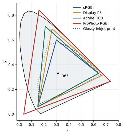
Gamut: larger is not automatically better
Why not always use the largest space? Larger spaces preserve more colors: saturated flowers, sunsets, clothing and the cyan and yellow colors that modern inkjet printers can reproduce but sRGB cannot. Converting early to sRGB discards those colors permanently. But a larger space spreads the same number of code values over a larger range of colors, so each step between adjacent values represents a bigger color difference. In an 8-bit file, this can cause banding in smooth gradients after editing, especially in ProPhoto RGB, which is why large spaces should be used with 16-bit files. Large spaces also include colors that no monitor can display, so you may be editing colors you cannot see; soft proofing and gamut warnings help. Finally, an image in a large space shown in software that ignores profiles looks dull and desaturated, so delivery files must be converted to the space the recipient expects.
A useful comparison is that modern photo inkjet printers on glossy paper reproduce some cyans, blues and yellows outside Adobe RGB, and some greens and oranges outside sRGB and even Display P3. If you want prints to show all the color your camera captured and your printer can reproduce, edit in ProPhoto RGB or a similarly large space in 16 bits, and convert to the printer profile at print time.
Bit depth and quantization
Bit depth sets how many values each channel can take. An 8-bit file has 256 levels per channel; a 16-bit file in Photoshop has 32,769 levels per channel (Photoshop uses 15 bits plus one); a raw file typically records 12 or 14 bits. Each editing operation that stretches tones, such as curves, levels and large exposure or saturation changes, can leave gaps between previously adjacent values, visible as banding or posterization in smooth areas and as a comb-like histogram. More levels mean more headroom before gaps become visible. Sixteen-bit editing is therefore standard for fine printing. The final output file can often be 8-bit, since a carefully edited 8-bit JPEG for the web or an 8-bit TIFF sent to many labs shows no banding, but some printing paths accept 16-bit data and can benefit from it in smooth gradients.
Worked problem
Steps per stop in different spaces
A smooth sky gradient spans about 0.5 of the code range in a channel. How many distinct levels describe it in an 8-bit file and in a 16-bit file (using Photoshop's 32,769 levels)? Why might banding appear after editing the 8-bit file in ProPhoto RGB?
Show solution
- 8-bit: 0.5 × 256 = 128 levels across the gradient.
- 16-bit: 0.5 × 32,769 ≈ 16,384 levels.
- A strong curves adjustment might stretch part of the gradient by a factor of 2, leaving gaps of 2 levels in the 8-bit file, which can be visible as steps.
- In ProPhoto RGB each level is a larger color difference than in sRGB, so the steps are more visible; in 16-bit, the gaps remain far below visibility.
Answer: About 128 levels in 8-bit versus about 16,000 in 16-bit; stretching 8-bit data in a large space can create visible steps, so edit in 16-bit.
Application color settings
Image editors have color settings that determine the default working spaces, color management policies and conversion options. In Photoshop, these include an RGB working space for new and untagged documents; CMYK, grayscale and spot working spaces; policies for opening documents whose embedded profile differs from the working space (preserve, convert or discard), with options to warn; and conversion options such as the engine, default intent and black point compensation. A sensible configuration for photographers is to set the RGB working space to the space you edit in, such as Adobe RGB or ProPhoto RGB; set policies to preserve embedded profiles and warn about mismatches and missing profiles; and use relative colorimetric with black point compensation as the default intent. Lightroom and Capture One manage color internally and require less configuration, but their export and external editor settings must match your workflow: for example, sending files to Photoshop as 16-bit ProPhoto RGB TIFF or PSD.
Converting between spaces
Converting from a larger to a smaller space, such as ProPhoto RGB to sRGB, requires handling colors outside the destination gamut. Matrix-based working space profiles usually support only relative colorimetric conversions, so out-of-gamut colors clip to the edge of the smaller space. To control this, check the image with a gamut warning or soft proof before converting, and reduce saturation or adjust hue locally in areas that will clip. Converting from a smaller to a larger space, such as sRGB to Adobe RGB, does not add colors; it simply re-encodes the existing ones, so there is no benefit to converting sRGB images to larger spaces except to combine them with other material. Avoid repeated conversions back and forth, which accumulate small rounding errors, especially in 8-bit files. Convert once, at the end, for each output.
Grayscale and black-and-white working spaces
Black-and-white images can be kept as RGB files with neutral colors, or converted to grayscale. Keeping black-and-white images in RGB preserves the ability to tone them, to split-tone and to print them through color printer drivers that perform best with RGB data, and many photographers keep monochrome work in RGB throughout. Grayscale working spaces are defined by a tone curve, such as gamma 2.2 or a dot gain curve for presses. When converting to grayscale, use the black-and-white mixer or a channel mixer adjustment first (PHOT-202), rather than a simple mode change, so that you control how each color becomes gray. Black-and-white printing modes in printer drivers (Lesson 11) can accept RGB or grayscale input.
A practical working space strategy
A robust strategy for most photographers is:
- Capture raw, with the raw processor working internally in its own wide space.
- Edit in 16 bits in ProPhoto RGB for images destined for fine prints, or in Adobe RGB or Display P3 for general work if you prefer a space your monitor can display almost completely.
- Keep masters in the editing space, as 16-bit TIFF or PSD with embedded profiles.
- For prints on your own printer, convert at print time to the printer and paper profile, choosing the intent by soft proofing.
- For labs, follow their instructions: many accept sRGB or Adobe RGB, and some supply profiles for soft proofing and accept files converted to them.
- For the web and social media, convert to sRGB, or Display P3 where the platform preserves profiles and the audience uses wide-gamut devices, and embed the profile.
Document your strategy so that assistants, retouchers and labs work consistently, and test it periodically with a reference image that contains saturated colors, skin tones, neutrals and smooth gradients.
Lab color and editing in Lab mode
Photoshop also allows editing in Lab mode, which separates lightness (L) from color (a and b channels). Some retouchers use Lab mode for specific tasks: sharpening only the lightness channel to avoid color halos, increasing color separation with steep a and b curves, or adjusting color without changing tone. Because conversions to and from Lab can cause small rounding changes, it is best done in 16 bits and only when its specific advantages are needed. Most modern editing tools, such as luminosity blend modes and color-specific adjustment layers, achieve similar results without leaving RGB.
Working spaces for scanning and archives
When digitizing film and prints, the choice of working space depends on the material and the purpose of the files. Archives and museums often use Adobe RGB, ECI-RGB v2 (a European standard working space with a D50 white point), or ProPhoto RGB for color originals, and a grayscale space with gamma 2.2 or L* for monochrome originals, recording the profile used in the metadata. Wide spaces preserve colors from transparencies, which can be very saturated, while documented spaces ensure that future users can interpret files correctly. Consistency within a collection matters more than the specific choice.
Testing your working space choices
A simple test reveals the practical effect of working spaces. Take a raw image with saturated flowers or a sunset, export it as 16-bit TIFF in sRGB, Adobe RGB and ProPhoto RGB, then soft proof each with the same glossy paper profile and print small test strips. The differences, usually visible in the most saturated areas, show whether your images and printer benefit from wider spaces, and build confidence in your workflow.
Common mistakes
MistakeEditing ProPhoto RGB images in 8 bits.
InsteadUse 16-bit files with large working spaces.
MistakeConverting raw files to sRGB before editing for print.
InsteadEdit in a wide space and convert at the end.
MistakeSending ProPhoto RGB files to web platforms.
InsteadConvert to sRGB or Display P3 with embedded profiles.
MistakeConverting sRGB images to Adobe RGB to gain color.
InsteadRemember conversion cannot add colors.
MistakeDiscarding embedded profiles on opening.
InsteadSet policies to preserve embedded profiles.
Summary and key terms
- Working spaces are defined by primaries, white point and tone curve.
- sRGB, Display P3, Adobe RGB and ProPhoto RGB differ greatly in gamut.
- Inkjet prints reproduce some colors outside sRGB and even Adobe RGB.
- Large spaces need 16-bit editing to avoid banding.
- Color settings should preserve embedded profiles and warn on mismatches.
- Convert once at the end for each output, controlling out-of-gamut colors.
- Keep black-and-white work in RGB for toning and printer drivers.
- Working space
- Device-independent RGB space used for editing.
- sRGB
- Standard small RGB space for the web and consumer use.
- Adobe RGB (1998)
- Larger RGB space covering most printable colors.
- Display P3
- Wide-gamut space with DCI-P3 primaries and D65 white.
- ProPhoto RGB
- Very large RGB space for editing and archives.
- Gamut
- Range of colors a space or device can represent.
- Bit depth
- Number of bits per channel value.
- Posterization
- Visible steps where smooth tones should be.
- Color management policy
- Rule for handling embedded profiles on opening.
- Untagged image
- Image without an embedded profile.
Practice problems
Work each problem on paper first, then reveal the answer to check.
What three things define a working space?
Show answer
Primaries, white point and tone curve.
Which space is the web default?
Show answer
sRGB.
Which extends further into cyan-green, Adobe RGB or Display P3?
Show answer
Adobe RGB.
Why does ProPhoto RGB need 16 bits?
Show answer
Larger steps per level cause banding in 8 bits.
Levels per channel in 8 bits?
Show answer
256.
What does a comb-like histogram show?
Show answer
Gaps between levels after stretching tones.
Does converting sRGB to Adobe RGB add colors?
Show answer
No.
What color policy is safest?
Show answer
Preserve embedded profiles and warn on mismatches.
Why keep black-and-white images in RGB?
Show answer
For toning and printer drivers.
When should you convert to the printer profile?
Show answer
At print time.
Lesson quiz · 5 questions
Score 60% or more to complete this lesson.
Create a free account to save your progress, take quizzes and earn a certificate.