
CRE-230 · Lesson 5 of 12 · 26 min
Colour, palettes and contrast
Colour is often the first thing viewers notice about a graphic and the quickest way to recognize a creator's brand. It sets mood, creates hierarchy, groups information and helps a post stand out from the feed. It can also cause problems: clashing palettes, text that cannot be read, colours that shift between devices and meanings that differ between cultures. VIS-110 explained how we see colour and how colour is described and reproduced. This lesson applies that knowledge to social graphics: colour models for screens, building palettes, using colour for hierarchy and meaning, contrast, colour on different screens and in dark mode, colour and photographs, and keeping colour consistent across a brand.
Colour models for screens
Social graphics are displayed on screens, which create colour by mixing red, green and blue light. Design tools describe screen colours in RGB values, each from 0 to 255, or as hexadecimal codes such as #1E6FD9, where each pair of characters represents red, green and blue. Many tools also offer HSB or HSL (hue, saturation, brightness or lightness), which is more intuitive for adjusting colours: hue is the position on the colour wheel in degrees, saturation the intensity, and brightness or lightness how light or dark the colour is. Graphics for screens should be created and exported in the sRGB colour space for consistent appearance across devices and platforms (VIS-120). CMYK, used for printing, is not appropriate for social graphics.
| Colour | Hex | RGB | HSB |
|---|---|---|---|
| A strong blue | #1E6FD9 | 30, 111, 217 | 214°, 86 %, 85 % |
| A warm orange | #F28C28 | 242, 140, 40 | 30°, 83 %, 95 % |
| A dark navy | #14213D | 20, 33, 61 | 221°, 67 %, 24 % |
| An off-white | #F7F4EE | 247, 244, 238 | 40°, 4 %, 97 % |
Building a palette
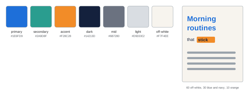
A palette is a limited set of colours used consistently. A practical palette for a creator brand usually includes:
- One or two primary brand colours that appear in most graphics and become recognizable.
- One accent colour, often contrasting, for emphasis, highlights and calls to action.
- Neutrals: a dark colour for text (often a very dark grey or navy rather than pure black), a light colour for backgrounds (often off-white), and one or two mid-tones.
- Optionally, tints and shades of the brand colours for backgrounds, boxes and charts.
Colour harmony principles help choose colours that work together: analogous palettes use neighbouring hues for calm, cohesive looks; complementary palettes use opposite hues for energy and contrast; split-complementary and triadic palettes offer variety with balance; monochromatic palettes use one hue in different lightnesses. Palette generators and colour tools can propose options, but the palette should reflect the brand's personality and audience (CRE-110).
The 60-30-10 guideline
A simple guideline for balancing colour is 60-30-10: about 60 % of the graphic in a dominant colour (often a neutral background), 30 % in a secondary colour (such as a brand colour for shapes or images), and 10 % in an accent colour that draws attention to the most important element. The proportions are approximate, but they prevent the common problem of using every palette colour in equal amounts, which makes graphics feel busy and removes the emphasis that an accent should provide.
Colour for hierarchy and meaning
Colour supports hierarchy: the accent colour on the key word, button or number pulls the eye there first; muted colours push secondary information back. It also carries meaning, though meanings vary by culture and context. In many Western contexts, red signals urgency, danger, sales or passion; green signals growth, nature, health or success; blue signals trust, calm and technology; yellow signals optimism and warning; purple signals creativity or luxury; black signals sophistication or seriousness. In China and many East Asian contexts, red signals luck and celebration, and white is associated with mourning in some traditions. Colours also have conventional meanings in data and interfaces, such as red for decreases and green for increases in financial charts. Use meanings deliberately, consider your audience, and never rely on colour alone to convey essential information, since some viewers cannot distinguish certain colours (Lesson 11).
Contrast
Contrast is the difference in lightness between colours, and it determines whether text and important elements are visible. The Web Content Accessibility Guidelines (WCAG) define a contrast ratio based on the relative luminance of two colours, from 1:1 (no contrast) to 21:1 (black on white). For normal text, WCAG 2.2 level AA requires a ratio of at least 4.5:1; for large text, at least 18 points or 14 points bold (roughly 24 pixels or 19 pixels bold on the web), at least 3:1; and for important graphical elements, such as icons and chart lines, at least 3:1. Social platforms do not enforce these standards for graphics, but they are an excellent guide, especially since viewers see graphics in bright light and on dim screens.
Here \(L_1\) is the relative luminance of the lighter colour and \(L_2\) that of the darker, each between 0 and 1. Contrast checker tools calculate this automatically from hex codes. Colours that look different in hue can have very similar luminance and therefore poor contrast, such as red text on a green background, or orange on blue of similar lightness.
Worked problem
Checking text contrast
A creator wants white text (#FFFFFF, relative luminance 1.0) on their brand orange (#F28C28, relative luminance about 0.38). Does it meet 4.5:1 for normal text? What about navy text (#14213D, luminance about 0.016) on the same orange?
Show solution
- White on orange: (1.0 + 0.05) ÷ (0.38 + 0.05) = 1.05 ÷ 0.43 ≈ 2.4:1, which fails for both normal and large text.
- Navy on orange: (0.38 + 0.05) ÷ (0.016 + 0.05) = 0.43 ÷ 0.066 ≈ 6.5:1, which passes AA for normal text.
- Use navy text on the orange, or darken the orange considerably if white text is required.
Answer: White on this orange gives only about 2.4:1 and fails; navy on orange gives about 6.5:1 and passes.
Colour on different screens and in dark mode
Colours look different on different devices: phones with OLED screens and wide gamuts may show colours more saturated than a laptop; older or budget screens may show them duller; night modes shift colours warmer; and automatic brightness changes perceived contrast. Designing in sRGB, avoiding reliance on subtle colour differences, and testing on more than one device reduce surprises. Dark mode changes the context around graphics: a bright white graphic surrounded by a dark interface feels much brighter, while dark graphics can merge with the interface. Many creators use off-white or light-tinted backgrounds rather than pure white, and avoid pure black backgrounds that disappear in dark mode, or add a subtle border.
Colour and photographs
Graphics often combine photos with brand colours. A few techniques create harmony: sample colours from the photo for text and shapes, so they relate naturally; apply a consistent grade or filter to all photos in a series (PHOT-202 covers colour grading); use a duotone effect, mapping a photo's shadows and highlights to two brand colours, for a strong branded look; place photos on brand-colour backgrounds; and ensure that brand colours do not clash with dominant colours in the photo. Skin tones should remain natural; heavy colour treatments that distort skin are best avoided unless the effect is clearly stylized.
Gradients and texture
Gradients, smooth transitions between colours, add depth and energy, and darkening gradients behind text improve legibility. Platform compression can create banding in subtle gradients, especially in dark tones; adding a small amount of noise or grain, using more contrast between gradient stops, or exporting at high quality reduces it. Textures such as paper, grain or subtle patterns can add warmth and distinguish a brand, but should not compete with text.
Consistency across a brand
Recognizable brands use colour consistently. Record your palette with exact hex values in a brand kit (Lesson 12), set up the colours as saved swatches in your design tools, and use them in every template. Decide which colours are used for which purposes: background, text, headlines, accents, charts and buttons. Avoid introducing new colours casually; if a campaign needs a seasonal colour, add it deliberately for that campaign. Check colours periodically across your feed, viewing several posts together, to make sure the overall look remains coherent.
Tints, shades and tones
A small palette can produce a wide range of colours through tints (adding white), shades (adding black) and tones (adding grey). A primary blue might have a very light tint for backgrounds, a mid tint for boxes, the full colour for headlines and a dark shade for text. Generating these systematically, for example at 10 %, 30 %, 60 % and 100 % strength, keeps them related. In HSB or HSL terms, tints raise lightness and lower saturation, while shades lower lightness. Check each tint and shade for contrast with the text colours you plan to use on it, since a light tint background with white text will fail.
Worked problem
Building a tint scale
A creator's brand blue is #1E6FD9. They want a pale background tint at about 15 % strength on white. How is it calculated?
Show solution
- Mix 15 % of the colour with 85 % white for each channel: value = 0.15 × colour + 0.85 × 255.
- Red: 0.15 × 30 + 0.85 × 255 ≈ 4.5 + 216.8 = 221.
- Green: 0.15 × 111 + 216.8 ≈ 16.7 + 216.8 = 234.
- Blue: 0.15 × 217 + 216.8 ≈ 32.6 + 216.8 = 249, giving about RGB 221, 234, 249 (#DDEAF9).
Answer: About RGB 221, 234, 249 (#DDEAF9), a pale blue suitable for backgrounds with dark text.
Colour psychology with caution
Popular articles often claim that particular colours reliably cause particular emotions or behaviours, such as blue increasing trust or red increasing appetite. Research shows that colour effects are real but depend heavily on context, culture, personal experience and what the colour is applied to. A red that feels exciting on a sports brand may feel alarming on a health brand. Treat colour psychology as a starting point for discussion rather than a rule, and choose colours that fit the brand and stand out in its niche.
Standing out in a niche
Colour can differentiate a creator from competitors. If most finance creators use navy and green, a warm palette may stand out; if most wellness creators use soft pastels, a bold contrast palette may be distinctive. Review the dominant colours in your niche's feeds and thumbnails, and consider choosing a signature colour that is relatively uncommon there, while still fitting your brand personality. Using that colour consistently, in borders, highlights or backgrounds, makes your posts recognizable before viewers read anything.
Colour in charts
Charts benefit from restrained colour: a neutral grey for most data and one brand or accent colour to highlight the series or bar that matters. Sequential palettes, from light to dark of one hue, show ordered values; diverging palettes, with two hues meeting at a neutral middle, show values above and below a midpoint; categorical palettes use distinct hues for unrelated groups, best limited to about five or six. Always check charts for colour vision accessibility (Lesson 11).
Testing colour choices
Before finalizing a palette, test it in real graphics: a headline post, a chart, a thumbnail and a story. Check contrast for every text pair you will use, view the graphics in light and dark mode and on two devices, and simulate colour vision deficiency. Palettes that look harmonious as swatches sometimes fail in practice.
Seasonal and campaign colours
Seasonal campaigns, such as holidays or back-to-school, sometimes call for temporary colours. Introduce them as accents alongside the core palette rather than replacing it, so posts stay recognizable, and retire them when the campaign ends.
Common mistakes
MistakeUsing every palette colour equally.
InsteadFollow roughly 60-30-10 proportions.
MistakeLow-contrast text on brand colours.
InsteadCheck contrast and aim for at least 4.5:1 for normal text.
MistakeRelying on colour alone for meaning.
InsteadAdd labels, icons or patterns.
MistakeExporting in CMYK or untagged colour.
InsteadUse sRGB for social graphics.
MistakePure white graphics that glare in dark mode.
InsteadConsider off-white backgrounds or borders.
Summary and key terms
- Screens use RGB; describe colours with hex, RGB or HSB values in sRGB.
- A palette includes primary, accent and neutral colours.
- Colour harmonies guide combinations; 60-30-10 balances proportions.
- Colour creates hierarchy and meaning, which vary by culture.
- WCAG contrast ratios: 4.5:1 normal text, 3:1 large text and graphics.
- Test colours across screens and in dark mode.
- Harmonize photos with brand colours and keep colour consistent.
- RGB
- Red, green and blue light colour model.
- Hex code
- Hexadecimal notation for RGB colours.
- HSB
- Hue, saturation and brightness model.
- Palette
- Limited set of colours used consistently.
- Accent colour
- Colour used for emphasis.
- Complementary colours
- Colours opposite on the colour wheel.
- Contrast ratio
- WCAG measure of luminance difference.
- Relative luminance
- Perceived lightness of a colour from 0 to 1.
- Duotone
- Image mapped to two colours.
- Banding
- Visible steps in a smooth gradient.
Practice problems
Work each problem on paper first, then reveal the answer to check.
What does each pair in a hex code represent?
Show answer
Red, green and blue.
Which colour space should social graphics use?
Show answer
sRGB.
Name the parts of a creator palette.
Show answer
Primary, accent, neutrals, tints and shades.
What is the 60-30-10 guideline?
Show answer
Dominant, secondary and accent proportions.
Give an example of a cultural colour difference.
Show answer
Red for luck in China; white for mourning in some traditions.
Minimum WCAG AA contrast for normal text?
Show answer
4.5:1.
Contrast of colours with luminance 0.9 and 0.1?
Show answer
0.95 ÷ 0.15 ≈ 6.3:1.
Why avoid pure white in dark mode?
Show answer
It glares against a dark interface.
What is a duotone?
Show answer
A photo mapped to two colours.
How can gradient banding be reduced?
Show answer
Add noise, increase contrast, export at high quality.
Lesson quiz · 5 questions
Score 60% or more to complete this lesson.
Create a free account to save your progress, take quizzes and earn a certificate.