
CINE-310 · Lesson 2 of 12 · 25 min
Color science for grading: perception, contrast and color relationships
Grading decisions are judgments about how viewers will perceive images. A colorist does not need to derive color appearance models, but understanding how the visual system responds to light, contrast and color explains why certain corrections work, why images look different in different contexts, and why the same numbers can look right in one scene and wrong in another. CINE-202 and PHOT-301 covered the measurement side of color: color spaces, transfer functions, CIE diagrams and color management. This lesson focuses on perception as it applies to grading: opponent color, luminance and chroma, simultaneous contrast and adaptation, the perception of contrast and sharpness, memory colors, and the emotional and cultural associations of color that colorists use to tell stories.
Three channels, opponent pairs
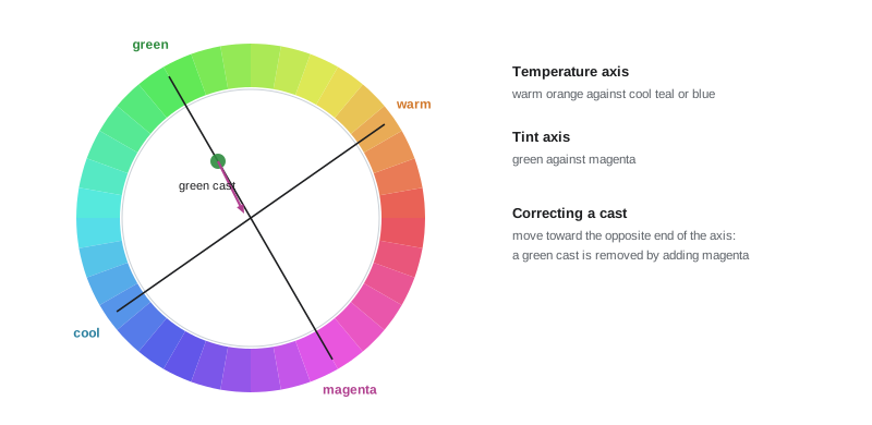
The eye has three types of cone, sensitive to long, medium and short wavelengths, loosely called red, green and blue. But the visual system does not send three separate color signals to the brain. Retinal processing combines cone responses into one luminance channel and two opponent color channels: red versus green, and yellow versus blue. This is why we can imagine a bluish green or a reddish yellow, but not a reddish green or a yellowish blue: the two members of each opponent pair cancel. Grading tools mirror this structure. Color balance wheels move the image along two axes, roughly orange–teal and green–magenta, and the color temperature and tint controls of raw and primary tools map onto the yellow–blue and green–magenta opponent axes. Thinking in opponent terms helps diagnose casts: an image that looks sickly needs less green, which means adding magenta; an image that looks cold needs less blue, which means adding yellow or orange.
Luminance and chroma
Because the visual system separates luminance from color, most grading systems also separate them. Luminance, the perceived brightness, carries most of the detail, texture and depth information in an image; we are far more sensitive to errors in luminance than in chroma. This is why video codecs subsample color, why black-and-white images can be as expressive as color ones, and why many grading operations are done in luminance-preserving modes. Luma in video is a weighted sum of the red, green and blue signals that approximates perceived brightness:
Green contributes most to perceived brightness and blue least. One consequence is that changing color balance also changes perceived brightness: pushing an image toward blue makes it look darker, and toward yellow-green makes it look brighter, unless the tool compensates. Many grading tools offer luminance-preserving balance controls or a "luminance mix" setting that keeps brightness constant while color changes. Saturation adjustments also depend on luma weighting; a saturation control that ignores weighting can make blues look darker and yellows brighter as saturation increases.
Worked problem
Brightness change from a color shift
A neutral gray has R' = G' = B' = 0.50, so its luma is 0.50. A colorist adds blue by raising B' by 0.10 and lowering R' and G' by 0.02 each to cool the image. What is the new luma, and does the gray look brighter or darker?
Show solution
- New values: R' = 0.48, G' = 0.48, B' = 0.60.
- Luma: 0.2126 × 0.48 + 0.7152 × 0.48 + 0.0722 × 0.60 = 0.1020 + 0.3433 + 0.0433 = 0.4886.
- The luma fell from 0.500 to about 0.489, so the cooler gray looks slightly darker even though blue was raised by 0.10.
Answer: About 0.489: the cooler image looks slightly darker, because blue contributes little to perceived brightness while red and green fell.
Adaptation
The visual system continuously adapts to the overall level and color of light. Chromatic adaptation makes a white shirt look white under tungsten light and under daylight, even though the light reflected from it is very different. Light adaptation adjusts sensitivity to the overall brightness level. Adaptation has direct consequences for grading. Colorists working for hours adapt to the image in front of them: a slightly warm grade begins to look neutral after a few minutes, and a slight cast may become invisible. Experienced colorists counter this by checking scopes, looking away at a neutral reference such as the gray surround or a white patch, comparing with reference stills and other scenes, and taking breaks. Adaptation also explains why a scene graded in isolation may look wrong when the film plays continuously: the previous scene sets the viewer's adaptation state, so a slightly blue scene following a very warm one will look bluer than intended.
Simultaneous contrast and surround
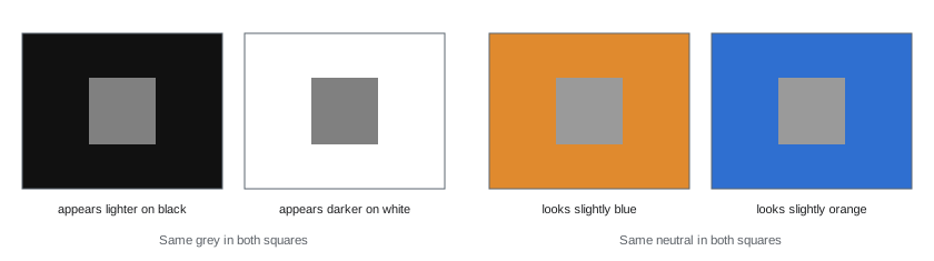
The appearance of a color or tone depends on what surrounds it. A gray patch looks lighter against black and darker against white; a neutral object looks slightly blue next to orange and slightly orange next to blue. This simultaneous contrast is constantly at work in images. Skin tones look warmer against a cool background, which is one reason the complementary orange–teal palette became popular. A dark interior makes a window look brighter, and a bright surround makes shadows look deeper. Colorists use these effects deliberately: darkening the edges of the frame makes the center appear brighter without changing it; cooling a background makes faces look warmer and healthier; desaturating surroundings makes a saturated object pop. The surround of the viewing environment matters too: images viewed in a dark cinema appear to have lower contrast than the same images in a dim living room, which is why theatrical and home masters use different gammas (CINE-202 Lesson 9).
Perceiving contrast and depth
Contrast has a profound effect on how images feel. Global contrast, the difference between the darkest and brightest parts of the image, sets the overall mood: high contrast feels dramatic, harsh or energetic; low contrast feels soft, nostalgic, foggy or melancholic. Local contrast, the difference between neighboring areas, determines perceived sharpness, texture and depth. The visual system is more sensitive to edges and local differences than to absolute values, so increasing local contrast in midtones makes images look sharper and more three-dimensional even without changing resolution. Depth cues in grading include aerial perspective, the tendency of distant objects to look lighter, bluer and lower in contrast; the darkening of foreground elements; and separation between subject and background through differences in brightness, color or saturation. Colorists enhance depth by gently reducing contrast and adding haze to backgrounds, keeping subjects slightly brighter and more saturated than their surroundings, and shaping light with windows and gradients.
Brightness, color and the Hunt and Stevens effects
Perceived colorfulness and contrast increase with brightness. The Hunt effect describes how colors look more saturated at higher luminance, and the Stevens effect how contrast looks greater at higher luminance. Both matter for HDR and SDR trims (Lesson 9): an image mastered at 1,000 nits looks more colorful and contrasty than the same image at 100 nits, so SDR versions often need slightly more saturation and contrast to feel equivalent, while HDR versions may need saturation reduced in very bright areas to avoid garish highlights. Conversely, dark scenes look less colorful than bright ones, which is why night scenes graded with high saturation can look surprisingly vivid on bright consumer displays.
Memory colors
Viewers have strong expectations for certain familiar colors, called memory colors: skin, sky, foliage, and some foods. These expectations are not literal records; people tend to remember sky as bluer, grass as greener and skin as slightly more saturated and warmer than they measure. Deviations from memory colors are noticed quickly, while deviations in less familiar colors are often accepted. Skin is the most important memory color for colorists (Lesson 7), and most grades protect skin from extreme shifts even when the rest of the image is heavily stylized. Skies and foliage can be shifted more, but viewers notice when they become implausible, such as cyan grass or purple skies, unless the stylization is clearly intentional.
| Memory color | Typical expectation | Grading consideration |
|---|---|---|
| Skin | Warm, healthy, slightly saturated | Protect from casts; keep near the skin tone line |
| Blue sky | Bluer and more saturated than measured | Can be deepened; avoid cyan or purple shifts |
| Foliage | Rich green, slightly yellow in sunlight | Shift hue carefully; avoid sickly yellow-green |
| Neutral grays and whites | Neutral under the scene light | Use as balance references |
| Familiar foods and brands | Very specific expectations | Match references in commercials |
Color, emotion and story
Color carries emotional and symbolic associations, though they vary between cultures and contexts. Warm palettes often suggest comfort, nostalgia, heat or intimacy; cool palettes suggest isolation, calm, night or clinical environments; desaturation can suggest bleakness, memory, documentary realism or exhaustion; saturated palettes suggest energy, fantasy or heightened emotion; green can suggest sickness or unease as well as nature. Films use color structurally: distinct palettes for different locations, timelines or characters; gradual shifts in palette across a story arc; or a signature color that recurs at key moments. Examples often studied include the color-coded worlds of Traffic (2000), the green tint of The Matrix (1999) inside the simulation, and the controlled palettes of Wes Anderson's films. The colorist's role is to realize the color script, often developed by the director, cinematographer and production designer, consistently and subtly, so that viewers feel it without consciously noticing it.
Cultural and individual differences
Color meanings differ across cultures: white is associated with weddings in many Western contexts and with mourning in parts of East Asia; red signifies luck and celebration in China and danger or passion in other contexts. Individual viewers also differ: about 8 % of men and 0.5 % of women of Northern European descent have some form of color vision deficiency, most commonly reduced red–green discrimination. Colorists cannot grade for every viewer, but awareness of these differences helps when grading for international audiences and when using color alone to carry story information; contrast, shape and context should support color cues.
Contrast sensitivity and noise
The visual system is most sensitive to contrast at moderate spatial frequencies, roughly the scale of facial features at normal viewing distance, and less sensitive to very fine detail and very broad gradients. This has practical consequences for grading. Noise and grain are most visible in smooth midtones and shadows, such as skies, walls and dark backgrounds, where there is no texture to hide them; raising shadow levels or adding contrast in those areas makes noise more obvious. Broad gradients, such as a vignette or a graduated sky, can be large in absolute value without drawing attention, because the eye is insensitive to slow changes across the frame. Fine sharpening, by contrast, is easily overdone, producing haloes along edges that viewers read as artificial. Knowing where the eye is sensitive helps colorists decide where corrections can be bold and where they must be gentle.
Where the eye goes
Viewers look first at faces, especially eyes, then at areas of high contrast, brightness, saturation or movement. Grading can reinforce or fight this. A bright, saturated object at the edge of the frame competes with the actor; a dark, desaturated surround lets the face lead. Colorists therefore often reduce brightness and saturation slightly toward the edges, keep the brightest and most saturated areas near the subject, and check that no stray highlight, such as a window, a reflective prop or a white shirt, pulls attention away from the story. These are perceptual decisions as much as technical ones, and they explain why many secondaries in a grade are subtle reductions rather than dramatic enhancements.
Perception checks in practice
- Look away from the screen at a neutral gray surface for a few seconds before judging a subtle cast.
- Compare the current shot with a reference still from an earlier, approved scene.
- Toggle the grade on and off to remind yourself where you started.
- Watch scenes in sequence at full speed before signing off.
- View the grade at the end of the day and again the next morning, when eyes are fresh.
Common mistakes
MistakeTrusting your eyes after hours of grading.
InsteadCheck scopes, references and neutral surroundings, and take breaks.
MistakeIgnoring luma changes when shifting color.
InsteadUse luminance-preserving controls or compensate brightness.
MistakeGrading scenes in isolation.
InsteadReview in sequence to account for adaptation between scenes.
MistakePushing memory colors beyond plausibility.
InsteadProtect skin and keep skies and foliage believable.
MistakeRelying on color alone to tell the story.
InsteadSupport color cues with contrast and context.
Summary and key terms
- Vision uses a luminance channel and two opponent color channels.
- Balance controls map to orange–teal and green–magenta opponent axes.
- Luma weights green most and blue least, so color shifts change brightness.
- Adaptation changes perception over time and between scenes.
- Simultaneous contrast makes surroundings change appearance.
- Contrast, depth cues and the Hunt and Stevens effects shape perception.
- Memory colors and cultural meanings guide creative choices.
- Opponent color
- Red–green and yellow–blue channels in vision.
- Luma
- Weighted sum of R'G'B' approximating brightness.
- Chroma
- Color information separate from luminance.
- Chromatic adaptation
- Adjustment of perception to the color of light.
- Simultaneous contrast
- Change in appearance caused by surroundings.
- Local contrast
- Contrast between neighboring areas.
- Aerial perspective
- Distant objects appearing lighter and lower in contrast.
- Hunt effect
- Colorfulness rising with luminance.
- Stevens effect
- Perceived contrast rising with luminance.
- Memory color
- Familiar color with strong viewer expectations.
Practice problems
Work each problem on paper first, then reveal the answer to check.
What are the two opponent color axes?
Show answer
Red–green and yellow–blue.
How do you correct a green cast?
Show answer
Add magenta.
Write the Rec.709 luma weights.
Show answer
0.2126 R, 0.7152 G, 0.0722 B.
Why does a bluer grade look darker?
Show answer
Blue contributes little to luma.
How do colorists counter adaptation?
Show answer
Scopes, references, neutral surround, breaks.
Why does a cool background make skin look warmer?
Show answer
Simultaneous contrast.
What does local contrast affect?
Show answer
Perceived sharpness, texture and depth.
What is the Hunt effect?
Show answer
Colors look more saturated at higher luminance.
Name three memory colors.
Show answer
Skin, sky, foliage.
Approximate share of men with color vision deficiency (Northern European descent)?
Show answer
About 8 %.
Lesson quiz · 5 questions
Score 60% or more to complete this lesson.
Create a free account to save your progress, take quizzes and earn a certificate.